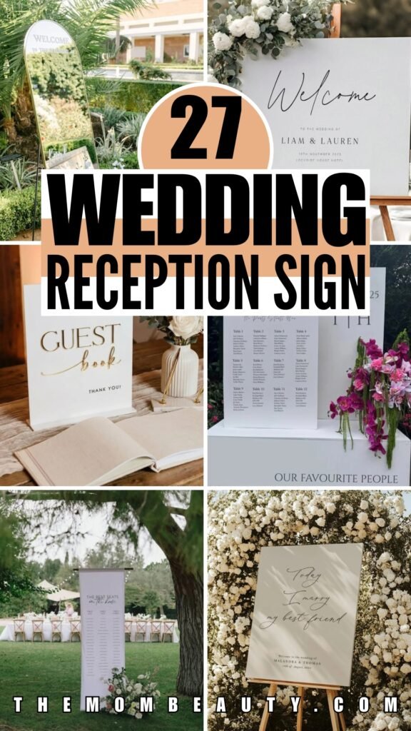
Wedding Reception Signs That Add So Much Personality to Your Big Day
I started planning our wedding reception signs thinking it would be straightforward. Write a few messages, pick some pretty fonts, done. Turns out, once you’re staring at a blank venue space trying to imagine where confused guests might wander, the whole thing gets complicated fast.
You start second-guessing everything — do people really need a welcome sign, or will the seating chart be enough?
What if someone can’t find the gift table? What if half your guests show up at the same time and create a bottleneck at the entrance?
The truth is, the right reception signs prevent problems you didn’t even think to worry about.
Let me walk you through what actually works.
Where Wedding Reception Signs Should Actually Go
Here’s what I learned from watching our guests navigate the space (and from a few minor disasters at friends’ weddings): placement matters way more than how pretty your calligraphy looks.
Put your welcome sign where people will see it before they start looking lost.
The seating chart goes just inside the entrance, but off to one side so people can actually stop and read without blocking everyone behind them.
Think about the guest journey like you’re directing traffic. Signs should appear right before someone needs the information, not after they’ve already walked past three tables trying to figure out where they belong.
Save this article for later! 👇👇
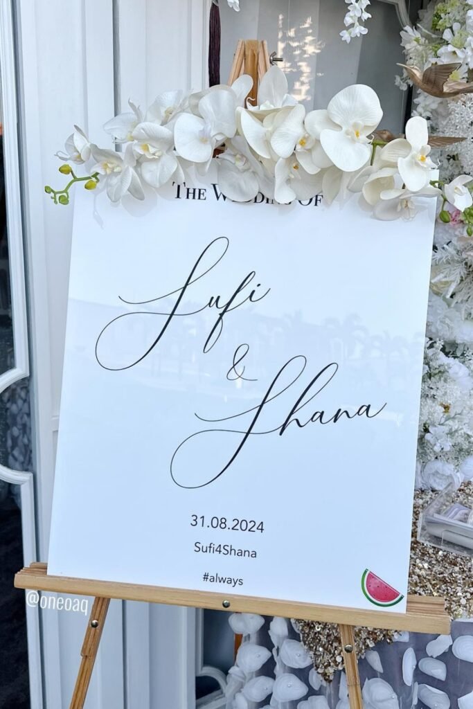
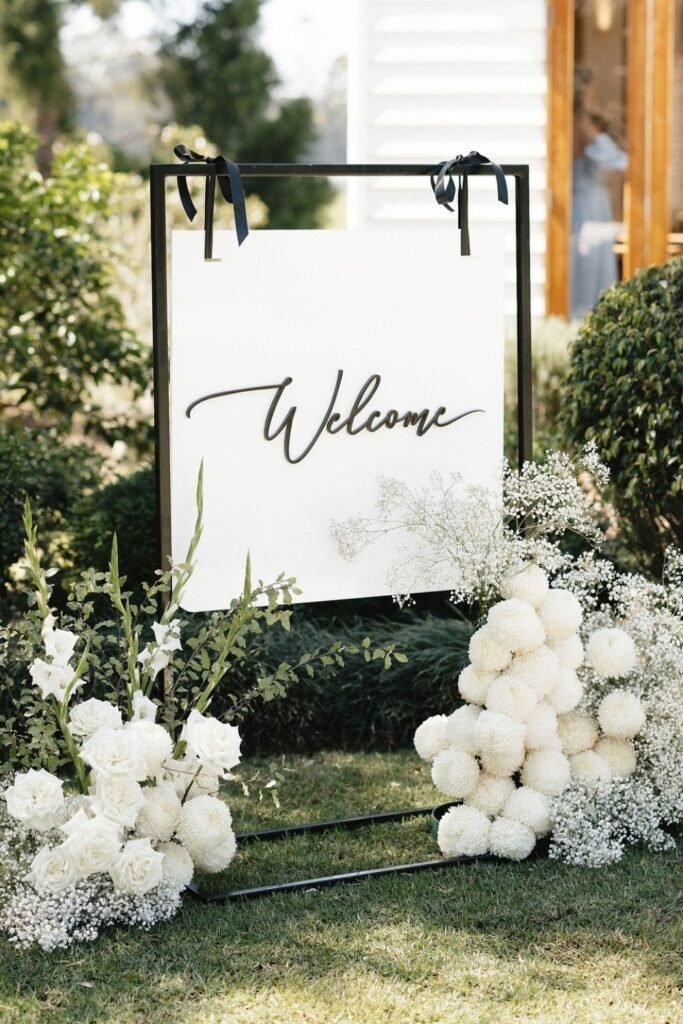
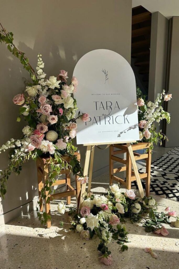
Floral Welcome Board
This is the kind of welcome sign that makes people feel immediately calm about being in the right place.
The soft florals don’t compete with the text, and everything sits at the perfect reading height for people walking toward the entrance. I love how it doesn’t scream for attention but still guides guests exactly where they need to go.
Position this slightly angled toward your main walkway so people read it naturally instead of having to stop and turn.
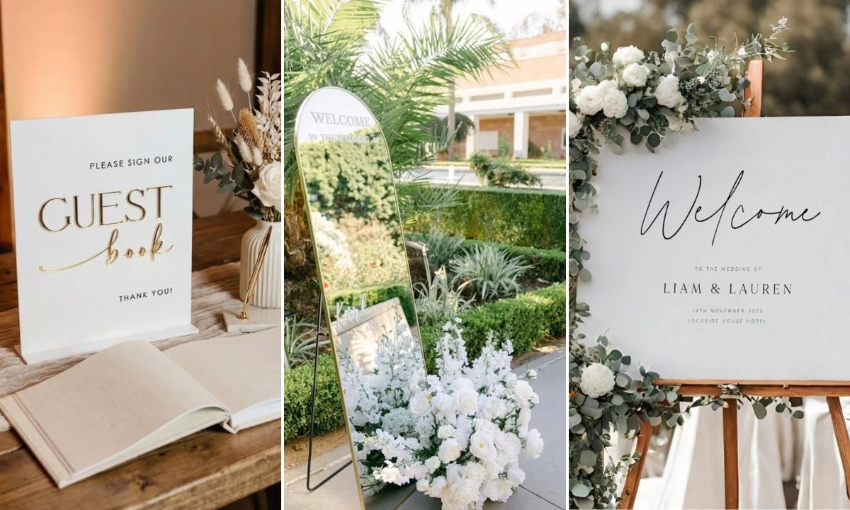
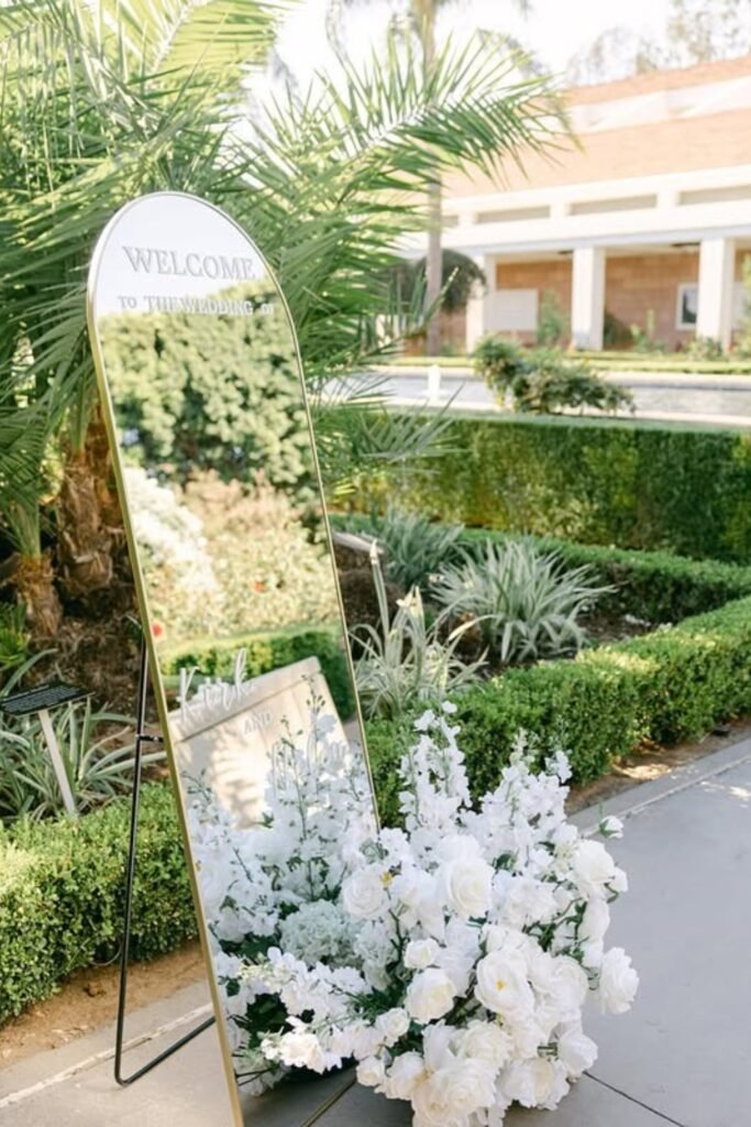
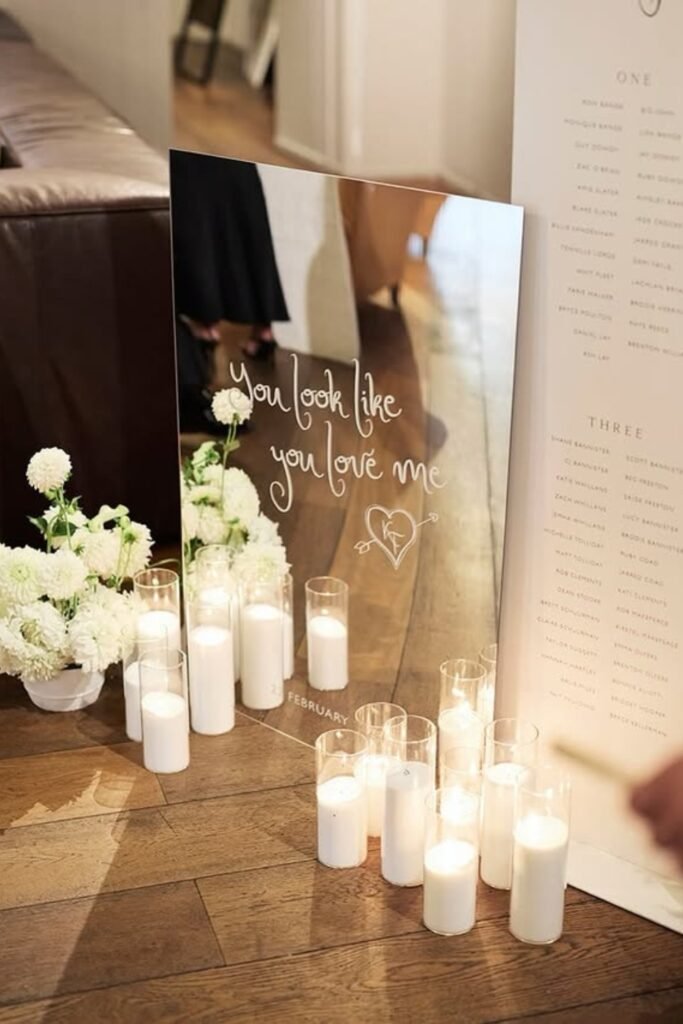
Mirror Welcome Sign
Mirrors are brilliant for small entrance spaces because they bounce light around and make everything feel bigger.
The reflective surface picks up the greenery and movement around it, so the sign feels integrated into the space instead of just plunked down. Plus, honestly, people love catching a glimpse of themselves before walking into a party.
This works especially well for outdoor receptions where natural light changes throughout the day — the mirror adapts to whatever’s happening around it.
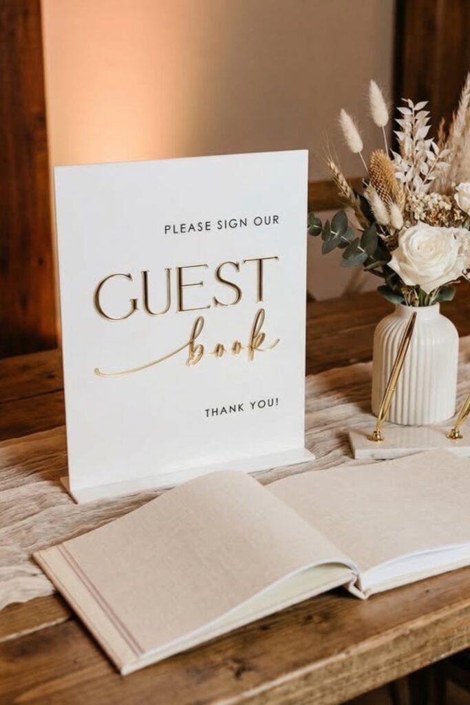
Guest Book Reminder
If you’re doing a traditional guest book, you need this sign. People want to participate, but they’re not mind readers.
Set this up near your cocktail hour area where people have time to pause and actually write something thoughtful (instead of rushing past on their way to find their table).
Make sure the pens work and there are backups. Nothing kills guest book momentum like a dried-out Sharpie.
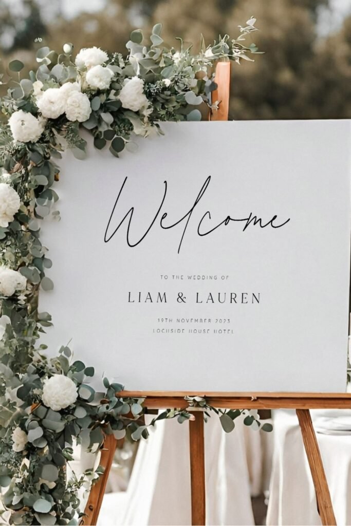
Acrylic Welcome Sign
Clean, modern, and photographs beautifully from any angle — which matters more than you think when everyone has phones out.
The key with acrylic is keeping the florals minimal so they frame the text instead of overwhelming it. Too many flowers and you lose the sleek effect that makes acrylic worth choosing in the first place.
Perfect for indoor venues or anywhere you want the sign to feel sophisticated without being stuffy
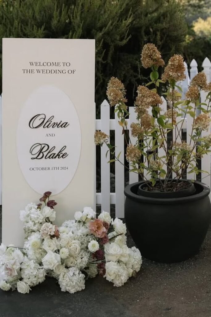
Floral Statement Welcome
When your venue entrance feels too plain, this is your answer.
The oversized florals create an instant photo moment without requiring awkward posing — people just naturally want to stand in front of it. Plus, it signals that this is a celebration before guests even step inside.
Use this approach when you want the welcome sign to do double duty as décor, especially for outdoor receptions where you’re working with a blank slate.
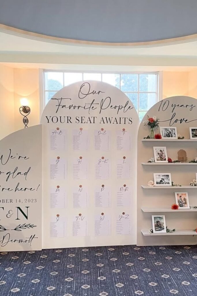
Vertical Seating Chart
This layout keeps guests moving instead of clustering. People can scan for their names without forming a crowd, which is crucial when everyone arrives at roughly the same time.
The vertical format also works better outdoors where you’re dealing with uneven sightlines and natural obstacles. Plus, it photographs well if someone wants to document their table assignment (yes, people do this).
Position it right before the dining area, not at the very entrance where it competes with welcome signs.
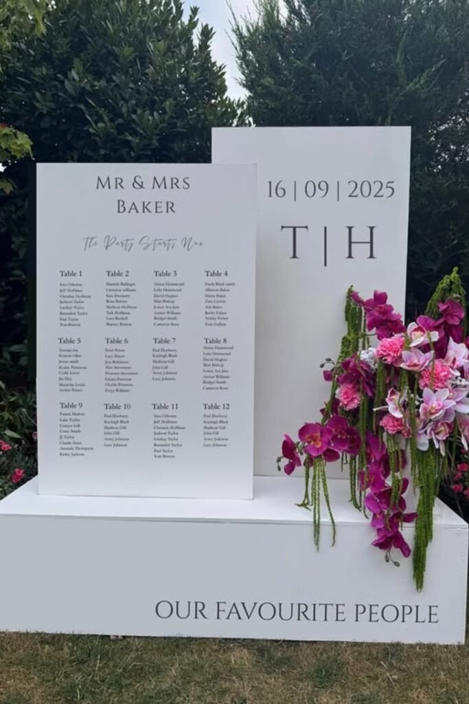
Modern Seating Display
When you have a lot of tables, readability from a distance becomes critical. This board style lets people spot their names without having to get close, which prevents bottlenecks.
The structured layout also looks intentional — like you put thought into organizing everything, not like you grabbed a piece of poster board an hour before the reception.
Make sure to place this slightly off the main walkway so people can step aside to look without blocking others.
Sculptural Welcome Sign
This feels more like art than signage, which suits receptions where you want everything to feel curated and special.
The raised lettering adds texture that people notice up close, but the minimal text keeps it from feeling cluttered or trying too hard. It’s the kind of sign that enhances your venue instead of competing with it.
Best indoors where consistent lighting lets the dimensional details shine without weather concerns.
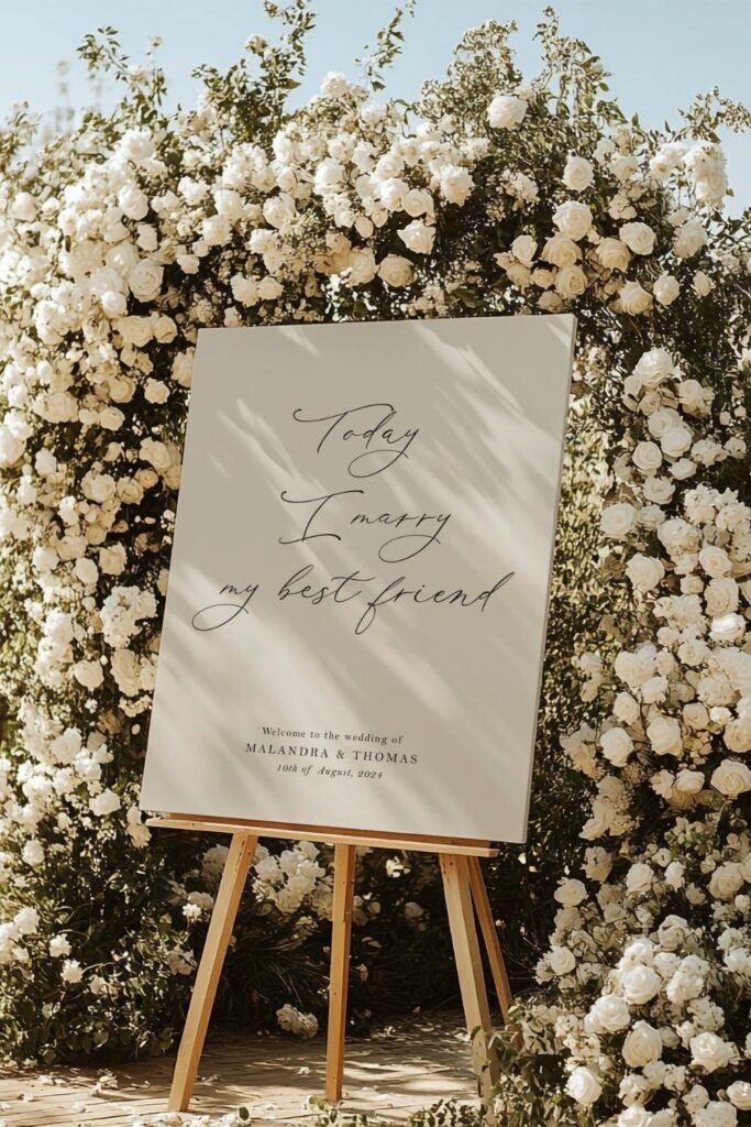
Romantic Floral Frame
Sometimes you want the flowers to be the star, with the welcome message woven in naturally.
This setup works beautifully when your florals echo what you used in the ceremony — it creates visual continuity without needing extra décor throughout the venue. Plus, the lush backdrop makes every entrance photo look intentional.
Position this against a simple background so the florals pop instead of competing with busy scenery
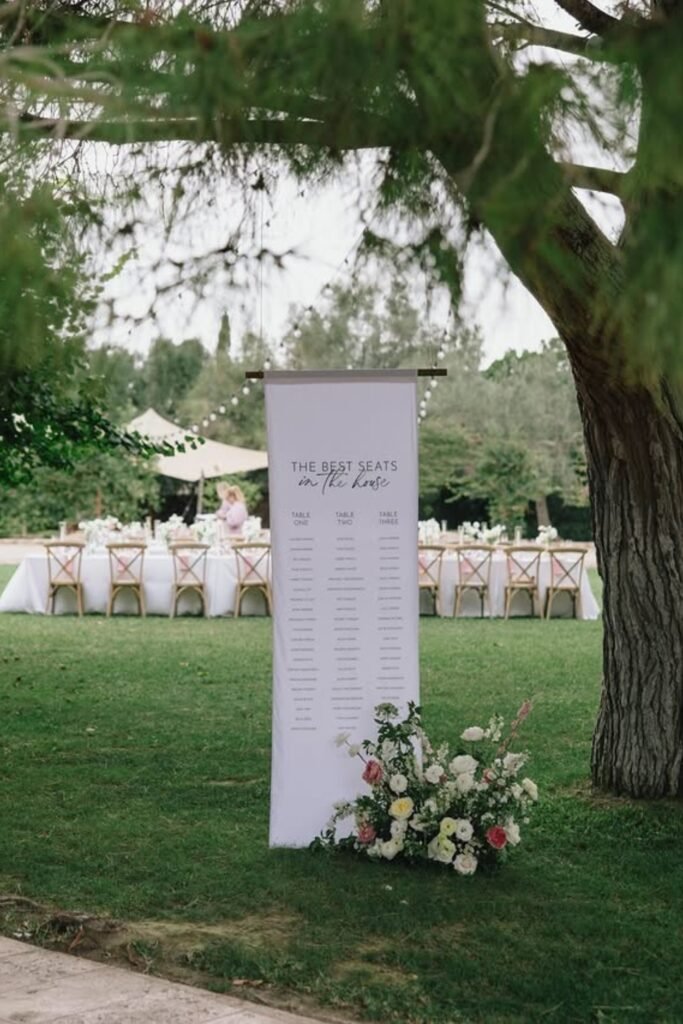
Hanging Seating Chart
Hanging seating charts feel lighter in outdoor spaces and keep sightlines open, which matters when your reception is spread across a large area.
The elevated position also makes names easier to read from different angles, and honestly, it just looks more interesting than another standing board. People notice it without feeling like they’re reading a menu.
Make sure whatever you’re hanging it from is sturdy enough to handle outdoor conditions if there’s any breeze.
Minimalist Modern Sign
For venues that already have strong architectural details, sometimes less is exactly what you need.
Save this post for later ❤️
This approach lets your venue be the star while still giving guests clear direction. The raised text adds just enough interest to feel intentional, and the clean lines work with modern or industrial spaces perfectly.
Keep lighting consistent if you choose this style — the dimensional text needs good illumination to read clearly.
Curved Seating Display
The curved layout keeps everything organized while feeling less formal than straight rows of names.
Large panels make names readable from wherever people approach, which is crucial when groups arrive together and you don’t want anyone squinting or asking others what table they’re at.
Set this up with enough space around it so people can step aside without creating traffic jams
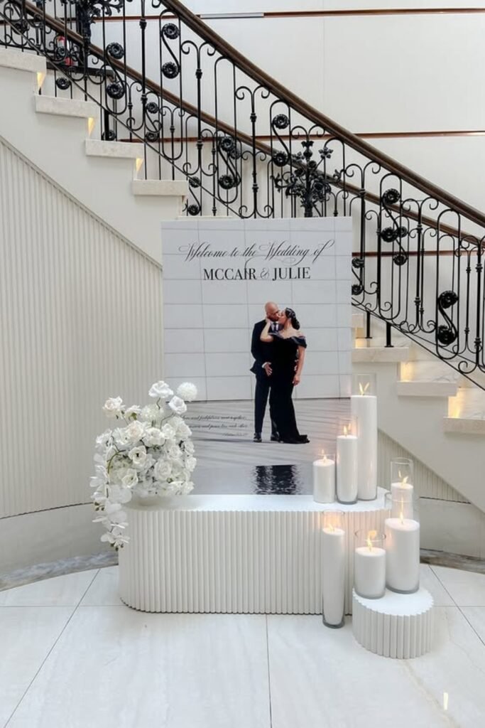
Staircase Welcome Display
A welcome sign at the bottom of stairs creates a natural pause that feels dramatic instead of awkward.
The candles and florals anchor the display so it doesn’t get lost in large spaces, and guests naturally slow down anyway when they hit the staircase. It’s perfect timing for a welcome message.
This works especially well in venues with grand architecture where you want to enhance what’s already impressive.
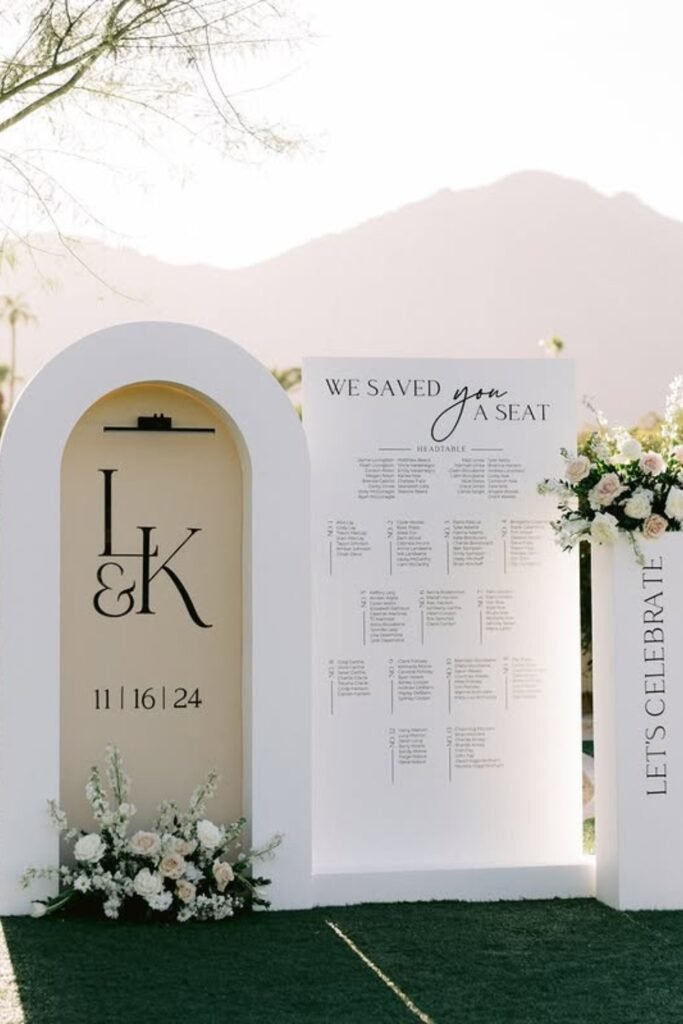
Outdoor Seating Arch
The arch frames your seating chart while making it feel intentional in outdoor settings where everything else is more organic.
Clear headers and good spacing help with outdoor readability issues — natural light shifts, and you want people to find their tables quickly instead of lingering and getting sunburned (or cold).
Position this near cocktail areas so guests can check their table assignment early and then relax.
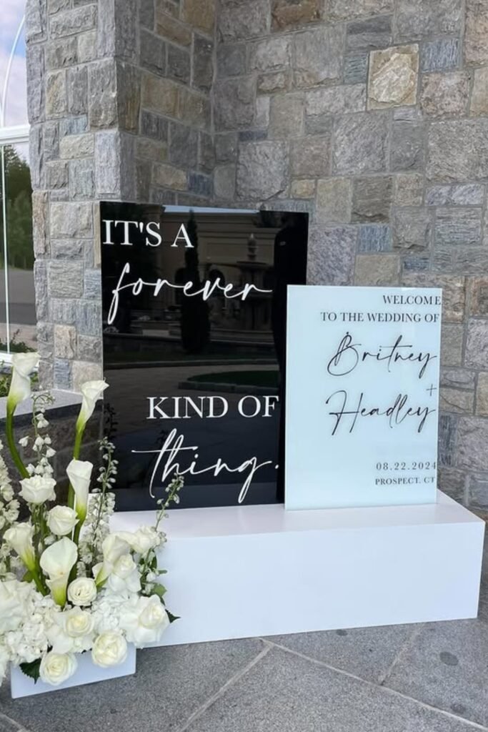
Dual Welcome Boards
Two signs let you balance the emotional moment with practical information — welcome message on one, timeline or details on the other.
Different colors help messages stand out against various backgrounds, and contrasting boards add visual interest without looking chaotic. Keep text minimal so guests absorb everything quickly.
This approach works great when you have multiple things to communicate but don’t want one overwhelming sign.
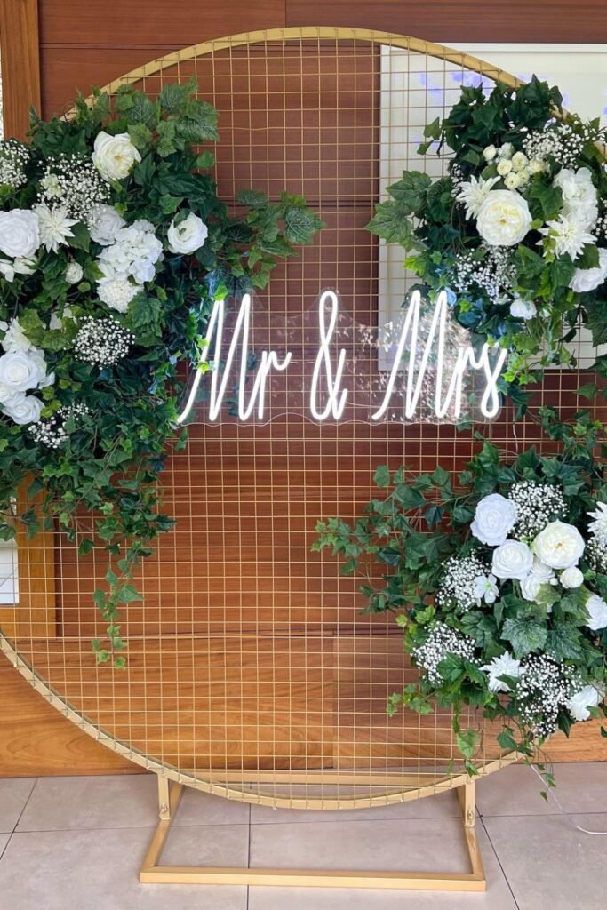
Neon Name Sign
A neon sign turns your entrance into a landmark that guests will remember (and definitely photograph).
The circular frame keeps florals contained while the light stays readable in daylight and looks amazing after sunset. It’s functional and Instagram-worthy, which honestly matters in 2024.
Place this near your cocktail area so it doubles as a photo backdrop without blocking important navigation signs.
Garden Path Welcome
This freestanding design feels natural in outdoor settings without trying to compete with your surroundings.
Keeping florals low and asymmetrical helps the sign blend into garden settings instead of looking like it was dropped there. It guides guests forward without shouting for attention.
Perfect near driveway entrances or natural transition points where people expect to see direction.
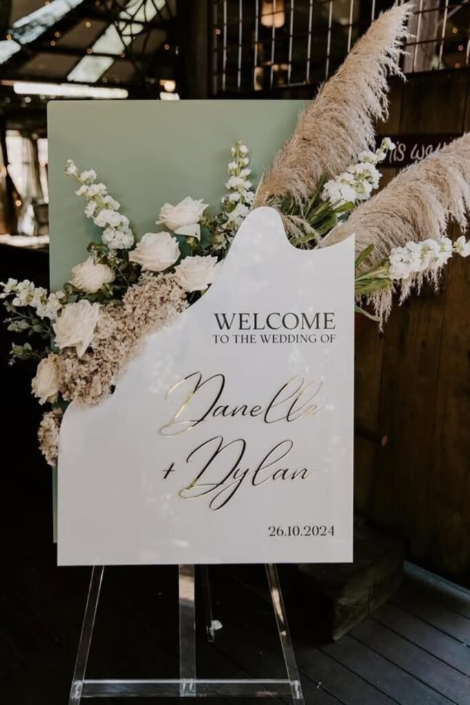
Abstract Acrylic Shape
When you want a welcome sign that feels more like an art piece, this abstract approach works perfectly.
The soft pampas balances sharp edges, keeping everything warm instead of stark. It signals modern styling without being cold or uninviting.
Great for industrial venues, barns, or anywhere traditional shapes would feel too predictable
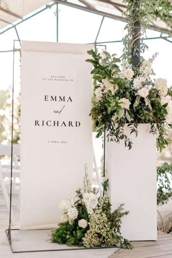
Fabric Welcome Banner
Fabric banners move gently in outdoor air, which feels effortless and elegant compared to rigid signs.
Pairing it with tall florals anchors the banner so it doesn’t disappear in open spaces, and the soft texture suits garden or vineyard receptions perfectly.
This works beautifully for ceremony-to-reception transitions where you want subtle guidance without another heavy sign.
Rounded Arch Welcome
The soft curve instantly makes modern spaces feel warmer and more inviting.
Varied height florals add depth while keeping text readable, and the whole setup works great when natural light shifts throughout the day. It’s architectural enough to hold its own in sleek venues.
Position this near lobby entrances where guests naturally pause and orient themselves.
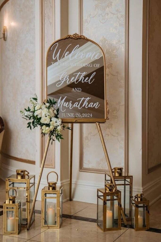
Gold Mirror Elegance
Gold frames instantly elevate formal venues, and the mirror surface reflects light beautifully in grand interior spaces.
Adding lanterns at the base gives the tall mirror visual weight so it doesn’t feel floaty in high-ceiling rooms. Classic elegance that pairs well with formal evening receptions.
Use this approach near staircases or hallways where lighting is consistent and guests pause naturally.
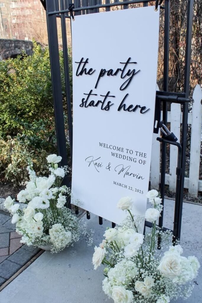
Let’s Party Welcome
Sometimes you want to signal fun immediately, and playful wording does exactly that.
This approach sets expectations for a relaxed, celebratory evening while still giving guests clear direction. It breaks any potential awkwardness before people even enter the reception area.
Perfect for casual outdoor receptions where humor feels natural and you want guests to know they can relax.
Layered Welcome Display
Multiple boards create visual movement while keeping information organized and scannable.
The mix of curved and straight panels adds interest without chaos, and separating names, dates, and celebration cues helps guests process everything quickly. Great for large outdoor entrances that need more presence.
Set this up where guests have space to appreciate the display without crowding entrance flow