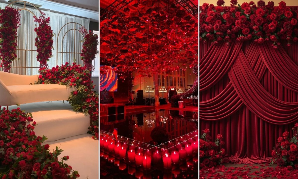
Red Weddings Are Passionate and Bold and These Ideas Show Exactly How to Pull It Off

I keep seeing red wedding themes everywhere… and then remember why I’m scared to actually commit. It’s gorgeous when done right, but honestly? One wrong move and you’re looking at Christmas-in-July vibes or something that screams “I bought everything from the Valentine’s section at Target” (which, let’s be real, I’ve definitely done for other parties and regretted it immediately).
But here’s the thing I’ve learned from scrolling through approximately 847 wedding photos this month — red works when you know how to control it.
The secret isn’t avoiding red, it’s knowing where to put it so it looks intentional instead of… intense.
The Best Color Pairings That Balance Red Without Clashing
Look, I’ve made the mistake of thinking “more red equals more dramatic” and let me save you from that particular Pinterest fail. Red needs a partner, something that says “yes, this was planned” instead of “someone got carried away at the craft store.”
Ivory and champagne are your safety net. They cool down red’s intensity without making it disappear completely, which is exactly what you want when you’re trying to look sophisticated.
Gold adds the kind of warmth that makes red feel expensive instead of aggressive, while black creates drama but only when you use it sparingly — think napkin rings, not tablecloths.
And if you want something that doesn’t scream “holiday party,” sage green works beautifully. It’s muted enough to let red be the star but fresh enough to keep things feeling current.
Save this article for later! 👇👇

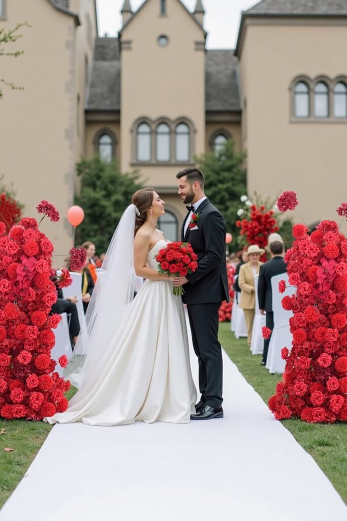
Floral Aisle Drama
This is where red really gets to shine — literally guiding people’s eyes exactly where you want them. The white runner keeps it from feeling overwhelming, and honestly, outdoor venues are perfect for this because all that greenery in the background naturally softens everything.
The trick is keeping the guest seating neutral (those white chairs are doing all the work here). Red becomes the moment instead of the entire experience.
Plus, this photographs beautifully because you’ve got that clear focal point leading straight to where the actual important stuff is happening.
Burgundy Bridal Party
Deep burgundy is red’s sophisticated older sister — it doesn’t fight for attention the same way bright red does. And thank goodness, because finding bridesmaid dresses that look good on everyone is hard enough without adding “will this photograph like a fire truck” to the list of concerns.
Pairing these dresses with black suits and simple red bouquets keeps everything cohesive without anyone looking like they’re competing with the bride for attention.
This whole look supports the color story without taking over — which is exactly what you want from your bridal party. They should enhance, not upstage.

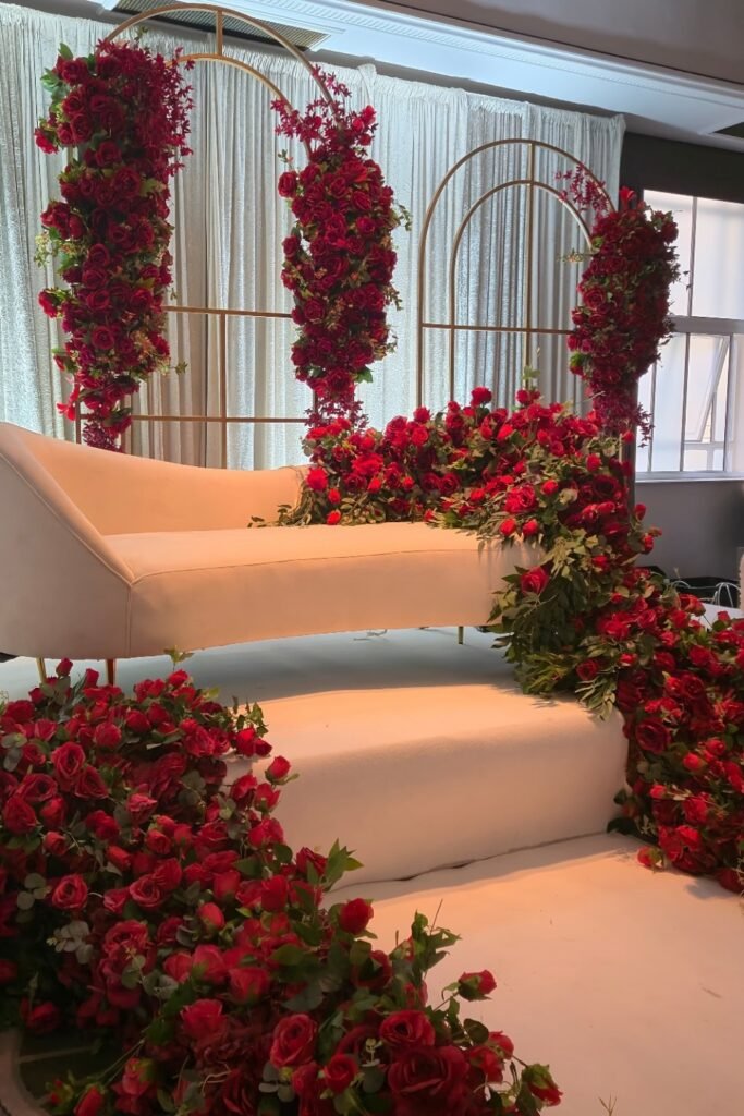
Statement Lounge Backdrop
I love this approach because it gives you all the drama of red florals but contains it to one area. Guests naturally gravitate toward photo-worthy spots anyway, so why not make this your designated “everyone’s going to want pictures here” zone?
The soft seating and light flooring do all the heavy lifting balance-wise. Red gets to be the star, but it’s not overwhelming the entire reception space.
Perfect if you want that bold color impact in photos without committing red florals to every single table (which, let’s be honest, gets expensive fast).
Dramatic Ceiling Styling
When you want to go big with red but smart about placement, look up. Ceiling installations create that immersive feeling without making the ground level feel chaotic or crowded.
The candlelight reflecting those red tones creates actual magic — large spaces instantly feel intimate and intentional instead of empty or impersonal.
This works especially well when you keep the tables simple. Let the ceiling be the showstopper and everything else can breathe.

Romantic Canopy
This is red doing exactly what it should — creating intimacy instead of just making noise. Concentrating it around one focal area (like this gorgeous canopy situation) gives you all the romance without the visual overwhelm.
The sheer draping softens everything beautifully, and that warm lighting makes it glow instead of just… sitting there being red and intense.

Velvet Backdrop
Velvet is red’s best friend because texture completely changes how color behaves in photos. Instead of that flat, aggressive look you get with basic red fabric, velvet absorbs light and creates depth.
Those florals framing the edges keep the center clean, which guides attention forward instead of making guests stare at the backdrop instead of whatever’s actually happening in front of it.
This setup is perfect for photo walls or ceremony backdrops when you want drama that stays contained instead of taking over the whole space.

Balanced Arch
This is smart red usage — white as the foundation means burgundy gets to shine without shouting at everyone. The asymmetrical floral placement keeps it modern and prevents that overly structured look that can feel stiff.
The focus stays on the couple instead of the décor trying to steal the show, which is exactly what ceremony styling should do.
Perfect for people who love red but also want their wedding to feel light and photo-friendly for guests.

Grand Stage
When red becomes the main character, scale absolutely matters. Those massive installations prevent the color from looking accidental or like an afterthought.
The warm lighting layered throughout those arches softens what could easily become overpowering, turning bold into inviting.
This works beautifully for stages or head tables where symmetry and drama feel purposeful instead of excessive — there’s a difference, and this nails it.

Luxe Centerpieces
Tall red centerpieces are instant luxury, especially with crystal candleholders doing the reflecting-light thing that makes everything feel expensive instead of just… loud.
This works perfectly for long banquet tables where height creates drama without crowding anyone’s sightlines (because nobody wants to lean around flowers to talk to the person across from them all evening).
Keeping those linens neutral is key — red gets to be intentional instead of overwhelming across the entire reception.

Chandelier Drama
When you want maximum impact without maximum risk, this is it. Layering red florals behind the stage creates incredible depth, and those crystal chandeliers add just enough sparkle to keep everything from feeling heavy.
Evening receptions are perfect for this because controlled lighting makes bold red tones feel rich and intentional instead of aggressive.
Save this post for later ❤️
The whole setup feels luxurious without being intimidating, which is a fine line that’s easy to cross with red.

Aisle Framing
Framing the aisle with red florals is basically creating a pathway that says “important things are happening here.” The white chairs and flooring give your eyes somewhere to rest, which prevents red from feeling overwhelming even at full scale.
Those scattered petals add softness that proves red can feel romantic instead of just dramatic — it’s all about the details.

Statement Cake
This is probably the safest way to include red if you’re nervous about going too bold elsewhere. Keeping the cake white while adding red florals creates perfect contrast — red feels like an accent instead of an takeover attempt.
Plus, this approach photographs beautifully and won’t look dated in ten years (always a consideration with bold color choices).
Use deep red roses or similar blooms to tie everything into your overall palette without making the cake table fight for attention.

Romantic Heart Arch
Look, heart shapes can go very wrong very quickly, but this one works because it’s lush and intentional instead of crafty. The candle clusters at the base soften everything and add warmth that makes red photograph beautifully.
Perfect for proposals or intimate weddings where emotion matters more than restraint… sometimes you just want to lean into the romance of it all.

Burgundy Table Styling
Deep red linens paired with neutral plates — this is exactly how you make red feel rich instead of overwhelming. The simple glassware and soft candlelight balance everything perfectly.
This approach works especially well for long tables because the color stays elegant and cohesive from one end to the other without any jarring moments or visual chaos.

Red Bridal Moment
A red bridal outfit automatically becomes the focal point, so everything around it needs to stay soft. Those florals along the aisle echo the color gently without competing for attention.
This works beautifully for cultural weddings or when red carries deeper meaning beyond just decoration — sometimes the color choice is about more than aesthetics, and that’s perfectly valid.

Regal Seating Stage
Framing the seating with red florals creates that throne-like effect without going overboard with décor everywhere else. The gold accents and chandeliers soften the bold palette, making dramatic feel warm instead of intimidating.
Keep the surrounding tables simpler so this stage remains the visual anchor instead of competing with fifty other focal points throughout the space.

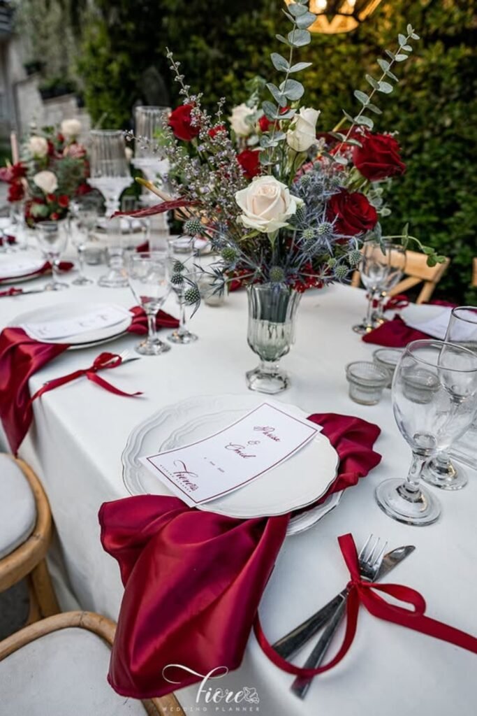
Classic Red Tablescape
Red satin napkins over white plates — simple contrast that lets florals shine without making the table feel crowded. Clear glassware and pale linens soften everything, helping red appear elegant instead of heavy.
This setup works perfectly for garden or courtyard weddings where refinement matters more than making a statement.
Dramatic Red Aisle
A red carpet aisle immediately creates anticipation — guests know something important is about to happen. Those ceiling drapes frame everything beautifully while soft lighting prevents the color from feeling overwhelming.
This works best for grand indoor receptions where you want drama without sacrificing guest comfort or visual balance.

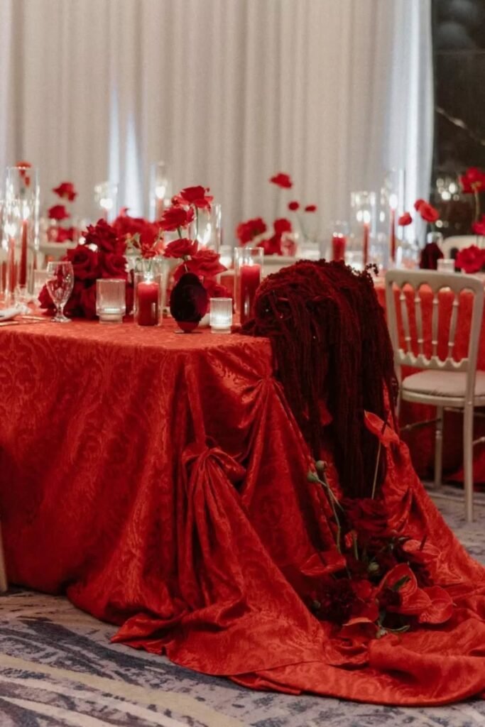
Velvet Red Tables
Textured red tablecloths add richness without feeling flat — the movement in the fabric makes color feel layered and intentional. Candles and minimal florals break up intensity perfectly.
This look is ideal for formal dinners where intimacy and elegance matter more than brightness or daytime atmosphere.
Coastal Red Ceremony
Red roses against ocean blues create incredible contrast without overwhelming that gorgeous natural setting. The white chairs and flooring calm everything down, letting red feel celebratory instead of dramatic.
Perfect for destination weddings where the view already provides impact and décor should stay intentionally restrained.

Modern Red Dining
Sleek tables with clear chairs let red accents feel intentional instead of overwhelming. Low centerpieces and candlelight create intimacy while keeping sightlines open for actual conversation (which, honestly, should be a priority at every wedding).
This style fits minimalist venues where red should feel chic rather than traditional.

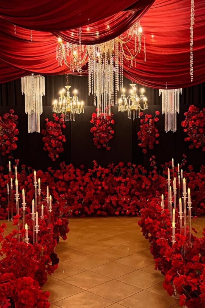
Crystal Candle Aisle
Tall crystal candles with dense red florals create instant drama while guiding guests forward. The ceiling draping deepens the mood, and those chandeliers add sparkle that prevents everything from feeling dark.
Perfect for indoor ceremonies where luxury, romance, and bold color need to coexist without overwhelming anyone.
Open-Air Floral Canopy
A gold-framed canopy with cascading red florals defines the ceremony space without blocking views or natural light. The airy structure keeps red from feeling heavy — instead, it floats above guests.
Ideal for outdoor weddings where you want grandeur while preserving those scenic surroundings that probably cost extra to book.

Geometric Rose Stage
Gold geometric frames layered with red roses create striking depth