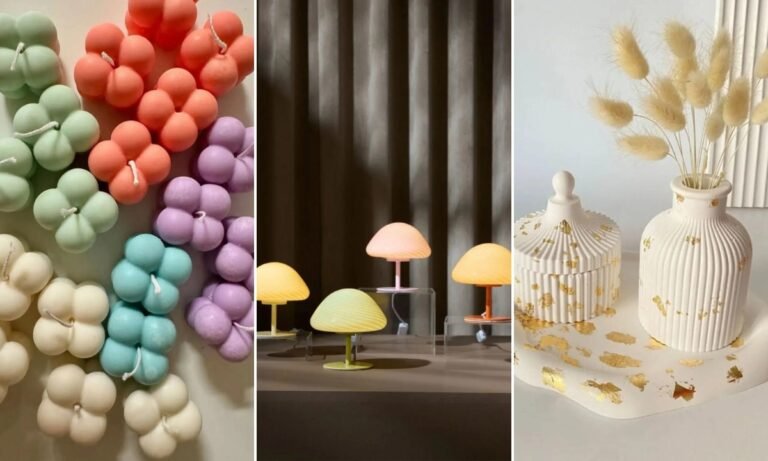
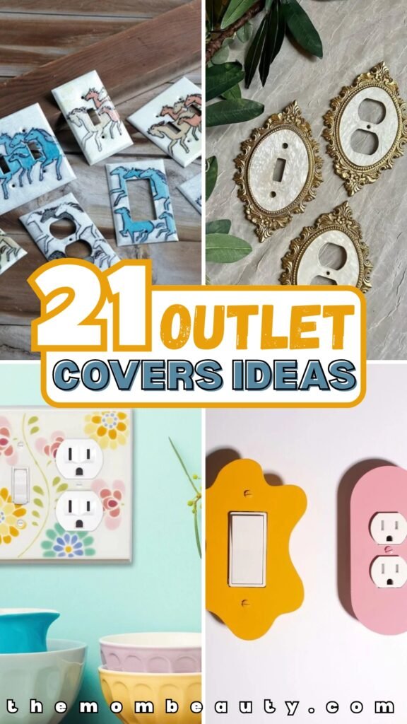
Outlet Covers That Blend In (Instead of Ruining Your Walls)
I was painting the guest bedroom last month. The color looked perfect — that soft gray-green I’d been wanting for two years. The room finally had the calm feeling I was after.
Then I noticed the outlet covers. Bright white plastic rectangles sitting there like they belonged in a different house entirely.
It’s remarkable how something that small can make a freshly painted room look unfinished. If you’ve ever decorated a space and felt like something still looked “off,” I’d bet money it’s your outlets.
Here are 21 outlet cover ideas that actually work in real rooms — not just in photos.
Most of these you can do yourself in an afternoon.
The Simple Fix Most People Skip
You don’t need to rewire anything or call someone to fix an ugly outlet. Nine times out of ten, the problem isn’t the outlet — it’s that white plastic plate sitting on a colored wall.
Paint the cover to match the wall. Once it’s reinstalled, it disappears.
If you have wallpaper, trace the cover onto leftover paper and wrap it. If the plastic looks yellowed or cheap, replace it with a screwless plate that sits flush.
Takes maybe an hour. Makes the whole wall look more intentional.
Save this article for later! 👇👇
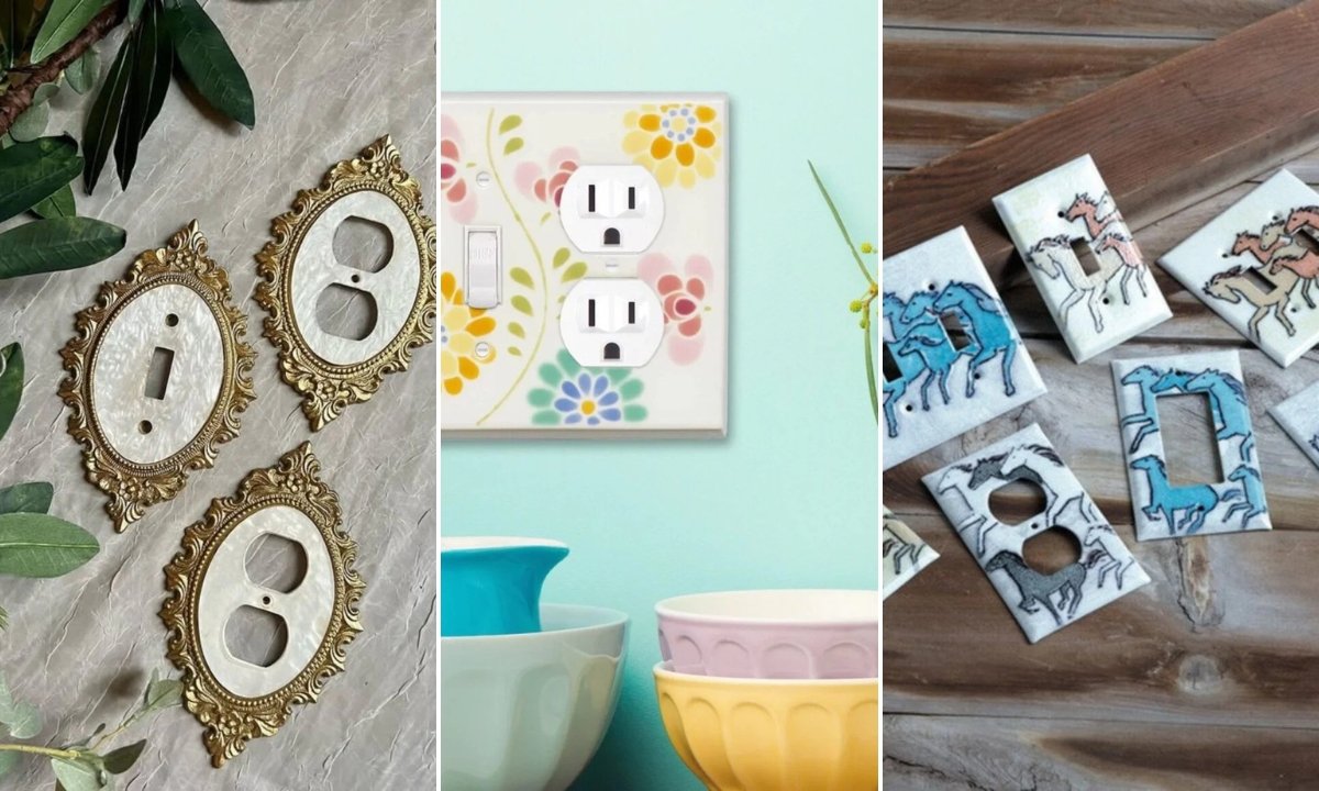
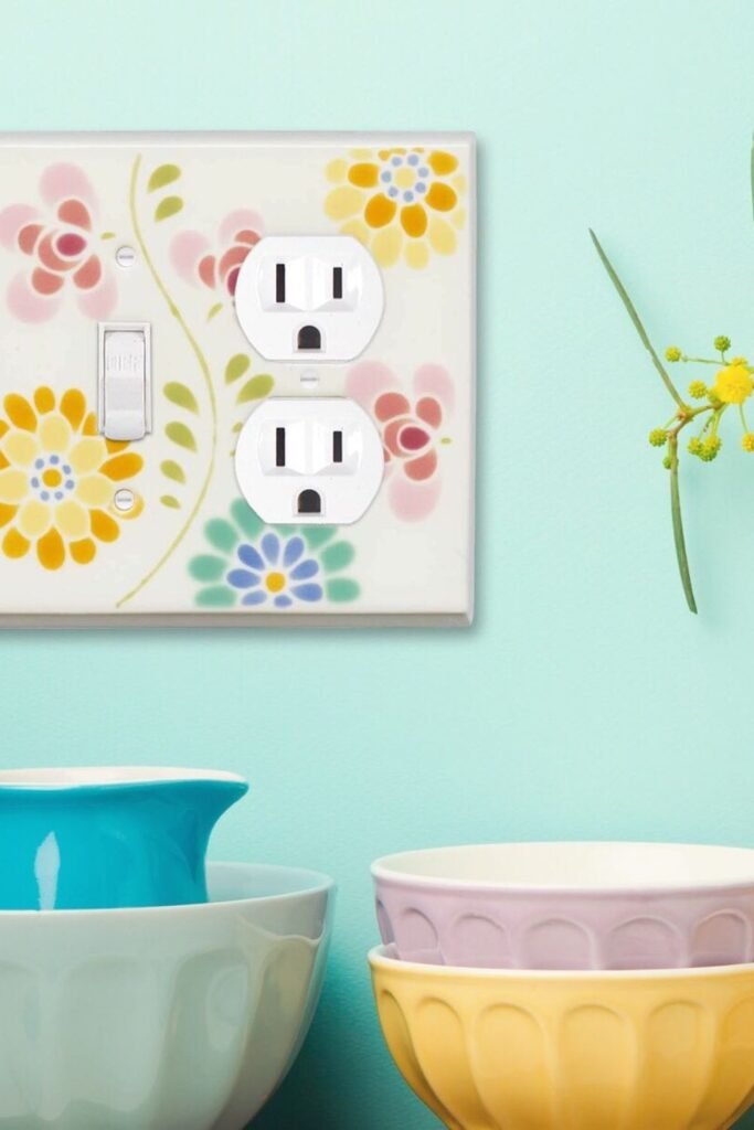
Floral Stencil
Sometimes plain white doesn’t belong. A soft floral pattern like this turns the outlet cover into something that actually adds to the room instead of interrupting it.
This works in kitchens, guest bedrooms, or anywhere you already have some color on the walls. If your space feels too neutral, little touches like this warm it up without going overboard.
Remove the plate first. Sand it lightly so the paint sticks properly. Use small stencil brushes and dab — don’t drag — so the edges stay clean.
Seal it with a clear topcoat before you put it back. The flowers should look deliberate, not like you were testing paint colors on whatever was handy.
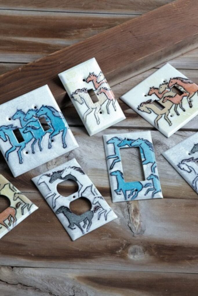
Western Motif
Themed outlet covers only work if the theme is already happening in the room. Horse silhouettes like these make sense in a ranch house or a kid’s western-themed bedroom. They’d look ridiculous in my kitchen.
But in the right space, they turn something utilitarian into part of the story. The outlet stops being an afterthought and becomes a small piece of the bigger picture.
Start with a paintable ceramic cover. Sketch lightly in pencil first — you want clean lines, not something that looks like a craft project gone wrong. Use fine brushes for details and let each layer dry completely
The key is keeping it simple. Bold, graphic shapes read better than fussy details when you’re standing across the room.
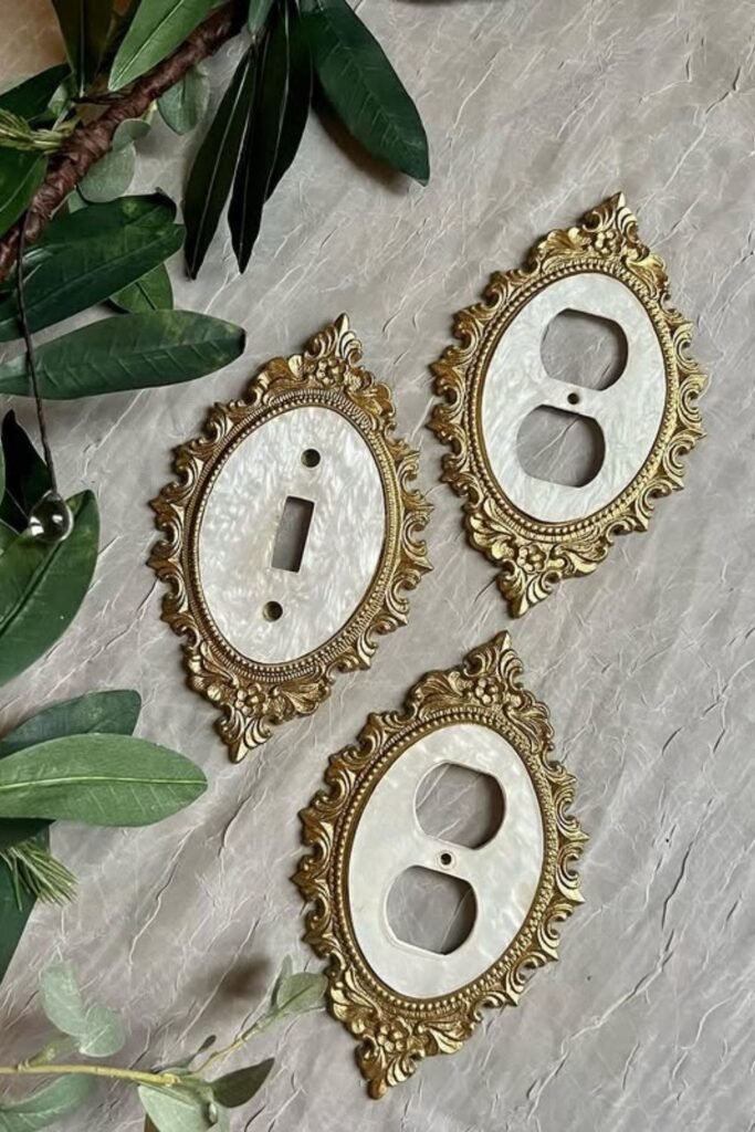
Vintage Frames
If you already have brass hardware or gold-framed mirrors, ornate outlet covers like these tie everything together. The outlet becomes part of your metal finish story instead of competing with it.
I wouldn’t put these in a modern farmhouse kitchen. But in a formal dining room or a powder room with some personality? They make sense.
Measure your outlets before ordering anything decorative. Not all covers fit all outlet types, and there’s nothing worse than getting something beautiful that doesn’t actually work
Keep the wall behind it neutral. The cover should be the detail, not fight with a busy wallpaper or strong paint color.
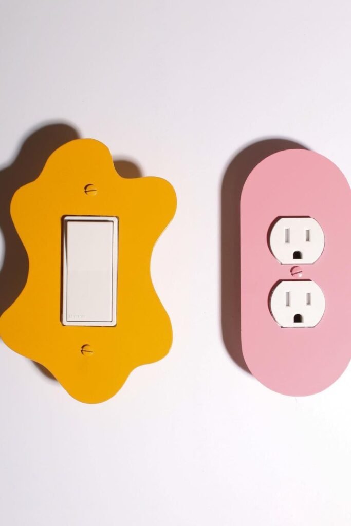
Bold Shapes
Round outlet covers feel friendlier than sharp rectangles. These work well in kids’ rooms or creative spaces where everything doesn’t need to be serious and straight-lined.
The trick is picking one color that’s already somewhere in the room — maybe it matches the bedding or pulls from a piece of artwork. That way it feels intentional instead of random.
Custom-cut acrylic covers give you the most shape options. Keep the wall paint simple when you’re using a bold cover shape. Too many competing elements and the room starts feeling chaotic instead of playful
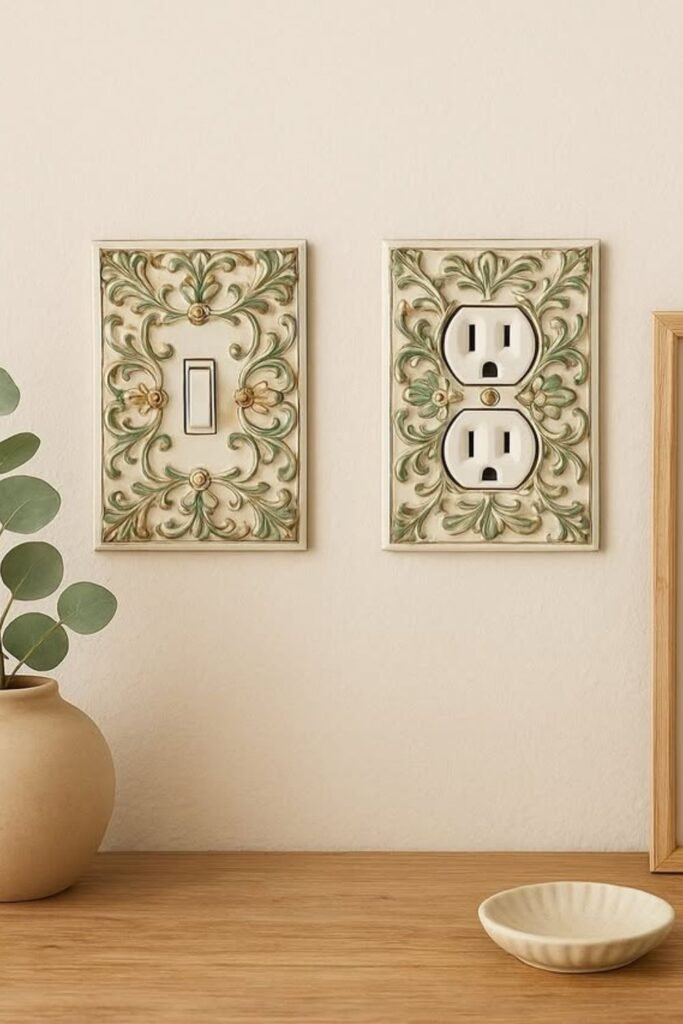
Ornate Detail
Carved details like this soften hard plastic edges. They work in traditional spaces where you want everything to feel warm and layered, not clinical.
The sage green finish here is smart — it’s decorative but not flashy. Gold would be too much in most rooms, but this muted tone blends while still adding texture.
Look for embossed covers in soft finishes rather than shiny ones. Cream, sage, brushed gold, or matte bronze feel more natural than bright metallics. And think about placement
These work best where they can be appreciated, like in a reading nook or near a seating area. In a high-traffic hallway, something simpler makes more sense.
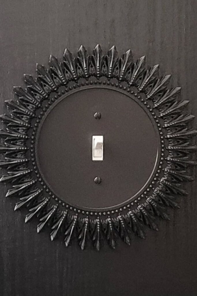
Dramatic Halo
This only works on dark walls. Against white or beige, it would look like you were trying too hard. But on charcoal or navy, it feels right.
The sunburst design turns the switch into a focal point instead of something you ignore. It’s bold without being silly.
Match your screws to the plate finish so they disappear. Nothing ruins a dramatic look faster than mismatched hardware. And limit yourself to one or two dramatic plates per room
This works as an accent, not as a pattern repeated everywhere.
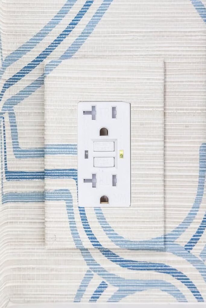
Seamless Blend
This is the best solution for patterned walls. White plastic breaks up wallpaper or painted designs — wrapping the outlet cover in the same pattern makes it disappear entirely.
Remove the cover first and trace it onto leftover wallpaper. Cut carefully around the outlet openings and use strong adhesive so it lays flat without bubbling up at the edges
The goal is to make your eye follow the pattern instead of stopping at the outlet. When it’s done right, you almost forget there’s an outlet there at all.
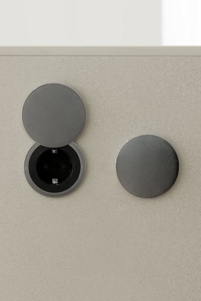
Hidden Disc
These pop-up or flip-style covers hide the outlet completely when you’re not using it. Closed, they look like simple metal discs. Open, they give you access to the outlets inside.
Perfect for clean, modern kitchens where you don’t want outlets interrupting a stone backsplash or painted wall. They usually require special recessed boxes, so this is more of a renovation project than a quick swap
Choose a finish that matches your other hardware. Brushed steel, matte black, or bronze depending on what you already have going on.
Save this post for later ❤️
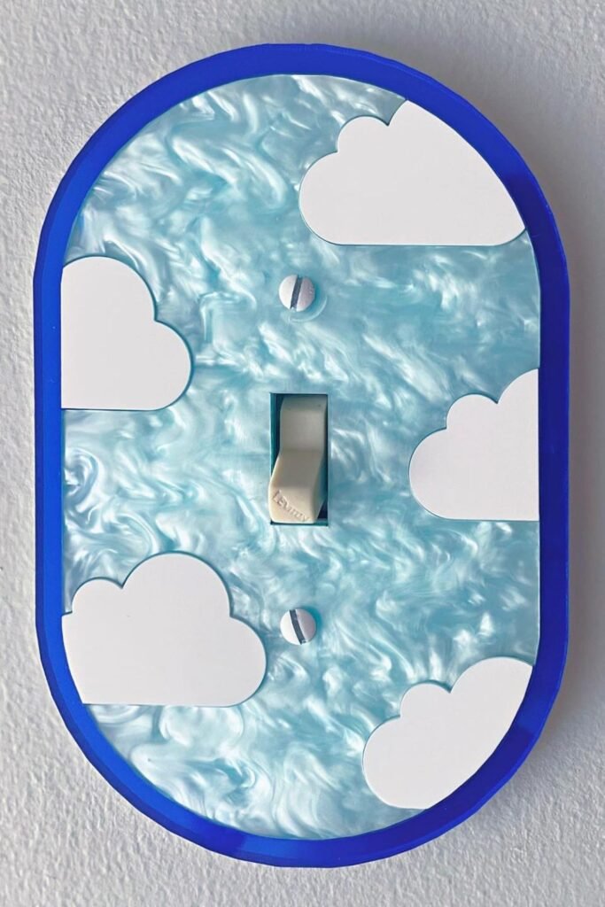
Playful Clouds
Kids’ rooms can handle more whimsy. A sky theme like this works if the room already has soft blues and whites — it becomes part of the story instead of looking random.
Use a paintable cover with rounded edges. Add the blue base first, then layer white clouds on top. Keep the shapes bold and simple so they read clearly from across the room
Finish with a durable topcoat because little hands touch everything. When the outlet feels like part of the room’s theme, it stops looking like something you stuck on afterward.
Desert Vibes
Southwestern colors and desert themes work in boho bedrooms or rustic spaces with earthy tones. The key is keeping the design graphic and clean — detailed artwork gets lost at outlet-cover scale.
Start with a bold base color that’s already happening somewhere in the room. Add simple black silhouettes with a small brush. Stick to two or three colors maximum
More than that and it starts looking busy instead of intentional. Light distressing around the edges can add character, but don’t overdo it.

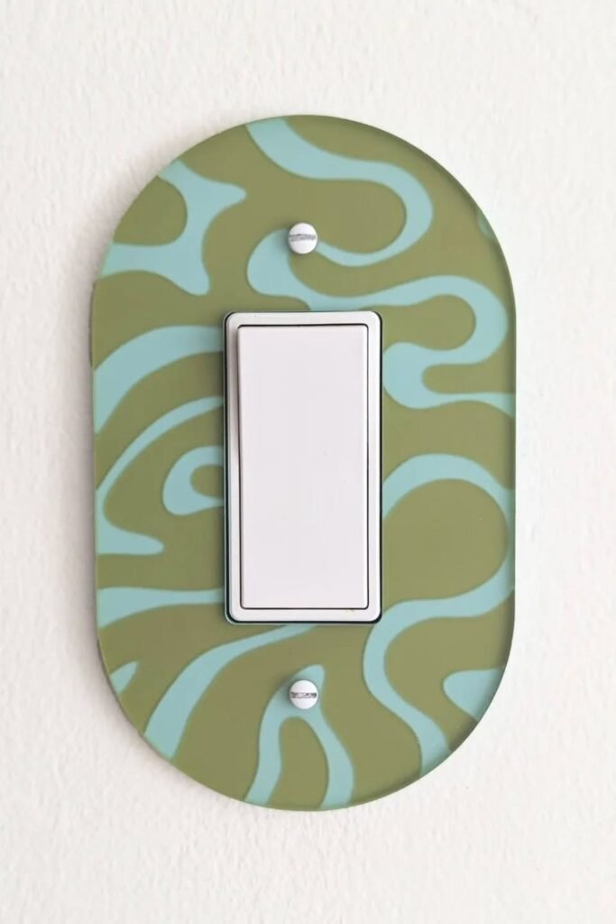
Retro Swirl
Mid-century modern rooms can handle curves and bold patterns. This retro swirl design works if you already have curved furniture, round mirrors, or that classic 70s color palette happening.
Use painter’s tape for clean lines or go freehand if you’re confident with a brush. The movement should feel organic, not stiff
Pair bold patterns with simple wall colors. Let the outlet cover carry the visual interest while everything around it stays calm.
Upholstered Panels
This works when the outlet is part of a larger upholstered wall or headboard. Wrapping the surrounding area in matching fabric makes it look built-in instead of stuck on afterward.
Cut the fabric carefully around outlet openings and stretch it over a thin backing board. Sloppy edges will show, so take your time with the cutting
This is more of a custom project than a quick fix. But when it’s done right, the outlet becomes invisible against the textured surface.
Sculptural Plates
Geometric shapes turn outlets into design features instead of things you try to ignore. These work in eclectic homes or creative spaces where not everything needs to be predictable
Pick one strong shape and echo it elsewhere in the room — maybe in picture frames or decorative objects. That makes it feel intentional rather than random.
Measure your outlets carefully before ordering custom shapes. And match the screws to the plate color so they don’t interrupt the clean lines.

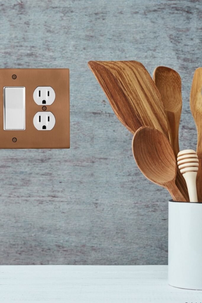
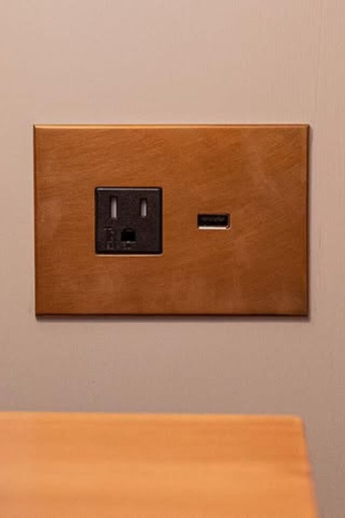
Warm Metals
Cold white plastic makes a cozy kitchen feel unfinished. Copper or brushed bronze outlet covers connect to wood cabinets and warm up the whole wall without trying too hard.
Match the metal finish to your existing hardware. If your cabinet pulls and faucet lean warm, stay in that same family. Mixed metals can work, but they need to feel deliberate
This small change makes the outlet feel like part of the kitchen’s story instead of an afterthought.
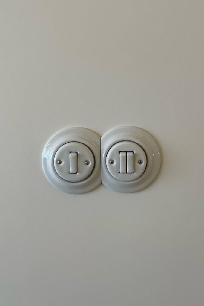
Porcelain Rounds
Sharp rectangular plates feel harsh in soft, traditional rooms. Rounded porcelain covers like these have a subtle vintage feel without looking old-fashioned.
They work well in classic homes or European-inspired spaces where you want things to feel refined but not fussy
Keep the colors neutral — white, cream, or soft gray blend naturally with most wall paint. The curved edges are the detail, not the color.
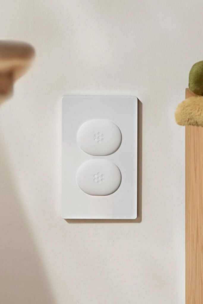
Soft Buttons
Harsh toggle switches can look bulky in minimal bedrooms or nurseries. Smooth push-button switches feel more subtle and modern.
These usually require changing the internal switch mechanism, so check compatibility first. The flat white plate here blends into the wall instead of standing out
In quiet, calm spaces, every detail should feel intentional and soft.
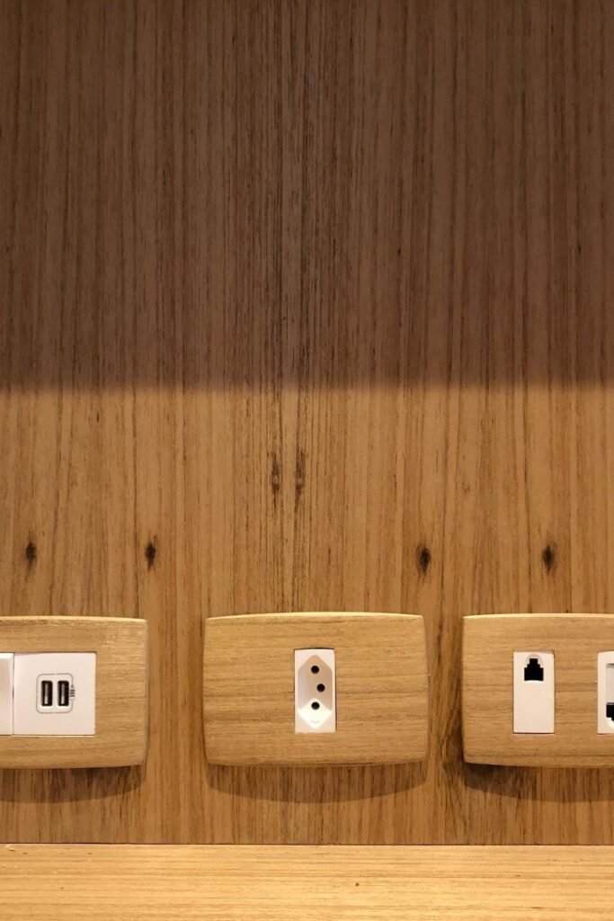
Natural Wood
White plastic on wood paneling never looks right. Wood outlet covers make the outlet feel built-in instead of added as an afterthought.
Match the wood grain and tone as closely as possible. Pay attention to undertones — warm oak, cool ash, deep walnut. Even small differences show up when they’re side by side
Make sure wood covers are properly sealed, especially in kitchens where humidity can be an issue.
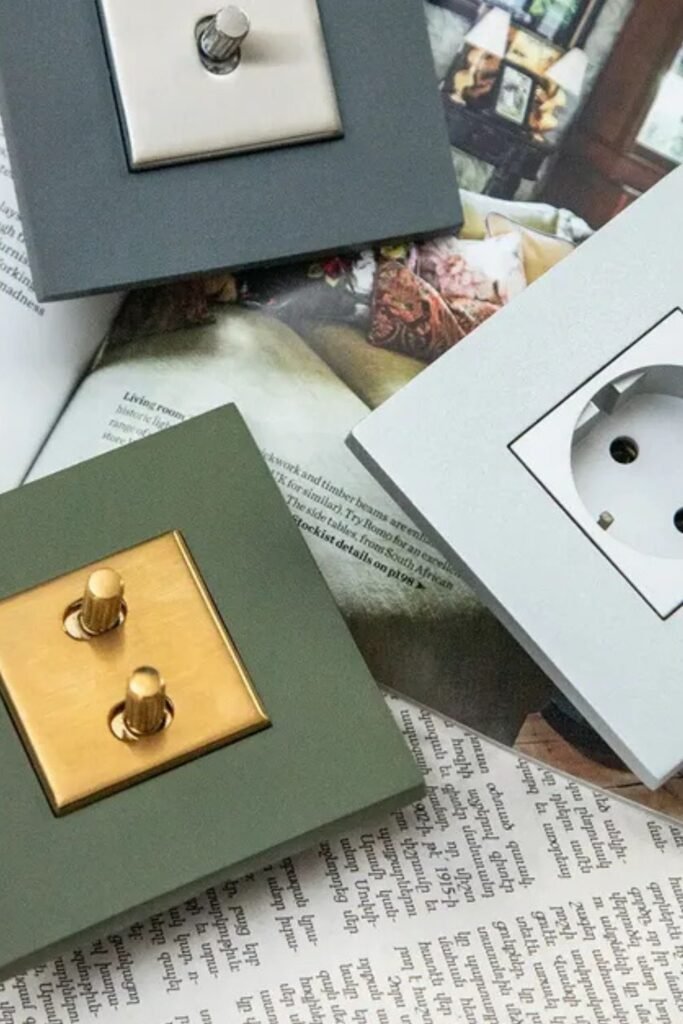
Layered Contrast
Two-piece covers with contrasting finishes create depth and make outlets look more custom. The outer frame and inner plate work together instead of just sitting flat against the wall.
Choose a darker outer frame if your wall is light, or flip it for dark walls. Match the inner switch to the outlet itself, and let the frame carry the personality
Leather Finish
Leather-wrapped outlets feel unexpected and add texture to a plain wall. They work well in home offices, libraries, or masculine bedrooms with warm neutrals.
Use high-quality leather or faux leather and cut the openings precisely. Sloppy edges will make it look homemade instead of intentional
Keep surrounding decor simple so the texture can be the star. Sometimes the goal isn’t to hide the outlet — it’s to upgrade it.
Marble Effect
Faux marble finishes work beautifully in bathrooms or glam bedrooms with metallic

I’ve spent over four decades building a marriage, raising a family, and learning what truly matters along the way. I write about relationships, home, and navigating life’s later seasons with grace, honesty, and a little humor. My goal is to share the kind of steady, real-life wisdom that helps you feel grounded, encouraged, and a little less alone.