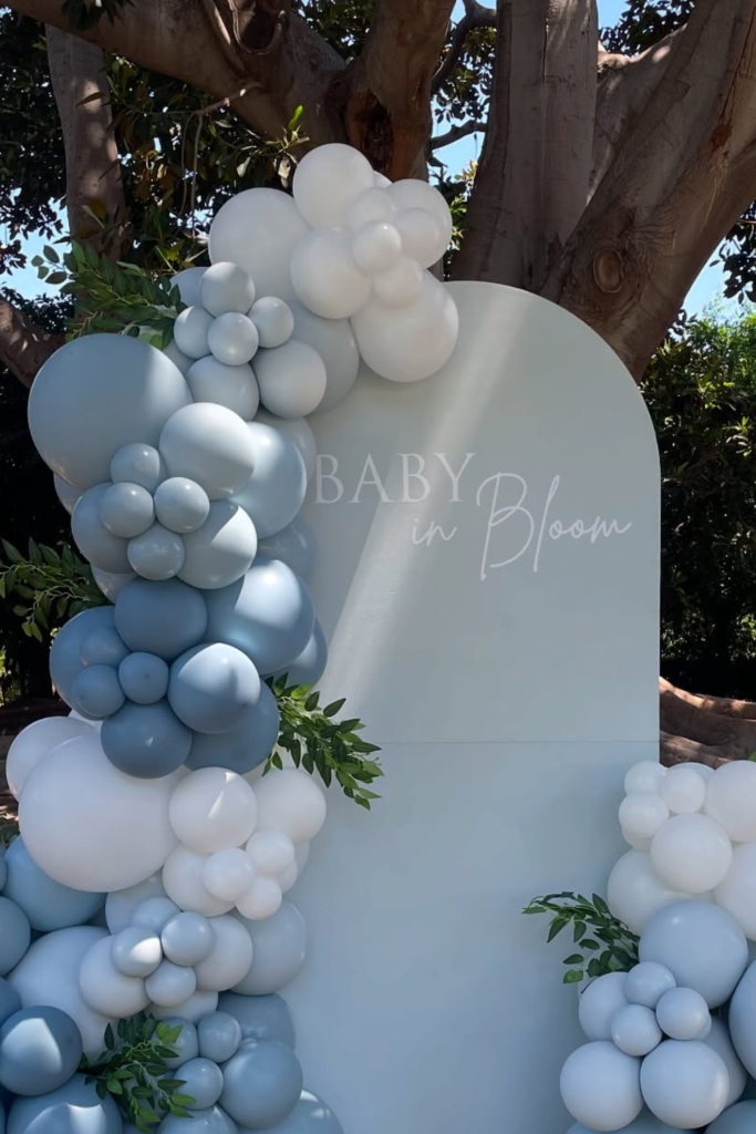
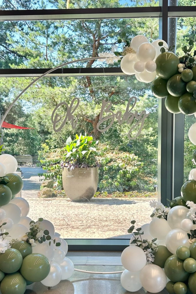
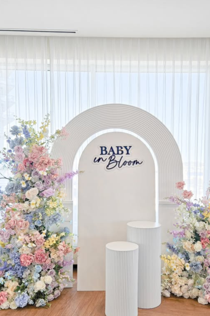
Baby in Bloom Is the Baby Shower Theme You Haven’t Overused Yet
I thought planning Jake’s soccer banquet last month was complicated until I started researching “Baby in Bloom” ideas for my friend Sarah’s shower.
Turns out there are approximately seventeen different ways to interpret “bloom,” and most of the Pinterest boards I found looked like someone threw a craft store at a wall.
Do you go full garden party? Soft pastels? And how do you make it look intentional instead of like you bought every pink thing at Party City?
After scrolling through hundreds of setups (and saving way too many to my phone), I figured out what actually works—and what makes the difference between “cute” and “wow.”
Creating a Stunning Focal Point (Backdrops, Balloon Arches & Floral Installations)
Here’s what I learned the hard way: you cannot fix a scattered setup by adding more stuff.
Pick one wall, one corner, one area where you want people to look first—and make that the star.
Everything else becomes supporting cast, which is exactly what you want.
If you’re doing balloons, stick to three colors maximum and vary the sizes so it doesn’t look like you ordered a bulk pack from Costco.
If florals are your thing, cluster them at different heights instead of spreading them evenly—it looks more organic and less like you followed a math equation.
The trick is making one area feel complete before you move on to the rest.
Once your focal point actually works, the tables and side decorations become so much easier to style.
Save this article for later! 👇👇
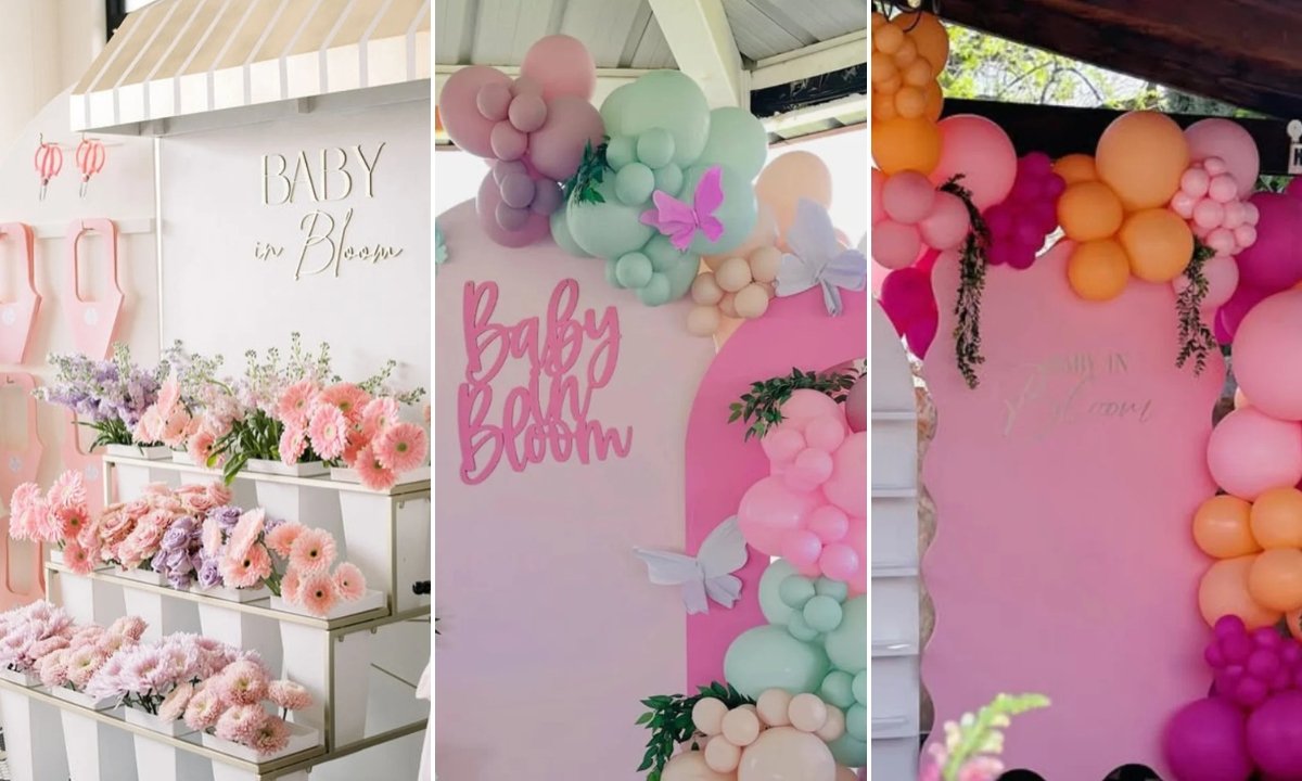
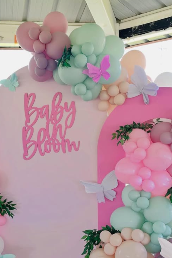
Soft Pastel Arch
This is what I wish I’d shown Sarah when she was panicking about her color scheme.
The layered pink backdrop creates this soft, dreamy base, and then the mint and peach balloons add just enough variety without making your eyes confused about where to look.
Those little butterflies tucked into the greenery? They’re doing exactly what they should—adding detail without shouting about it.
If you’re the type who worries about things looking “too much,” this proves you can have impact without chaos.
One strong backdrop, controlled balloon placement, and tiny floral moments. That’s it. Sometimes the best approach is knowing when to stop adding things.
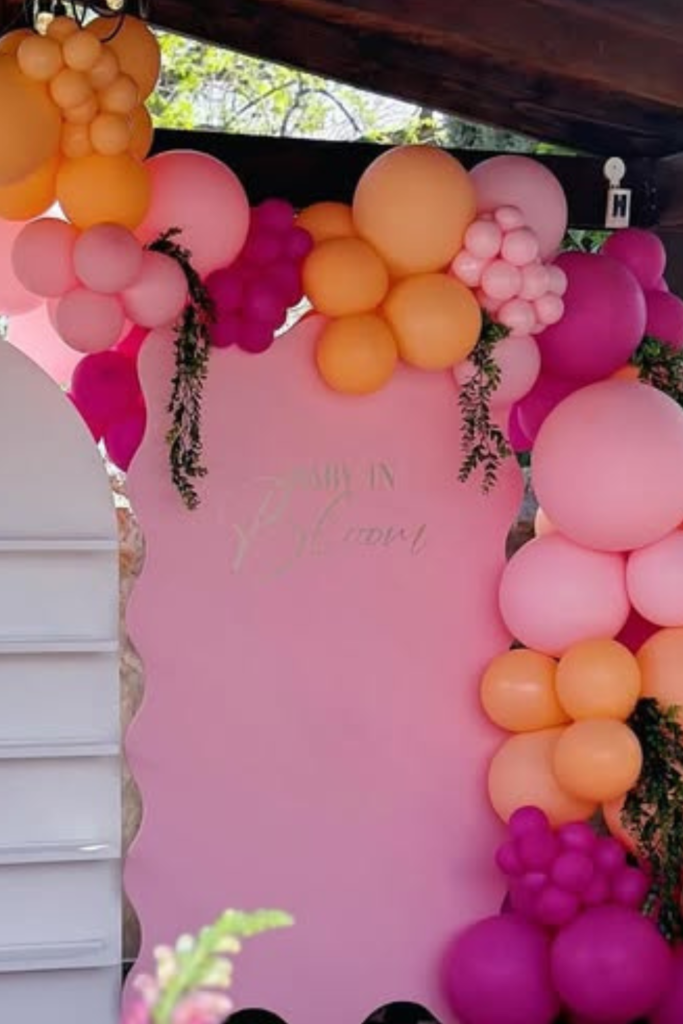
Bold Bloom Pop
Honestly, this is for people who don’t want to whisper their way through a baby shower.
The bright pinks and corals here would have made me nervous two years ago, but look how well it works when you commit to the energy instead of trying to tone it down.
The balloon garland frames everything like it’s announcing something important, and that bright table runner pulls the whole look together so it feels intentional.
If you’re going bold, the secret is keeping your furniture simple and your florals controlled.
Let the color be the star—don’t compete with it by adding more patterns or textures than necessary.
Bloom Market Bar
This is so smart it makes me wish I’d thought of it.
Instead of just putting desserts on a table and hoping people notice them, this setup turns the whole thing into an experience.
The tiered shelving filled with those gorgeous pink blooms makes everything feel like you’re shopping at the prettiest flower market, and the neutral backdrop keeps it from feeling too sweet.
If you want people to actually interact with your décor instead of just taking photos and leaving, give them something to explore.
Layer your flowers at different heights, keep them in the same color family, and suddenly your dessert table becomes the conversation starter.

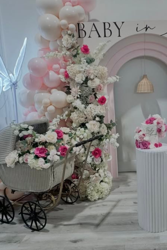
Luxe Floral Stage
Okay, this is what happens when you decide to go completely over the top—and somehow it works perfectly.
The oversized balloon installations and layered florals create this whole immersive scene instead of just a backdrop you stand in front of.
That vintage pram and the centered cake pedestal turn the whole thing into a styled vignette rather than just a photo wall.
If you want your shower to feel like an actual event experience, think in layers—something at floor level, something at eye level, something overhead.
When every height has something interesting happening, people will walk around the setup instead of just snapping one quick picture.
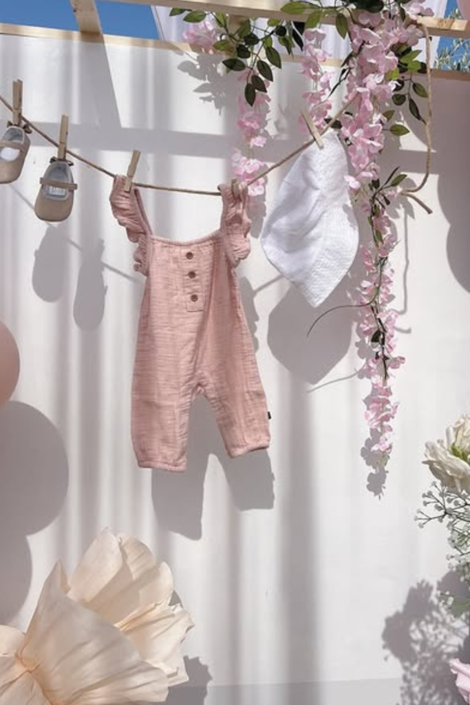
Babyline Detail
This tiny pink outfit hanging there like a little clothesline moment makes me tear up every single time I look at it.
It’s not just decoration—it tells the whole story of what this celebration is actually about.
Paired with those delicate florals and soft draping, the whole setup feels intimate instead of staged.
If you want your shower to feel personal, add one or two meaningful touches like this.
Don’t hang up the entire baby wardrobe—that gets cluttered fast.
But one special outfit or a pair of tiny shoes? That’s what makes people pause and smile instead of just scrolling past the photos later.
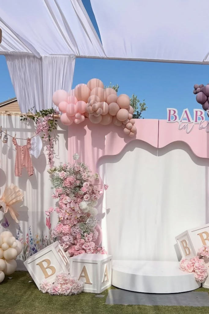
Garden Canopy Scene
The first thing I noticed here isn’t the balloons—it’s that gorgeous overhead draping that completely transforms the space.
If you’re hosting outside, most people forget to look up, which is such a missed opportunity.
Fabric, string lights, or even something like this woven chandelier can soften an outdoor space instantly and make it feel intentional instead of just “we set up some tables in the yard.”
The mauve and blush balloons work so well here because they stay in the same soft family—no competing colors trying to grab your attention.
When you design from top to bottom, the whole setup feels like an environment people want to stay in.
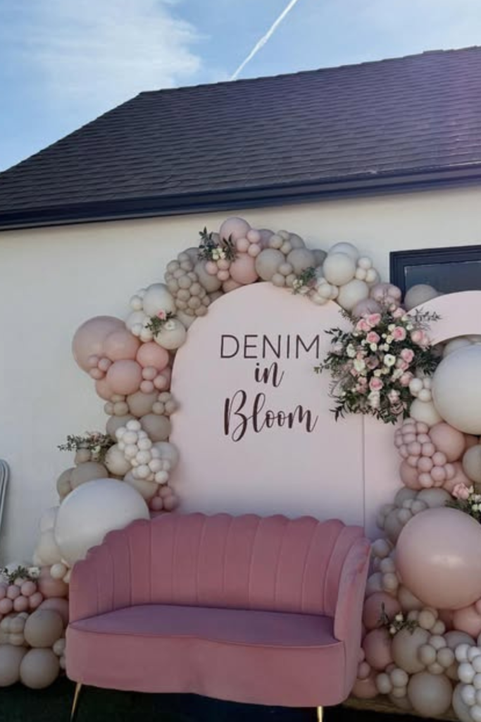
Neutral Bloom Lounge
This proves you don’t need bright pink to make “Baby in Bloom” feel warm and romantic.
The soft denim-inspired blues with creamy balloons and blush florals create this really sophisticated palette that still feels celebratory.
But what I love most is that velvet sofa—it turns the backdrop from a photo wall into an actual lounge where people want to sit and chat.
If you add seating to your backdrop area, guests naturally gather there for longer conversations instead of just snapping a quick picture and moving on.
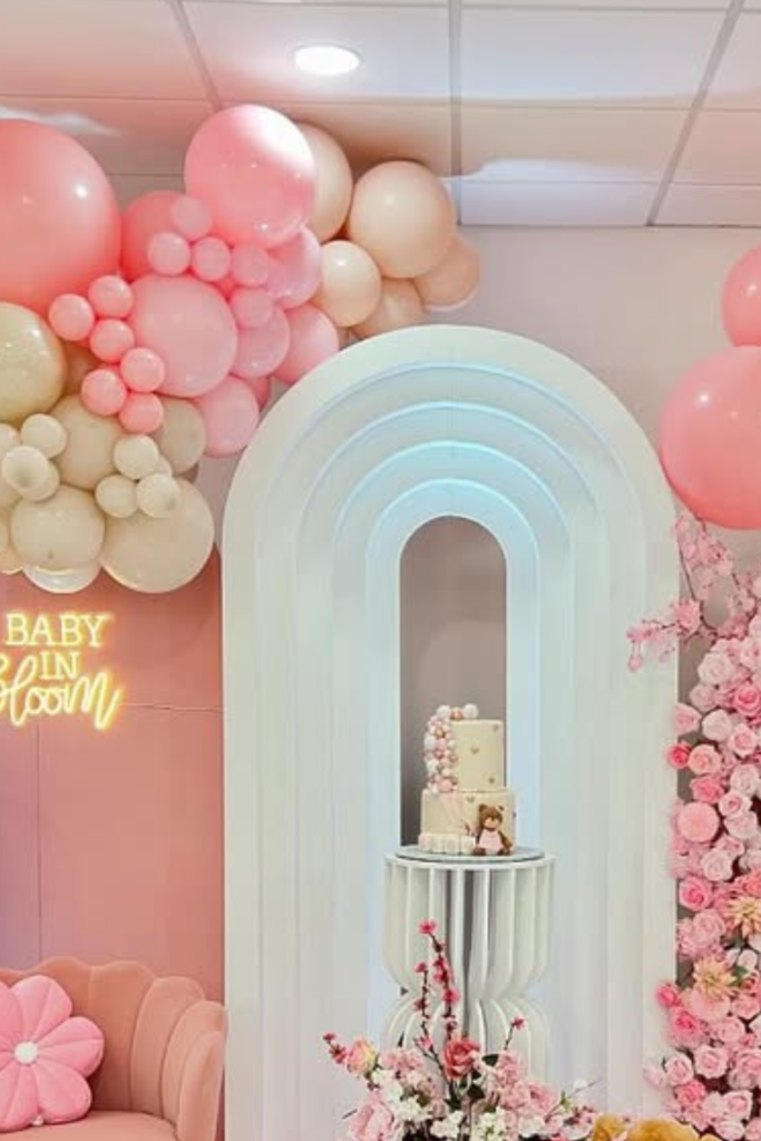
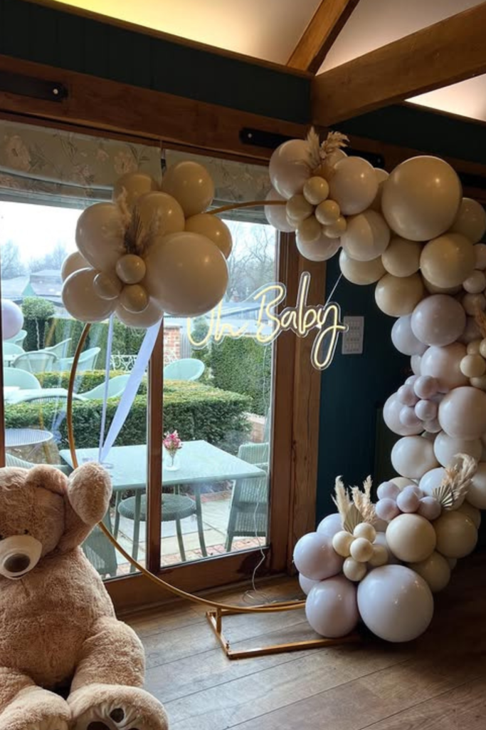
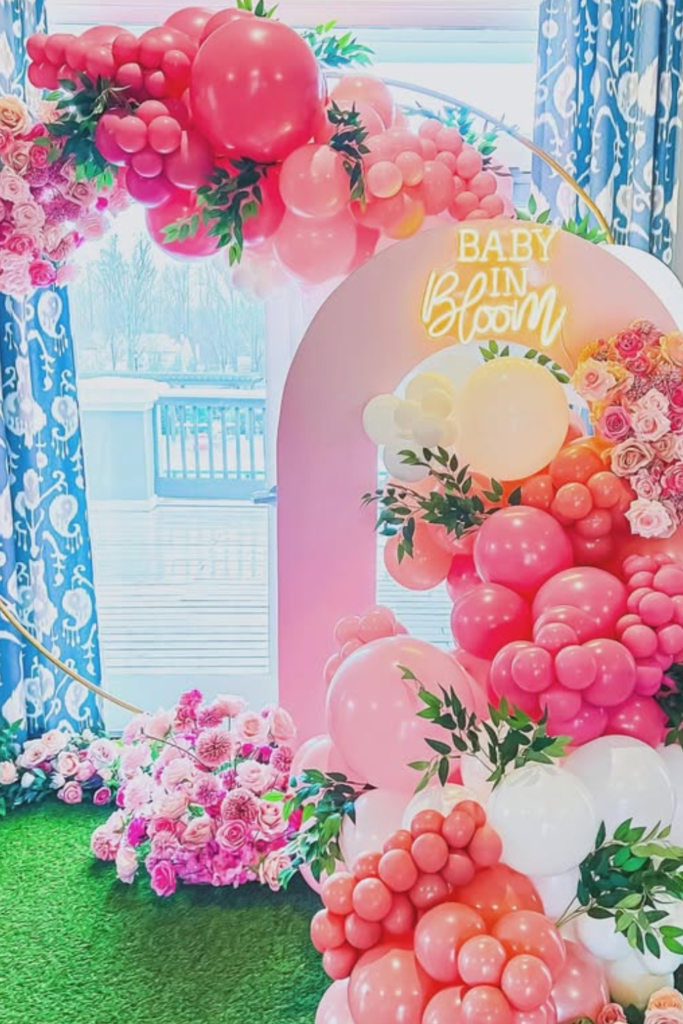
Pink Bloom Fantasy
If you want full wow factor, this is how you commit to it.
The layered arches, balloon clusters, neon sign, and teddy bear create this complete visual story that feels playful but still polished.
What keeps it from looking chaotic is staying within that blush and cream palette—even with all these different elements, your eye isn’t getting confused about what to focus on.
Notice how the florals are placed strategically around the base and at mid-height to soften all that balloon volume.
Save this post for later ❤️
If you want high impact, pick one dominant color and build texture with different shapes instead of adding more colors. That’s what keeps bold from becoming overwhelming.
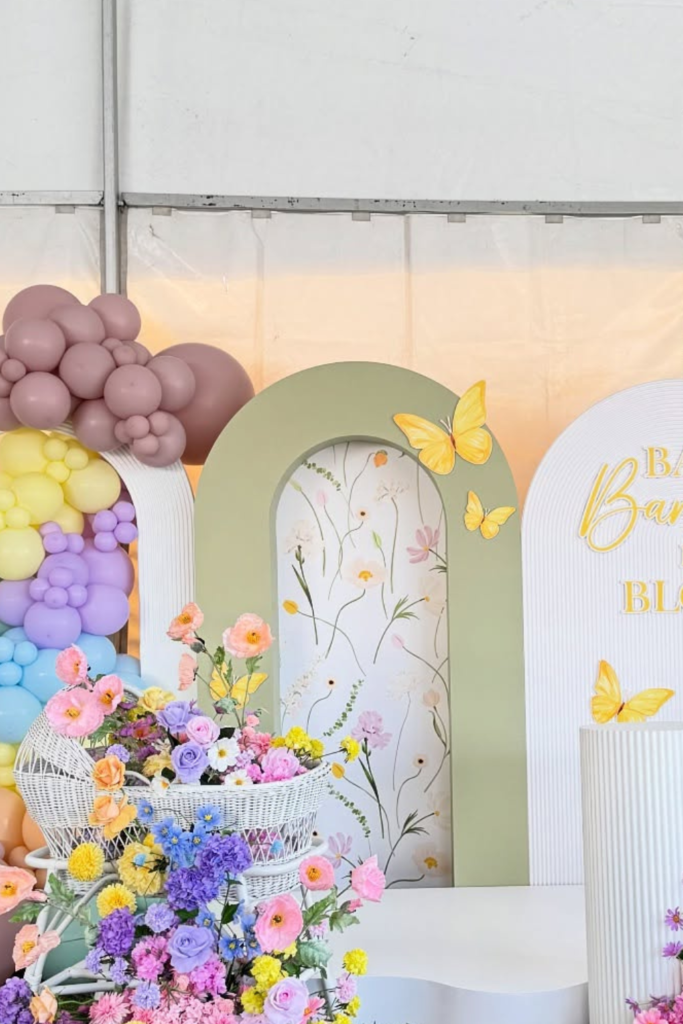
Rainbow Bloom Burst
I used to think “Baby in Bloom” automatically meant soft pinks, but this pastel rainbow setup completely changed my mind.
The wildflower-inspired florals ground all those playful colors so it still feels garden-themed instead of just colorful for the sake of it.
What makes this work is those structured arch panels—they contain the energy so it feels intentional rather than chaotic.
If you want to experiment with multiple colors, anchor them with clean white or neutral backdrops.
Bloom Basket Moment
Sometimes the easiest way to elevate your setup is concentrating your flowers in one gorgeous statement piece instead of scattering them everywhere.
This woven basket overflowing with blush and ivory blooms proves that texture matters just as much as color.
Instead of buying six small arrangements and hoping they look cohesive, invest in one lush piece that creates real impact.
It’s so much more effective than spreading flowers around hoping something will stick.
Draped Bloom Drama
If you’re setting up under a tent, please don’t ignore the ceiling—it’s basically free decoration space.
The soft pink and lavender draping here instantly transforms what would otherwise be a basic white tent into something romantic and intentional.
Paired with that multi-toned balloon arch and oversized floral cutouts, the whole space feels layered and thoughtful.
The secret is combining different textures—fabric for softness, balloons for volume, florals for detail.
Neutral Teddy Arch
Not every backdrop needs bright florals to feel complete.
This creamy balloon arch with the gold frame and neon sign keeps everything calm and sophisticated, while that oversized teddy bear adds warmth without making it feel overly cute.
If you’re going for a neutral “Baby in Bloom” look, focus on varying your textures and shapes instead of adding more colors.
Mix balloon sizes, add subtle dried elements, and include one playful accent. It stays modern while still honoring the sweetness of the occasion.
Blue Bloom Backdrop
If you’re planning for a baby boy or just want something less traditional, this soft blue palette feels so calm and refined.
The layered dusty blue and white balloons stay cohesive, and those small touches of greenery prevent it from looking flat or one-dimensional.
What makes this setup work is restraint—there’s no competition for your attention, just a clean, beautiful backdrop.
If you’re nervous about committing to bold colors, stick to two tones and add texture through balloon sizing and foliage.
Sage Arch Moment
This is how you do gender-neutral without it feeling boring or like an afterthought.
The sage green and white balloon arch feels fresh and modern, especially with those delicate white florals tucked between the balloons.
Setting it up in front of those large windows brings natural light into the whole design, which makes everything feel more elevated instantly.
If you choose green, mix matte and glossy balloon finishes to create depth—it’s such a simple trick but it makes a huge difference.
Floral Frame Focus
Sometimes you don’t need balloons at all, and this setup proves it beautifully.
Lush pastel florals on both sides of this structured arch create the feeling of walking into a blooming garden without any competing elements.
If you want a softer, more romantic atmosphere, let the flowers be the star and keep your backdrop neutral.
By concentrating the florals at the base and sides, you get fullness without overwhelming the center space where people will actually stand.
Neon Bloom Glow
If you love a statement moment, a glowing “Baby in Bloom” sign changes the entire energy of your setup.
The bright pink and coral balloons feel playful and modern, while the neon script adds this contemporary edge that keeps it from feeling too precious.
That curved gold frame is doing important work here—it holds everything together visually so the bold colors don’t feel chaotic.
If you’re mixing bold shades, anchor them with one structural element like this. It makes the whole design feel intentional instead of busy.
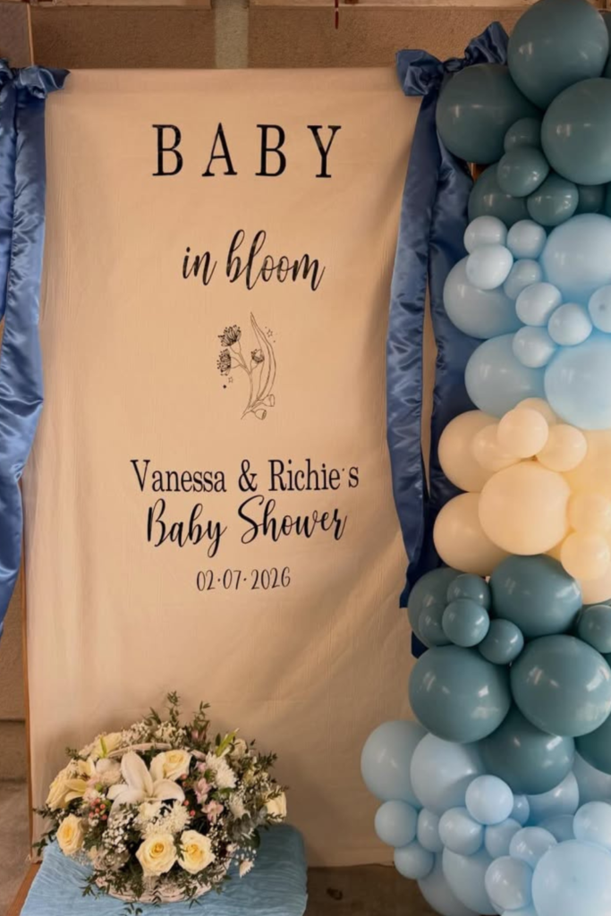
Blue Banner Bloom
If you want your shower to feel personal instead of generic, customizing your backdrop makes such a difference.
This fabric-style banner with the parents’ names instantly makes the whole setup feel intimate and meaningful.
The satin blue bows add softness, and those layered blue and cream balloons keep it celebratory without competing with the message.
Notice how the florals stay minimal at the base—that restraint keeps the focus on what matters most.
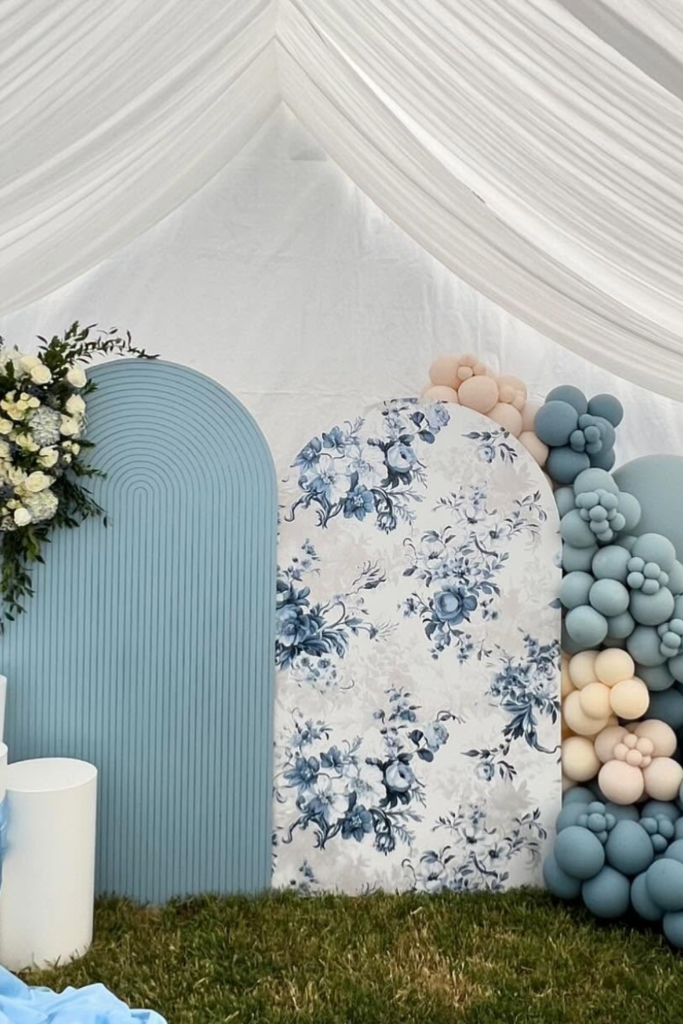
Toile Bloom Touch
If you love classic aesthetics, adding pattern to your backdrop is such a smart move.
The blue floral toile panel instantly elevates this from basic to refined, and instead of competing with the balloons, it adds depth and visual interest.
Those soft blue and cream balloon clusters keep everything cohesive without fighting the print.
If you want timeless instead of trendy, mix texture and pattern carefully—one statement backdrop, structured elements, controlled balloon placement.
Gold Bloom Glow
When you want warmth without defaulting to pink, gold tones are your best friend.
This soft cream and metallic balloon palette feels elegant and slightly luxe without being flashy or overdone.
The subtle maternity silhouette on the panel adds meaning without overwhelming the clean design.
If you’re hosting under a covered patio or in a space with wooden beams, warmer tones like champagne and gold soften the architecture beautifully. Keep your palette tight and let metallic accents add just enough shine.