Dusty Blue and Sage Green Is Having a Major Wedding Moment — and Honestly I Get It
I thought a dusty blue and sage green wedding would be straightforward to plan, but honestly? It’s trickier than it looks.
These colors are soft and pretty on Pinterest, but in real life they can disappear completely or look like they’re fighting each other.
The secret is giving each color a clear job—one needs to lead, the other supports, and you need enough contrast so the whole thing doesn’t look washed out in photos.
Here’s what actually works when you want this palette to look intentional instead of accidental.
How to Balance Dusty Blue and Sage Green Without Overdoing Either?
The biggest mistake I see is treating these colors like equals. They’re not.
One needs to dominate while the other plays support, or everything just blends into beige from ten feet away.
I like the 60-30-10 rule: let sage green carry about 60% of the visual weight through greenery and natural elements, dusty blue takes 30% in linens or flowers, and save 10% for neutrals.
This gives you enough contrast to photograph well while keeping everything cohesive.
When I see both colors competing equally, the whole wedding looks muddy. Trust me on this one.
Save this article for later! 👇👇
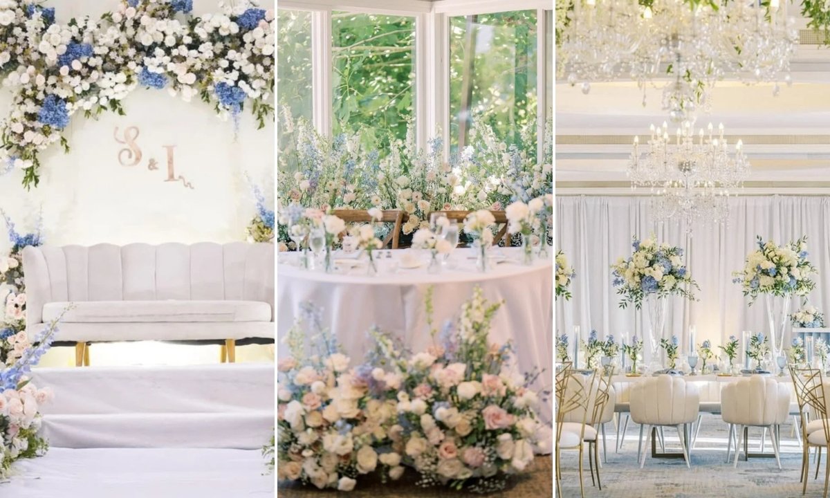
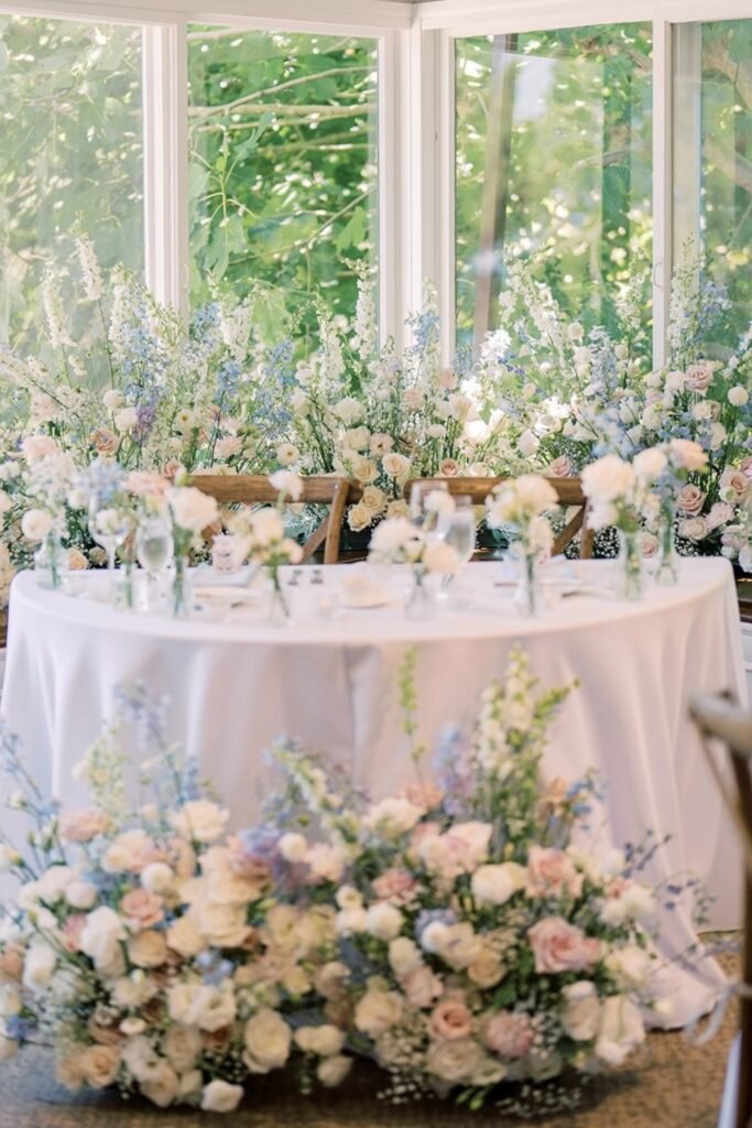
Greenery First
Let the greenery do most of the work. Sage tones from actual plants give you that base layer, then dusty blue flowers feel like perfect little surprises instead of trying too hard.
This works especially well if your tables are neutral wood or white linens. The florals define your palette without overwhelming anyone.
Perfect for garden parties or outdoor ceremonies where you want it to feel effortless.
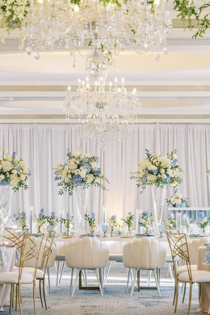
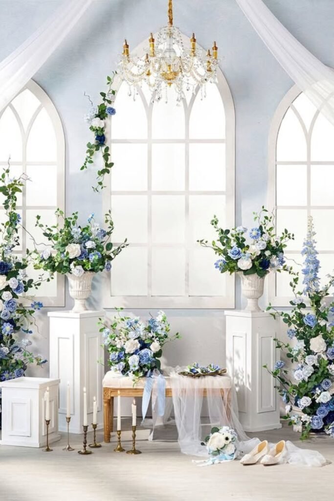
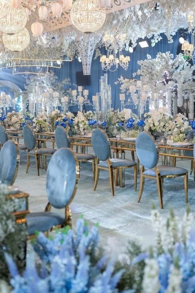
Soft Glam
Crystal chandeliers and white draping create the structure, while your dusty blue and sage florals soften everything and keep it from feeling too formal.
I love this setup because it proves muted colors can still look expensive when you pair them with good lighting and intentional symmetry.
Choose this if you want elegance without bold colors—the texture and scale do the elevating for you.
Blue Focus
Sometimes you want dusty blue to be the star. This floral backdrop does that without feeling overwhelming because the greenery frames everything perfectly.
The key is repetition—blue blooms appear in clusters, creating visual rhythm that carries through your ceremony photos.
Use this for ceremony backdrops or photo walls where you need a focal point that still feels romantic and soft.
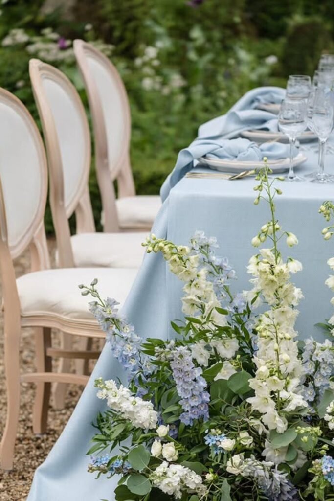
Linen Balance
Dusty blue linens instantly set your color story, and sage greenery along the table edges keeps everything grounded.
This combination photographs beautifully outdoors—natural light enhances muted colors instead of washing them out.
Perfect when you want tables that feel styled but not stiff. Modern garden vibes without the fuss.
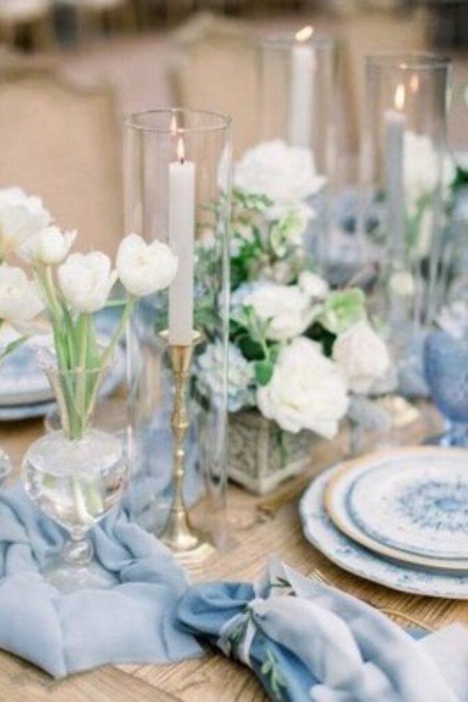
Candle Warmth
Candles are non-negotiable with this palette. They add the warmth that keeps dusty blue from feeling cold during evening receptions.
Clear glass hurricanes with sage greenery reflect light gently without competing with your color story or crowding the table.
This approach works when you want romance and intimacy without adding extra colors or heavy statement pieces.
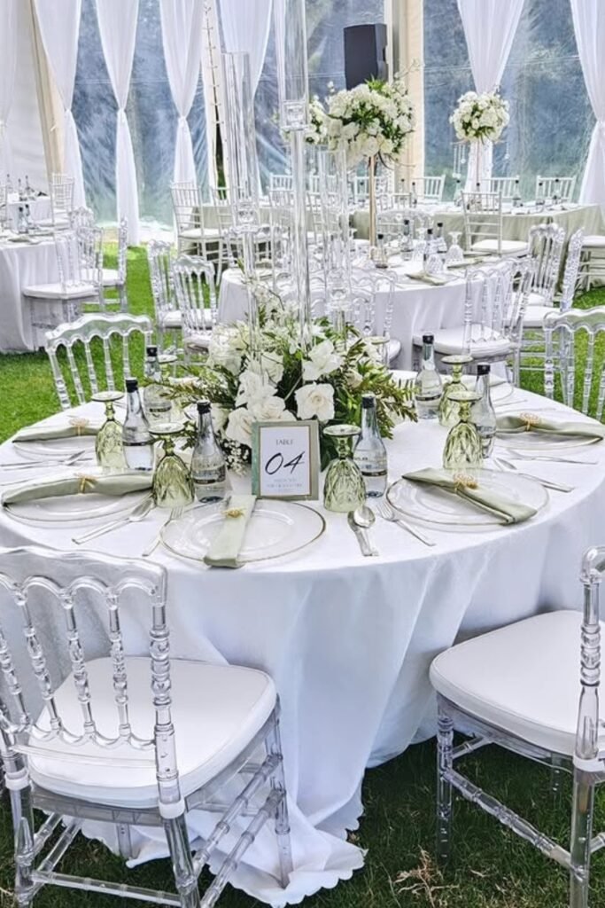
Clear Seating
Clear chairs are brilliant here because they let your sage and white surroundings shine while keeping dusty blue details visible.
If your venue already has beautiful greenery, transparency avoids visual clutter while still layering in soft color through florals.
Modern yet romantic, especially when you don’t want heavy furniture competing with natural scenery.
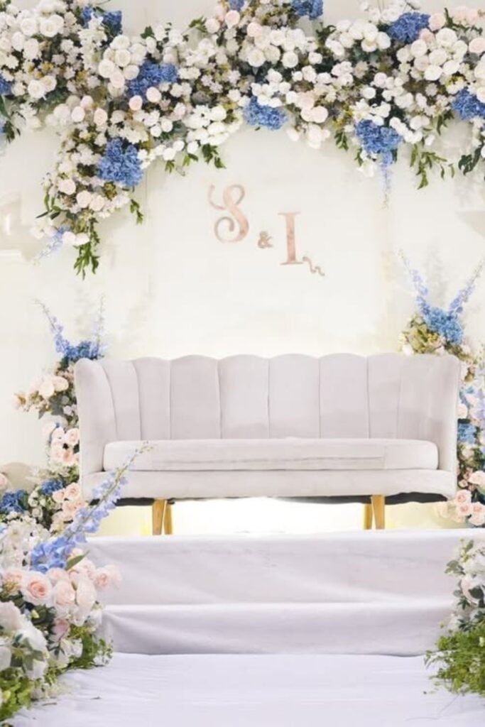
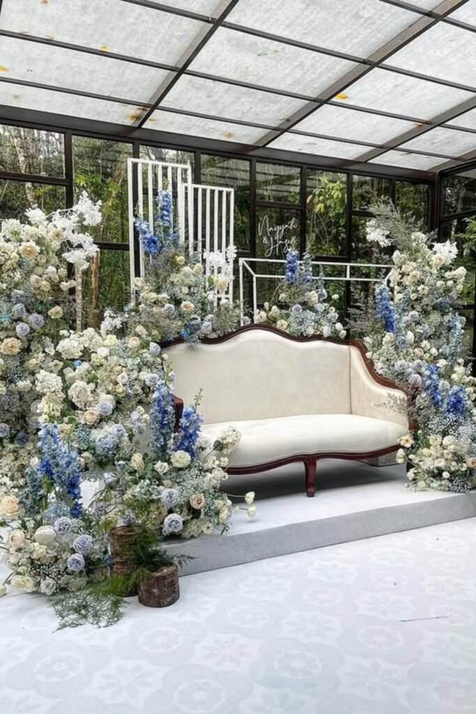
Floral Stage
A floral installation like this lets dusty blue make an impact while sage greenery frames the moment instead of competing with it.
Notice how the blue blooms repeat vertically—it gives structure to an otherwise soft palette and guides your eye upward in photos.
Great for ceremonies or lounge areas where you want a focal point without overpowering everything else
Altar Framing
Framing your altar with dusty blue florals adds color while sage greenery keeps everything grounded against architectural backdrops.
Tall arrangements work especially well here—they draw attention upward and make the ceremony feel intentional, not sparse.
Perfect when your venue already feels elegant and you just need thoughtful color placement.
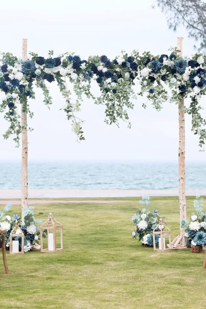
Coastal Arch
Using sage greenery as your main structure keeps the arch natural, while dusty blue flowers add just enough contrast without fighting ocean views.
This balance works perfectly outdoors where soft blue reads clearly against sky and water.
Choose this for ceremony backdrops that feel airy and coastal without looking overdone.
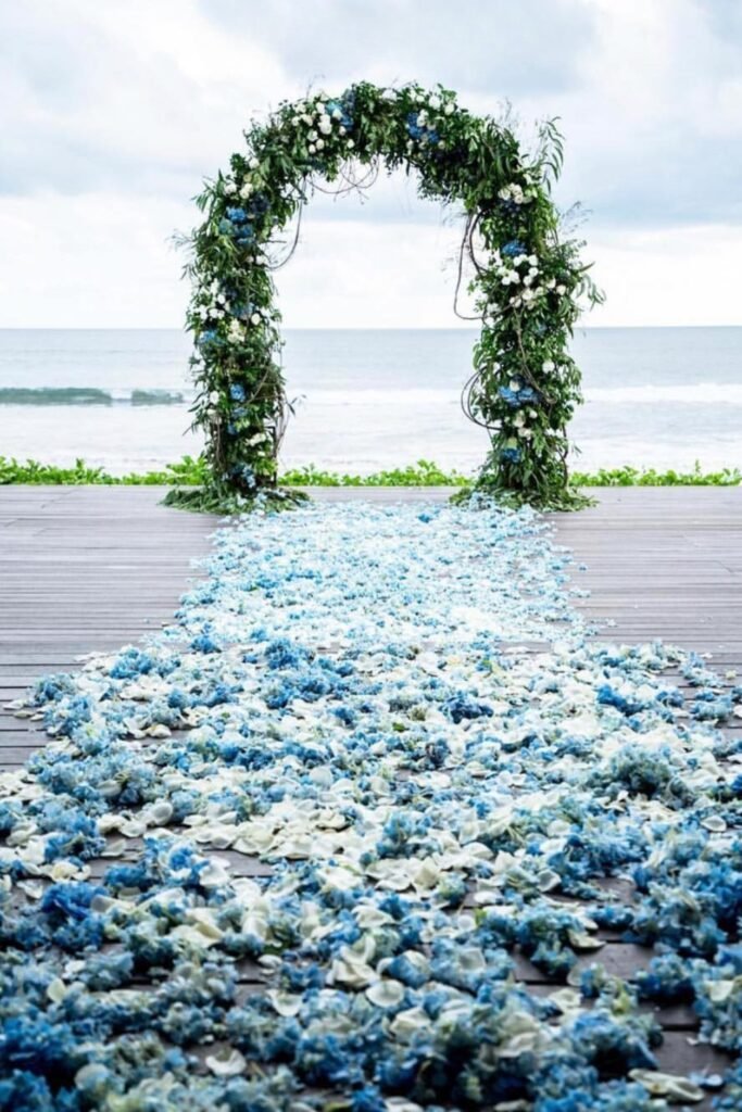
Petal Path
A flower-covered aisle pulls dusty blue forward beautifully, letting it shine while sage greenery frames the walk naturally.
This works especially well for minimalist setups where color underfoot adds drama without cluttering the surrounding space.
Love statement moments but hate heavy décor? This delivers impact in a clean, controlled way.
Blue Drama
Leaning into dusty blue seating creates instant drama, while sage florals soften the look and prevent it from feeling too bold.
Save this post for later ❤️
This setup works best in large venues where scale matters and color needs confidence to hold the room.
Keep sage consistent in your arrangements so the palette stays grounded and elegant, not overly dramatic.
Soft Runners
Dusty blue gauze runners instantly soften wooden tables and create movement while sage greenery keeps everything cohesive.
This combination is gorgeous for long tables where fabric flow helps guide your eye across the space without needing heavy centerpieces.
Perfect when you want texture and color without committing to bold florals on every single table.
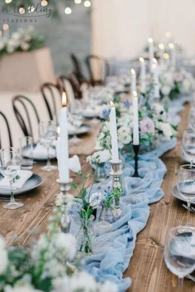
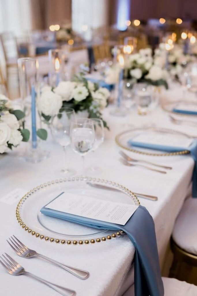
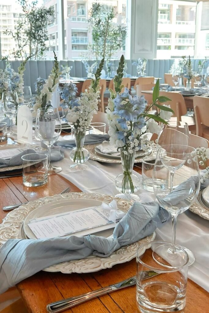
Table Details
Dusty blue napkins against crisp white linens create instant contrast, helping soft colors stand out without overwhelming the table setting.
Those gold-rim plates add just enough warmth to prevent the palette from feeling cool while keeping the overall look refined.
Use this when you want elegance that feels subtle and timeless rather than trendy or overly styled.
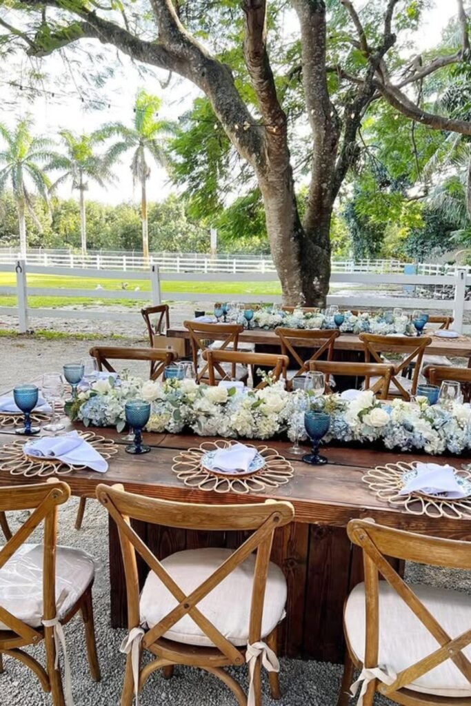
Outdoor Mix
Natural wood tables ground dusty blue details perfectly, letting sage and white florals soften the setting without competing with outdoor scenery.
Blue glassware repeats the color gently, adding depth while keeping the palette relaxed and approachable during long outdoor dinners.
Choose this for rustic charm with intentional color instead of heavy décor taking over your space.
Soft Knots
Dusty blue knotted napkins add texture immediately—guests notice the styling before they even see your centerpieces.
Sage and white flowers stay light here, supporting the color story instead of becoming the main focus.
Works beautifully for modern receptions where simplicity feels intentional, not unfinished.
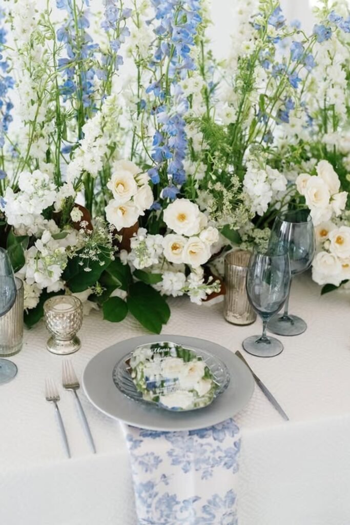
Floral Layers
Tall dusty blue blooms create height while white flowers and greenery keep the arrangement from feeling heavy or crowded.
Layered florals like this photograph beautifully, adding depth without relying on bold colors or dramatic props.
Perfect when you want the palette to feel romantic and naturally abundant across long banquet tables.
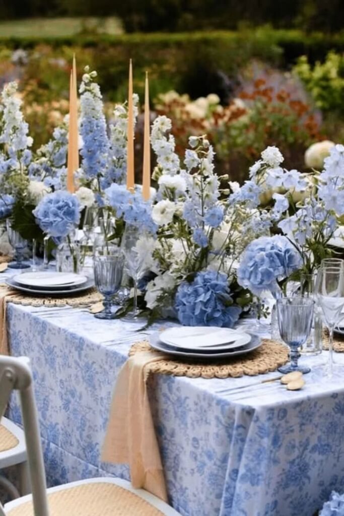
Garden Linens
Patterned dusty blue linens bring instant charm, letting soft color lead the table while sage florals balance everything naturally.
This works best when chairs and tableware stay neutral so the print feels intentional rather than overwhelming.
Choose this for romance and detail without heavy centerpieces competing with conversation or garden scenery.
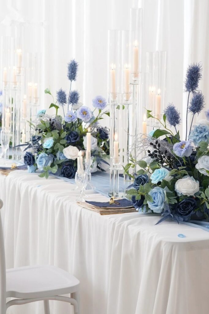
Glass Glow
Tall glass cylinders lift your eye upward, making dusty blue florals feel dramatic while keeping the overall palette light.
Clear holders are crucial here—they reflect candlelight without adding visual weight or breaking the softness of your colors.
Use this when your space feels minimal and you need height, glow, and elegance working together.
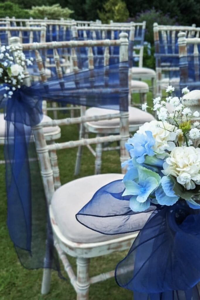
Aisle Wraps
Sheer dusty blue fabric tied across chairs creates soft visual rhythm without distracting from the ceremony space.
The trick is keeping florals minimal, letting sage greenery support the color instead of competing with it along the aisle.
This detail works best for daytime ceremonies where subtle texture photographs better than bold décor under natural light.
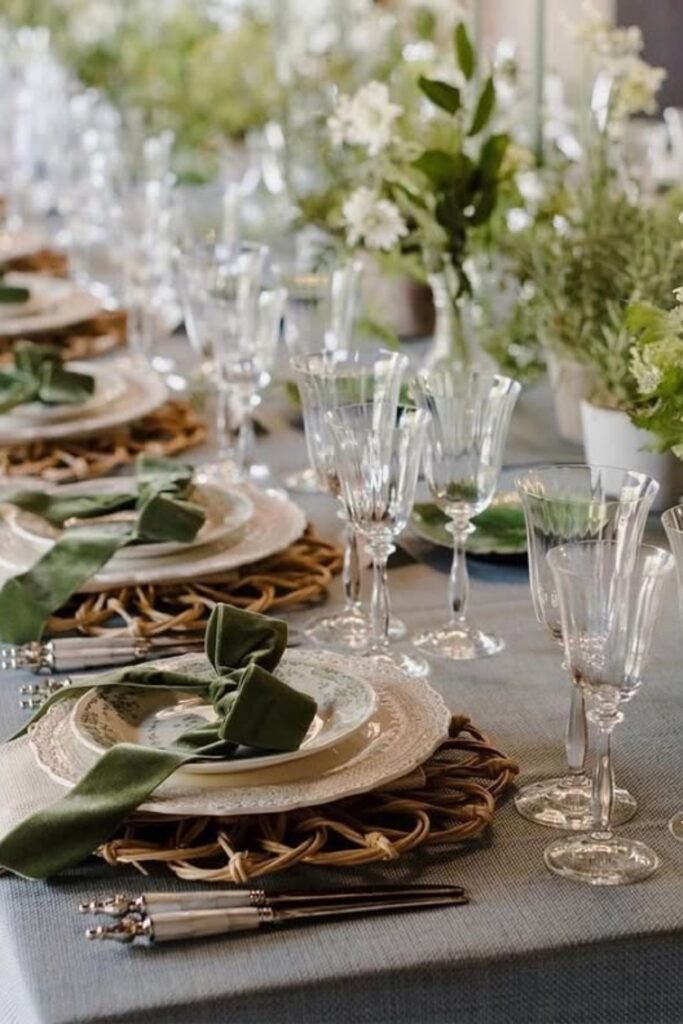
Sage Grounding
Sage green napkins instantly ground the table, giving dusty blue accents a calm place to shine within the overall setting.
This balance keeps the palette from feeling too cool, especially when paired with warm wood or woven chargers.
Perfect when you want color control without sacrificing that natural, relaxed feel guests love during long dinner celebrations.
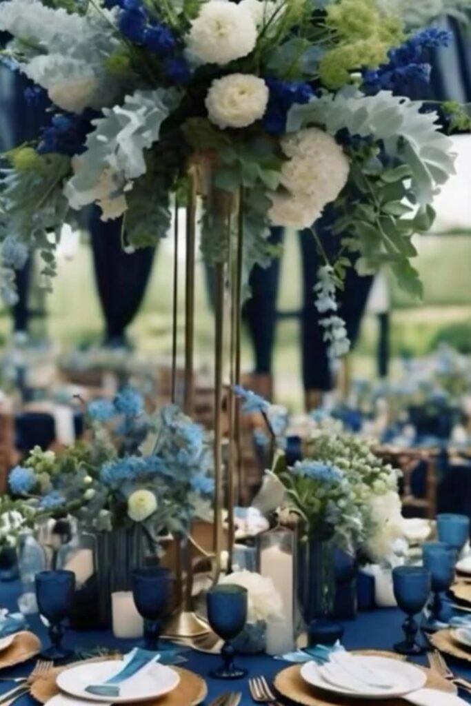
Go Vertical
Tall floral centerpieces instantly lift the table visually, pulling eyes upward and making your entire reception feel more layered and intentional.
This works best in large venues where ceiling height matters, especially with slim stands and airy flower choices.
Balance the height by keeping table details low—candles, glassware, and soft linens so guests still see each other
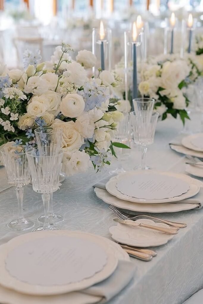
Soft Whites
An all-white table palette feels calm and timeless, letting subtle textures like linen, china edges, and florals do the talking.
This look shines at elegant indoor receptions where light bounces around, creating a clean backdrop for candles and glass details.
To avoid it feeling flat, mix in soft blue accents through napkins or flowers—keeps the palette gentle and cohesive.
FAQs
Can a blue wedding theme work for both indoor and outdoor venues?
Absolutely. Lighter blues feel fresh and airy outdoors, especially with greenery and natural light working in your favor.
Deeper blues work beautifully indoors, adding elegance under candles and chandeliers without feeling heavy or overwhelming.
How do I keep a blue wedding theme from feeling too cold or formal?
Balance is everything. Pair