The Ralph Lauren Baby Shower Theme Is Giving Preppy Luxury and People Are Obsessed With It
Honestly, I’ve been obsessing over Ralph Lauren baby showers lately (probably because I’ve seen three on Instagram this week and they all looked amazing).
But then I started actually planning one and realized… this is harder than it looks. Like, do you go full equestrian with horses everywhere, or is that too much? And how do you make it feel expensive when you’re not actually spending a fortune?
The thing is, Ralph Lauren isn’t just about throwing some plaid around and calling it a day. There’s actually a method to getting that refined, old-money look without it feeling like a costume party.
Trust me, I’ve seen the disasters where someone went overboard with polo bears and it looked more like a sporting goods store than an elegant celebration.
So here’s exactly how to pull off a Ralph Lauren baby shower that actually looks sophisticated – from someone who spent way too much time researching this.
The Essential Decor Elements That Make the Theme Feel Cohesive
Okay, first things first – you need to pick a lane and stay in it.
Choose two colors, maybe three if you’re feeling ambitious, and repeat them absolutely everywhere. Navy and cream, hunter green and gold, or that soft beige with white that makes everything look expensive.
I learned this the hard way when I tried to incorporate “just a little” pink into a navy theme and it looked like I couldn’t make up my mind.
Then you layer in texture – and this is where it gets fun. Plaid (obviously), but also wicker baskets, brass picture frames, crisp cotton anything.
The key is making everything feel like it belongs in the same upscale vacation house, not like you raided five different stores.
And here’s what nobody tells you: if you’re using teddy bears or polo elements, they need to look tailored, not like they came from a toy store. Think more “expensive children’s boutique” and less “carnival prize.”
When every single detail connects back to your color story, the whole thing looks like you hired a professional.
Save this article for later! 👇👇
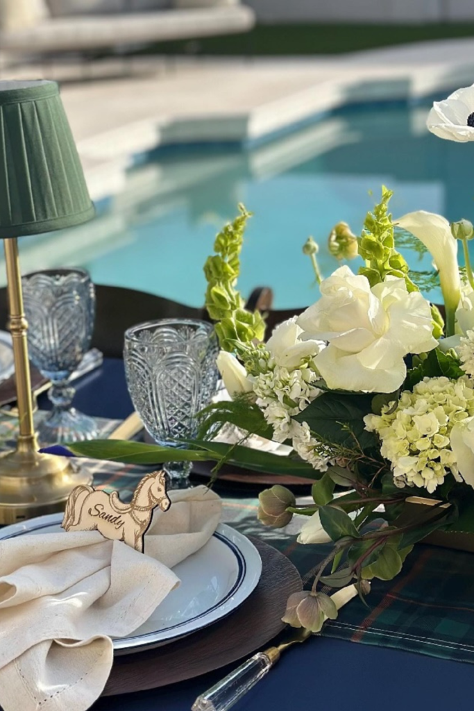
Poolside Plaid
This is what I’m talking about when I say “effortless elegance.”
Deep navy base, green tartan layered on top, white flowers to keep it from feeling too masculine. The brass lamp (which, let’s be honest, probably cost more than my entire centerpiece budget) makes it feel like a country club.
But here’s the thing – you could recreate this look with wood chargers from Target, some decent glassware, and those battery-operated candles that actually look real.
The secret is the layering. Every element has a purpose, nothing looks random, and that plaid runner does most of the heavy lifting for creating the theme.
If you’re doing an outdoor shower, this exact setup would make it feel sophisticated instead of… well, like a picnic with fancy napkins.
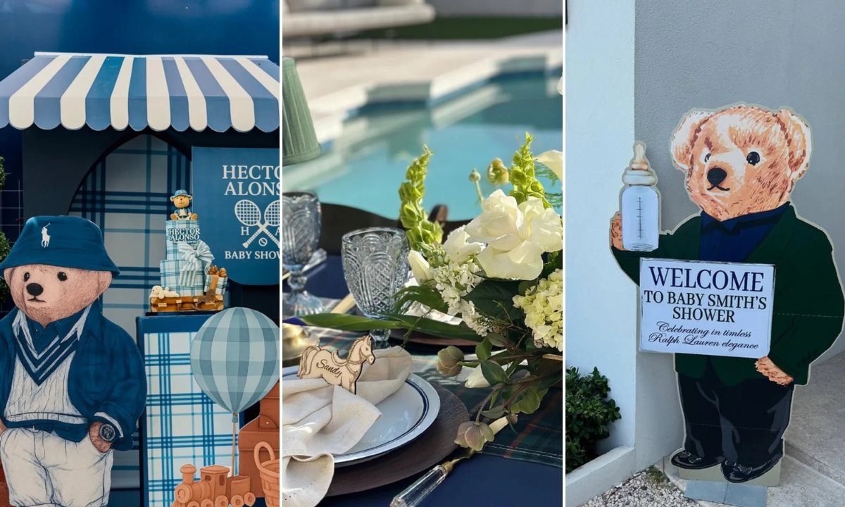
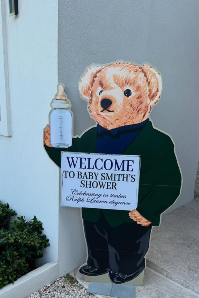
Preppy Welcome
I love this because it commits to the theme without apology.
That life-size teddy bear cutout is bold, but it works because everything else stays classic – clean typography, muted colors, structured pose. It’s like saying “yes, this is a themed party, and we’re doing it right.”
The font choice matters more than you’d think. Serif, clean, not too playful. When you’re going for upscale, avoid anything that looks like it came from a kids’ party store.
If you can’t do a full cutout, even a smaller version on an easel would set the same tone. Just make sure your bear looks expensive, not… well, not like something you’d win at a fair.
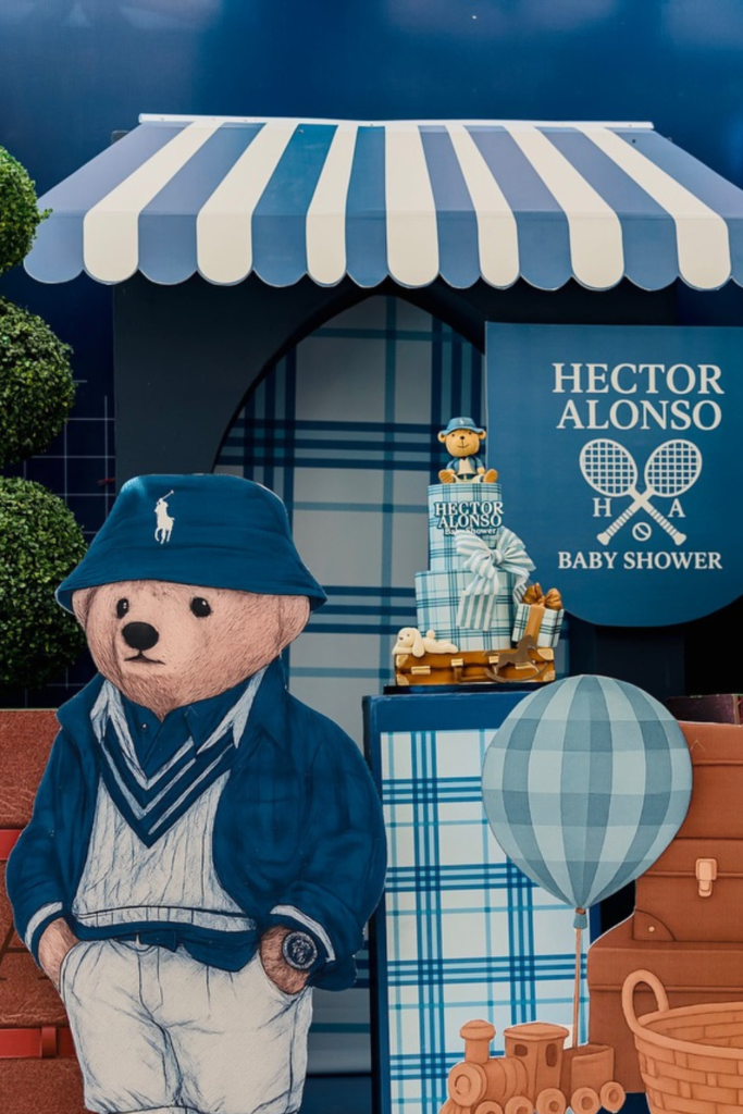
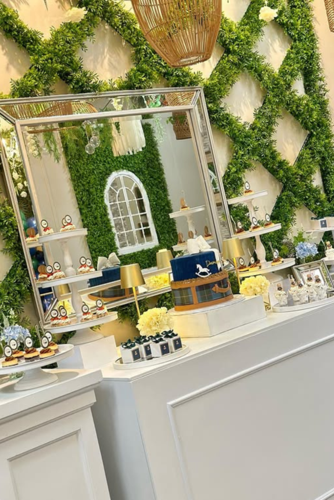
Heritage Backdrop
This is what happens when you go all in and it actually works.
Plaid panels, perfectly styled bear, structured props that look like they belong in an actual Ralph Lauren store. The key is commitment – half-hearted theming looks worse than no theming at all.
I’m obsessed with how they used actual luggage and vintage-looking baskets. It’s not just decoration, it’s world-building. You feel like you’re at some fancy boarding school or exclusive club.
The bear’s outfit is perfection – tailored, layered, and it actually looks like something you’d see in a Ralph Lauren kids’ catalog. That attention to detail is what separates this from looking like a generic “preppy” party.
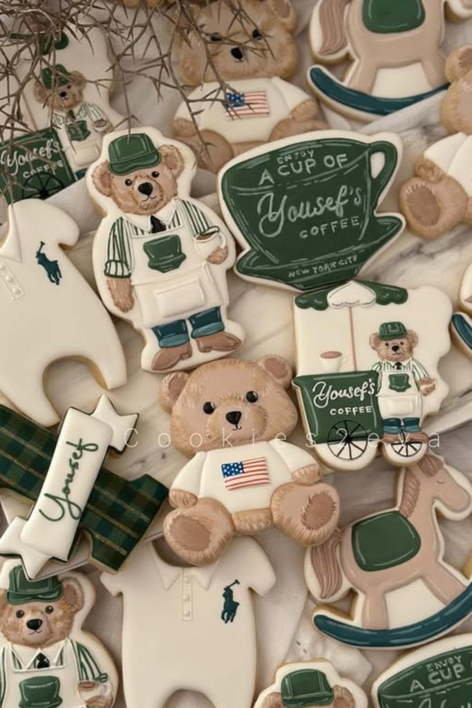
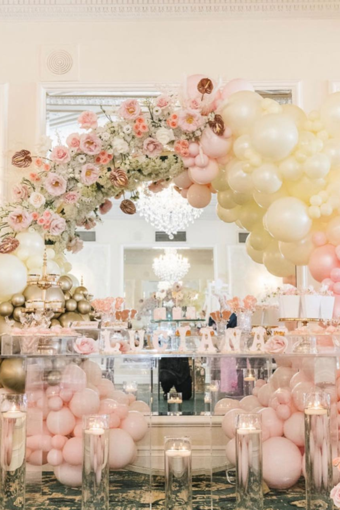
Signature Sweets
Okay, this is where you can have fun without breaking the bank.
Custom cookies are honestly one of the best investments for a themed shower because they do double duty – they’re decoration AND dessert. These ones are perfect because they stick to the color palette exactly.
Notice there’s no random pastel pink or baby blue thrown in just because it’s a baby shower. Green, navy, cream, maybe a touch of brown for the rocking horse. That’s it.
The plaid ribbon underneath is such a small detail, but it’s what makes the display look intentional rather than just… cookies on a table. When you repeat design elements like that, everything feels connected.
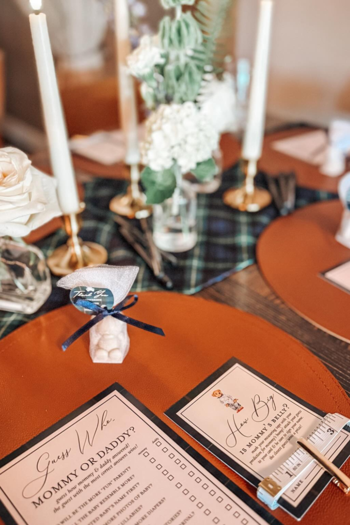
Leather & Tartan
This is exactly what I mean about texture doing the work for you.
Those brown leather chargers against the plaid runner instantly make everything look expensive. Add the brass candlesticks and you’ve got that old-money vibe without actually spending old-money prices.
Even the game cards look sophisticated – cream cardstock, navy border, clean fonts. It’s proof that when you apply the aesthetic to everything (not just the obvious stuff like flowers and cake), the whole event feels curated.
And those navy ribbon ties on the favor bags? That’s the kind of small detail that makes guests think you had a professional planner when really you just paid attention to consistency.
Garden Estate
If you want to skip balloons entirely (which, honestly, sometimes feels more sophisticated), this is how you do it.
Structured greenery instead of inflatables, oversized mirrors to make everything feel grand, white pedestals that let the cake be the star. It feels like you’re in someone’s actual estate garden, not a rented party room.
The plaid ribbon on the cake stand is barely there, but it’s enough to tie into the theme without screaming about it.
This approach works especially well if you’re hosting at someone’s house with a nice backyard – you’re enhancing what’s already there rather than covering it up with party decor.
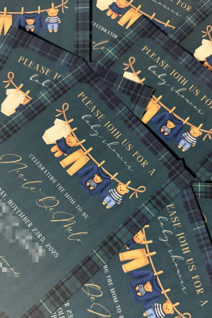
Plaid Invitations
Your invitation is literally the first impression, so don’t mess this up.
Dark tartan background, gold script (not Comic Sans, please), and those teddy bear illustrations that actually look classy instead of childish. The whole thing sets expectations that this is going to be a sophisticated event.
I’ve seen people try to recreate the Ralph Lauren look with bright, cartoon-y graphics and it just doesn’t work. The brand is about understated luxury, not loud patterns and primary colors.
Keep your text readable, leave white space, and let that plaid pattern carry most of the visual weight.
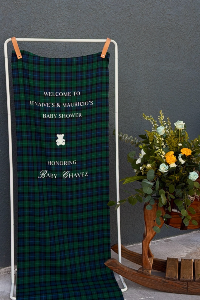
Plaid Welcome
Sometimes the simplest solutions are the best ones.
Instead of trying to build some elaborate entrance display, just drape quality tartan fabric over a clean frame. It immediately looks custom and expensive, especially with that white serif lettering.
The wooden rocking horse adds dimension without clutter, and those white flowers soften what could otherwise feel too masculine or formal.
Save this post for later ❤️
This is perfect if you’re working with a smaller space or budget – let the fabric do all the heavy lifting while you focus on getting the details right.
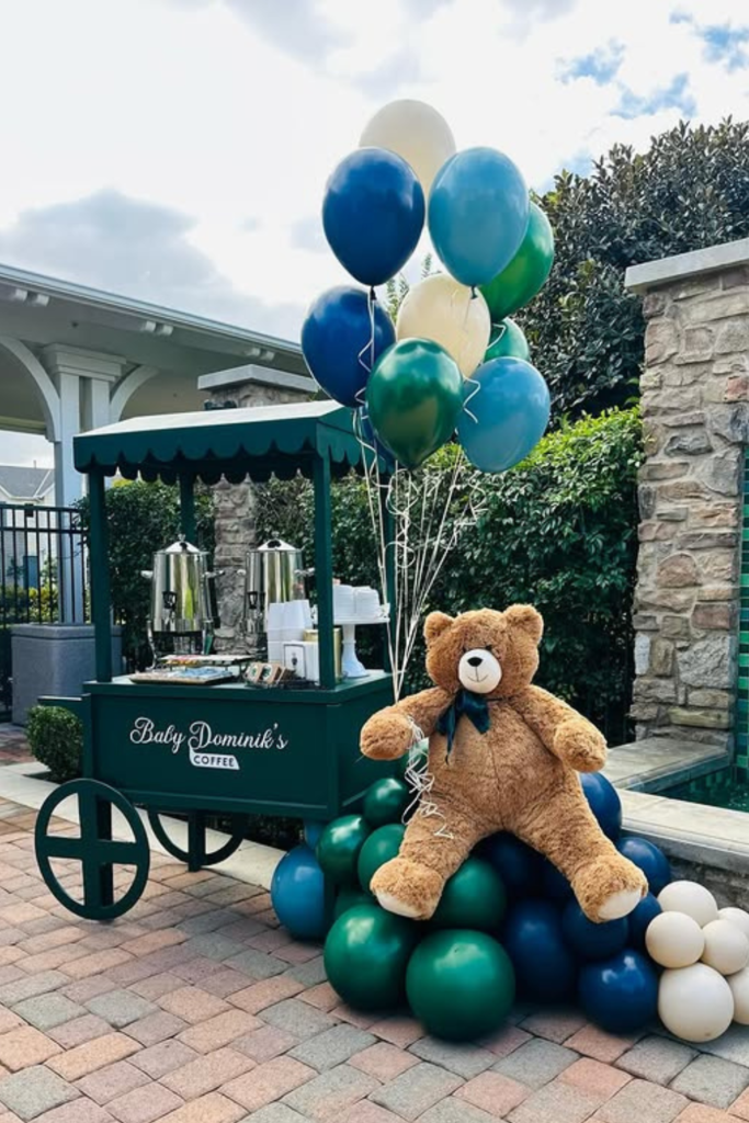
Coffee Cart Charm
This is next-level party planning right here.
A custom coffee cart that matches your theme and actually serves drinks? It’s functional AND gorgeous, which is honestly my favorite kind of party element.
The deep green paint job with clean lettering looks like something you’d see at an actual country club. And notice how even the balloons stick to the navy, green, and cream palette – no random colors thrown in.
If you can’t do a full coffee cart, even a styled beverage station with the right color scheme and typography would create a similar effect. It’s about creating an experience, not just serving drinks.
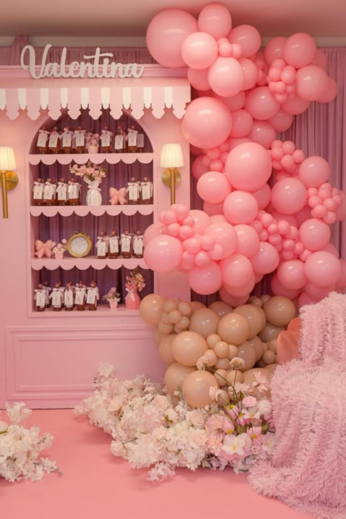
Blush Boutique
See? Ralph Lauren doesn’t have to be navy and green.
This soft blush version works because it keeps all the structural elements – paneled walls, tailored details, quality materials. The color changed, but the sophistication stayed exactly the same.
That balloon installation is gorgeous because every single shade is within the same family. No random pinks, no “let’s throw in some silver for fun.” Just different tones of blush and champagne that all work together.
The built-in shelving with carefully arranged favors makes it feel like an actual boutique instead of just a party room.
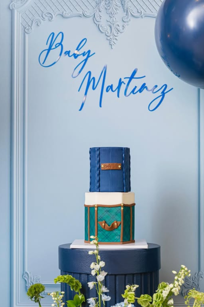
Tailored Cake
Your cake can literally carry the entire theme if you do it right.
Look at that fondant work – it actually looks like fabric texture, not just smooth icing with a plaid pattern slapped on top. The leather-looking brown band, the structured tiers, even the proportions feel architectural.
This is why I always tell people to invest in a good baker if you’re doing a heavily themed shower. A well-executed cake like this becomes the centerpiece and conversation starter all in one.
The white flowers around the base keep it from feeling too heavy or masculine, which is important when you’re going for that Ralph Lauren elegance.
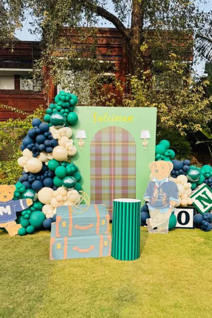
Estate Lawn
If you have access to a nice outdoor space, don’t fight it – enhance it.
This setup works because it doesn’t try to cover up the natural setting. The clean arch, structured balloons, and prop pieces all complement the lawn rather than competing with it.
The spacing here is key – everything has room to breathe. When you cram too many elements together, even expensive decor can look cheap.
That monogram block and vintage trunk situation is giving me serious country club vibes in the best way. It feels like a private estate party, not a rented pavilion.
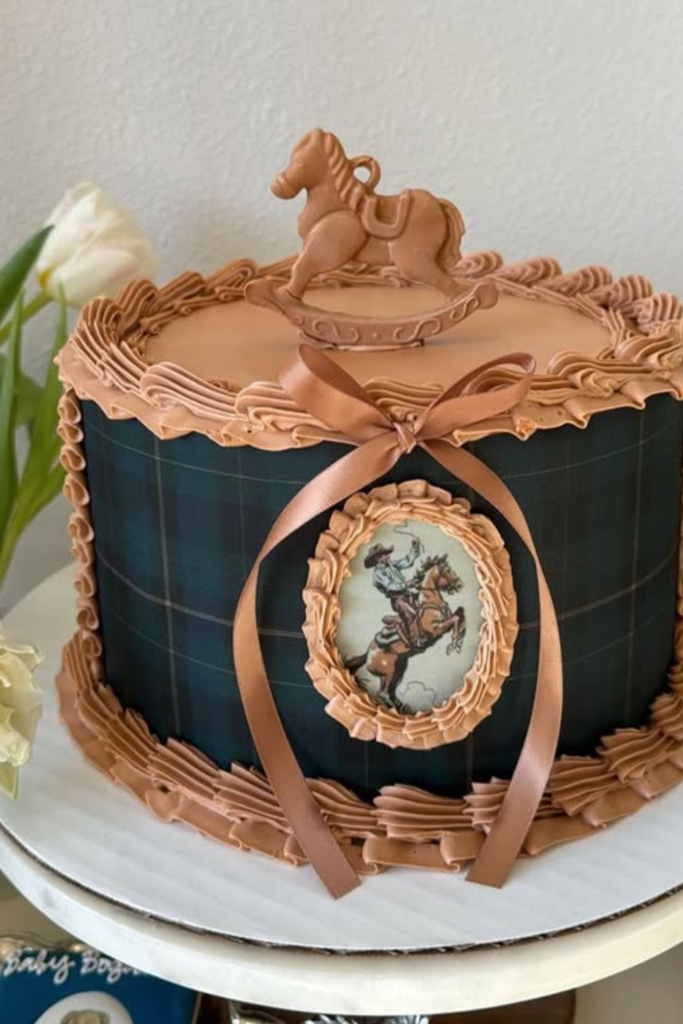
Equestrian Elegance
This is what happens when you lean into the horse theme without making it cheesy.
That deep tartan base with caramel piping looks rich and expensive, while the framed horse detail adds authenticity without being too literal. It’s subtle enough to feel sophisticated.
The rocking horse topper keeps it baby-appropriate, but it’s styled in a way that feels upscale rather than toy-like. That balance is so important – you want whimsical, not childish.
Even as a single tier, this cake feels like a statement piece because every detail is intentional and well-executed.
Ballroom Blush
Sometimes you want full glamour, and that’s okay too.
Those clear acrylic tables with gold accents are so smart – they don’t compete with all the floral and balloon elements, but they still feel luxurious. The blush and champagne balloon palette stays cohesive even though there’s a lot going on.
The candle cylinders underneath add that romantic glow that makes everything look more expensive in photos. If you’re hosting in a formal venue, this is how you make it feel warm and personal instead of cold and rented.
Elevated Dessert
This is proof that simple can be incredibly effective.
Wooden table, neutral linens, oversized cream balloons with those perfect green ribbon ties. Then every single dessert follows the exact same color story – navy, green, white, period.
Those acrylic risers are genius because they create levels without adding visual weight. Everything feels light and airy while still being structured and intentional.
If you’re stressed about making your dessert table look professional, this is your template: limit your colors, repeat them everywhere, and let clean presentation do the rest.
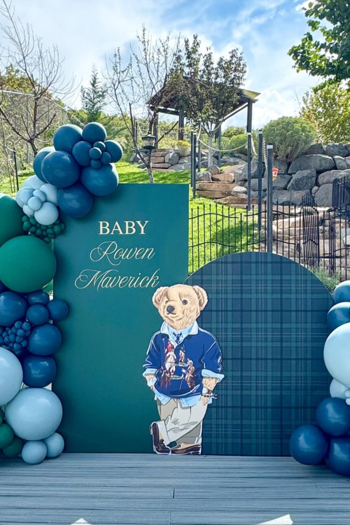
Monogram Moment
Personal touches make all the difference, but they have to feel integrated, not tacked on.
That script lettering on the deep green backdrop looks custom and expensive, while the balloon clusters frame everything without overwhelming it. The plaid panel adds texture and pattern without making it busy.
And can we talk about that teddy bear styling? The little blazer, the proportions, even the pose – it all feels very intentional and sophisticated rather than just “cute.”
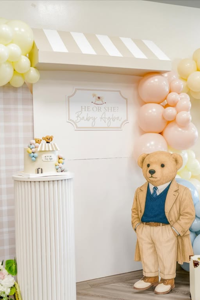
Neutral Reveal
Gender reveals can still be elegant – you just have to resist the urge to go full neon.
Muted pastels with that plaid backdrop and structured paneling keeps everything feeling refined. The teddy in the blazer is such a perfect touch – it’s clearly themed without being over the top.
Notice how even with pink and blue elements, they stayed within a soft, cohesive range? No electric blue or hot pink that would totally break the aesthetic.
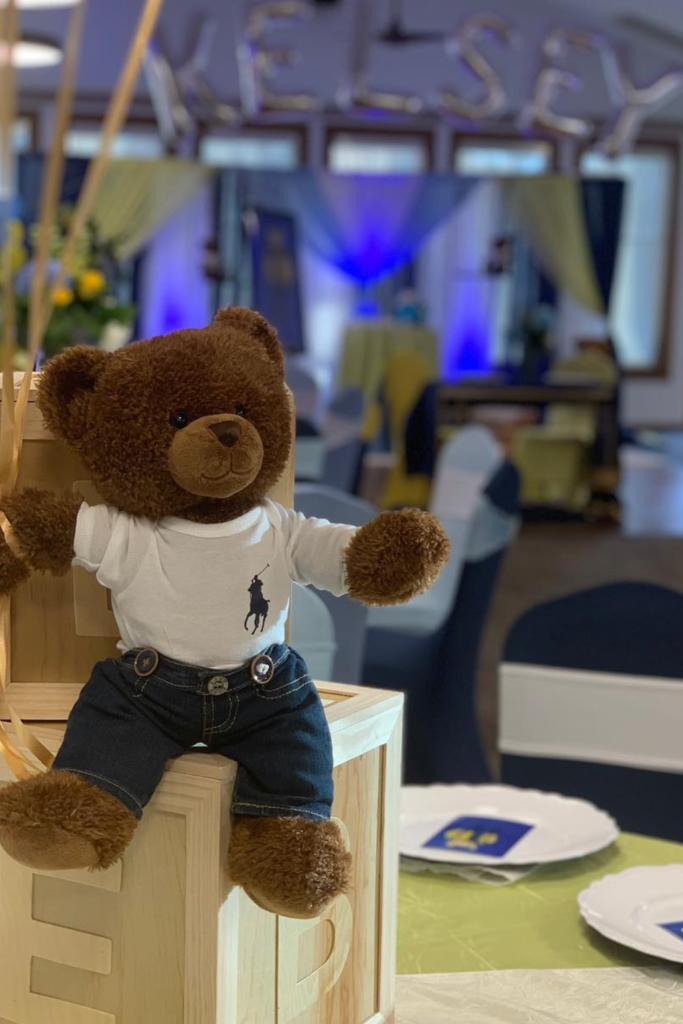
Tabletop Bear
Sometimes the smallest details have the biggest impact.
Placing that styled teddy on wooden crates instead of just randomly on the table makes it look intentional. The polo tee and proportions are perfect – preppy without being costume-like.
This is especially great if you’re working with a venue that already has some decor, because you can add your theme elements without having to redo the entire space.
Coffee Station
Don’t let your beverage area be an afterthought.
That deep green menu board with the script lettering ties directly into the theme, while the organized setup with matching cups and wooden stirrers makes it feel like part of the design, not just a functional necessity.
Even those small teddy graphics on the cups keep everything connected without being overwhelming. It’s the kind of detail that makes guests feel like every aspect was thoughtfully planned.