Blue Wedding Themes That Go Way Beyond Something Borrowed Something Blue
I spent three months last year scrolling wedding inspiration boards trying to figure out how to use blue without making our reception look like a corporate conference room.
Daniel kept saying “just pick a shade” but honestly, there are like fifteen different blues and they all do completely different things to a space.
Here’s what I learned after talking to our planner, looking at way too many photos, and seeing a few blue weddings in person: it’s all about matching the shade to your venue first, then building everything else around that.
Which shade of blue works best for your wedding style and venue?
Your venue should pick your blue shade, not Pinterest. I learned this the hard way when I fell in love with dusty blue online but our ballroom had these warm gold fixtures that made it look gray and sad.
Navy or midnight blue saves you in formal spaces because it looks intentional under dim lighting and doesn’t compete with fancy architecture.
Outdoor venues can handle dusty blue because natural light and greenery soften it automatically.
Beach or garden weddings? Go lighter. Sky blue won’t fight the setting. The worst thing you can do is pick a shade because you love it in isolation and then watch it clash with everything else on your actual day.
Save this article for later! 👇👇
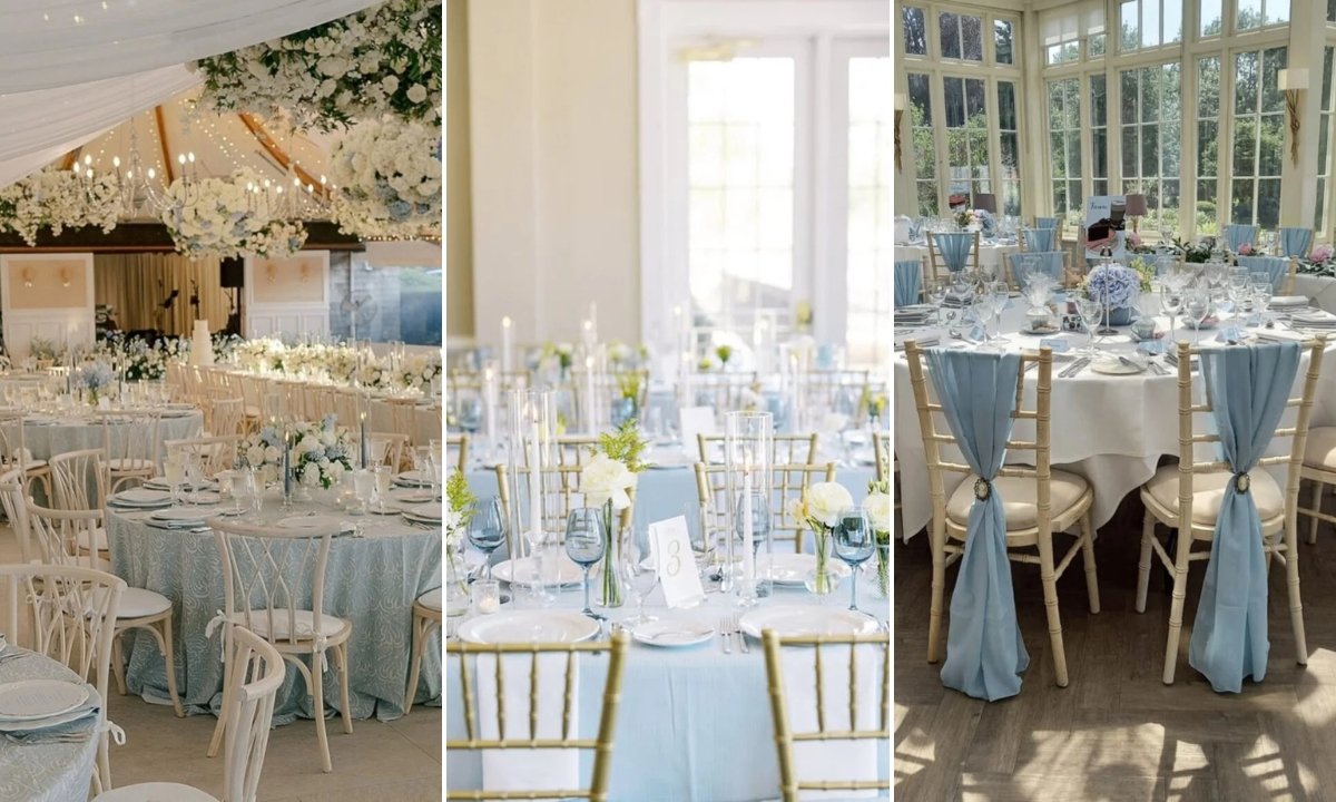
Dusty Blue Party
This is what I wanted for my own wedding but couldn’t make work with our venue. Dusty blue bridesmaid dresses with navy suits look effortless and polished without trying too hard.
The trick is keeping everything else really simple — white bouquets, minimal jewelry, classic shoes. When the color palette does the talking, you don’t need busy details.
This works best outdoors where natural light keeps the blue soft instead of flat.
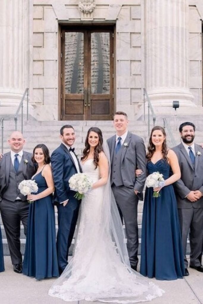
Formal Navy Lineup
Deep navy instantly makes any wedding party look more expensive. It photographs beautifully and works with literally any venue that has stone, columns, or historic details.
The key is not overdoing it everywhere else — let the dresses be the statement and keep florals white or very pale pink. Navy can handle being the star color.
This is probably the safest blue choice if you’re nervous about committing to color.
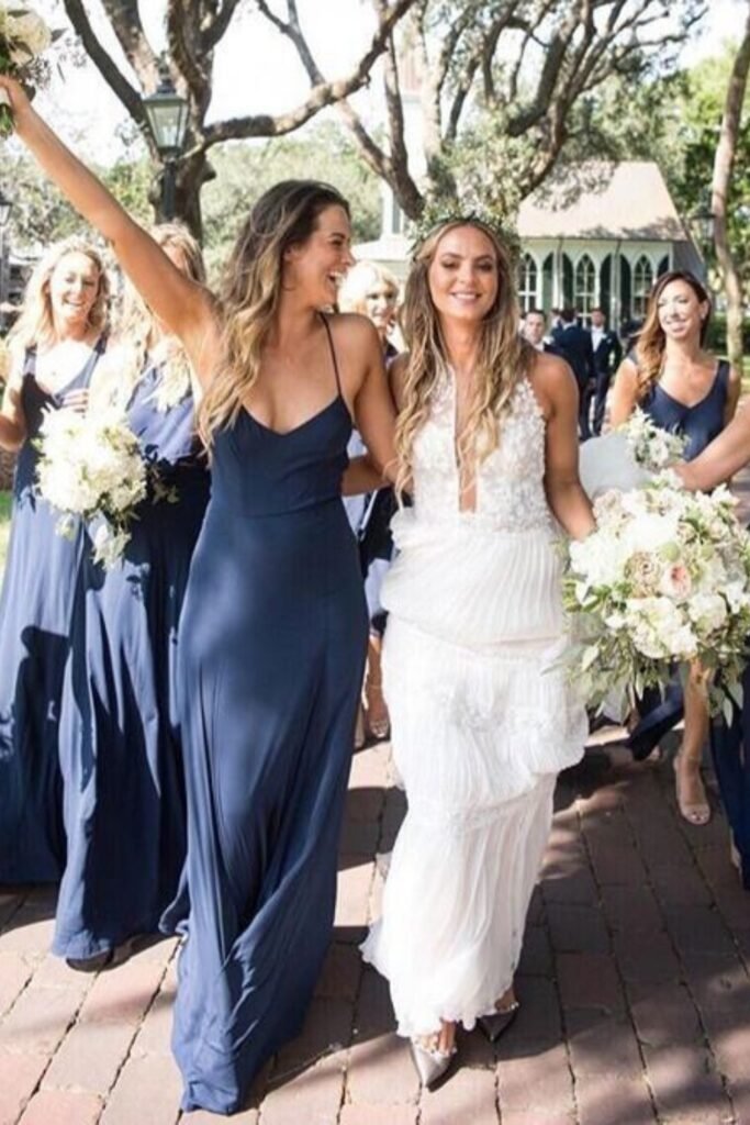
Flowing Navy Style
I love how movement changes everything about a color. These flowing navy dresses feel completely different from structured ones — more joyful, less formal.
This is perfect for destination weddings or anywhere your bridesmaids need to be comfortable for hours. Comfort shows in photos… and so does discomfort.
The textured white gown keeps the focus where it should be while still letting blue be the supporting story
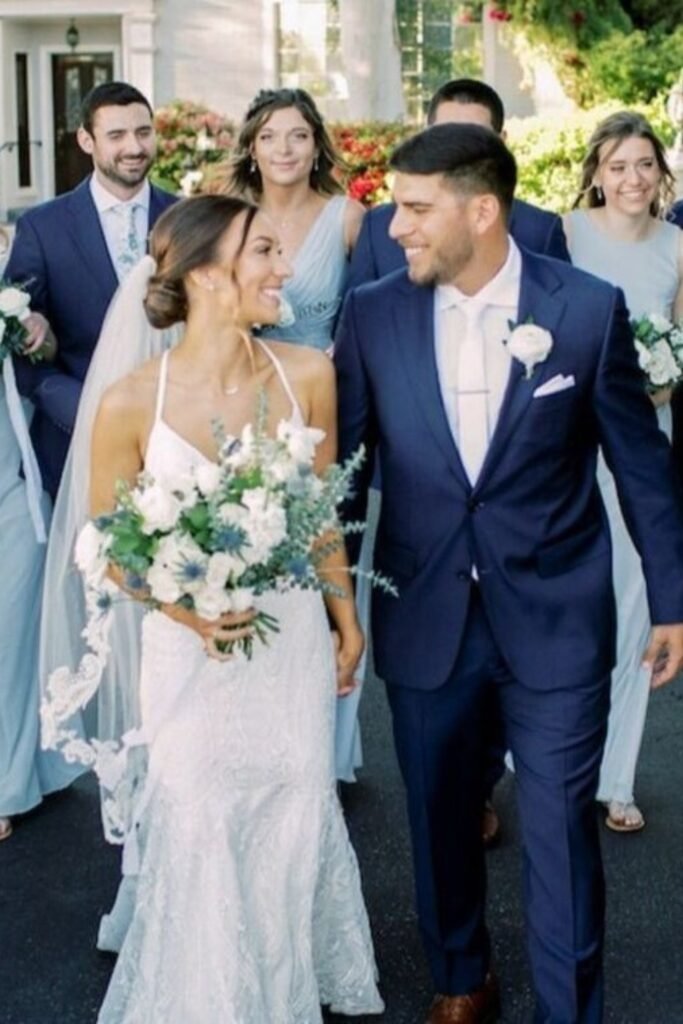
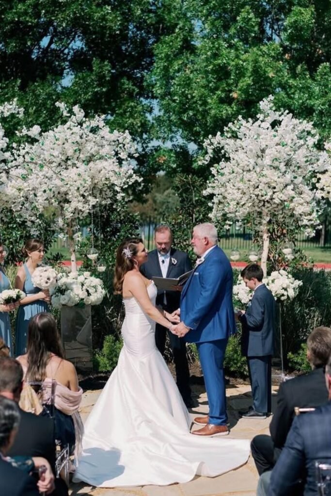
Blue Groom Suit
Daniel actually looked at this approach for about five minutes before deciding he’d feel “too fancy” (his words). But honestly, a blue groom’s suit is such a good move for couples who want the theme to feel balanced.
It works especially well in garden settings where greenery and white flowers keep everything from feeling too matchy. The groom becomes part of the color story instead of just standing next to it.
Just make sure the bridesmaids’ blue is different enough that nobody looks like they’re wearing uniforms.
Soft Blue Tables
This is how you do blue without committing your entire wedding to it. Soft blue linens give guests somewhere calm to rest their eyes while still clearly expressing your color choice.
White florals and clear glasses keep everything feeling light — which is crucial because heavy blue table settings can make a reception feel like a business dinner.
Plus, if you change your mind about anything else, the tables anchor the whole theme.
Gold Chair Contrast
Light blue with gold chairs is one of those combinations that just works. The warmth from the gold prevents blue from feeling cold, and the blue keeps gold from feeling too flashy.
This setup is perfect for indoor venues with neutral walls where you need the decor to create all the personality. The color contrast does the work so you don’t need dramatic centerpieces or complicated details.
Repeating the blue in small touches like napkins ties it together without overdoing it
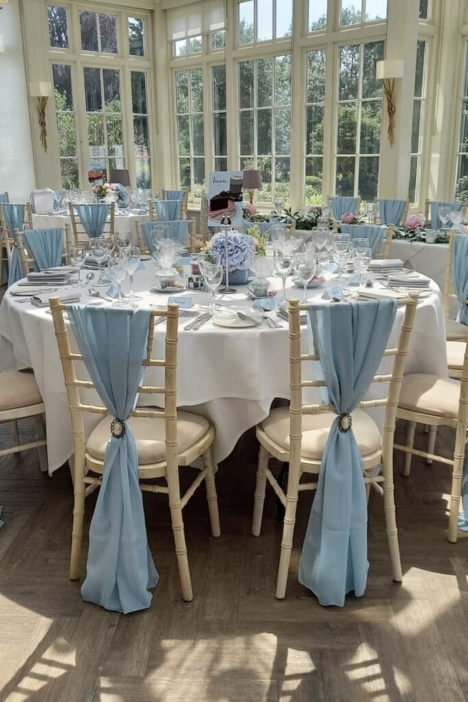
Chair Sash Accent
Chair sashes are genius if you’re renting and can’t choose your chair color. They’re also great if you want flexibility — you can add them, take them off, or adjust them right up until guests arrive.
In bright spaces like this, the soft blue fabric adds just enough color without competing with all that natural light streaming in.
This is probably the most budget-friendly way to bring blue into your reception decor.
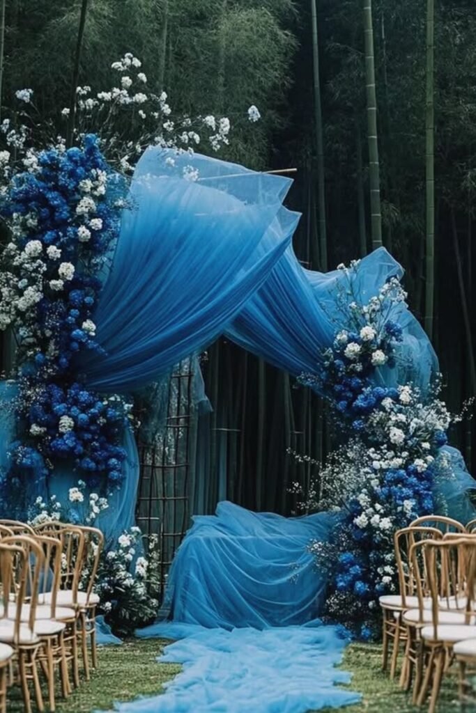
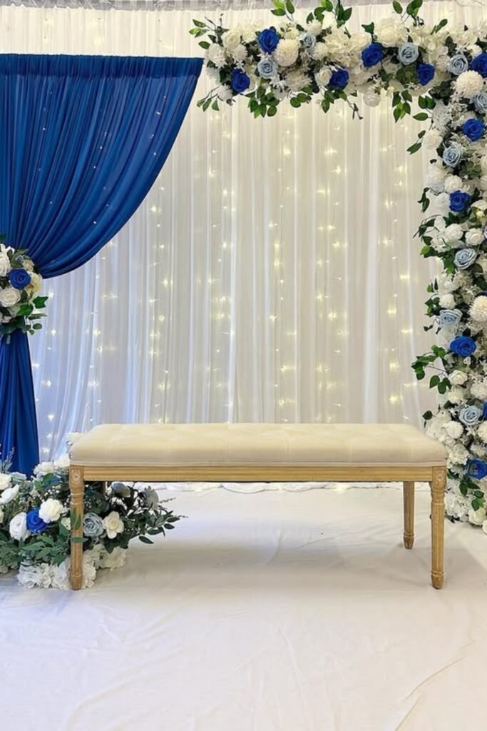
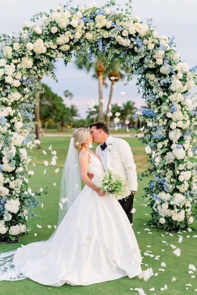
Statement Blue Arch
If you want drama, put your blue at the ceremony altar. This creates instant impact and gives you that wow moment without spreading color everywhere else.
The white florals mixed in keep it romantic instead of overwhelming, which is important because your ceremony photos will be mostly of this backdrop.
You can actually keep your reception decor pretty simple after something this bold — the ceremony arch does all the heavy lifting for your theme.
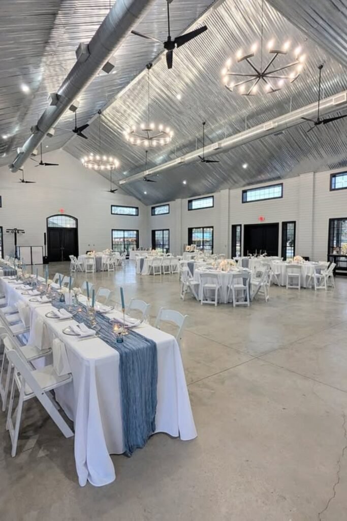
Modern Barn Runner
Barn venues can handle bold choices, but I love how restrained this blue runner feels. It guides your eye down those long tables without fighting the industrial ceiling or lighting.
This is smart for venues that already have a lot of character — you don’t need to compete with the space, just complement it.
Simple centerpieces let the runner be the color moment at each table.
Soft Blue Tablescape
Pale blue glassware is such a subtle way to repeat your color theme. Most guests won’t even consciously notice it, but it creates this cohesive feeling throughout the reception.
The tent setting here is perfect because that soft lighting makes everything feel warm and romantic, which balances out cooler blue tones naturally.
This approach avoids the “too much blue” problem while still making it clear that blue was intentional
Draped Ceremony Backdrop
A fabric backdrop like this instantly frames your ceremony space and gives the photographer something beautiful to work with. Deep blue feels dramatic but not overwhelming when it’s balanced with good lighting.
This works especially well indoors where you control the lighting completely — you can make sure the blue looks rich instead of flat or muddy.
Save this post for later ❤️
Keep everything else light so the backdrop reads as intentional design, not just a dark wall behind you.
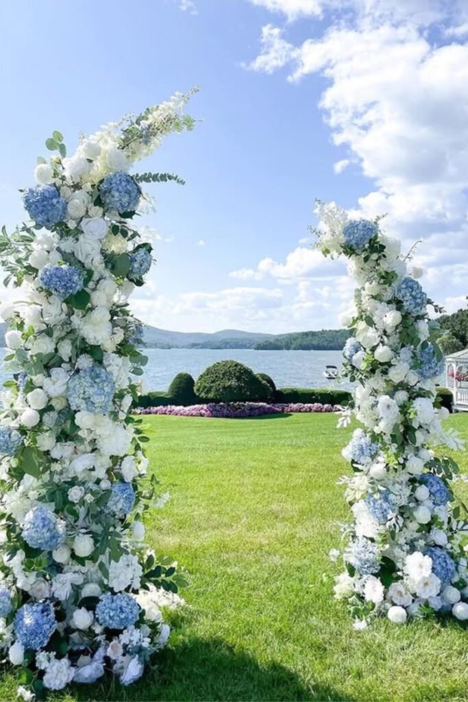
Floral Pillar Altar
Two structured floral arrangements create this beautiful outdoor altar that doesn’t compete with the natural setting. The blue hydrangeas echo sky and water tones without looking forced or theme-y.
This style is perfect for waterfront or garden venues where you want some structure but don’t want to block the natural beauty behind you.
Concentrating your blue at the ceremony lets you go simpler on reception decor while still honoring the color throughout the day
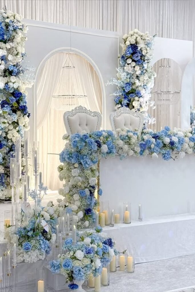
Floral Stage Focus
This is what happens when you fully commit to blue at the ceremony. The layered florals, arches, and soft candlelight create this grand focal point that photographs beautifully from every angle.
The symmetry and structure work best indoors where lighting makes all those blue tones look rich and intentional instead of overwhelming.
When your ceremony setup is this dramatic, guests won’t even notice if your reception decor is simpler.
Banquet Table Flow
Long banquet tables with soft blue florals create this calming rhythm that guides guests naturally through the space. I love how peaceful this feels.
Tented receptions are perfect for this because the greenery overhead and warm lighting make blue tones feel softer and more romantic.
Repeating the same pale blue down the entire length keeps everything cohesive without needing dramatic centerpieces at every single seat
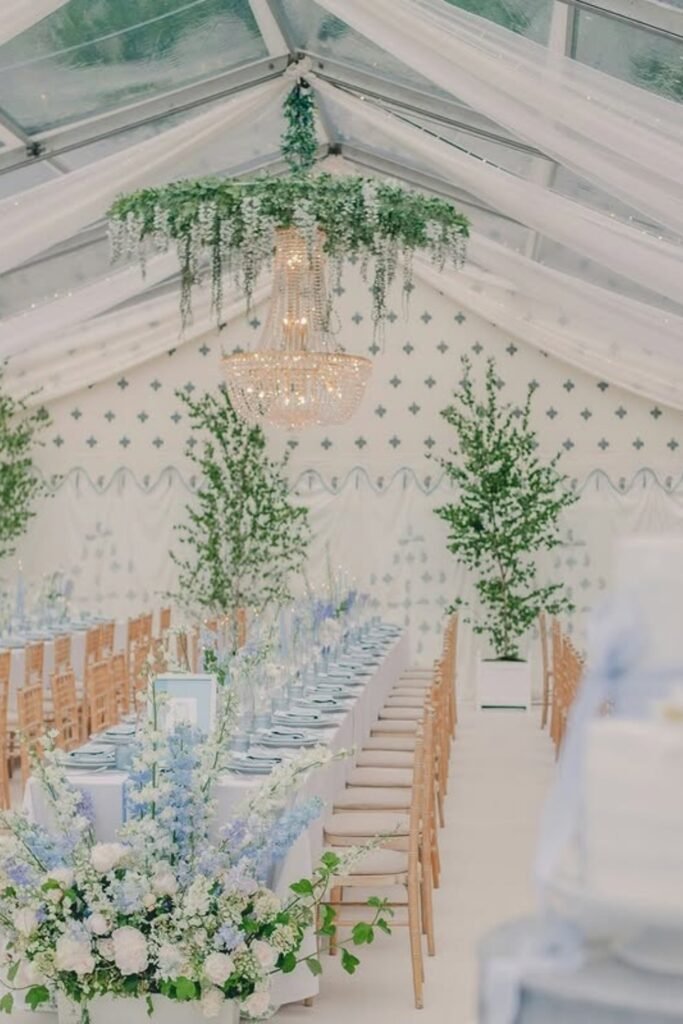
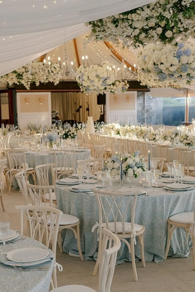
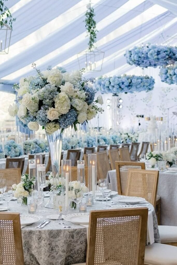
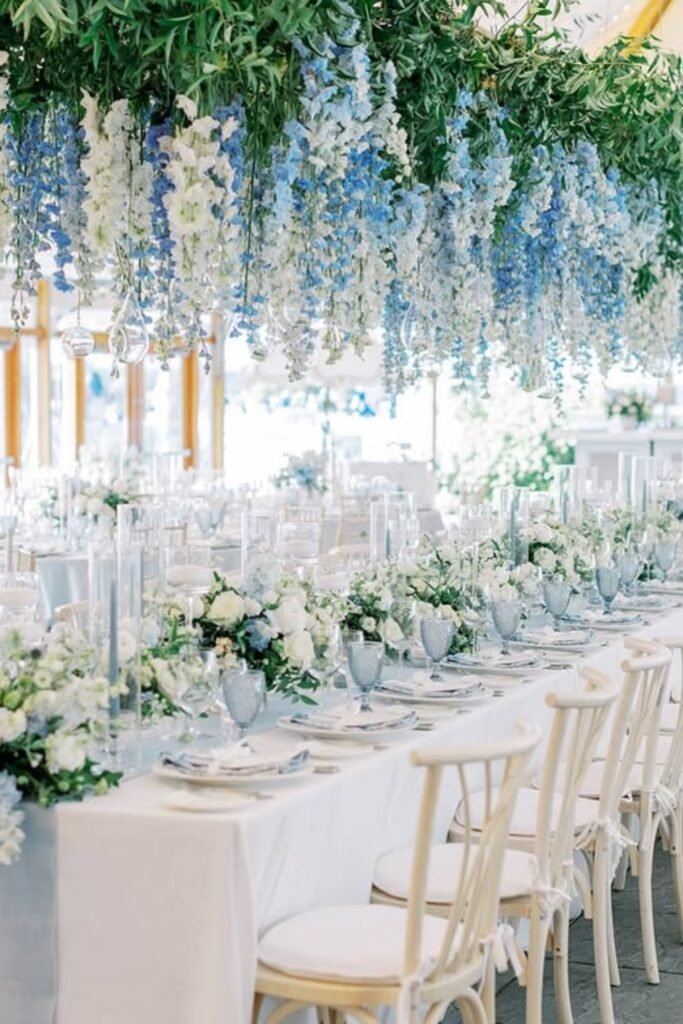
Hanging Blue Installations
Suspended floral installations make the whole reception feel immersive instead of just decorated. Guests look up and see blue, look around and see blue — it becomes the whole experience.
This approach works best in large tents or spaces with high ceilings where overhead decor prevents everything from feeling flat or empty above the tables.
Keeping the tables white lets the hanging elements be the star without creating visual chaos.
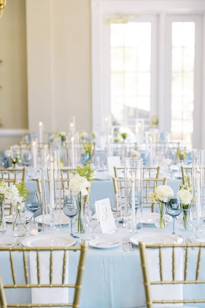
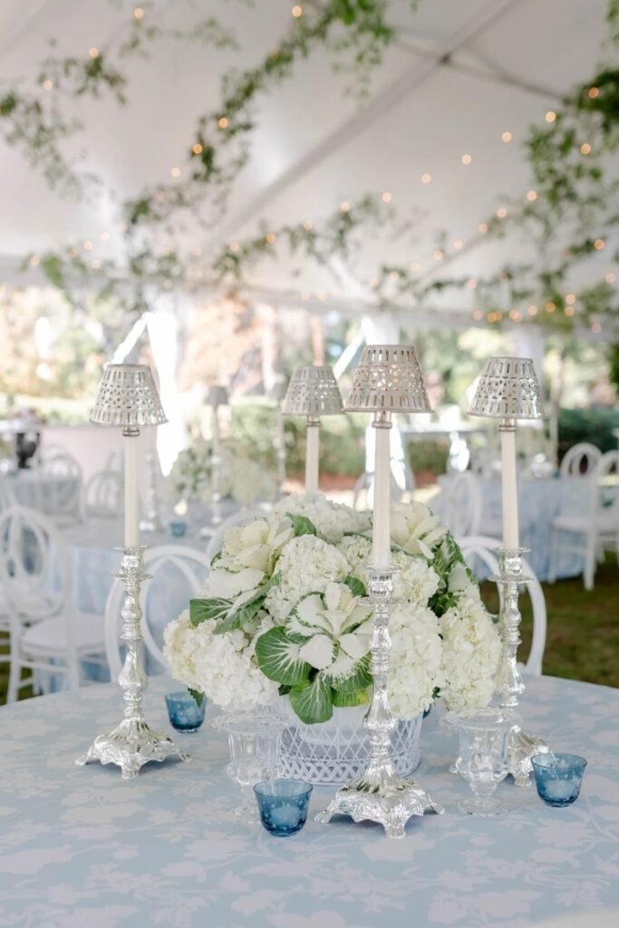
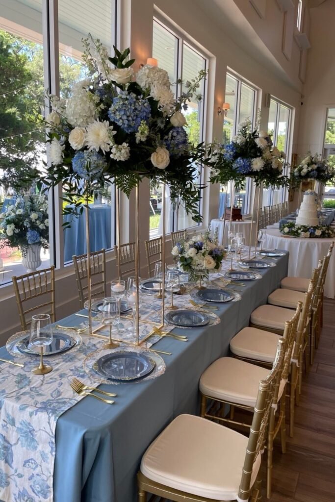
Elevated Table Centerpieces
Tall blue and white centerpieces add serious drama, especially with warm wood or gold seating. This feels formal but not stuffy, which is exactly what you want for an upscale reception.
The height creates visual interest from across the room while still letting guests talk comfortably at table level.
Neutral linens keep the centerpieces as the focal point without competing with all that beautiful floral work.
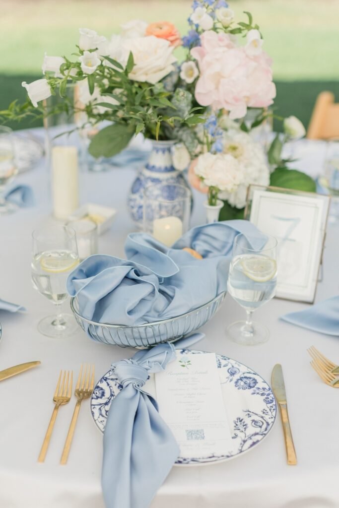
Blue Napkin Styling
Sometimes the simplest touches make the biggest difference. Soft blue napkins immediately set a calm tone when guests sit down — they know they’re somewhere thoughtful and intentional.
Gold flatware and white linens let the napkins be the color moment without overwhelming the place setting. This works especially well outdoors where natural light enhances those softer blue tones.
Plus, napkins are one of the most budget-friendly ways to incorporate your wedding colors.
Window-Side Banquet
Natural light streaming through those windows makes the muted blue linens feel soft and romantic instead of heavy or formal. The long table layout creates this graceful flow through the space.
White florals and greenery keep everything balanced — the blue feels intentional but not overwhelming or theme-park obvious.
This setup guides the eye naturally along the table length while keeping the overall vibe calm and cohesive
Classic Blue Arch
A full floral arch layered with blue and white blooms gives you that picture-perfect ceremony moment. It frames the couple beautifully without blocking the natural setting behind them.
This style works best outdoors where greenery and open skies balance out those cooler blue florals naturally.
When you put this much blue at the altar, you can definitely go lighter on reception decor and still have a strong theme throughout the whole day
Hanging Floral Canopy
This overhead blue installation transforms the entire reception into an experience. Guests feel surrounded by color instead of just sitting near it.
Long tables work perfectly with this approach because the hanging elements connect everything from ceiling to tabletop visually.
White chairs and linens keep the blue overhead feeling dreamy instead of overwhelming during dinner and speeches.
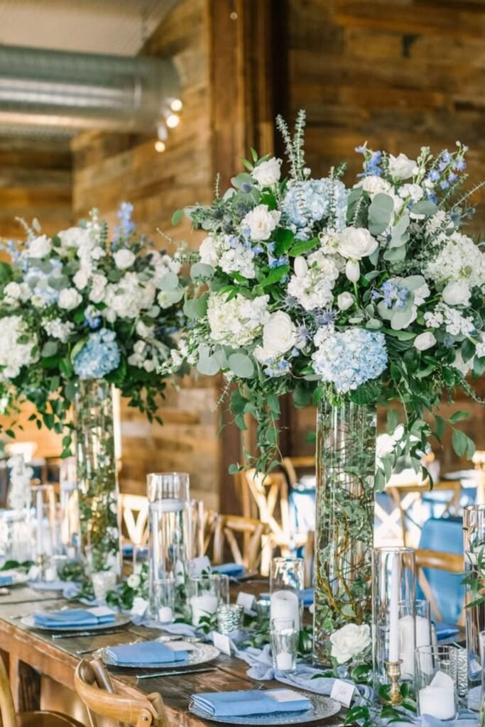
Rustic Blue Florals
Tall blue and white arrangements soften those rustic wood tables perfectly. The contrast feels romantic instead of too casual for a wedding reception.
Glass cylinders keep everything airy so the blue florals stand out without blocking conversation between guests. Simple linens let the natural wood texture and soft blue tones share attention comfortably.
This is probably my favorite approach for barn venues — elevated but not trying too hard.
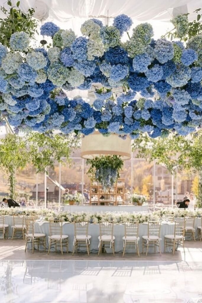
Hydrangea Ceiling Moment
When you want to make a statement, this is how you do it. A dramatic hydrangea installation overhead turns your reception into something guests will remember forever.
Large venues or tents can handle this kind of vertical drama — it prevents the space from feeling empty or disconnected above the table level.
Keeping tables mostly white below ensures the ceiling installation feels intentional rather than overwhelming throughout the entire dining experience.
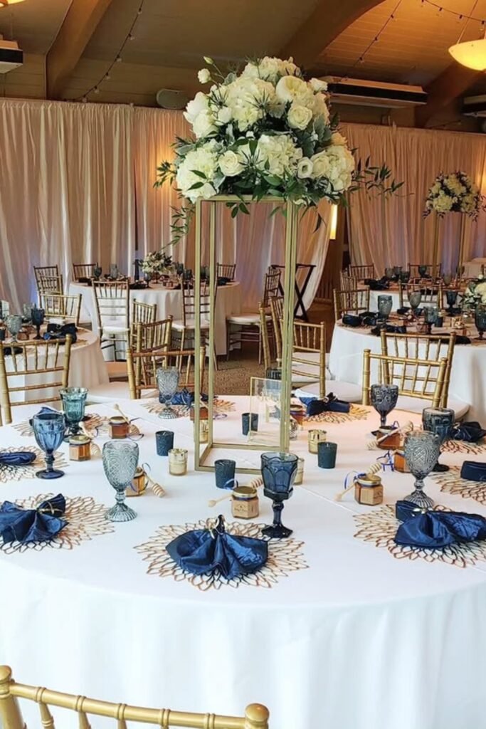
Navy Table Contrast
Deep navy napkins and blue florals create this richer, moodier take on blue that feels polished and sophisticated outdoors. Perfect for evening receptions where darker blues photograph beautifully under candlelight and string lights.
The white linens and light wood chairs keep everything refined instead of heavy or too formal for the setting.