Gender Neutral Baby Shower Ideas That Are Stylish, Sweet, and Loved by Everyone
I’ve been scrolling through baby shower ideas for weeks now and honestly… every “gender neutral” setup looks exactly the same. Beige balloons, woodland creatures, more beige.
You don’t want pink or blue, but you also don’t want your shower to look like it came from the same Pinterest board as everyone else’s.
You want something that feels intentional, not like you just removed all the color and called it neutral.
Here’s what I’ve learned after planning Jake’s shower (and helping my friend Priya with hers): neutral doesn’t have to mean boring if you know what you’re doing.
Let me show you what actually works.
Why Gender Neutral Showers Feel So Hard to Plan
The problem isn’t that neutral is limiting… it’s that removing pink and blue suddenly makes every other decision feel enormous.
When you can’t default to “it’s a girl” or “it’s a boy,” you actually have to think about what you want the shower to feel like.
Which is harder, but also better.
Most people start with decorations, which is backwards. You need to decide the vibe first.
Do you want cozy and earthy? Modern and clean? Playful but sophisticated?
Once you know that, the colors pick themselves. The real overwhelm comes from seeing the same sage-and-cream setup everywhere and thinking that’s your only option.
Trust me, it’s not.
Also, can we talk about how everyone acts like neutral means no personality? That’s ridiculous.
Save this article for later! 👇👇
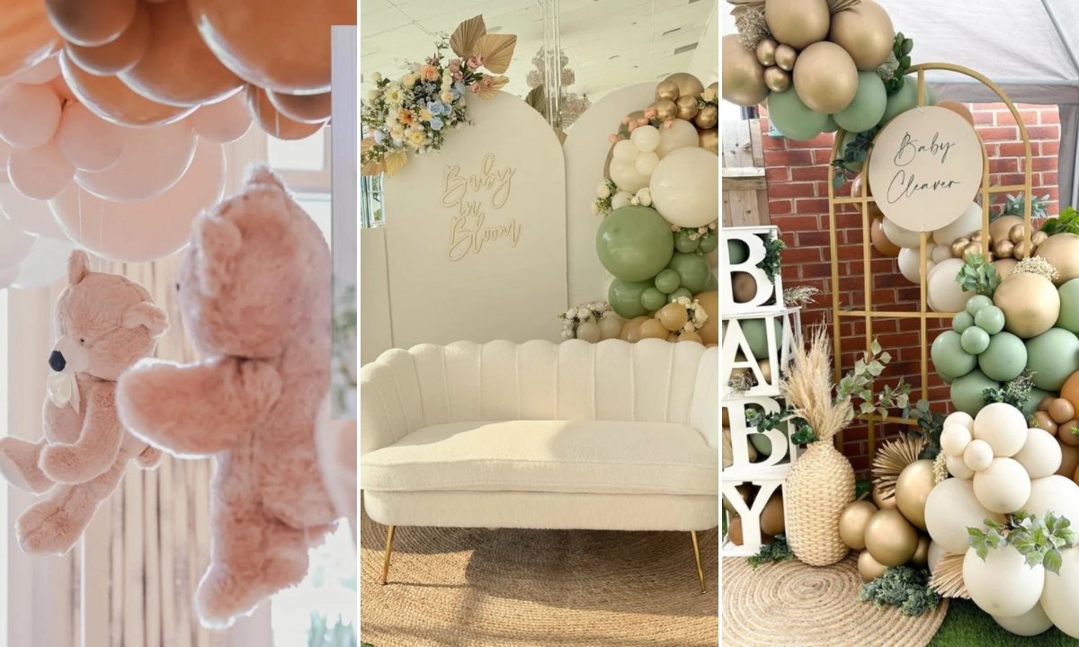
Baby in Bloom
Okay, this is how you do florals without looking like every other shower on Instagram.
Instead of pastels everywhere, they used sage, cream, and muted gold with just enough warmth to keep it from feeling cold. The flowers are tucked into the balloon clusters, not taking over the entire wall.
The round sign with script lettering keeps it modern instead of rustic-farm-chic.
If you’re going to try this, mix matte and metallic balloons so it doesn’t look flat in photos. Also, start with the backdrop structure first, then add florals… not the other way around.
The key here is restraint. Let the greenery soften everything while the backdrop stays structured.
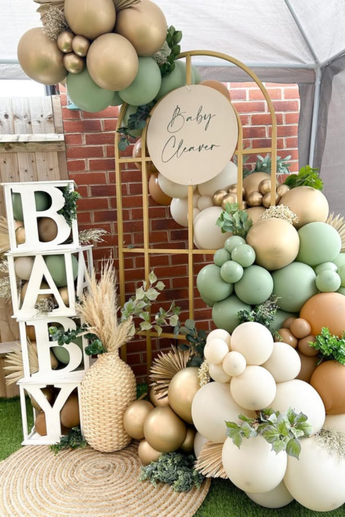
Earthy Balloon Arch
This is what I mean about building one strong focal point instead of decorating every surface.
That layered balloon arch does all the work. Cream, olive, tan, and muted gold in different sizes creates depth without needing a theme.
The dried palms tucked between clusters add texture, and the textured rug underneath grounds the whole thing (literally).
When your balloon installation looks this intentional, you don’t need much else. Clean backdrop, maybe a simple dessert table.
The whole shower feels styled without looking overdone.
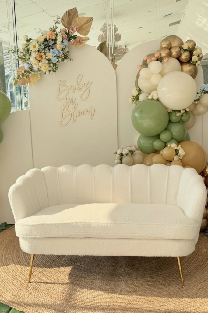
Floating Teddy Moment
I love this because it’s playful without being cutesy.
Suspending soft teddy bears underneath balloon clusters adds charm, but keeping everything monochromatic (creams and warm blush) keeps it sophisticated.
The different heights create movement, and placing it near a window lets natural light make everything look softer in photos.
This works if you want cozy and sentimental instead of bold and dramatic. It’s sweet without being saccharine.
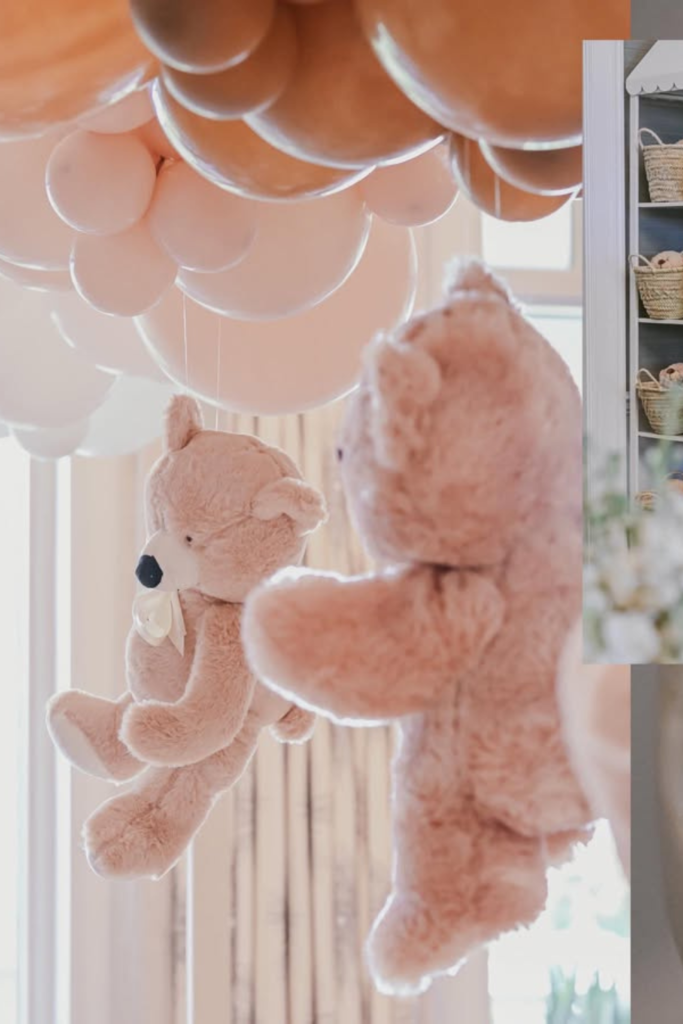
Modern Arch Setup
If you like clean lines and don’t want anything too organic, this is your direction.
The curved panels create height and structure, while the balloons frame the sides instead of covering everything. Notice how much breathing room there is in the center? That’s what makes it look modern instead of busy.
Sage, cream, and soft gold are enough. You don’t need twelve colors to make an impact.
Add one statement piece like a dessert cart to anchor the space, but keep the focus on that clean arch structure.
Citrus Sweet
Okay, this completely changed my mind about using brighter colors.
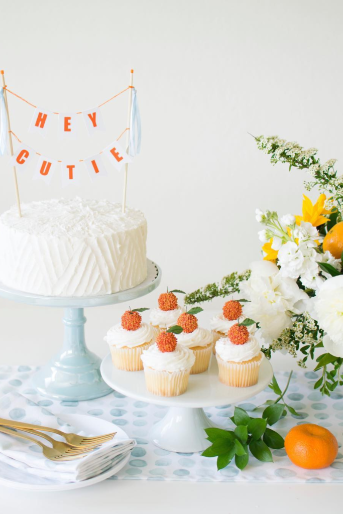
A clean white cake with tiny pops of orange feels fresh without leaning gendered at all. The “Hey Cutie” banner is playful without being over the top.
Adding real citrus on the table and warm yellow florals brings the whole thing to life without overwhelming the clean base.
If you’re nervous about using color, this is how you do it… one cheerful accent that carries all the energy while everything else stays simple.
Perfect for spring or summer showers when you want something bright but not loud.
Bumble Baby
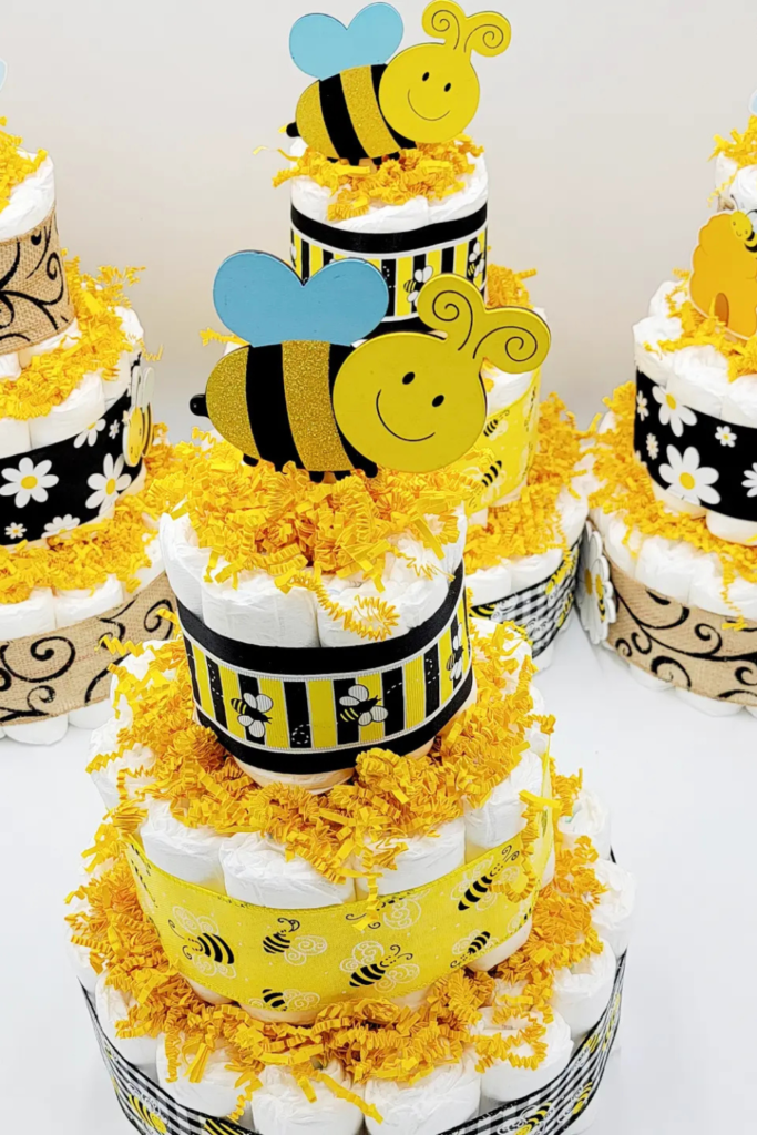
Yellow is so underrated for neutral showers, and a bee theme works because it’s cheerful without any gender coding.
The trick here is balancing that bold yellow with natural textures (burlap) and crisp white so it doesn’t feel cartoonish.
Those diaper cakes styled with bee cutouts are genius… they’re practical gifts that double as decor.
If you’re doing brunch or an outdoor shower, this theme feels natural instead of forced. The contrast between bright yellow and white keeps it intentional.
Champagne Glam
Sometimes neutral means elegant, not earthy.
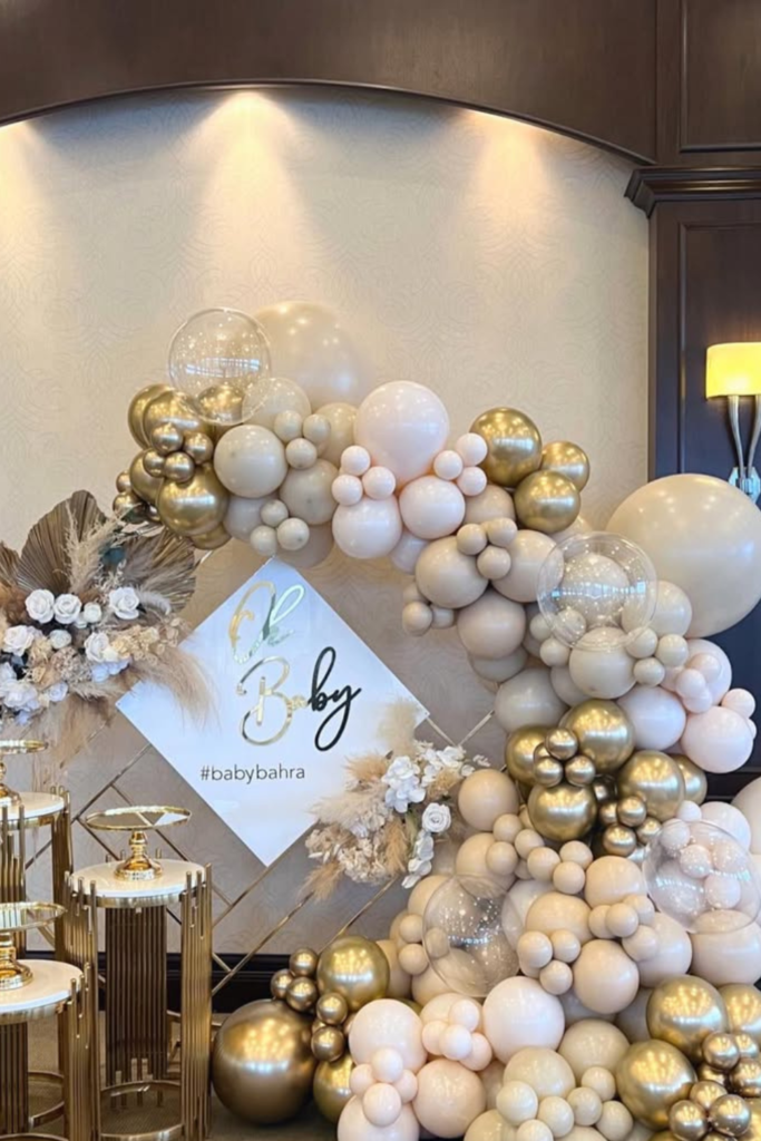
Cream and metallic gold with those oversized balloon clusters feels luxe without traditional pink-and-blue vibes. The different balloon finishes (matte, chrome, transparent) add depth without needing extra colors.
Gold dessert stands tie everything together, and just a few dried accents soften all that shine.
If you’re hosting in a hotel or somewhere formal, this style fits perfectly. It’s sophisticated neutral instead of rustic neutral.
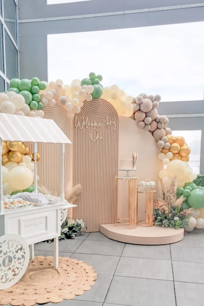
Garden Welcome
There’s something really inviting about this setup… it feels like walking into a soft garden moment.
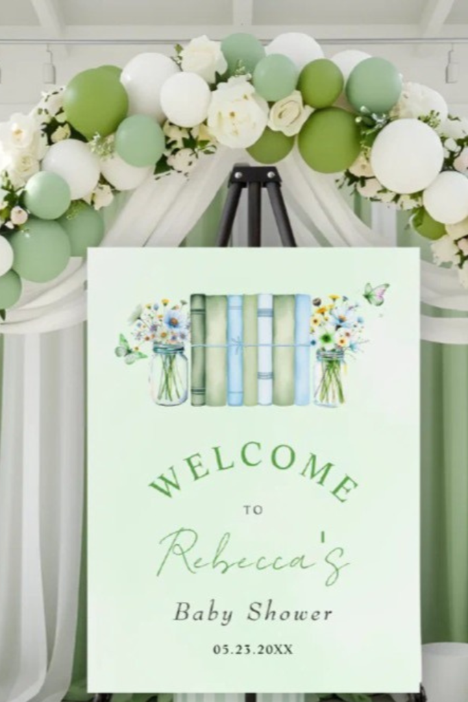
The green-and-white balloon arch frames the welcome sign instead of competing with it. Layering different shades of green (mint, sage, olive) gives it dimension, and the white florals keep everything light.
That draped fabric behind the arch adds softness, especially indoors where you might not have natural texture.
Start with your welcome sign design first, then match your balloons to it. When guests arrive, they immediately get the theme without it being overwhelming.
Save this post for later ❤️
Citrus Game Corner
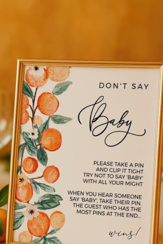
This is how you carry a theme into your games without it feeling like an afterthought.
That beautifully framed “Don’t Say Baby” sign with orange illustrations makes even classic shower games feel curated. Set it beside fresh citrus and simple candlelight, and suddenly your activity table matches your design palette.
When your game station looks this intentional, everything feels cohesive. Even something as basic as shower games becomes photo-worthy.
Safari Neutrals
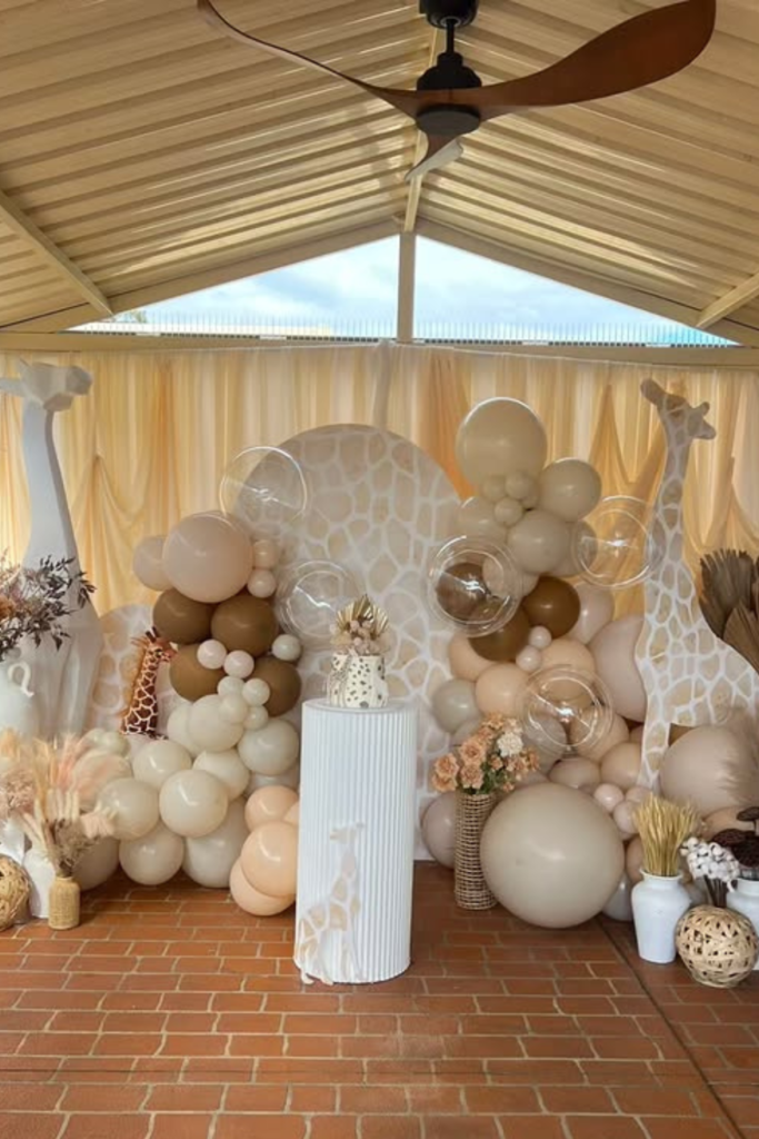
Safari themes can go loud really fast, but this version stays calm and adult-friendly.
Instead of bright jungle prints, they used layered creams, warm beige, and soft browns with subtle giraffe details. The large balloon clusters create impact without chaos.
Dried palms and textured vases bring in that earthy vibe, and if you’re hosting outdoors, this blends beautifully with natural light.
Keep the animal elements oversized and minimal instead of scattered everywhere. It feels themed but still refined.
Woodland Favors
Sometimes the magic really is in the details.
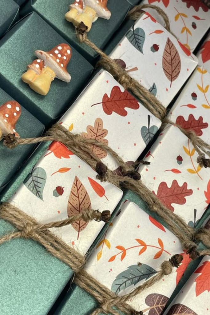
These autumn-inspired favor boxes prove that neutral doesn’t mean minimal. Earthy greens, rust tones, and leaf prints create instant warmth.
Wrapping with twine instead of ribbon keeps it organic, and those tiny mushroom charms add personality without overwhelming the design.
If you’re planning a fall shower, favors like this tie the whole theme together. It feels thoughtful and cozy instead of generic.
Honey Table
Want your tablescape to feel joyful the second guests sit down?
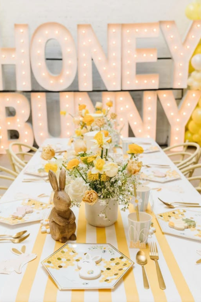
Go bold with yellow, but ground it with white and gold. That striped runner creates instant movement, while soft florals keep it elegant.
Those oversized “Honey Bunny” marquee letters work as both decor and backdrop… you’re not cluttering the space with extra stuff.
Add subtle bunny accents or honeycomb patterns for texture. When you balance brightness with clean white space, the whole table feels fresh instead of overwhelming.
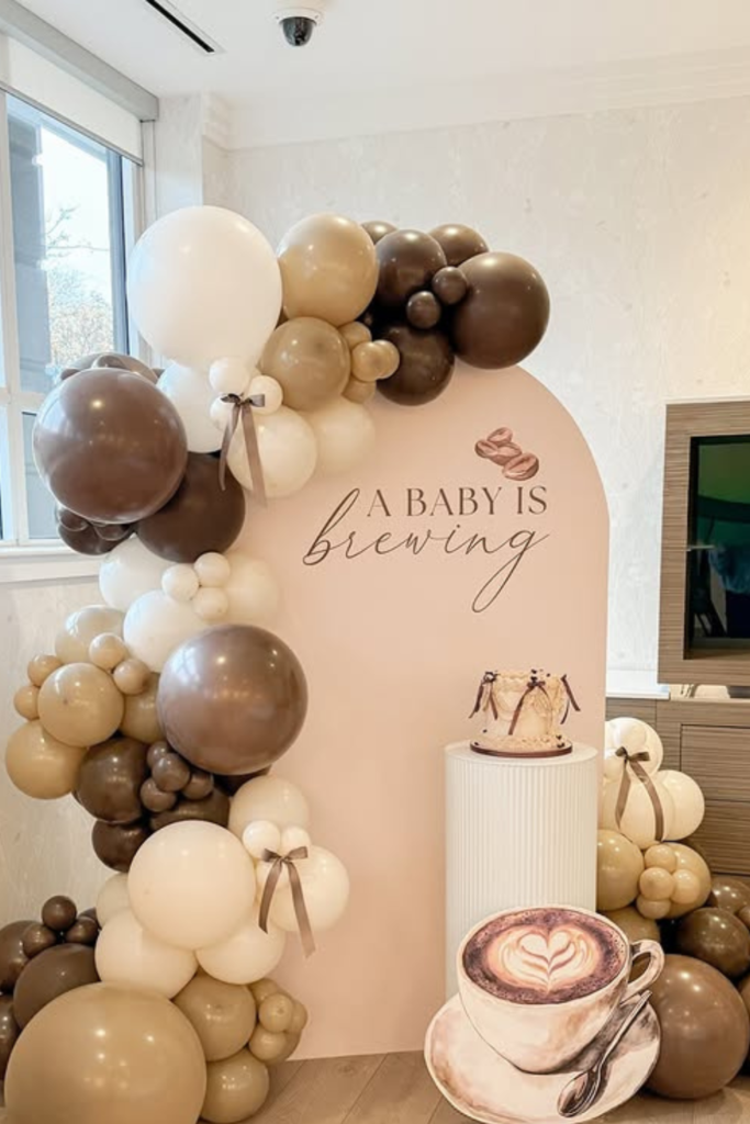
Baby Brewing
This is clever without trying too hard.
“A Baby Is Brewing” works perfectly with mocha, cream, and soft caramel tones. Instead of bright colors, build your palette around coffee shades… latte beige, espresso brown, frothy white.
Those small bows on balloons add a subtle, cozy touch. A coffee cup cutout or café-style signage sets the mood instantly.
If you’re hosting brunch, this theme feels natural. Keep everything warm and layered so it feels like your favorite café.
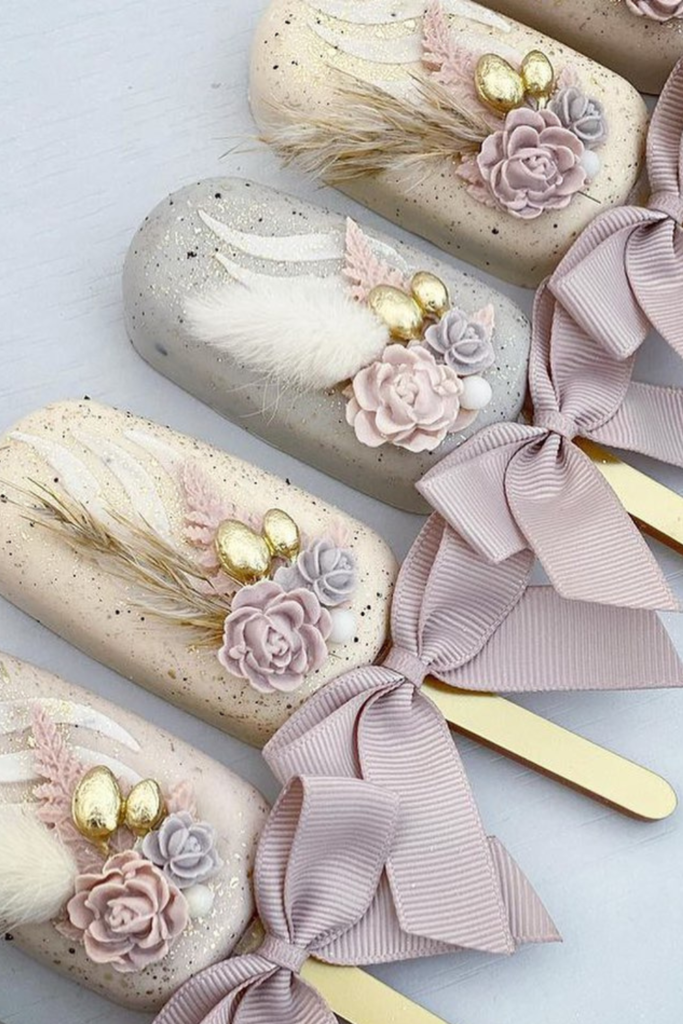
Boho Treats
Your desserts can absolutely double as decor if you style them thoughtfully.
These soft, speckled cake pops with dried florals and ribbon bows show how neutral sweets can look elevated. Choose muted blush, beige, or dusty mauve instead of bright icing colors.
Add tiny gold accents for depth. The bow detail makes them feel intentional instead of generic.
When your treats match your theme colors, your dessert table looks curated before guests even take a bite.
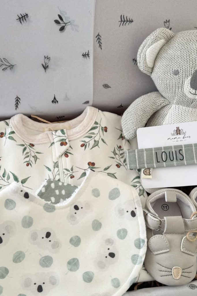
Neutral Gift Box
If you’re putting together a gift display, think texture over trend.
Soft sage prints, knitted toys, linen bibs, and neutral baby shoes create a cohesive look without screaming “theme.” Everything laid in a box with simple botanical paper so even the wrapping matches.
Stick to two or three muted shades. When everything coordinates subtly, the gift table feels styled instead of cluttered.
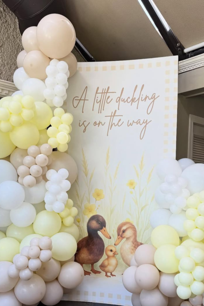
Little Duckling
Yellow doesn’t have to be loud to make an impact.
This soft duckling setup proves that pale butter tones mixed with cream and beige can feel sweet and modern simultaneously.
Layer balloons in slightly different shades so the backdrop doesn’t look flat. Keep the illustration soft and storybook-inspired rather than cartoonish.
“A little duckling is on the way” adds charm without being over the top. It’s playful but beautifully neutral.
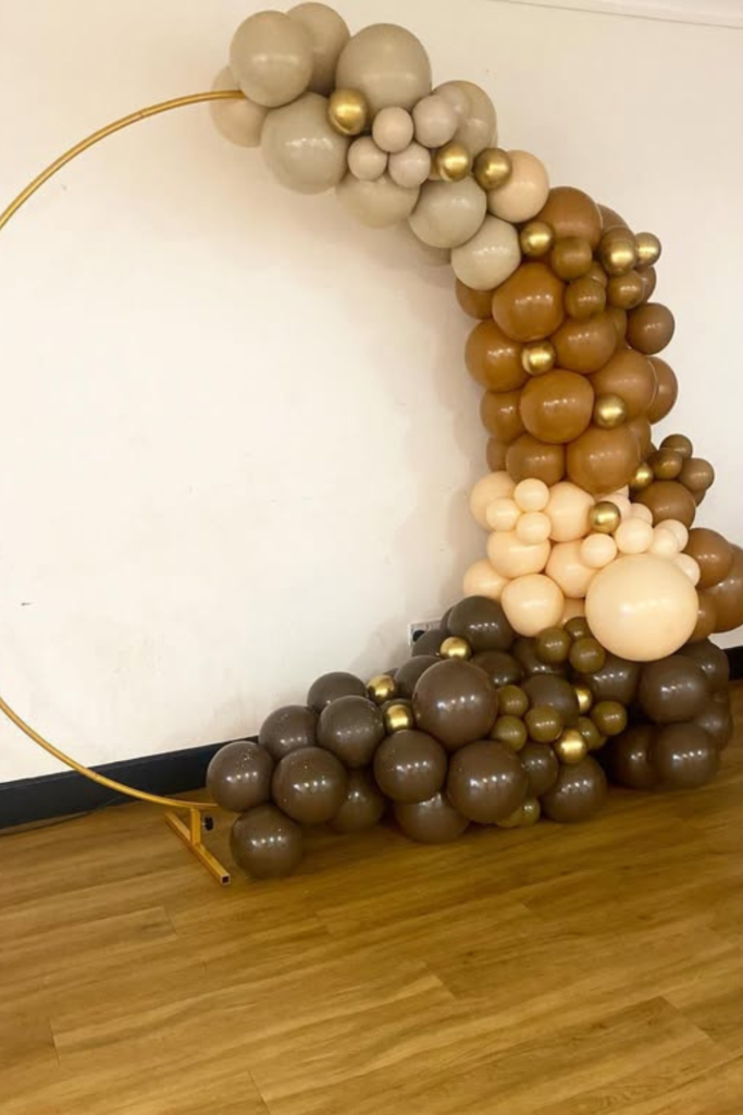
Mocha Crescent
If you want neutral to feel bold without adding color, play with shape.
This crescent balloon frame proves that silhouette alone can make a statement. Deep chocolate, caramel, sand, and metallic gold create richness instead of brightness.
The circular gold stand keeps it sculptural and modern. You don’t even need signage… the color story does all the talking.
If your venue is simple, this kind of curved installation adds instant drama while staying completely gender neutral.
Ray of Sunshine
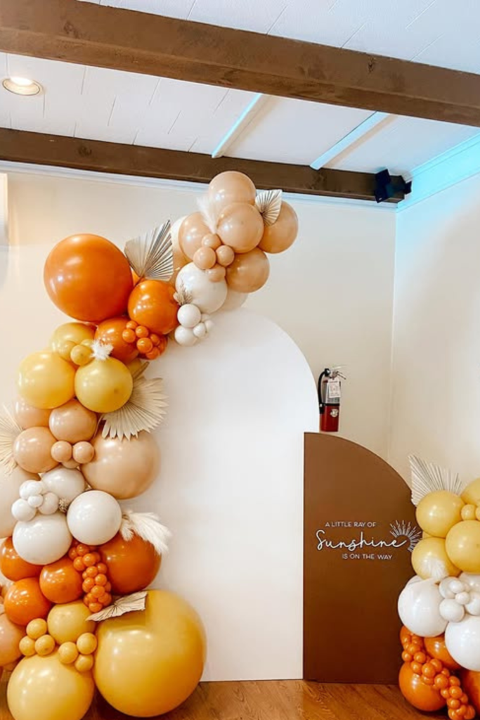
Sometimes the mood sets the theme.
“A Little Ray of Sunshine” works when you blend warm peach, soft yellow, and creamy white. Notice how the oranges are balanced with neutral tones so it doesn’t feel loud.
Small dried palm fans and matte balloons soften the brighter shades. If you’re nervous about using color, anchor it with a white backdrop first, then layer the warmth around it.
Mommy Banner
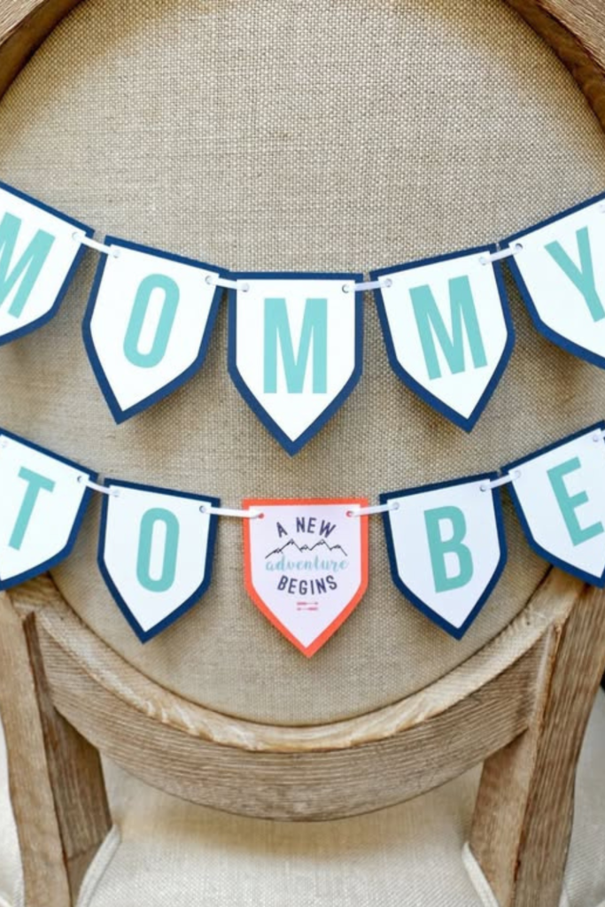
Don’t underestimate small details.
A “Mommy to Be” banner draped across a chair creates an intimate focal point without needing a full backdrop. This works especially well for gift-opening or brunch-style showers.
Choose soft blues, sage, or muted tones instead of traditional baby colors. The key is placement… hang it where photos will naturally be taken.
Adventure Awaits
If you want something completely different from florals and balloons, lean into a travel theme.
A cake topped with a globe, tiny suitcases, and city name tags tells a story instantly. Carry that into the dessert table with passport cookies, cloud toppers, and soft sky-blue accents.
Keep the palette dusty rather than bright so it feels timeless. This theme works especially well if the parents love to travel… it feels personal instead of trendy.
Neutral doesn’t have to mean nature.