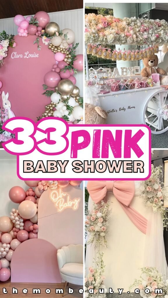
Pink Baby Shower Ideas That Don’t Look Overdone
I’ve been to exactly one pink baby shower that didn’t make me secretly cringe, and honestly? It changed everything I thought I knew about this color.
Most pink baby showers feel like someone dumped a craft store into a blender and called it a theme. But when my friend Sarah did hers last spring, every single detail felt intentional… even though she swears she threw it together in two weeks.
The difference was simple: she picked one shade of pink and built everything around it instead of trying to use every pink that exists. Here’s how to create that same cohesive look, plus 33 setups that actually work.
Let’s be honest about what makes some pink showers gorgeous and others… not.
How to Create a Cohesive Color Palette That Looks Professionally Styled
Here’s what I learned from Sarah’s shower: you can’t just walk into Target and grab everything pink.
Choose one primary pink first. Blush, dusty rose, pastel, hot pink – pick one and commit to it as your main character.
Then add exactly two supporting colors. Sarah used blush with cream and gold, and it looked expensive even though half of it came from the dollar section.
If you want something modern, try dusty rose with beige and sage. Going for glamorous? Hot pink with metallic gold works beautifully.
The secret is repeating those exact colors across everything – balloons, flowers, table settings, even the napkins.
Every time you add a random shade (oh, this coral is so pretty!), you’re breaking the spell.
Use the 60-30-10 rule: 60% your main pink, 30% secondary color, 10% accent.
I promise, once you nail this before you start shopping, everything else falls into place. No more standing in the party store wondering if mauve and rose gold “go together.”
Save this article for later! 👇👇
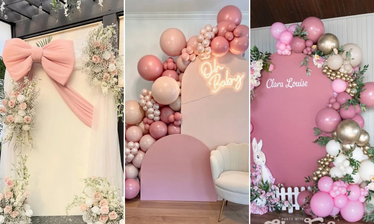
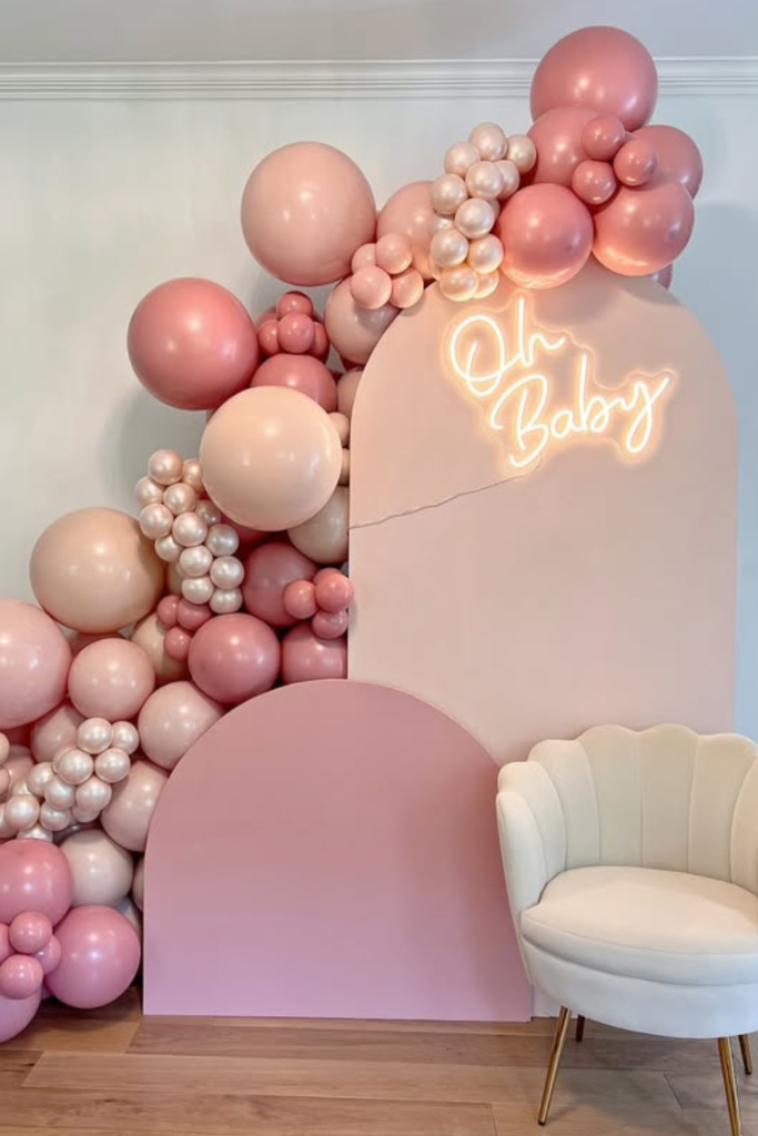
Blush Arch Moment
This setup gets it right because it doesn’t try to do twelve things at once.
The blush arch with layered balloon clusters creates that expensive depth without needing a million decorations scattered around. Mixing different balloon sizes makes it look custom instead of like you bought a kit from Amazon.
That soft neon sign adds warmth and gives photos a subtle glow (which your pregnant friend will appreciate when she’s already feeling puffy). The simple accent chair turns this into a natural photo station instead of an awkward “stand here and smile” moment.
Keep the palette tight – blush, dusty pink, soft nude. When you stick to three shades max, it looks intentional rather than chaotic.
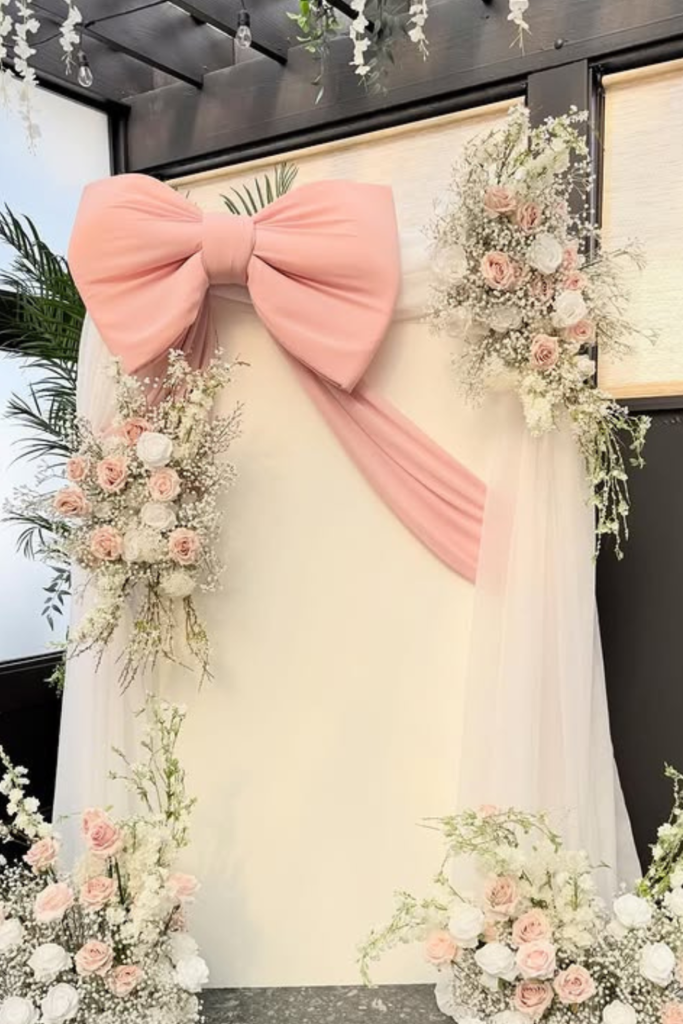
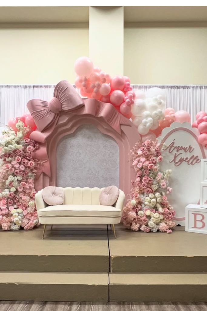
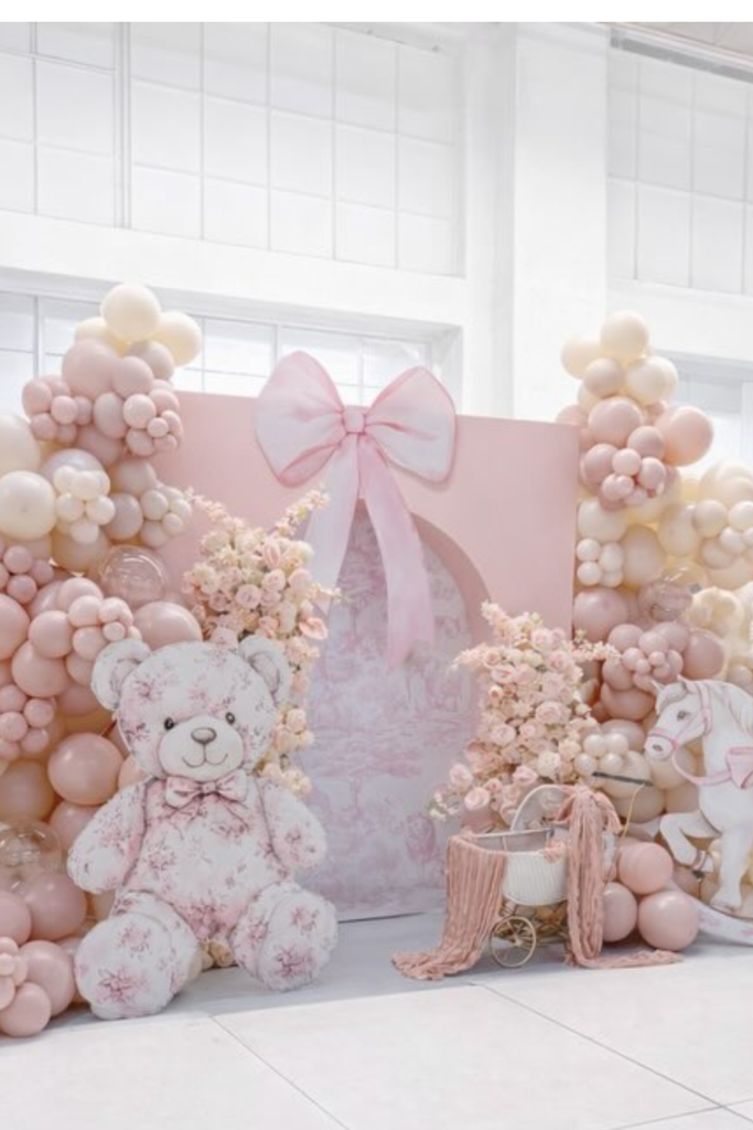
Statement Bow Backdrop
Sometimes one giant detail beats ten small ones.
That oversized pink bow immediately sets the tone without needing explanation. The trick is balancing it with delicate florals and sheer draping so it doesn’t look flat against the wall.
I love the contrast here – structured bow, flowy fabric, organic flowers. It keeps your eye interested instead of just landing on one element and staying there.
Place floral arrangements at different heights to frame the backdrop naturally. This works perfectly for a garden party theme where you want romance without balloons taking over every surface.
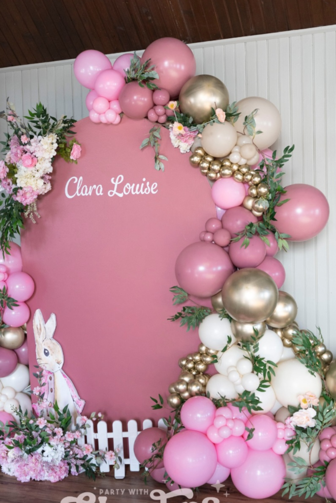
Personalized Balloon Wall
Put the baby’s name front and center if you really want it to feel custom.
A statement wall with the name surrounded by layered balloons and greenery immediately feels tailored instead of generic. The mix of matte pinks with gold and cream keeps it rich without being overwhelming.
Add small themed touches like that bunny cutout, but don’t go overboard. The key is layering: balloons first, then greenery, then florals. That order keeps everything looking intentional instead of randomly stuck on.
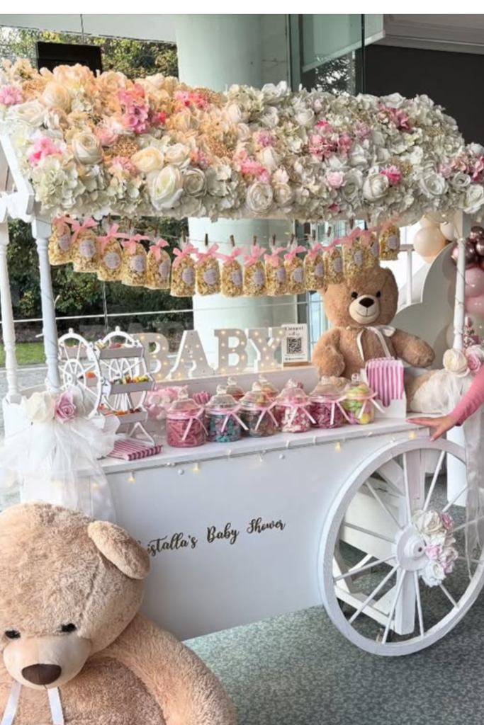
Teddy Cart Display
A decorative cart instantly creates more visual interest than a standard table.
Top it with a floral canopy and draped fabric to soften all those hard edges. The oversized teddy bears nearby make the space feel immersive rather than just decorative (and kids at the party will actually have something to do).
Keep desserts coordinated in pink, ivory, and hints of gold so nothing clashes. Style in clusters instead of spreading everything evenly – group sweets in sections so the display feels curated.
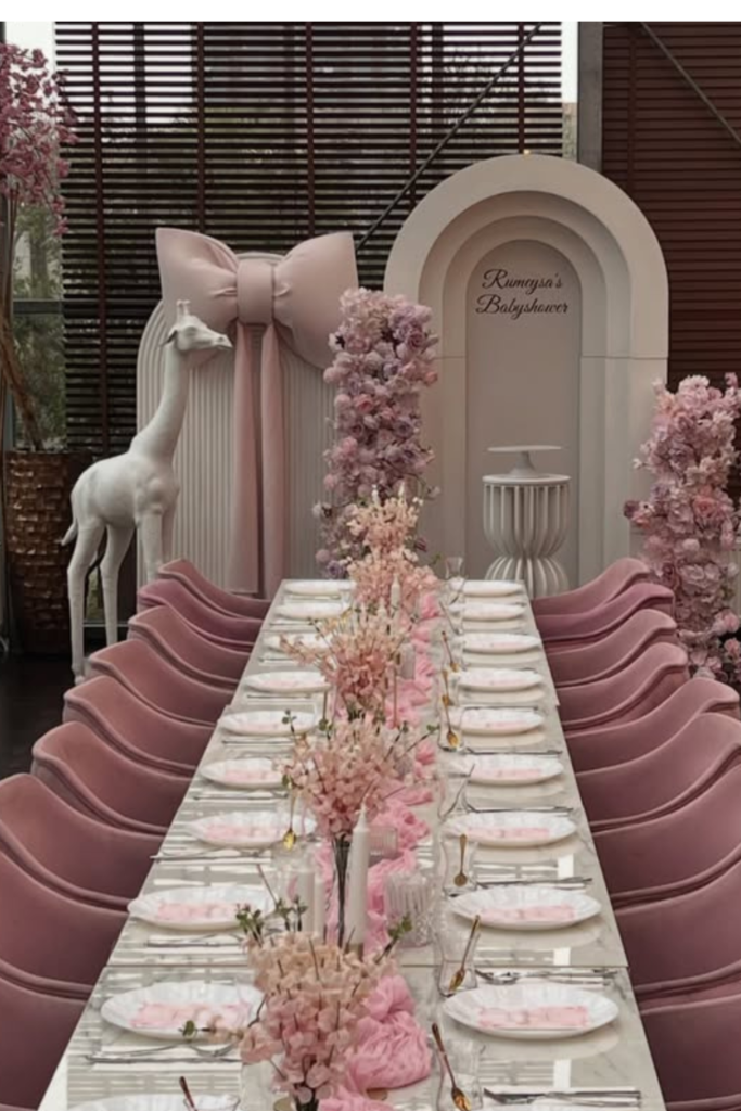
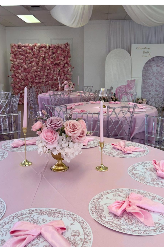
Elegant Tablescape
If you want guests to feel like they walked into an actual event, don’t skip the dining setup.
A long blush table with matching chairs immediately elevates everything. The pink isn’t screaming here – it’s layered through florals, napkins, and subtle backdrop details instead of painted on every surface.
Focus on symmetry. Line up florals down the center, keep place settings consistent. When everything is evenly spaced and color-coordinated, it gives that high-end event feel without requiring excessive décor everywhere else.
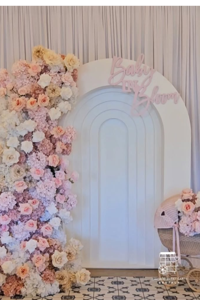
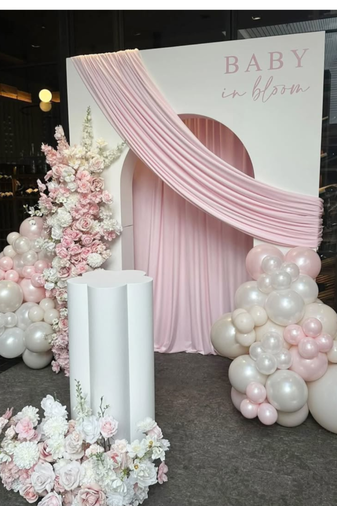
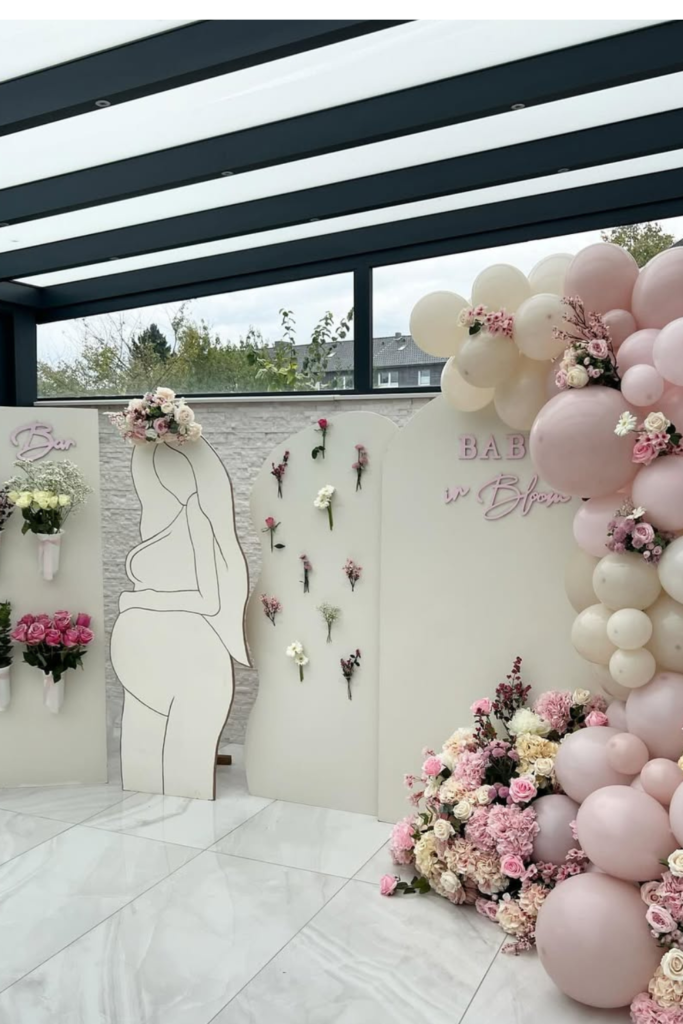
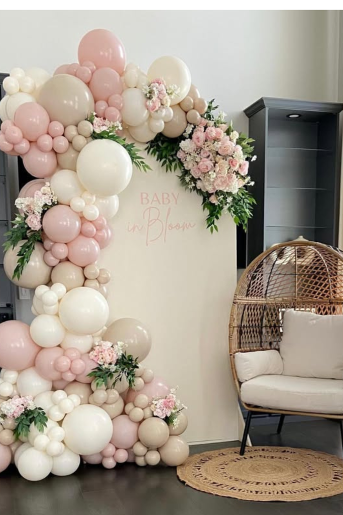
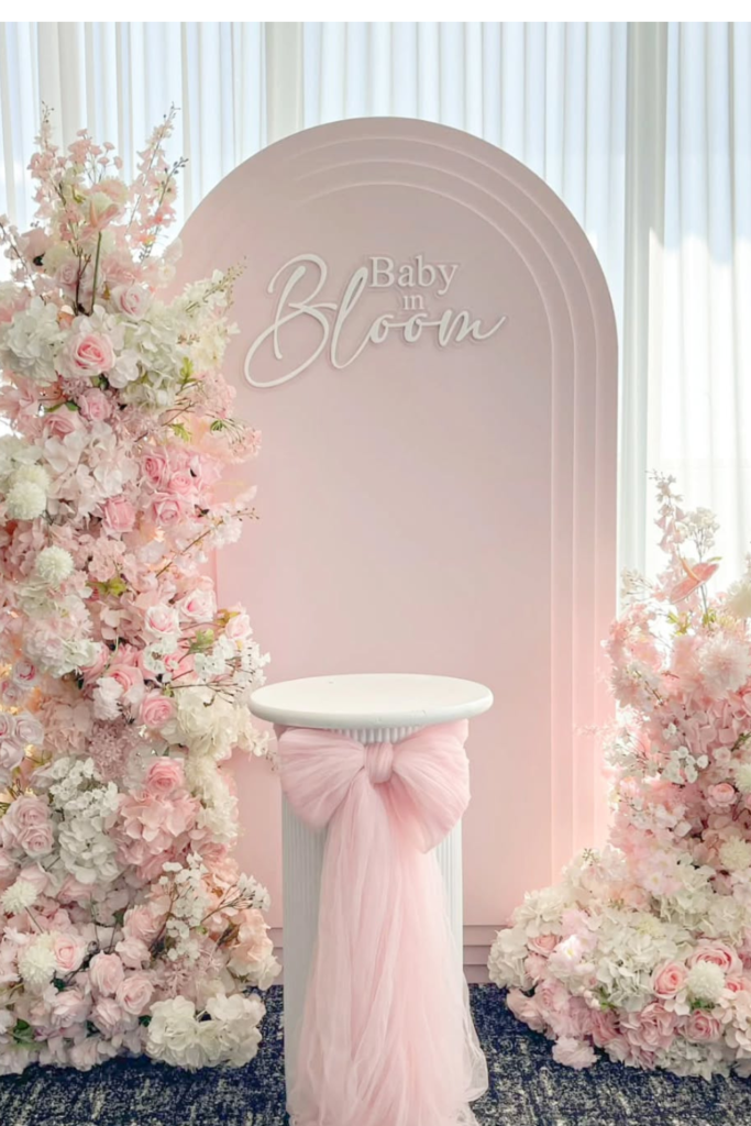
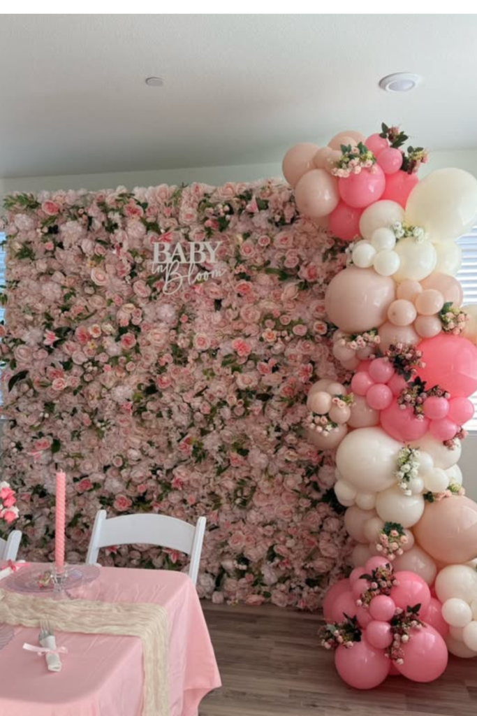
Baby in Bloom
Draped pink fabric over clean white panels softens everything without looking messy.
Add that vertical floral arrangement on one side to create height and balance the balloon clusters below. The contrast between crisp white and blush details keeps it airy instead of heavy.
If you’re recreating this, choose one floral tone (like those blush roses) and repeat it throughout. Mixed bouquet vibes never photograph as well as you think they will.
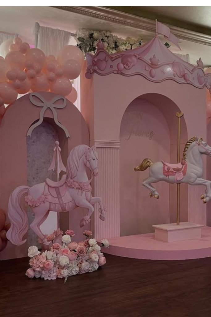
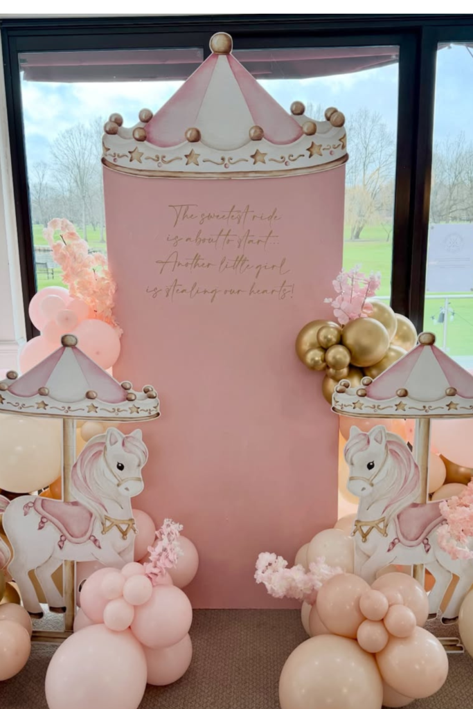
Carousel Princess
When you commit to a theme, really commit.
The carousel horses and arched panels create actual dimension so the backdrop doesn’t look like a cardboard cutout. But notice the controlled color palette – soft pinks and creams only. That’s what keeps it magical instead of overwhelming.
Balloon arches framing the structure tie everything together and make the whole setup feel intentional. This works beautifully for larger venues where you need a strong focal point that can hold its own in the space.
Pink Garden Tables
Round tables create a softer, more conversational atmosphere than long ones.
Blush tablecloths with gold candle holders warm up the room instantly. Instead of massive centerpieces that block conversation, choose compact floral arrangements that let guests actually see each other.
A flower wall in the background ties everything together without crowding the dining space. And here’s a detail that makes a difference: those napkins folded into bows. Subtle, but it reinforces the theme without being obvious about it.
Bloom Wall
Sometimes you want something artistic instead of obviously decorative.
Clean panels with intentional floral placements feel modern and curated. The soft backdrop with blush balloons on one side stays current, while those pinned florals add garden touches without overwhelming everything.
Don’t scatter flowers randomly if you try this – place them in small, spaced clusters so it looks deliberate.
Save this post for later ❤️
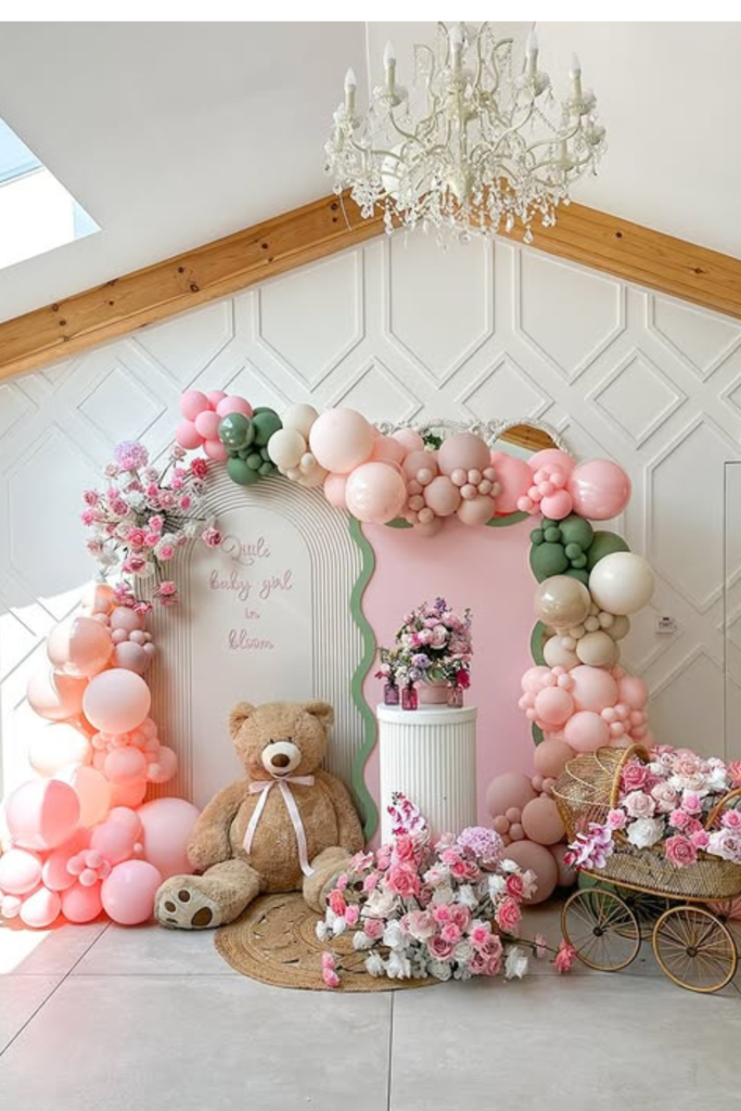
Soft Garden Corner
Not every backdrop needs to demand attention.
This one works because it blends blush balloons with muted greens and soft florals – that “freshly picked” look instead of store-bought perfection. The teddy bear and vintage stroller warm up the space and make it feel cozy rather than staged.
Keep balloon colors slightly varied – dusty pink, peach, cream – for layers. The textured rug underneath grounds everything so the setup doesn’t look like it’s floating awkwardly in the room.
Balloon Cascade
You don’t need a full wall to create impact.
A cascading balloon arrangement flowing down one side creates drama without taking over the entire room. Mixing greenery into the balloons softens the look and makes it feel organic instead of plastic-heavy.
Perfect for smaller spaces – it leaves room for seating while still giving you a gorgeous photo area. Just keep the palette tight: blush, ivory, and soft pink are plenty.
Princess Stage
If you’re going big, go all the way.
A raised stage with oversized bows, layered balloon arches, and those BABY blocks creates a legitimate focal point. The secret to keeping it from looking chaotic is repetition – the same pink tones in florals, balloons, and signage throughout.
Add comfortable seating in the center so the mom-to-be has somewhere styled to sit for photos. When everything frames that central spot, the whole setup feels intentional.
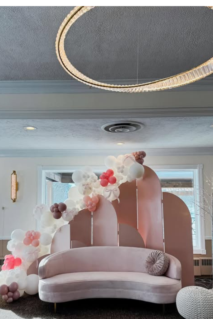
Modern Lounge Setup
Think lounge instead of photo booth if you want something that feels current.
That curved blush sofa in front of layered panels softens everything and makes photos look natural instead of posed. The balloon garland flows diagonally rather than symmetrically, which feels more styled and less staged.
Keep the colors subtle – ivory, soft pink, touch of mauve. The overhead chandelier makes everything feel upscale without adding more décor on the floor level.
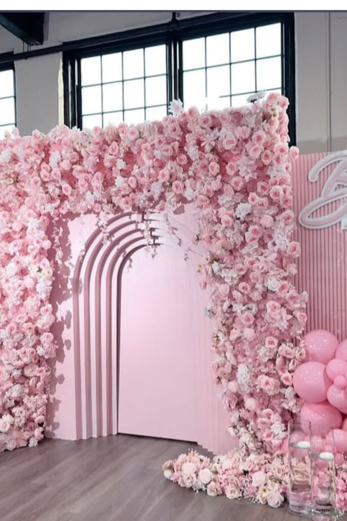
Floral Archway
This is for that secret “wow” entrance moment.
A full floral arch creates depth without needing ten different elements. The key is commitment – if you’re going floral-heavy, let flowers dominate and keep balloons secondary.
Use layered arch cutouts in the center for dimension. The monochromatic pink palette keeps it cohesive even with a lot happening. Low floral arrangements at the base ground the entire backdrop.
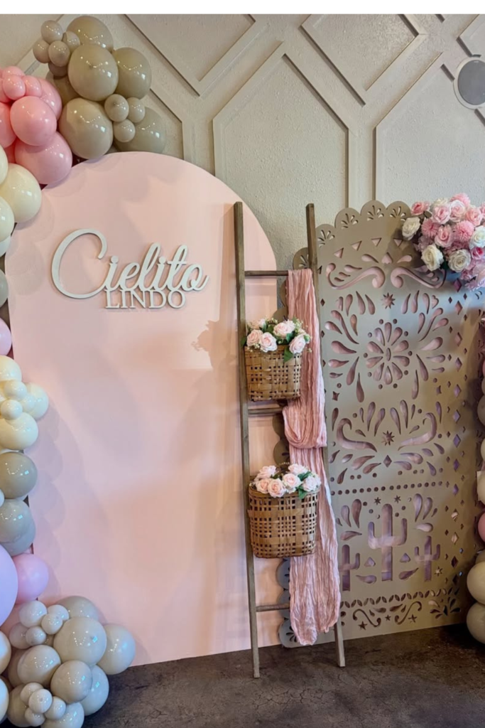
Chicita Lindo
Mix blush with beige and taupe instead of white for a warmer, more modern feel.
That muted combination feels current and sophisticated. Add textured panels to create visual interest without extra color. Small styling details like the ladder with hanging baskets make the space feel layered instead of flat.
The contrast between smooth balloon clusters and detailed panels gives you depth without clutter.
Bloom Statement
Sometimes less structure, more florals works better.
A single blush arch panel with oversized floral arrangements on both sides creates balanced, elegant framing. To make it feel high-end, stick to one flower palette – soft pink, ivory, hints of peach – and repeat consistently.
The tulle-wrapped pedestal adds softness and texture. Perfect for smaller venues where you want impact without massive installations.
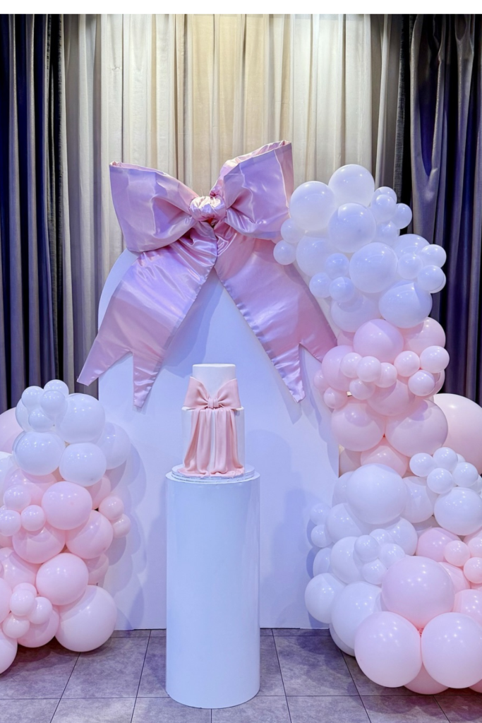
Bow Cake Stage
Build the entire setup around the cake if it deserves its own spotlight.
The sculpted white backdrop with oversized satin bow frames the cake without needing extra props. Keep balloon clusters soft and rounded so they don’t compete with the bow detail.
A tall pedestal gives height and makes photos look more editorial. Limit colors to baby pink and white so the bow becomes the focal point.
Carousel Charm
Go symmetrical for princess or fairytale themes.
Matching carousel horse cutouts create balance while blush and gold balloons add warmth. Keep the center panel clean with elegant script so the theme feels refined rather than cartoonish.
Metallic gold elevates soft pinks and prevents flat-looking palettes. This works beautifully near large windows where natural light enhances those creamy blush tones.
Whimsical Wonderland
You can mix teddy bears, carousels, and florals – just unify them through color.
When everything stays within blush, nude, and soft cream, multiple elements coexist without chaos. Oversized character props feel intentional when grounded with balloon clusters at their base.
Think in layers: backdrop first, balloon structure second, character pieces last. That order keeps everything structured.
Bloom Wall Moment
When in doubt, go floral-heavy.
A full flower wall creates instant texture and depth, especially with a coordinating balloon garland on one side. Choose two to three pink shades instead of mixing every tone available to keep it modern.
Small greenery pieces between balloons soften transitions between florals and latex. Perfect behind dining tables or gift areas – turns ordinary corners into photo-ready focal points.
Floral Elegance
Let flowers take the lead if you prefer softness over balloons.
A sculpted white arch with cascading floral installation feels romantic and refined. Keep it in the blush, ivory, and peach family instead of mixing too many pink tones for cohesion.
The vintage pram beside the backdrop makes everything feel storybook without extra signage. Timeless and photographs beautifully from every angle.