26 Burgundy Wedding Theme for 2026

Choosing a burgundy wedding theme often comes with hesitation. You may love the depth of the color but worry it will feel too dark, too heavy, or hard to balance.
Many couples struggle to use burgundy without overwhelming their décor or limiting their color options.
The problem isn’t the shade, it’s knowing where to use it and where to hold back. This guide shows you how to style burgundy with intention.
Pair it with the right colors, and create a wedding that feels rich, refined, and beautifully cohesive from start to finish.
Is a Burgundy Wedding Theme Right for Your Season and Venue?
If you’re wondering whether a burgundy wedding theme fits your season or venue, the answer depends on how you plan to use it.
Burgundy naturally feels richer and deeper, which is why it works effortlessly for fall and winter weddings, especially in indoor venues, ballrooms, or candlelit spaces.
For spring or summer, burgundy can still work but it should act as an accent, not the dominant color.
Think florals, stationery, or attire details rather than full linens or backdrops. Venue matters too: darker indoor spaces need lighter neutrals to balance burgundy.
While outdoor or airy venues can handle it more easily. If your venue already feels heavy, start lighter and layer burgundy intentionally.
Save this article for later! 👇👇

Sweetheart Frame
If you want burgundy to feel romantic instead of heavy, use it to frame the sweetheart table rather than covering every nearby surface.
Draped fabric behind the couple draws focus naturally, while soft florals and warm lighting keep the backdrop feeling light and intentional.
This works especially well indoors, where neutral linens and gold chairs stop burgundy from overwhelming the entire space visually for guests attending.

Airy Arch
Outdoor ceremonies look best when burgundy appears only in florals, letting open scenery soften the color naturally around the altar backdrop.
Keeping the arch structure minimal prevents a heavy look and helps burgundy feel fresh even during bright daytime weddings outdoors settings.
This approach suits summer and destination venues where bold color needs breathing room instead of full visual dominance throughout ceremony space.

Table Runner Focus
A burgundy table runner sets the mood instantly while allowing white linens and plates to keep the table visually calm and balanced.
Running burgundy down the center creates impact without crowding, especially when greenery and florals break up the depth along long tables.
This styling works beautifully for formal receptions where repetition feels intentional and neutral chairs keep everything feeling open for all guests.

Gold Balance
Burgundy tablecloths shine best in large venues where lighting and space prevent the color from feeling too intense for guests overall.
Gold chargers and clear glassware reflect light, helping deep tones feel rich instead of heavy during dinner service for everyone seated.
This setup works well for evening receptions when you want drama and warmth without sacrificing brightness.

Chair Accents
Chair sashes are an easy way to introduce burgundy without committing to dark linens or overwhelming the reception tables visually overall.
This keeps white tablecloths bright and clean while burgundy appears repeatedly around the room in a controlled, elegant rhythm for guests.
Tented, garden, or daylight-filled venues benefit most because natural light softens deeper tones and prevents the setup from feeling heavy visually.

Layered Florals
Layering florals in multiple burgundy tones creates depth, preventing the tables from looking flat or overly dramatic during reception styling moments.
Adding muted greenery and lighter blooms helps burgundy photograph better, especially under warm indoor lighting conditions for evening celebrations.
This floral approach works well when décor relies on centerpieces for impact rather than heavy runners or dark tablecloths across tables.

Soft Contrast
Blush runners and soft neutrals instantly lighten burgundy, making the tables feel refined instead of visually overpowering during reception setups overall.
This contrast allows burgundy to stay present while giving the eye places to rest between bold elements across the reception space.
Modern indoor venues benefit most since clean architecture and lighter finishes naturally balance deeper color palettes used throughout formal celebrations.

Statement Centerpiece
Tall burgundy centerpieces concentrate color upward, keeping place settings lighter while still delivering a dramatic visual statement during evening receptions.
This strategy prevents tables from feeling crowded and allows guests to enjoy rich color without visual fatigue throughout the dinner experience.
It works best in large venues with high ceilings where vertical design naturally enhances elegance and scale for formal evening events.

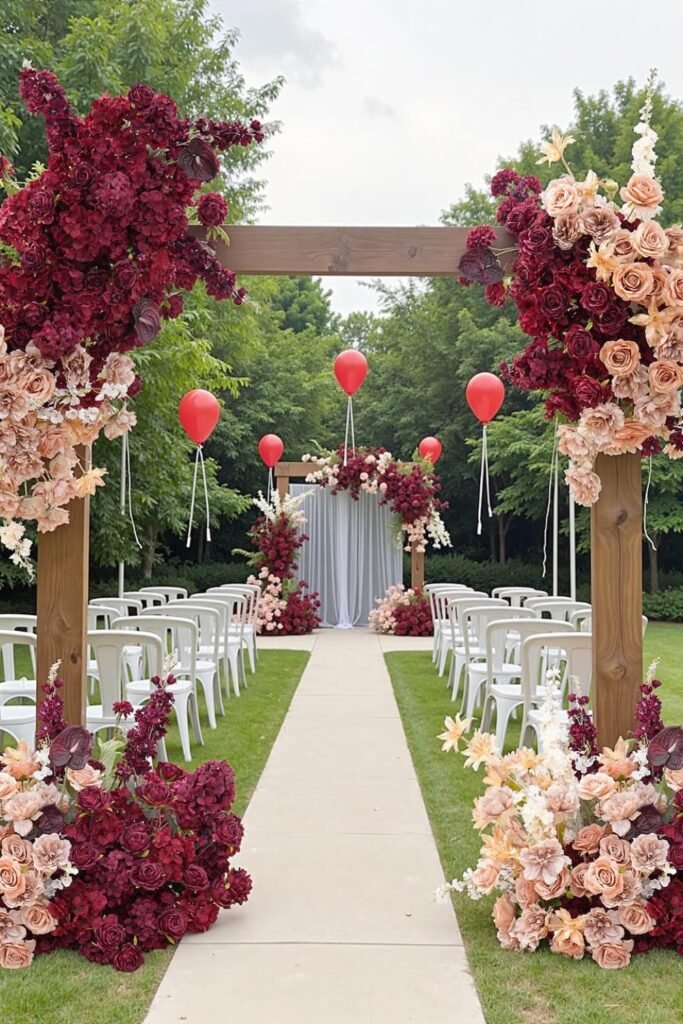
Floral Gateway
A bold floral gateway sets expectations immediately, guiding guests toward the ceremony while showcasing burgundy as a statement.
Blending blush and cream blooms softens the depth, preventing the entrance from feeling overpowering against lush green.
This works best for garden weddings where natural scenery already adds lightness, allowing burgundy florals to anchor the space visually naturally.

Moody Tables
Dark linens instantly shift the mood toward intimate and dramatic, making burgundy feel intentional rather than simply decorative on table surfaces.
Candle clusters and glassware reflections keep the tables from feeling flat, adding warmth that balances the depth beautifully for evening receptions.
This setup suits evening celebrations in historic or industrial venues where low lighting enhances richness instead of hiding details and textures.

Candle Drama
Tall burgundy candles introduce vertical drama, drawing attention upward and creating a luxurious rhythm across each table during formal dinner service.
Paired with lighter linens and clear glass, the color feels romantic instead of heavy under warm lighting conditions at indoor venues.
This approach works especially well for winter weddings where candlelight becomes part of the overall design story for guests visually present.

Draped Backdrop
Layered fabric backdrops allow burgundy to appear structured and soft simultaneously, framing key moments without overpowering photographs.
Using ivory alongside deep tones creates contrast, helping the color read elegant rather than overly dark indoors for most venues settings.
This style fits receptions or ceremonies where walls feel plain and need warmth without permanent décor changes during rented event spaces.

Moody Runner
Dark table runners create depth instantly, allowing burgundy to feel intentional while black linens ground the setup visually in modern spaces.
Cascading florals soften the intensity, guiding the eye down the table and preventing the color from feeling too rigid or severe.
This works best in industrial or brick venues where texture and contrast already support richer palettes without visual overload.

Crystal Glow
Statement chandeliers wrapped in burgundy fabric add luxury overhead, shifting attention upward and keeping tables lighter below naturally.
Warm crystal reflections soften deep tones, making the ceiling décor feel romantic instead of heavy or closed in visually.
This idea suits indoor receptions where lighting plays a major role in shaping atmosphere and elevating simple layouts.

Floral Focus
Concentrating burgundy florals around key areas like cake tables creates drama without spreading dark color everywhere unnecessarily.
Lighter backdrops and clear furniture balance the richness, helping the flowers stand out while keeping the room visually open.
This approach works well for modern venues where minimal décor benefits from one strong, memorable focal point.

Textured Tables
Rich floral textures mixed with fruit and greenery add dimension, keeping burgundy from looking flat or overly formal on tables.
Natural elements break up deep shades, making the setting feel layered, warm, and inviting for guests seated nearby.
This style fits fall or winter receptions where abundance and detail enhance the overall dining experience beautifully.

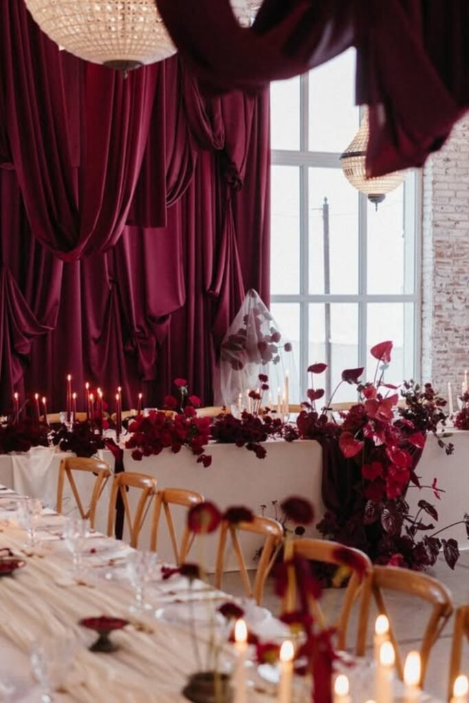
Velvet Backdrop
Deep burgundy velvet instantly creates drama, making this backdrop feel intentional and luxurious rather than simply decorative behind the ceremony space.
Layered draping adds movement and softness, helping the color read rich and romantic instead of flat or overpowering in photos.
This setup works best indoors where controlled lighting enhances texture and keeps deep tones from absorbing too much light visually.

Styled Display
Burgundy tablecloths turn a display table into a design feature, not just a functional surface for décor pieces.
Mixing fruits, florals, and vintage accents adds personality, keeping the look curated rather than overly formal or stiff.
This idea suits outdoor receptions where bold color anchors the setup against open green spaces naturally.

Ceremony Focus
Using burgundy draping and florals at the ceremony creates a strong focal point without overwhelming the surrounding greenery.
Petals along the aisle subtly guide attention forward, reinforcing the theme while keeping the walkway light and inviting.
This approach works beautifully for outdoor weddings where contrast helps the ceremony area stand out clearly.

Candle Romance
Candlelit tables deepen the burgundy palette, creating an intimate atmosphere that feels warm, elegant, and intentionally dramatic.
Gold accents and glassware reflect light, preventing darker tones from feeling heavy across the table setting.
This style fits evening receptions best, especially in classic venues where lighting defines the overall mood.

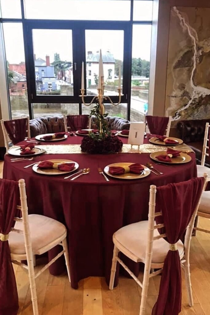
Round Table
A full burgundy tablecloth instantly anchors the reception, creating an intimate dining mood that feels cohesive and intentional for evening celebrations.
Gold chargers, candlelight, and glassware introduce contrast, keeping the deep color rich instead of dark or overwhelming across the entire table setting.
This setup suits indoor venues with windows or warm lighting that balance burgundy tones throughout the space during evening reception hours.

Modern Altar
Vertical panels in burgundy, blush, and charcoal create depth while keeping the ceremony backdrop clean and modern for contemporary indoor venues.
Florals placed at varied heights guide the eye naturally, preventing the design from feeling flat or crowded during intimate ceremony moments.
Candles along the floor soften sharp lines and add warmth, especially in minimalist spaces where lighting plays a major emotional role.

Grand Reception
Burgundy chair sashes introduce color gently, letting ivory linens and gold accents remain visually dominant across large banquet style reception halls.
Tall white centerpieces lift the room visually, preventing darker tones from closing in on the space during formal evening wedding receptions.
This balanced approach works well for large guest counts where elegance matters more than dramatic saturation throughout the entire venue layout.

Napkin Detail
Small details like a burgundy floral napkin instantly elevate the table, making each place setting feel styled rather than simply arranged.
Gold accents and glass chargers frame the color beautifully, preventing darker tones from blending into the table surface visually.
This idea works especially well when you want a burgundy present without committing to full linens or dramatic centerpieces.

Statement Wall
A burgundy floral installation behind the table turns the dining area into a focal point guests naturally gravitate toward.
White linens and soft lighting balance the intensity, keeping the setup romantic instead of overpowering in intimate indoor spaces.
This approach suits engagement dinners or sweetheart tables where photography and visual impact matter most.

Draped Romance
Floor-to-ceiling burgundy draping instantly softens industrial walls, transforming the space into an intimate reception setting that feels warm and intentional.
Candlelight along the tables adds glow and movement, preventing the deep color from feeling flat or visually heavy.
This look works best in loft or warehouse venues where fabric and lighting bring balance to raw architectural elements.

FAQs
Can a burgundy wedding theme feel too dark or heavy?
It can but only when it’s overused without balance. Burgundy works best when paired with lighter neutrals like ivory, blush, or soft gray.
Instead of covering every surface in burgundy, use it strategically in florals, textiles, or accents. This keeps the look rich and romantic, not overwhelming.
What colors pair best with a burgundy wedding theme?
Burgundy pairs beautifully with ivory, champagne, blush, dusty rose, gold, and deep greenery.
For modern venues, charcoal or soft black adds contrast, while outdoor weddings benefit from natural wood tones.
The key is choosing at least one lighter or warmer supporting color so burgundy feels intentional, layered, and visually balanced throughout the space.

Hi, I’m Ali Mehmood! I’m a writer who enjoys exploring different lifestyle topics and sharing ideas that make life’s special moments better.
I write about things that interest me and might help you too – whether it’s planning celebrations, finding inspiration for events, or discovering practical tips for everyday living.
My writing style is straightforward and easy to follow. I believe good ideas don’t need to be complicated, so I focus on what actually works and makes sense.
When I’m not writing, I’m usually reading, exploring new topics, or looking for interesting stories to share.
