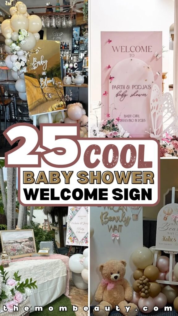
25 Baby Shower Welcome Sign Ideas for 2026
You’ve picked the theme, ordered the decorations, and planned every tiny detail-yet the very first thing your guests will see still feels uncertain.
What size should the welcome sign be? Will the colors print correctly? Should you choose a printable file or a fully editable template?
And most importantly, will it actually look elegant in photos-or accidentally DIY in the wrong way? If you’re feeling stuck, you’re not alone.
In this article, we will discuss why the baby shower sign is important and also see 25 best baby shower sign ideas.
Let’s jump in!
Why a Baby Shower Welcome Sign Is More Important Than You Think
If you want your baby shower to feel thoughtfully planned and instantly impressive, you can’t treat the welcome sign as an afterthought.
Before they notice the dessert table, the balloon arch, or the party favors, they see the entrance. And that entrance quietly sets expectations.
If the sign looks polished and cohesive, guests immediately feel like they’re walking into something special.
If it looks rushed or mismatched, it subtly lowers the overall impact-even if everything else is beautiful.
Your welcome sign also acts as a visual anchor. It ties together your theme, colors, and tone.
Whether you’re going for soft and elegant, playful and colorful, or modern and minimal, the sign introduces that vibe within seconds.
And don’t forget the photos. Guests will take pictures near it. It will appear in background shots.
It becomes part of the event’s visual memory. So if you want the entire celebration to feel elevated, you have to start at the entrance.
Save this article for later! 👇👇
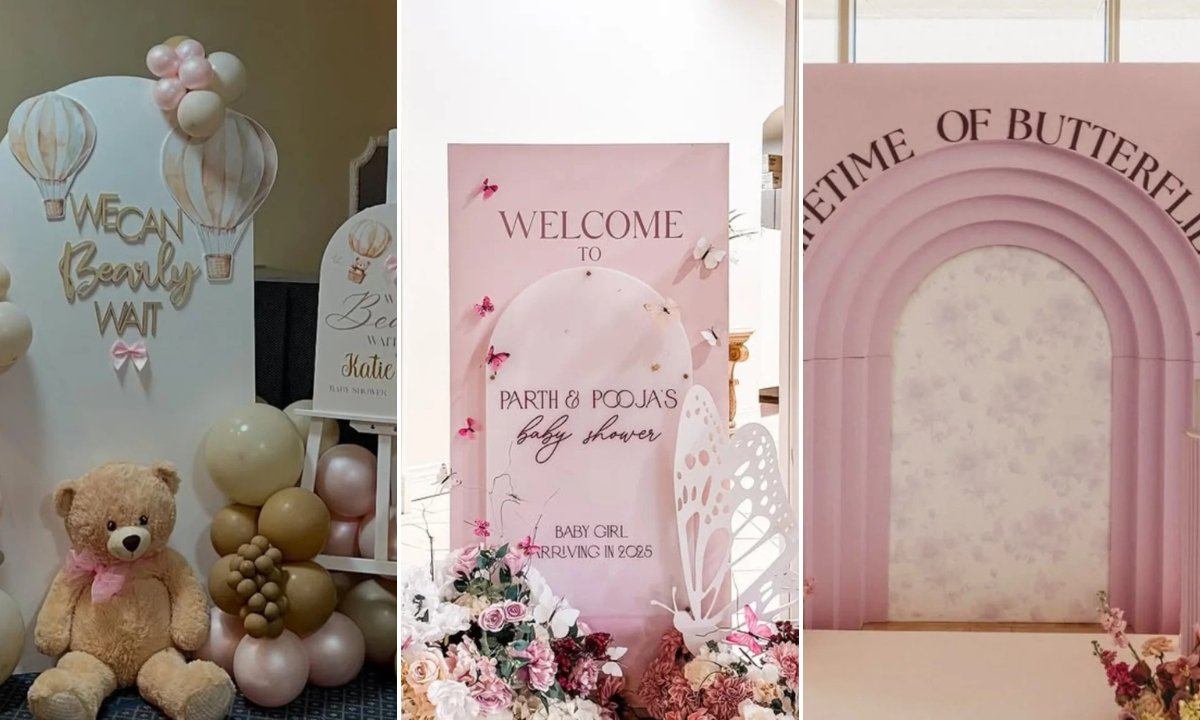
Blush Butterfly
If you want something soft but still statement-worthy, blush pink with layered arches is your sweet spot.
Notice how the curved design instantly adds dimension without needing loud colors.
The butterflies aren’t just decoration-they reinforce the “baby girl” theme in a subtle, elegant way.
And placing florals at the base makes the sign feel styled, not just placed.
If you’re going for romantic and feminine, think cohesive: match the pink tones in your flowers, add a sculptural element beside it, and keep the typography delicate.
This kind of setup works beautifully for venues with neutral walls because the sign becomes the focal point without overpowering the space.
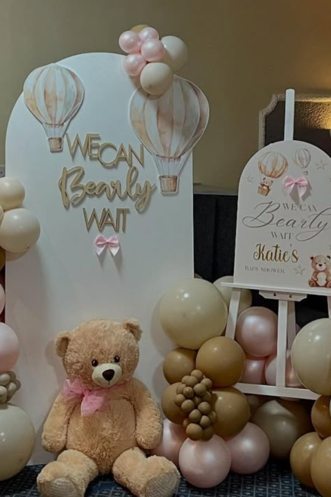
Bearly Wait
If you’re leaning into a teddy bear theme, commit fully-and this is how you do it.
The layered backdrop, balloon clusters in soft beige and blush, and oversized teddy props create depth instead of a flat display.
Notice how the pun (“We Can Bearly Wait”) makes it playful without looking childish.
If you want it to feel polished, keep your color palette tight-two to three shades max-and repeat them in balloons, bows, and props.
The key tip? Balance height.
One tall backdrop, one easel sign, and grounded decor like plush bears keep everything visually interesting.
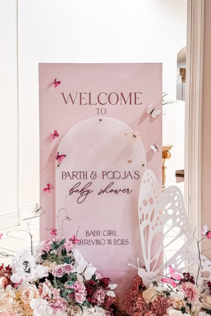
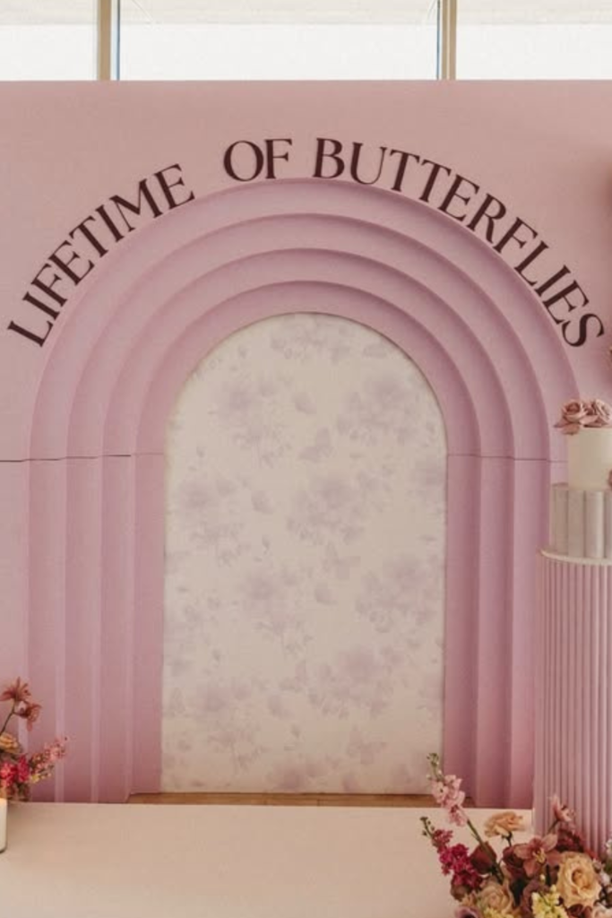
Lifetime Butterflies
Want to turn your welcome sign into a full photo moment?
Then think beyond a board and create a stage.
The layered pink arch backdrop with bold lettering transforms the entrance into an experience.
Candles and florals placed intentionally around the base elevate it from cute to dramatic.
If your venue has natural light, position your setup near windows so the soft tones glow in photos.
And instead of cramming in too many elements, let scale do the work-large arches, a clean platform, and one strong phrase create impact without clutter.
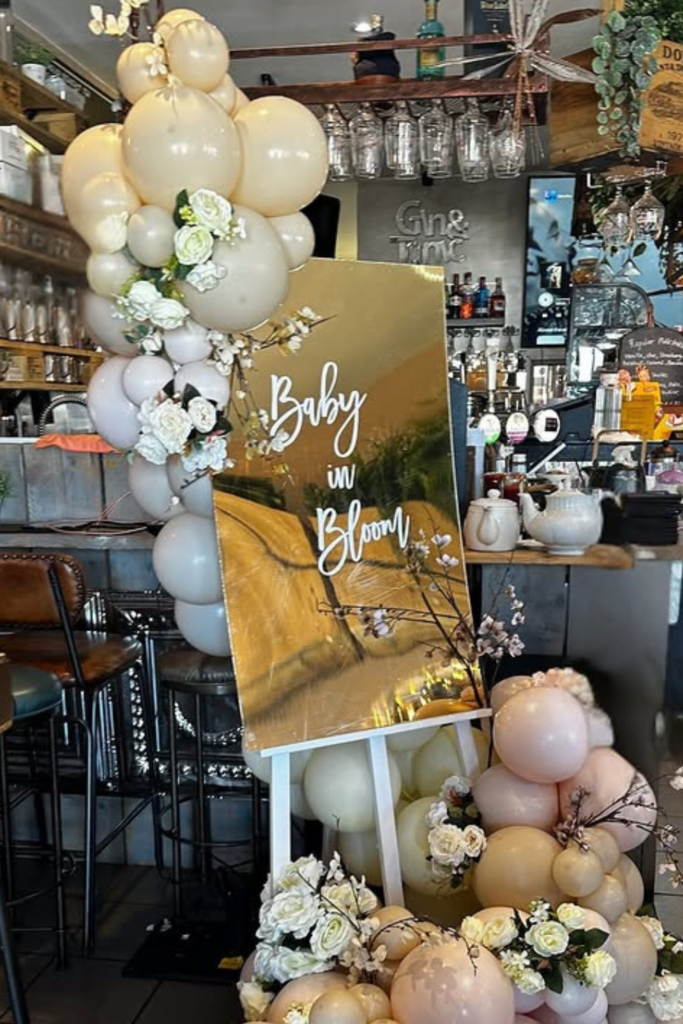
Baby in Bloom
If your venue already has personality-like a cozy café or rustic bar-work with it, not against it.
A reflective gold sign instantly adds sophistication, while creamy balloon clusters soften the space.
The trick here is contrast: modern mirror board paired with organic florals.
If you want a bloom theme to feel elevated, choose neutral florals with hints of green instead of bright colors.
And always anchor your sign with balloon clusters at different heights-it frames the board and prevents it from looking like it’s just leaning there.
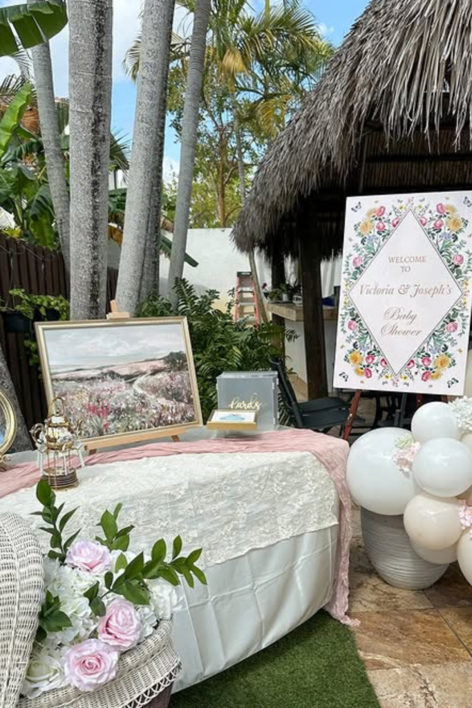
Garden Romance
If you’re hosting outdoors, let nature do half the styling for you.
This setup works because it blends seamlessly with the surroundings-soft florals, muted blush tones, and a framed welcome sign that feels like part of the décor, not an add-on.
Instead of overwhelming the space, it layers textures: lace tablecloth, wicker accents, framed art, and balloon clusters kept neutral.
If you want your sign to feel intentional, echo the venue’s vibe.
Tropical setting? Add greenery. Garden party? Lean into florals.
The trick is harmony-your welcome sign shouldn’t fight the background; it should complete it.
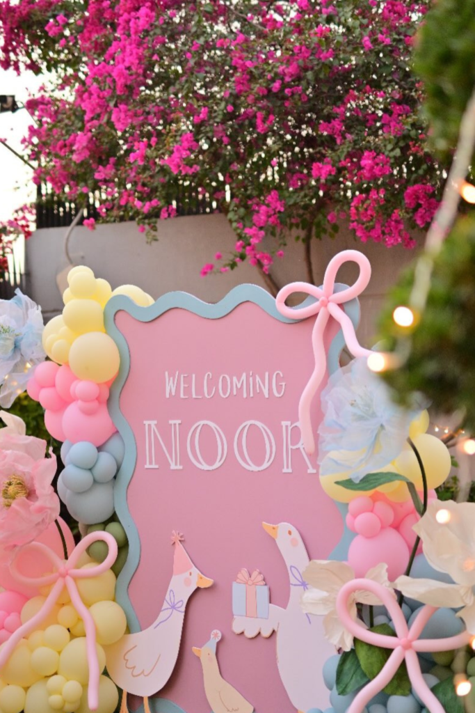
Pastel Pop
If you want playful without looking chaotic, pastel is your best friend.
The layered pink board with soft blue trim instantly feels custom, especially with balloon clusters flowing around it.
What makes this work is movement-the bows, oversized paper flowers, and cutout ducks make the display feel alive.
If you’re designing something similar, don’t keep everything symmetrical.
Let balloons climb one side, let details spill outward.
That controlled imbalance creates personality.
And always anchor the name boldly in the center so even with all the fun elements, the message stays clear.
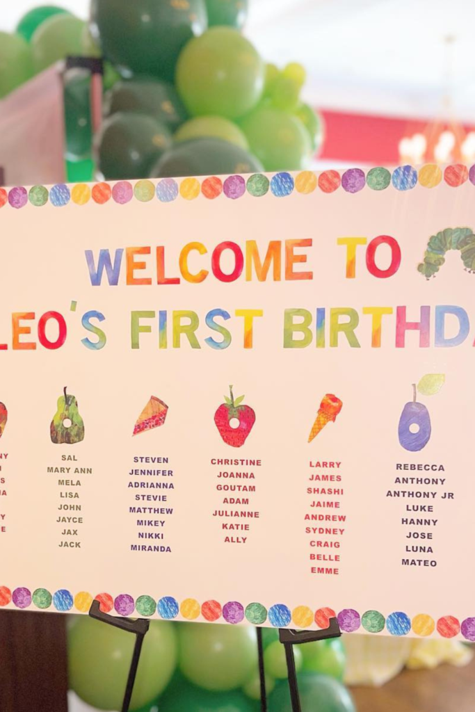
Storybook Charm
Sometimes bold color is exactly what you need.
This sign leans fully into a storybook theme, and that’s why it works.
The bright border, playful illustrations, and childlike lettering create instant nostalgia.
If you’re going themed, commit all the way-half-themed setups feel unfinished.
Notice how the surrounding green balloons complement the fruit illustrations instead of competing with them.
If you want guests to smile the moment they walk in, choose colors confidently and let your sign feel joyful.
Not every welcome sign has to be soft and neutral-sometimes fun wins.
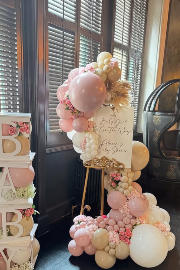
Elegant Layers
If your goal is “soft luxury,” layering is everything.
The combination of creamy balloons, blush accents, and pampas textures gives this setup depth without clutter.
And instead of relying on a giant backdrop, the sign is elevated on an easel, framed by cascading balloons that feel organic.
Want it to look upscale? Stick to two main tones and repeat them consistently.
The stacked BABY boxes add height on one side, balancing the sign visually.
When everything feels cohesive, the entrance instantly feels styled-even if the space itself is simple.
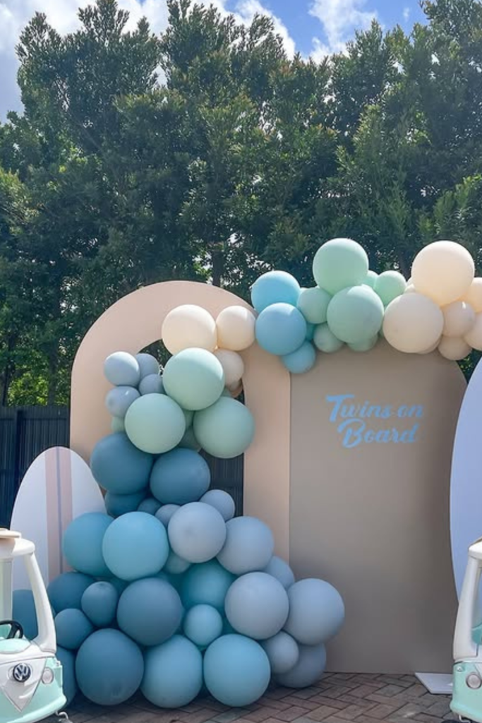
Twins on Board
If you’re celebrating twins, don’t just mention it-design around it.
This setup works because everything feels paired and intentional, from the double toy cars to the balanced balloon clusters.
The soft blue and mint tones keep it cohesive without overwhelming the space.
If you’re styling for multiples, symmetry is your secret weapon.
Two props, mirrored shapes, and a centered phrase instantly reinforce the theme.
And instead of overcomplicating the wording, keep it short and bold so it reads clearly against a statement backdrop.
When the design echoes the story, the sign feels thoughtful rather than decorative.
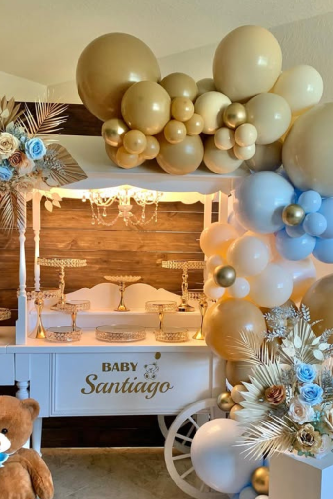
Luxe Bear Cart
If you want a teddy theme but still crave elegance, elevate it with metallics.
The gold and muted blue balloons instantly shift this from “cute” to “luxury baby.”
Notice how the dessert cart doubles as décor-it’s not just functional, it frames the entire scene.
If you’re building something similar, choose one standout accent (like gold trays or a wooden backdrop) and repeat it throughout.
The oversized teddy adds warmth, but the structured balloon arch keeps everything polished.
It’s all about mixing softness with structure.
Floral Frame
If you’re aiming for soft sophistication, think vertical drama.
This welcome sign works because the florals cascade along one side, almost like a living border.
Instead of filling every corner, it lets negative space breathe.
If you want this look, choose two to three floral shades and layer different textures-roses, hydrangeas, greenery.
Adding ribbon that flows naturally softens the frame and makes the setup feel romantic.
And don’t underestimate candles at the base-they instantly elevate the mood without adding clutter.
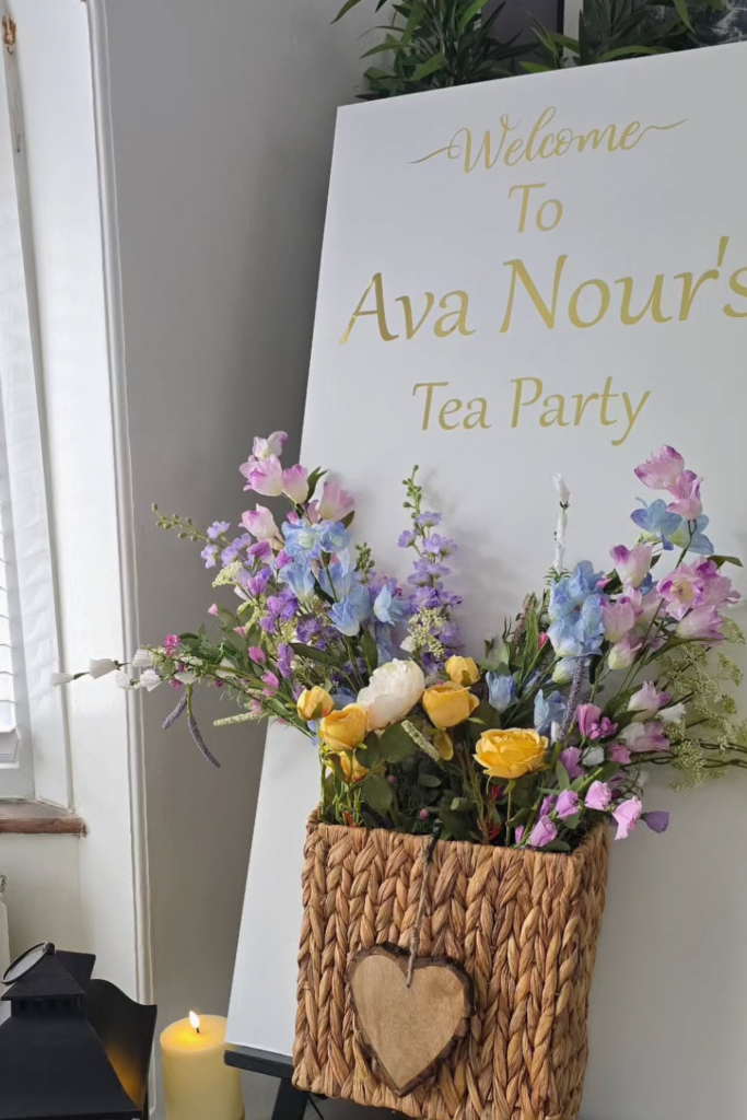
Tea Party Charm
If your theme leans intimate and delicate, keep your sign clean and let the styling speak.
The white board with gold lettering feels timeless, especially paired with soft florals in a woven basket.
Instead of balloon overload, this setup relies on texture-lanterns, candles, fresh flowers.
If you want something elegant without going over the top, scale down and refine.
Place your sign near natural light, add one thoughtful floral arrangement, and keep your typography simple.
Sometimes the most graceful entrances are the quietest ones.
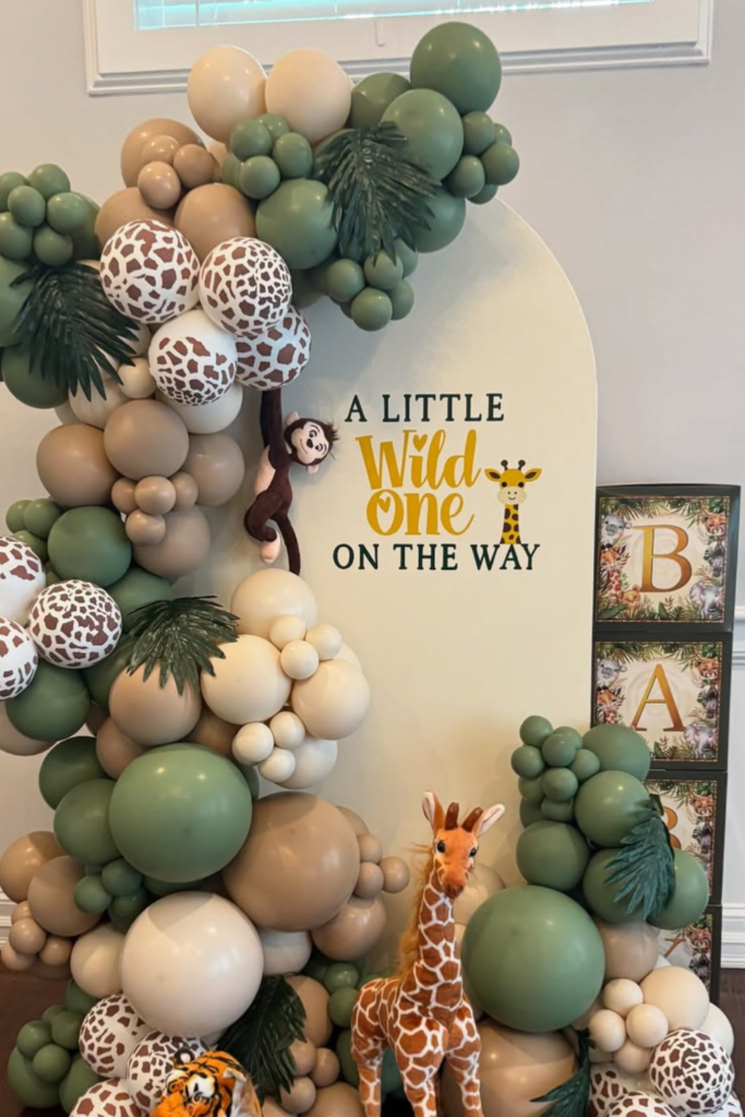
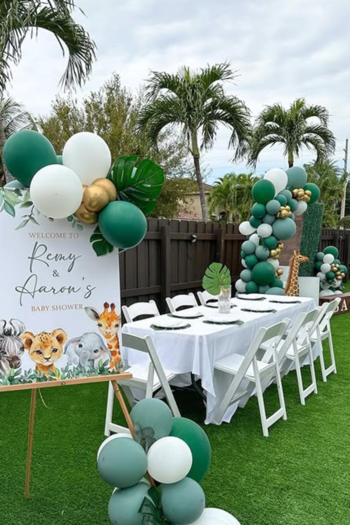
Little Wild One
If you’re going safari, don’t stop at greenery-add personality.
This setup works because it layers textures: matte green balloons, giraffe-print accents, and actual plush animals that make the theme feel alive.
The phrase “A Little Wild One” is bold but playful, which keeps it fun without looking overdone.
If you want your jungle theme to feel elevated, mix neutrals like beige and cream with deeper greens instead of using bright colors.
And here’s the tip: vary balloon sizes generously.
That mix of oversized and mini clusters gives the whole backdrop depth instead of making it look flat.
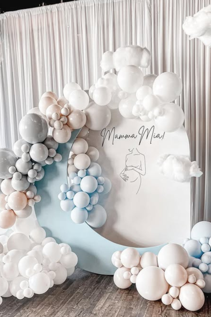
Modern Clouds
If you love minimal design but still want impact, think sculptural.
This setup proves you don’t need loud colors to stand out.
The soft whites and muted blues create calm, while the rounded shapes and floating cloud details add movement.
If you’re designing something similar, focus on form instead of florals.
Layer different circular panels, use tonal balloons, and keep the typography delicate.
When everything feels soft and cohesive, the entire entrance looks curated rather than busy.
Sometimes restraint is what makes it unforgettable.
Rustic Linen
If your venue has character-like stone walls or wood floors-lean into that warmth.
This welcome sign feels refined because it pairs natural textures with clean typography.
Instead of balloons, it uses fabric draping, tall florals, and candles to create atmosphere.
If you want a timeless look, choose neutral tones and let one element shine-like oversized white blooms.
And don’t underestimate the power of spacing.
Leaving room around the sign makes it feel intentional, not crowded.
Simple can absolutely be stunning when it’s styled thoughtfully.
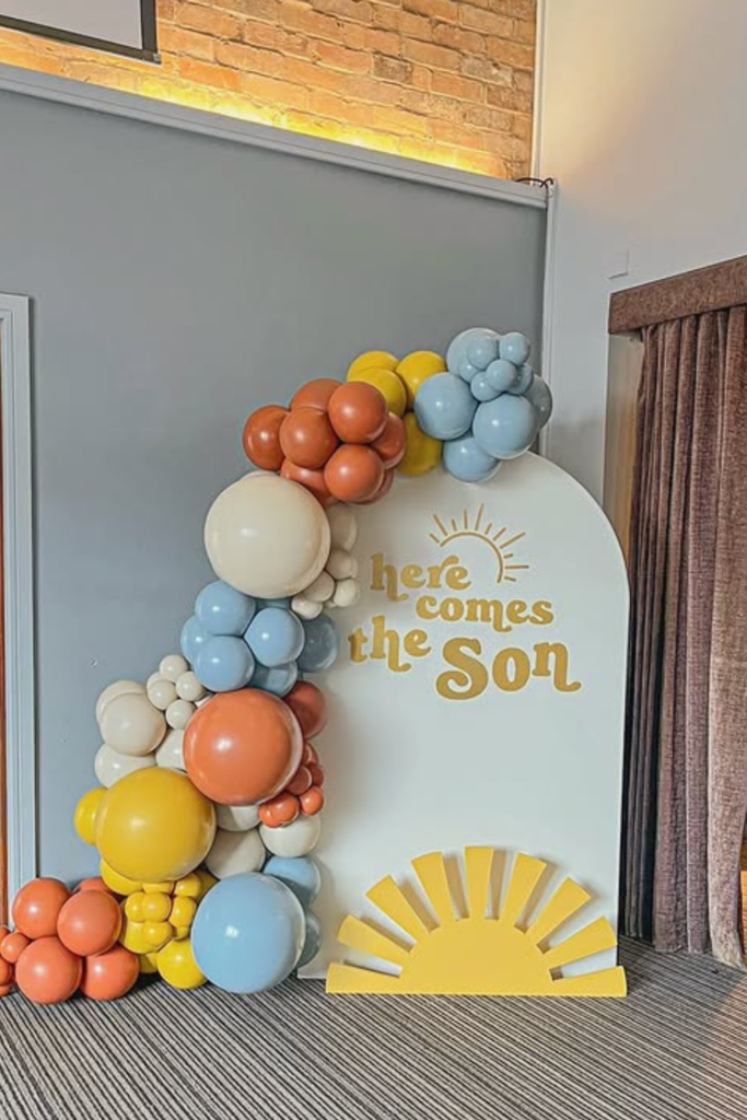
Here Comes Sun
If you want cheerful energy the second guests walk in, color blocking is your best move.
The mix of mustard yellow, soft blue, and warm orange instantly sets a joyful tone.
Notice how the balloon clusters frame one side only-that asymmetry keeps it modern.
If you’re working with a bright theme like “Here Comes the Son,” repeat one key symbol (like the sun) to make it memorable.
Keep the wording bold and readable from a distance so it pops in photos.
When your colors feel confident, the entire setup feels happy and intentional.
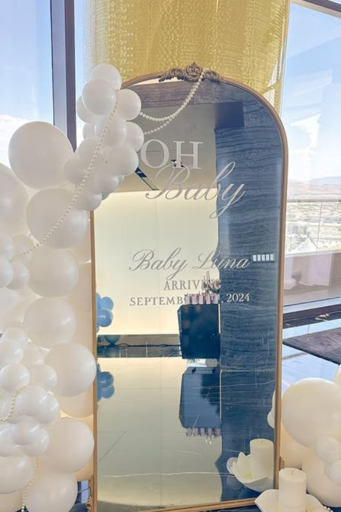
Mirror Glam
If you want instant luxury, go reflective.
A mirror welcome sign doesn’t just display the message-it becomes part of the room.
The soft white balloons paired with pearl details keep it elegant without feeling cold.
Here’s the trick: when you use a mirror, keep your lettering minimal and airy so the reflection can breathe.
Script fonts work beautifully here. And place it near natural light if you can-the reflection will elevate your photos automatically.
This style is perfect when you want modern sophistication with just enough softness to keep it baby-shower sweet.
Safari Garden
If you’re hosting outdoors, let your sign feel like it belongs there.
This safari-themed setup works because the greenery, balloon clusters, and illustrated animals all echo the tropical surroundings.
Instead of overloading with props, it keeps the focus on one clean sign and repeats the green tones throughout the space.
If you’re styling something similar, match your balloons to the environment-deep greens, muted golds, and crisp whites work beautifully outside.
When your sign complements the setting, it feels intentional instead of staged.
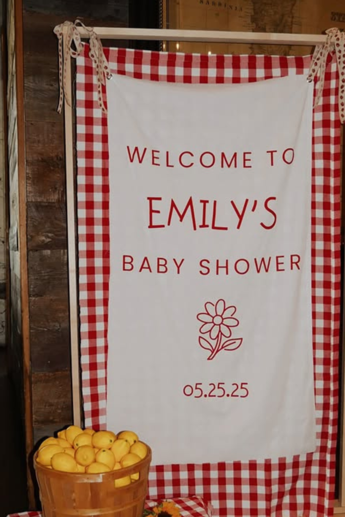
Picnic Sweet
If you want cozy and charming, fabric can completely transform a simple frame.
This gingham backdrop instantly gives picnic energy without needing heavy décor.
The basket of lemons and sunflowers reinforces the color story without overwhelming it.
If you’re working with a smaller budget, focus on one strong pattern and repeat it confidently.
Keep your typography clean so it stands out against the checkered design.
This style proves you don’t need oversized installations to create impact-just thoughtful coordination.
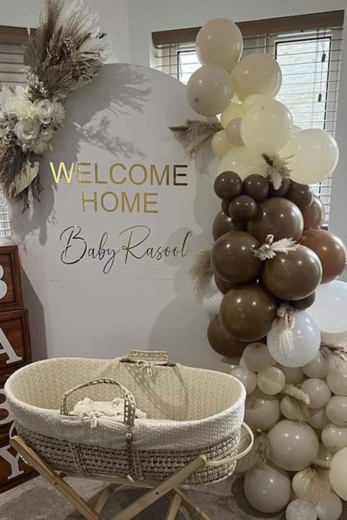
Welcome Home
If your celebration is intimate, lean into warmth.
This setup feels personal because it blends neutral balloons, wooden baby blocks, and a bassinet for that “homecoming” vibe.
The brown and cream tones create softness without being overly pastel.
If you want something timeless, choose earthy shades and add texture-woven baskets, pampas, wood accents.
And here’s a tip: vary balloon tones within the same color family to keep it interesting.
When everything feels layered but cohesive, the entrance feels heartfelt rather than flashy.
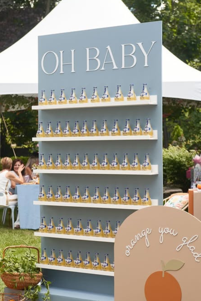
Citrus Bar Wall
If you want your welcome sign to do more than just welcome, turn it into a functional feature.
This “Oh Baby” display doubles as a drink wall, which instantly makes it interactive.
The muted blue backdrop keeps it fresh, while the oranges and greenery add warmth.
If you’re planning an outdoor shower, think beyond a standalone board-integrate shelves, favors, or drinks directly into the design.
When your sign becomes part of the experience, guests don’t just walk past it… they engage with it.
Watercolor Minimal
If the location is already breathtaking, keep your sign understated.
This soft floral design works because it doesn’t compete with the natural backdrop.
The neutral tones, delicate script, and light draping create movement without distraction.
If you’re hosting somewhere scenic, choose muted colors and airy fonts so the environment remains the star.
Sometimes elegance is about restraint. Let the setting elevate the sign, not the other way around.
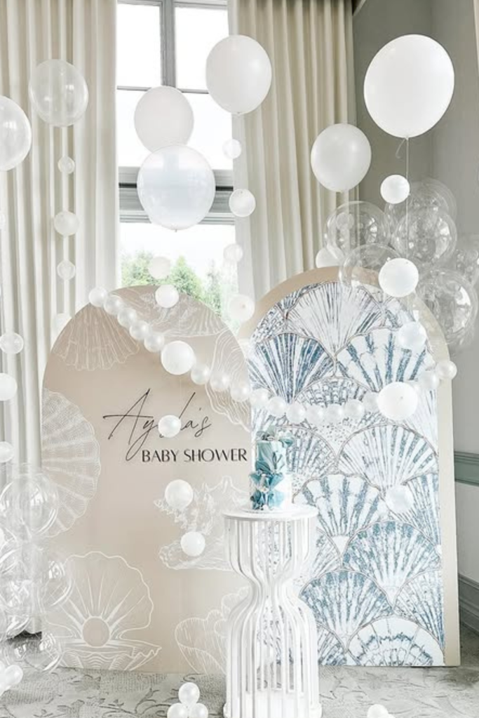
Pearl Dream
If you’re craving ethereal and modern at the same time, think texture over color.
This setup relies on layers-transparent balloons, soft white panels, shell-inspired graphics-to create depth without bold hues.
Notice how the shapes vary, but the palette stays cohesive.
If you want a dreamy effect, focus on tonal whites and soft metallics, then play with height and floating elements.
It feels immersive rather than decorative, and that’s what makes it unforgettable.
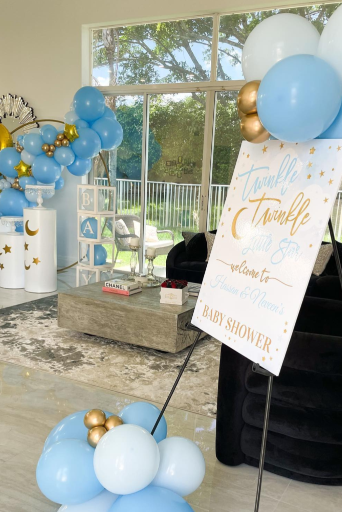
Twinkle Theme
If you’re leaning into a celestial vibe, balance bold and soft elements.
The blue and gold palette feels classic, while star details and crescent moons reinforce the theme without cluttering it.
The angled welcome sign adds a dynamic touch instead of keeping everything flat against a wall.
If you want your sign to stand out in a larger room, give it breathing space and frame it with balloon clusters at different heights.
When the theme is clear but not overwhelming, the whole room feels cohesive.
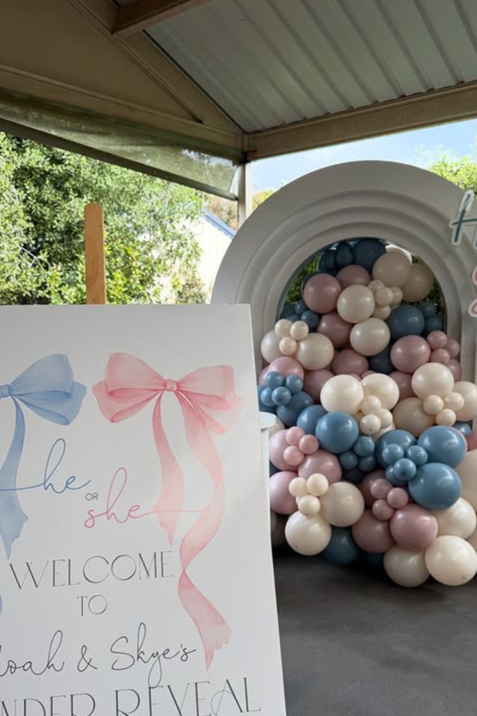
He or She
If you’re hosting a gender reveal, your welcome sign should build anticipation before anyone even steps inside.
This design works because it keeps the palette balanced-soft blue and blush without overpowering either side.
The oversized bows instantly communicate the theme without needing extra explanation.
If you want your reveal to feel cohesive, echo those same colors in the balloon arch behind it.
And here’s the key tip: keep the wording clean and centered so the focus stays on the moment, not the design.
When your sign feels calm and balanced, the reveal itself becomes the real drama.
FAQs
What size should a baby shower welcome sign be?
If you want your sign to actually make an impact, size matters more than you think.
The most popular choice is 18×24 inches because it’s large enough to be visible at the entrance without overwhelming smaller venues.
If you’re working with a bigger space or outdoor setup, 24×36 inches creates a stronger statement and photographs beautifully. Before choosing, consider where it will be placed.
If it’s near a doorway, medium size works. If it’s in an open hall or garden, go larger so it doesn’t look lost in the space.
Should I choose a printable template or a professionally printed sign?
It depends on your timeline and the look you’re going for.
If you need something quick and budget-friendly, an editable printable template is perfect-you can customize it and print locally.
But if you want a more polished, sturdy finish (like foam board or acrylic), professional printing gives you that elevated feel.
If photos are important to you, investing in high-quality printing makes a noticeable difference.

Hi, I’m Abrar! I’m a writer who loves creating content around fun, celebrations, and creative ideas that bring people together.
I enjoy writing about topics that add a bit of excitement to everyday life. Whether it’s planning something special or finding new ways to entertain, I focus on ideas that are simple and enjoyable.
I keep things practical and easy to understand. If something seems fun and worth trying, I’ll write about it.
When I’m not writing, I’m usually looking for inspiration or thinking up new ideas to share with you!