
27 Mulberry Wedding Color Scheme for 2026

Mulberry is beautiful but it confuses a lot of couples. It sits between burgundy and plum, looks different in every fabric, and can feel too dark if you don’t style it right.
Many people love the color yet hesitate because they don’t know what to pair it with, where to use it, or how much is too much. Pinterest shows inspiration, not answers.
This guide gives you clarity. You’ll learn how to use a mulberry wedding color scheme with balance, confidence, and purpose.
Let’s jump in!
Best Colors That Balance Mulberry Beautifully
Mulberry is a strong, saturated color, so the key is pairing it with shades that lighten, soften, or ground it.
If you want mulberry to feel elegant and not heavy you need balance. Soft neutrals like ivory, cream, and champagne keep it airy and photograph well.
Sage, olive, and eucalyptus green add freshness and prevent the palette from feeling too dark. For a romantic look, blush and dusty rose.
If you want a richer, formal feel, gold accents work better than silver because they warm the color instead of cooling it.
The goal isn’t adding more color, it’s choosing support colors that let mulberry shine without overwhelming the space.
Save this article for later! 👇👇
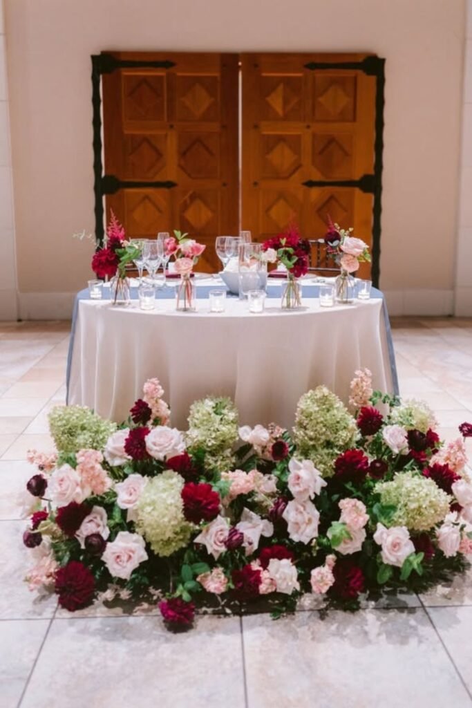
Ivory Balance
Start with ivory linens and light tableware so mulberry florals feel intentional, romantic, and balanced rather than heavy across the wedding tables.
This approach gives the color space to breathe while keeping photos bright, clean, and timeless in both indoor and outdoor venues.
If mulberry feels risky to you, leading with ivory is the easiest way to stay elegant without losing richness overall visually.
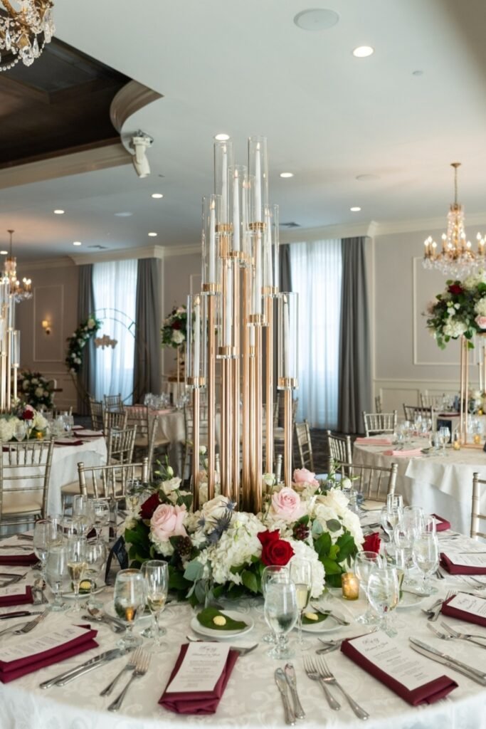
Gold Accents
Gold accents add warmth and lift to mulberry, creating a refined wedding look without introducing extra competing colors into the palette.
Metallic candleholders reflect light upward, preventing deep tones from feeling flat while enhancing evening ambiance beautifully for formal weddings.
If you want drama without heaviness, gold works harder than adding more colors ever will in mulberry-based wedding styling plans overall.
Tall Florals
Raising mulberry florals upward changes how the color reads, keeping tables lighter while still delivering visual impact through height and airflow.
Greenery and softer blooms surrounding deeper tones prevent the arrangement from feeling dense or overwhelming at guest eye level during dinner.
If mulberry feels intense on flat surfaces, vertical design instantly softens it without removing richness from the overall wedding palette visually.

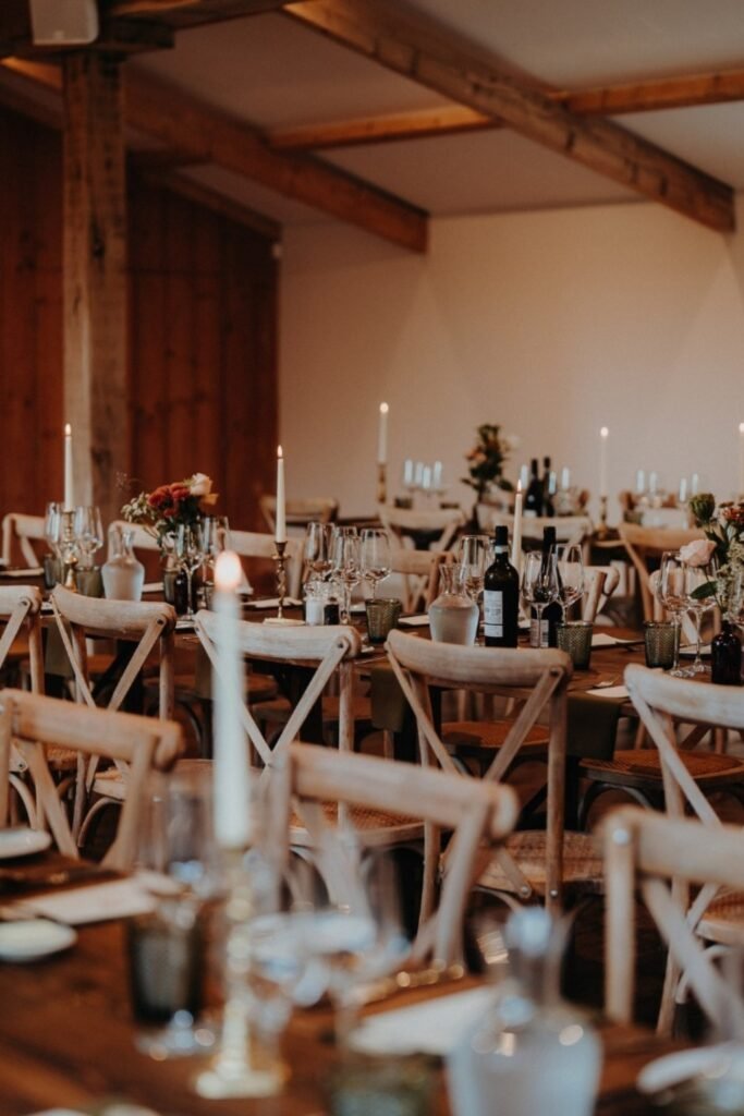
Layered Details
Using mulberry in repeated small details creates depth, helping the color feel intentional rather than overpowering the wedding table design overall.
Napkins, candles, and florals quietly echo each other, while neutral plates and wood surfaces keep everything grounded throughout the reception space.
If you prefer warmth over boldness, layering controlled touches like this keeps mulberry inviting for guests during intimate evening celebrations especially.

Courtyard Drama
This wedding setup leans into old-world architecture, letting mulberry florals and chandeliers create warmth against stone walls without competing visually.
The long table format stretches the color naturally, making mulberry feel immersive rather than overwhelming across the entire dining experience.
If your venue already has texture and history, mulberry enhances it instead of fighting it when used confidently like this.

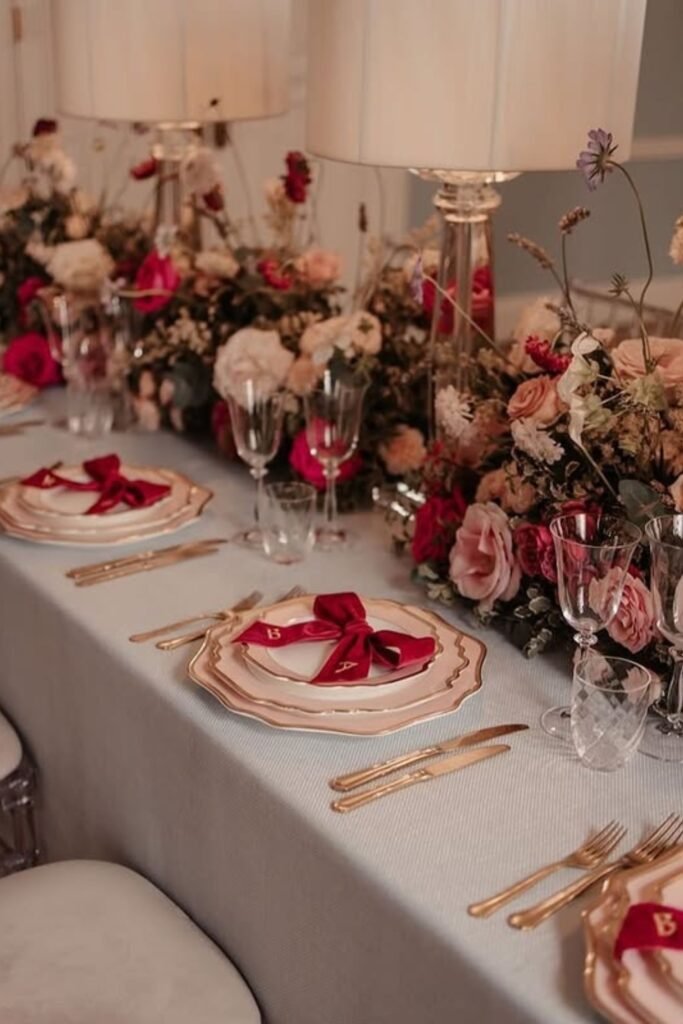
Refined Romance
Here, mulberry shows up in napkins and florals, balanced by soft blush tones, gold-edged plates, and neutral linens for a polished wedding feel.
The color reads romantic rather than bold because it’s paired with gentle lighting and elegant tableware instead of dark surfaces.
If you want mulberry without heaviness, this kind of refined layering keeps everything graceful and camera-friendly.
Statement Lighting
This wedding relies on lighting to carry drama, letting mulberry florals and red seating glow rather than dominate the entire room visually.
Uplighting and greenery soften the bold color, creating a rich atmosphere that feels intentional instead of intense for guests.
If you love bold mulberry tones, using lighting strategically lets you go dramatic without sacrificing balance.

Textured Warmth
This table mixes mulberry with warm wood, seasonal florals, and mixed glassware, creating depth that feels cozy instead of overly styled.
Candles and layered textures help the color blend naturally, making the setup feel inviting and organic rather than formal or stiff.
If you’re planning a relaxed or autumn wedding, mulberry thrives when paired with texture and warmth like this.

Playful Contrast
This wedding table feels lively because mulberry sits next to warm amber glassware and golden candles instead of dark neutrals here.
The contrast keeps the color rich while letting brighter tones bounce light around the table naturally during evening wedding celebrations effortlessly.
If mulberry ever feels serious, adding playful warm accents instantly lightens the mood without losing elegance for modern wedding settings overall.

Soft Formality
Here, mulberry blends into a soft formal wedding look through layered florals, glass cylinders, and neutral linens that calm the palette.
Nothing competes for attention, so the color feels romantic rather than bold or overpowering within intimate reception table styling moments here.
If you want mulberry to feel timeless, pairing it with gentle textures keeps everything refined and balanced for classic wedding aesthetics.

Tent Warmth
This tented wedding shows how mulberry thrives with wood tables, greenery runners, and candlelight instead of heavy linens throughout the reception.
The color grounds the space while the natural materials prevent it from feeling dark or enclosed inside large event tents visually.
If you’re planning an outdoor or tent wedding, mulberry works best when surrounded by warmth and texture for guest comfort overall.

Rustic Calm
This wedding setup uses mulberry subtly, letting wood beams, neutral tones, and simple florals lead the atmosphere throughout the reception space.
The color supports the mood instead of defining it, which keeps the space relaxed and welcoming for guests during dinner time.
If your venue already has character, mulberry should quietly enhance it rather than steal attention from architectural details present there naturally.
Floral Focus
Placing mulberry directly into floral arrangements keeps the color rich while blush blooms and neutrals soften its overall visual impact.
By concentrating deeper tones in flowers, the table avoids feeling heavy or cluttered with color across multiple competing surfaces.
If mulberry is your favorite shade, letting florals carry it creates romance without overwhelming guests seated nearby.

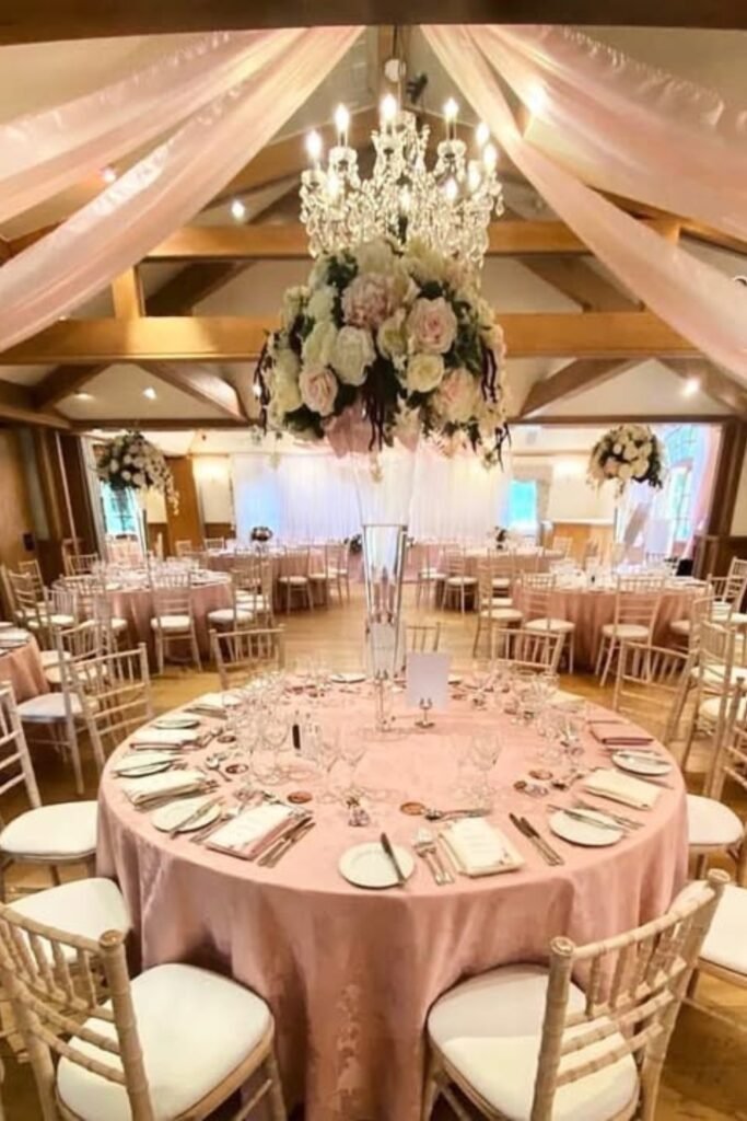
Blush Foundation
Using blush linens underneath mulberry accents instantly lightens the mood, making the palette feel softer and more inviting.
Tall arrangements and white chairs lift the deeper color upward, preventing it from settling too heavily across the reception space.
For couples nervous about dark tones, blush acts as a safety net that keeps mulberry elegant and approachable.
Aisle Harmony
Rather than dominating the ceremony, mulberry appears subtly alongside soft florals, neutral runners, and warm architectural wood details.
Natural light and white draping help the color blend seamlessly, keeping the aisle visually calm and balanced.
When extending mulberry beyond tables, restraint ensures the ceremony remains the emotional focal point.

Garden Ease
Chair sashes and small accents introduce mulberry gently, allowing greenery and white linens to stay visually dominant outdoors.
Surrounding the color with natural light prevents it from feeling heavy, even during daytime celebrations.
For garden weddings, mulberry works best as a supporting detail rather than the main visual anchor.

Ceremony Framing
Mulberry florals lining the aisle frame the ceremony beautifully, while neutral chairs and pale walls keep the space balanced and elegant.
Instead of overpowering the room, the color gently directs attention forward, making the walk feel intentional and visually grounded for guests.
When ceremony spaces feel plain, mulberry works best as a framing accent rather than becoming a heavy focal backdrop overall visually.

Outdoor Arch
A wooden arch wrapped with mulberry blooms and soft draping feels organic against greenery, sky, and natural outdoor surroundings during ceremonies.
Natural textures like wood and foliage prevent the color from feeling heavy, allowing mulberry to blend effortlessly outdoors in daylight settings.
Placing mulberry on one focal structure keeps the ceremony open, airy, and visually calm for guests throughout outdoor celebrations comfortably seated.

Barn Balance
Warm wood beams and neutral linens help mulberry settle naturally into rustic venues without clashing or overpowering the space visually indoors.
Keeping most surfaces light allows the deeper color to add richness while preserving a relaxed, welcoming atmosphere for wedding guests indoors.
Rustic spaces benefit when mulberry enhances existing warmth instead of competing with architectural character and texture.

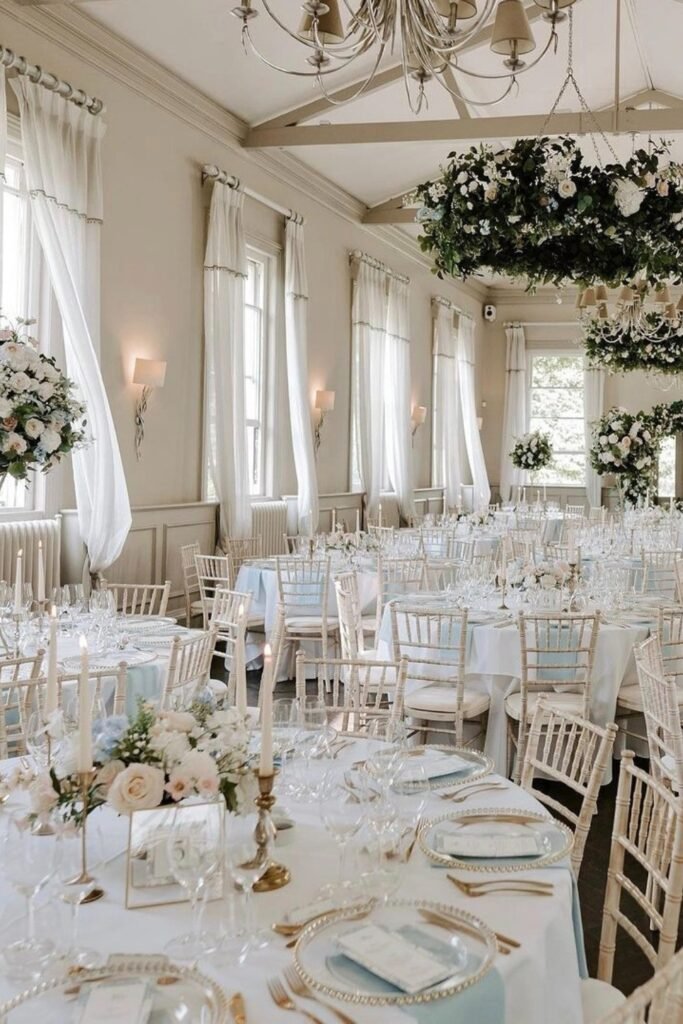
Classic Light
Bright rooms filled with white linens and greenery allow mulberry accents to feel refined, airy, and timeless throughout formal wedding receptions.
Abundant light prevents darker tones from settling visually, keeping the palette fresh and elegant during long reception hours indoors comfortably styled.
Surrounding mulberry with pale elements ensures the color supports the design without dominating the room visually, emotionally, and photographically.
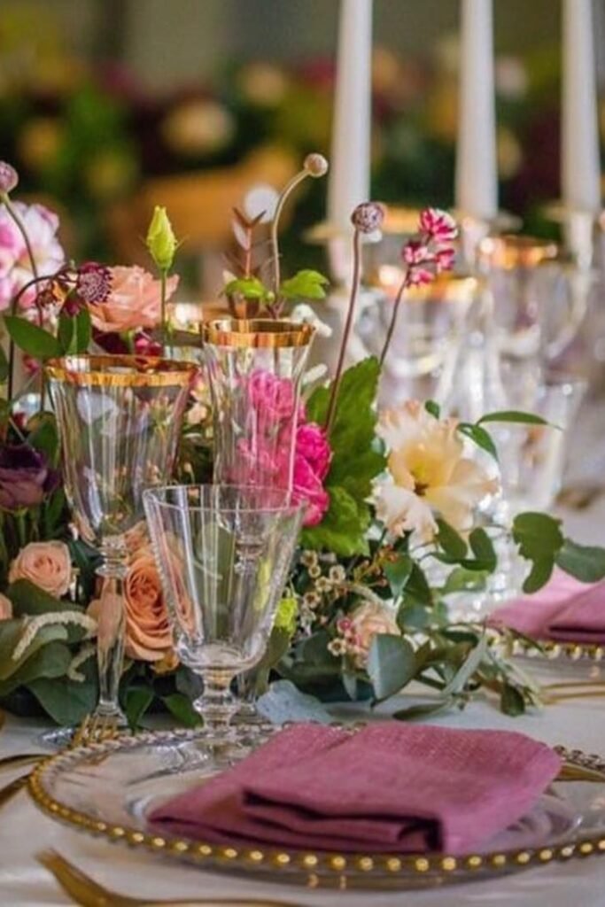
Peach Balance
Soft peach florals calm deep mulberry tones, letting the wedding feel romantic instead of heavy, especially when natural light floods the space.
Blush napkins and pale table linens give guests visual breathing room while still letting mulberry flowers stay bold and intentional.
This balance works best for daytime or garden weddings where softness keeps rich colors feeling airy and inviting.

Garden Contrast
Here, mulberry florals pop against fresh greenery, creating contrast that feels organic rather than overly styled or dramatic.
Hanging installations draw eyes upward, keeping the wedding immersive while darker tones ground the entire outdoor setup.
This approach suits couples who want drama without losing that relaxed, nature-forward wedding atmosphere.

Mulberry Cake
A mulberry-drip cake adds drama in a controlled way, becoming a focal moment without overpowering the wedding palette.
The creamy white base softens the color intensity while fresh roses repeat tones already used throughout the décor.
This works beautifully when you want one bold statement piece instead of spreading dark colors everywhere.

Textured Tables
Layered glassware, soft mauve linens, and floral clusters break up mulberry tones so the table feels rich, not flat.
Mixing textures keeps the wedding tables visually interesting even when using a limited, deeper color palette.
This styling shines for evening receptions where candlelight enhances depth and warmth naturally.
Striped Tablescape
That bold striped table instantly sets a playful yet polished wedding tone, mixing deep hues with contrast that feels intentional and visually unforgettable.
Layering stripes across linens and chairs works best when paired with solid candles, sculptural florals, and metallic accents to balance patterns.
This setup suits indoor weddings or styled shoots where color confidence matters and you want tables to feel like a design feature.

Crystal Drop
Instead of traditional florals, crystal hanging pieces pull the eye upward and add movement, sparkle, and drama without crowding the table surface below.
They work especially well in banquet halls where ceilings feel empty and you want lighting to double as decor, not just illumination.
Keep table styling minimal so the hanging crystals remain the clear focal point throughout the reception.

Garden Feast
Long outdoor tables styled with flowing greenery create a relaxed yet refined wedding atmosphere that feels intimate, organic, and naturally welcoming.
Using a continuous floral runner softens table edges and visually connects guests, encouraging conversation and shared moments during dinner.
This look shines best in garden venues or courtyards where nature already supports the overall wedding aesthetic.

FAQs
Can I mix bold table designs with elegant wedding decor?
Absolutely, and it often creates the most memorable setups. Bold table designs add personality, but elegance comes from balance.
Pair strong patterns or colors with softer florals, muted linens, refined glassware, and warm lighting so the overall look feels curated, not chaotic.
How do I choose the right tablescape style for my venue?
Look at your venue first, not Pinterest. Indoor ballrooms can handle dramatic colors, structured centerpieces, and hanging elements.
While outdoor spaces work best with lighter fabrics, greenery, and organic arrangements that blend naturally with the surroundings.

Hi, I’m Ali Mehmood! I’m a writer who enjoys exploring different lifestyle topics and sharing ideas that make life’s special moments better.
I write about things that interest me and might help you too – whether it’s planning celebrations, finding inspiration for events, or discovering practical tips for everyday living.
My writing style is straightforward and easy to follow. I believe good ideas don’t need to be complicated, so I focus on what actually works and makes sense.
When I’m not writing, I’m usually reading, exploring new topics, or looking for interesting stories to share.