25 Cielito Lindo Baby Shower Theme for 2026
You fell in love with the idea of a Cielito Lindo baby shower -vibrant colors, joyful energy, meaningful culture -but once you started searching, everything felt scattered.
Generic fiesta decor. Random talavera prints. No clear baby-shower structure. And suddenly, what should feel exciting feels overwhelming.
In this article, you’ll learn exactly how to transform the Cielito Lindo concept into a beautifully styled, fully planned baby shower with 25 unique ideas.
Let’s jump in!
The Meaning Behind “Cielito Lindo” – And Why It’s Perfect for a Baby Celebration
Before you start buying papel picado or choosing your balloon colors, it helps to understand what Cielito Lindo actually means.
The phrase translates loosely to “sweet little one” or “little heaven,” and it’s famously tied to a beloved Mexican folk song known for its joyful “Ay, ay, ay, ay” chorus.
It’s warm, affectionate, and full of celebration -which is exactly the energy you want when welcoming a baby.
If you want your theme to feel intentional (not just decorative), you have to connect it back to that meaning.
This isn’t just about throwing a fiesta. It’s about celebrating a “little heaven” entering your life.
When you anchor your decor, wording, and styling around that idea -sweetness, joy, cultural warmth -everything starts to make sense.
Your invitation phrases feel natural. Your colors feel symbolic. And your celebration feels heartfelt instead of random.
Save this article for later! 👇👇
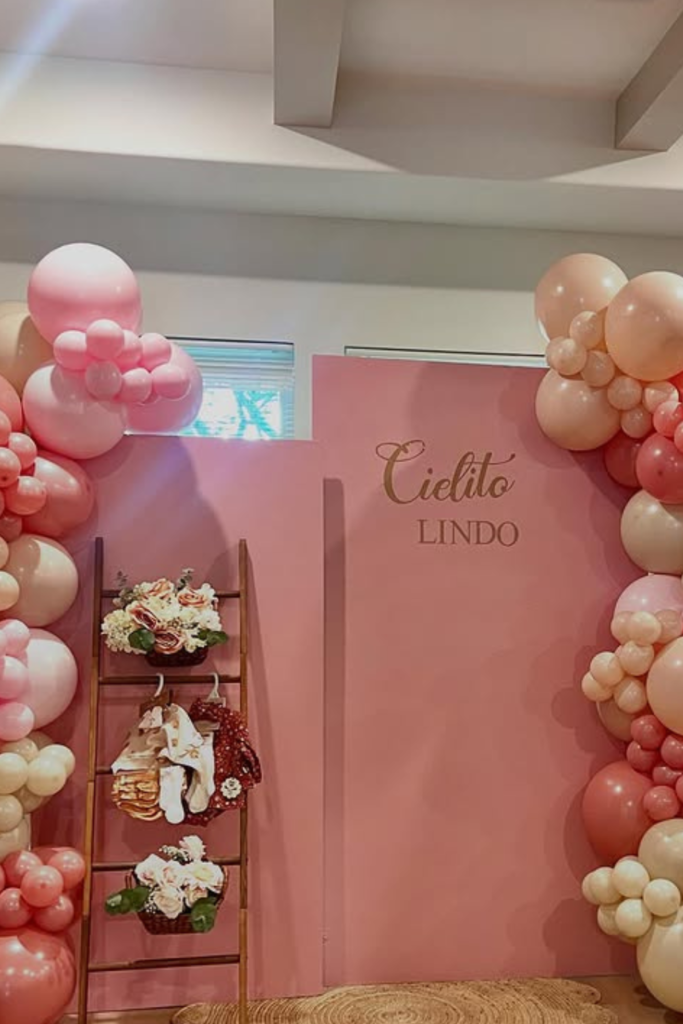
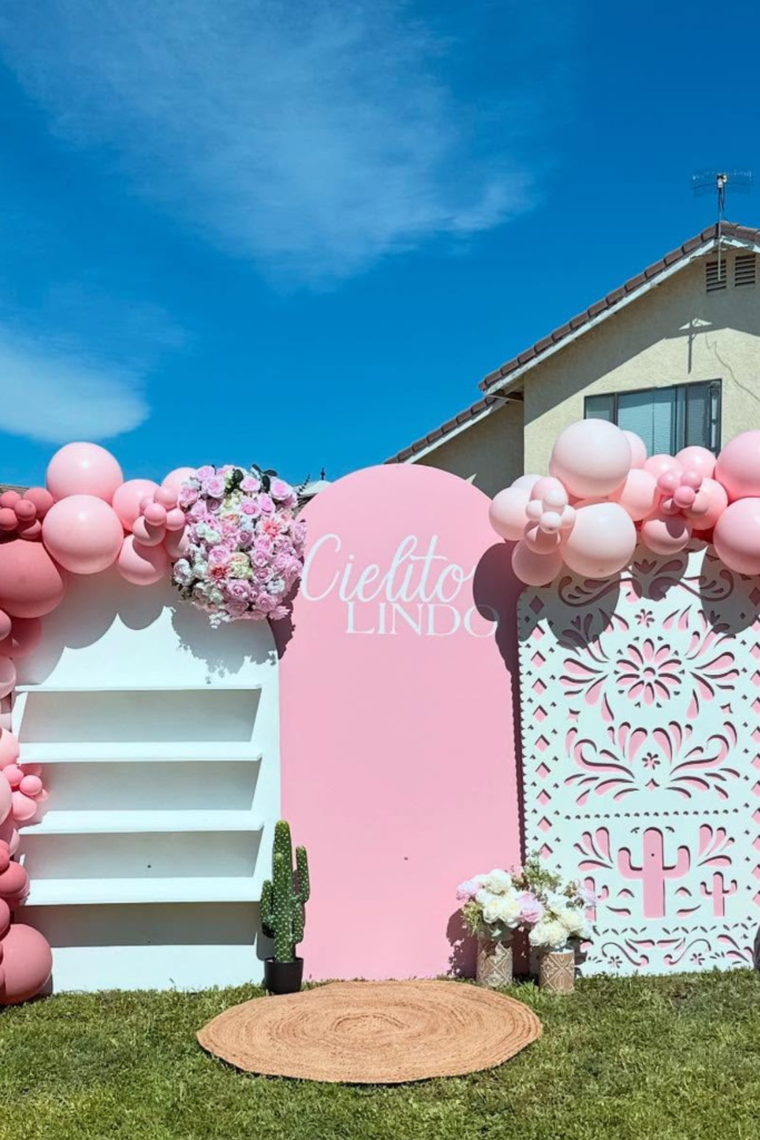
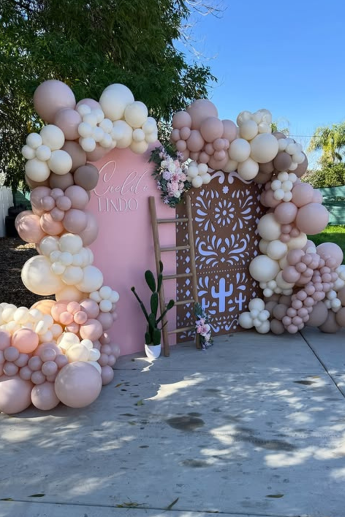
Layered Pink Luxe
If you think pink automatically means basic, this setup proves otherwise.
The magic here isn’t just the color -it’s the layering.
Multiple balloon sizes create movement, and mixing blush, rose, and champagne tones keeps it dimensional instead of flat.
If you try this, don’t stop at balloons.
Add texture at the base -a woven rug, a wood ladder, soft florals -so the backdrop doesn’t feel like a wall of latex.
And keep your signage simple.
A clean “Cielito Lindo” script stands out more when everything else is soft and tonal.
Sometimes less contrast actually makes a stronger statement.
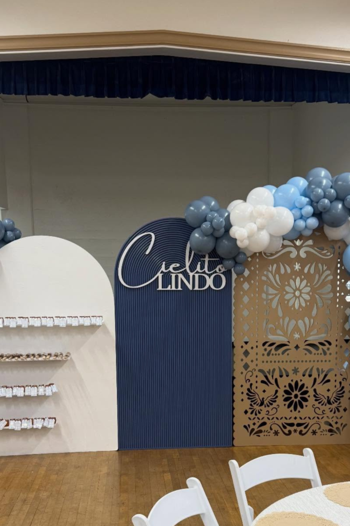
Structured Blue Panels
Here’s what happens when you combine culture with clean design.
The layered arches instantly elevate the setup, but it’s that carved panel detail that quietly brings in the Cielito Lindo essence.
You don’t need loud colors when your shapes are doing the storytelling.
If you love a modern look, stick to a tight palette -dusty blue, white, and warm beige.
Let the balloons frame the architecture instead of covering it.
The shelves on the side are smart too; they turn decor into function.
This works beautifully for a boy shower or a neutral celebration that still feels intentional and polished.
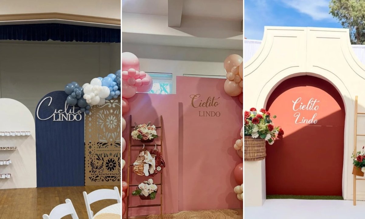
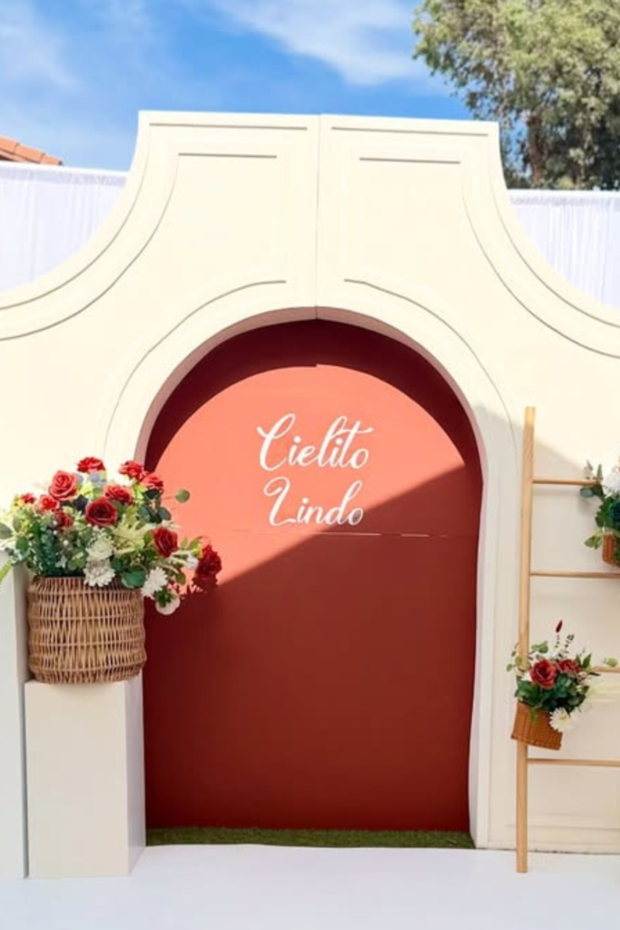
Hacienda Backdrop
Want your guests to feel like they just stepped into a little courtyard? This is how you do it.
The arched façade creates instant atmosphere, especially paired with terracotta and cream balloons.
It feels warm, grounded, and culturally inspired without being over-the-top.
If you’re hosting outdoors, lean into natural light and earthy tones.
Notice how the florals are placed strategically, not everywhere. That restraint keeps it elegant.
A statement arch like this eliminates the need for excessive props -the silhouette alone sets the mood.
When your backdrop feels architectural, the whole event feels custom.
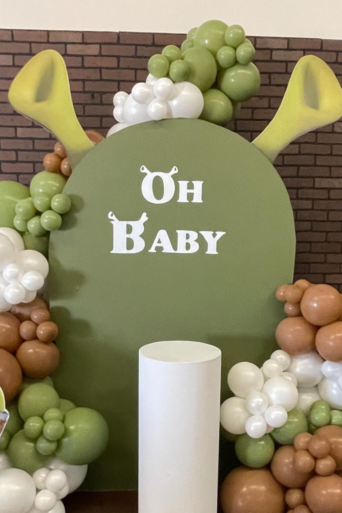
Playful Fusion
Sometimes you want a little fun mixed in -and that’s okay.
Even though this setup centers around a playful character theme, the reason it works is the controlled color story.
Greens, browns, and white keep it cohesive instead of chaotic.
If you’re blending Cielito Lindo with a secondary idea, choose one dominant shape (like this round backdrop) and let everything orbit around it.
The balloon clusters stay organic but contained, which prevents visual overload.
It’s a reminder that structure matters more than theme mashups.
When your base is strong, you can get creative without losing balance.
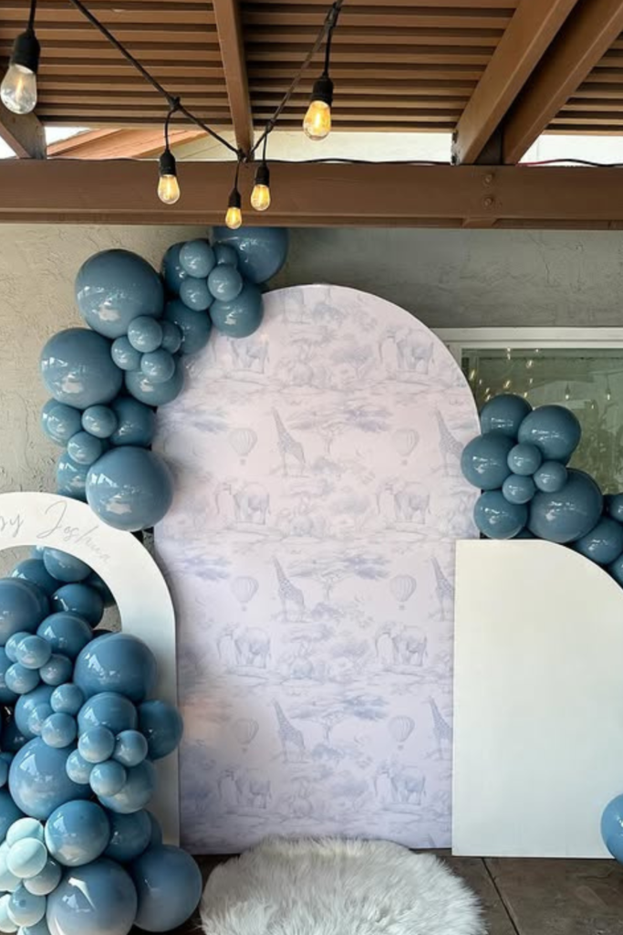
Soft Blue Safari
If you want a boy version that feels dreamy instead of bold, this is your blueprint.
The muted blue balloons instantly soften the space, while the arched panel keeps everything structured.
What really elevates it, though, is that subtle toile-style backdrop.
It adds detail without shouting for attention.
When you’re working with cooler tones, bring in one soft texture -like a faux fur rug -so it doesn’t feel cold.
And keep your balloon clusters concentrated to one side instead of wrapping everything.
It creates movement while leaving breathing room.
Calm colors + controlled placement = effortless elegance.
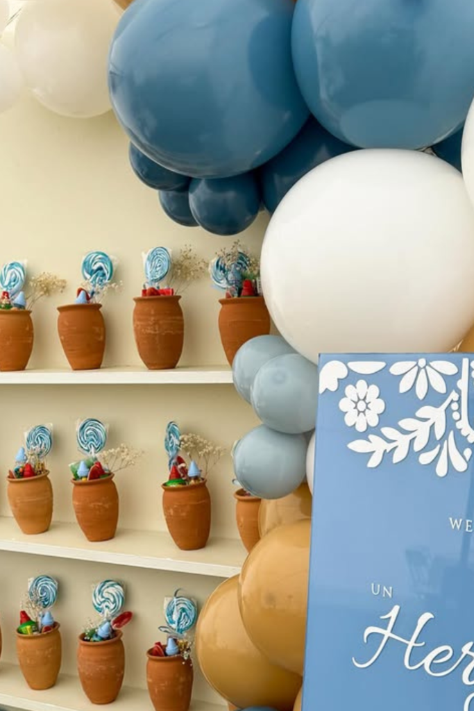
Terracotta Favors
Here’s a detail guests actually remember: thoughtful favors displayed beautifully.
Instead of laying treats flat on a table, stacking them in mini terracotta pots instantly ties back to the cultural vibe.
It feels intentional, not last-minute.
If you’re going blue and neutral, like this setup, the clay pots add warmth that balances the cool tones.
Fill them with sweets, small candies, or even custom cookies -but keep the presentation uniform.
Repetition is what makes it look styled. When your favors double as decor, you’re designing smarter, not harder.
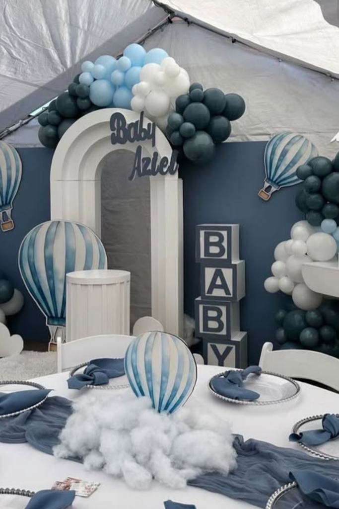
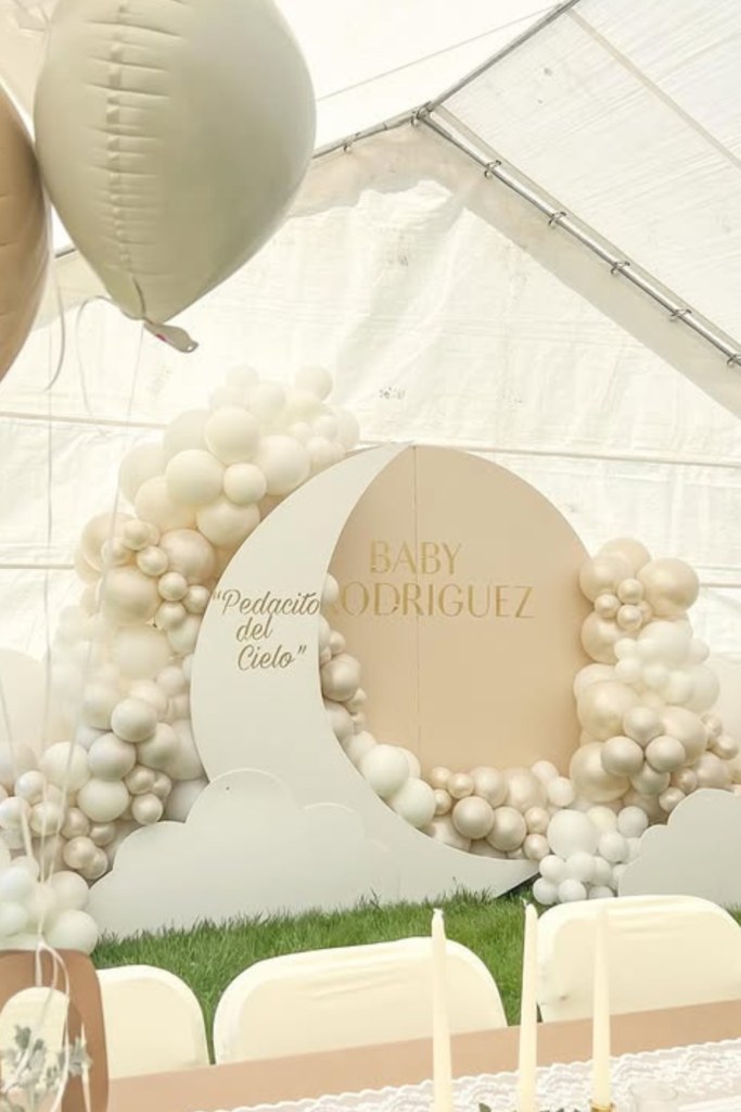
Sky Balloon Theme
If you’re leaning into a softer “little heaven” interpretation, this hot-air-balloon concept is a charming twist.
The layered blues paired with white cloud details feel light and airy without losing structure.
What makes it work is consistency.
The balloon backdrop, table settings, and centerpieces all echo the same shapes and tones.
If you try something thematic like this, repeat the motif in small ways -napkin accents, signage, props -so it feels cohesive.
And don’t overcrowd the tables. Clean place settings with one statement centerpiece keep everything polished.
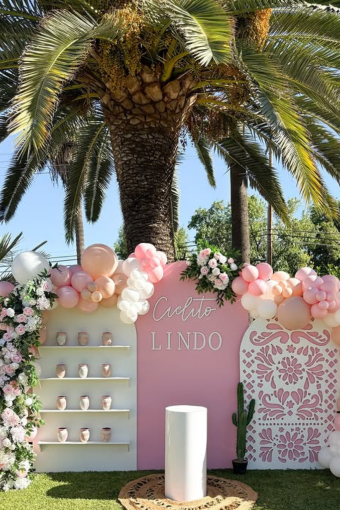
Garden Fiesta
Sometimes the setting does half the work for you.
If you’re hosting outdoors, let nature elevate the design.
The palm tree backdrop and natural greenery instantly warm up this pink Cielito Lindo setup.
Notice how the florals climb one side while the balloons balance the other.
That asymmetry keeps it interesting.
If you recreate this, don’t overfill the space just because it’s outdoors.
Choose one strong wall, layer it intentionally, and let the grass and sky do the rest.
Natural light makes pastel palettes glow -especially blush and cream.
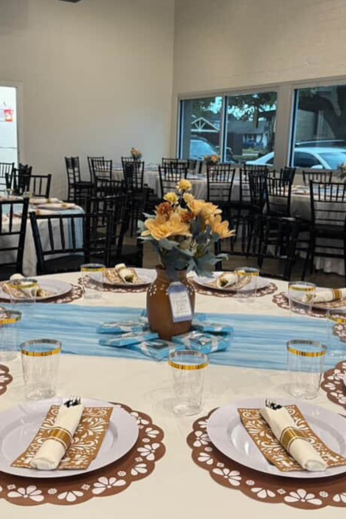
Talavera Tablescape
Don’t underestimate the power of a well-dressed table.
Before guests even see the backdrop, they sit down -and this is where the theme quietly shines.
The brown talavera-style placemats instantly ground the setting, while the soft blue runner keeps it fresh and balanced.
If you want cohesion, repeat one pattern across every place setting.
Consistency makes it feel styled, not thrown together. Notice how the florals echo the warm tones in the placemats?
That’s intentional layering. When your tables feel this polished, you don’t need over-the-top centerpieces.
Subtle cultural touches do the talking.
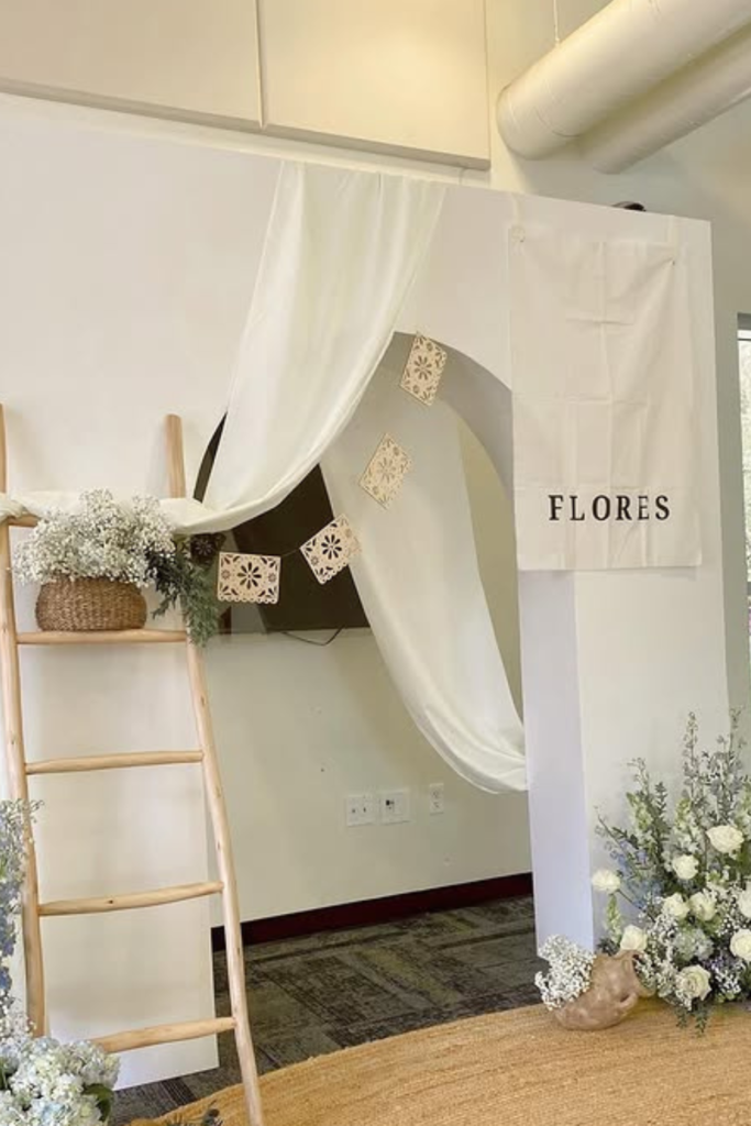
Neutral Flores
Sometimes the softest setups leave the strongest impression.
If bold colors aren’t your thing, a neutral Cielito Lindo approach can feel incredibly refined.
Draped fabric, woven textures, and delicate florals create warmth without relying on balloons.
If you try this look, focus on materials. Linen, rattan, soft greenery -they add dimension naturally.
Even the simple “Flores” detail adds a cultural nod without overpowering the design.
This works beautifully for an intimate shower where atmosphere matters more than spectacle.
Calm, airy, and thoughtful -that’s the vibe here.
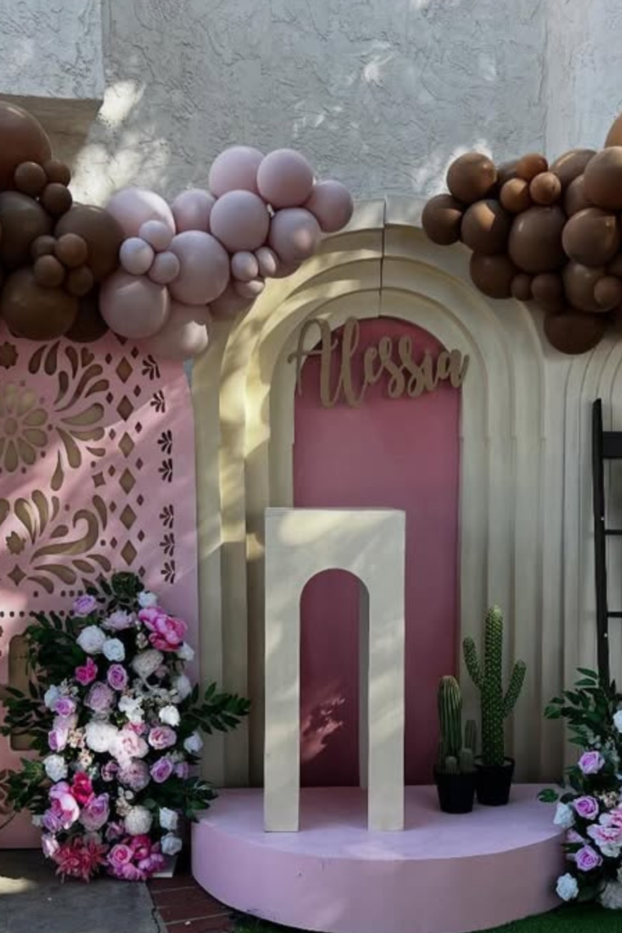
Pink Statement Wall
If you’re going pink, commit to it.
This setup works because it doesn’t hesitate -layered balloons, floral clusters, patterned panels -all within the same tonal family.
It feels bold but controlled.
The carved panel detail adds depth so the backdrop doesn’t look flat in photos.
And those small cactus accents? Just enough cultural reference without going overboard.
If you’re designing outdoors, bright pink pops beautifully against natural wood fences and green grass.
Keep the color story tight, and suddenly the entire space feels cohesive.
Cloud Cream Dream
If you want the “little heaven” meaning to shine, this is how you translate it visually.
Soft cream balloons, cloud shapes, and curved panels create a dreamy, almost celestial mood.
It feels gentle and intentional -not loud.
If you recreate something like this, avoid mixing too many colors.
The monochrome palette is what makes it look luxurious.
Even the table styling mirrors the softness with lace and simple greenery.
When everything flows in the same tone, the space feels calm and elevated.
Sometimes restraint is the real design statement.
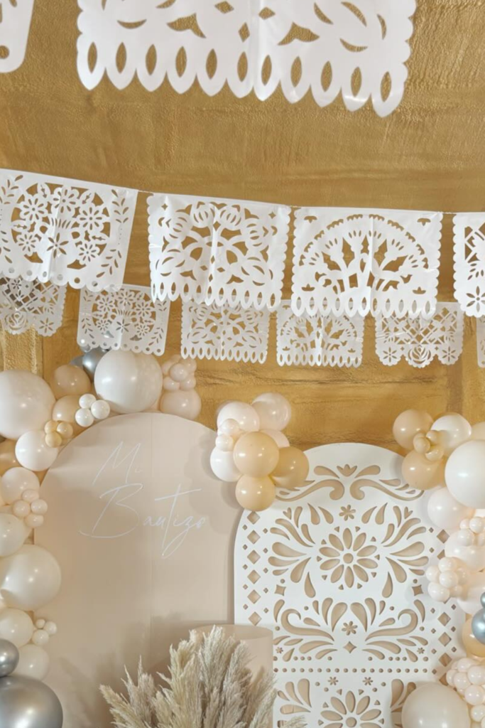
Papel Picado Luxe
If you want to instantly say “Cielito Lindo” without even reading the sign, hang papel picado overhead.
It frames the entire space before guests even step into the photo area.
Here, the soft ivory and champagne balloons stay neutral, letting the intricate cut-out panel shine.
Notice how silver accents sneak in for contrast -just enough shimmer without overpowering the warmth.
If you’re working with a textured wall like this, lean into creamy tones so nothing competes.
Add pampas or soft florals at the base to balance the height.
Sometimes the ceiling decor is what completes the story.
Cactus Welcome
Instead of a full backdrop, try making your entrance the moment.
This balloon cactus does exactly that -it’s playful, sculptural, and impossible to ignore.
Pairing it with a warm wood welcome sign keeps it grounded and personal.
If you recreate this, think about proportion.
The balloon sculpture should feel tall and intentional, not floppy.
And keep the surrounding decor minimal so the shape stands out.
A simple chair or small prop nearby can soften the setup.
When guests arrive, they should instantly feel the theme before they even walk inside.

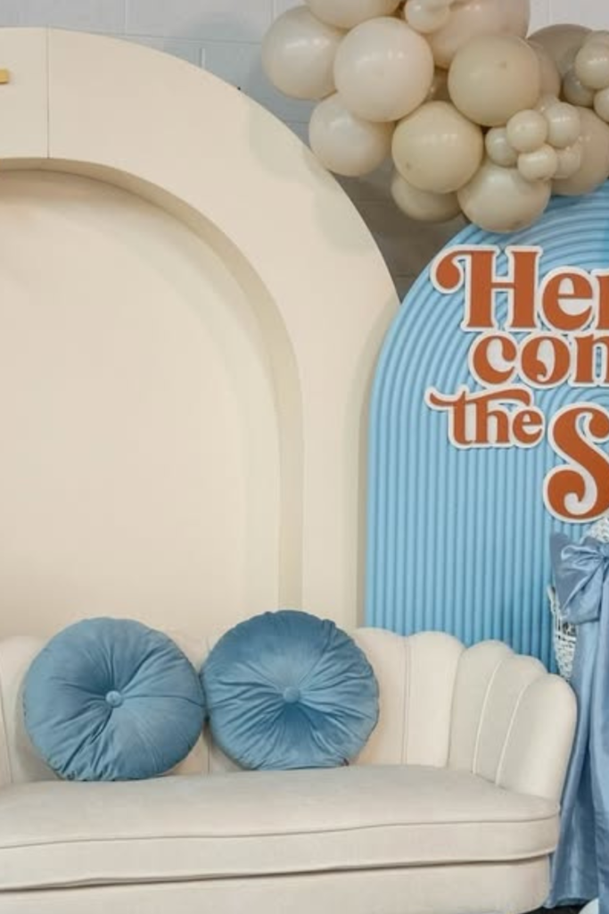
Sunshine Twist
You don’t have to stay traditional to stay meaningful.
This “Here Comes the Son” concept blends warmth and softness beautifully.
The creamy arch and sunshine detail nod to celebration, while the muted blues keep it baby-focused.
If you’re mixing themes, make sure the color palette overlaps.
That’s what keeps it cohesive. Florals, balloons, and even the stroller prop all echo similar tones.
When you layer textures -wicker, fabric, blooms -the space feels styled instead of staged.
A creative phrase can elevate the entire mood.
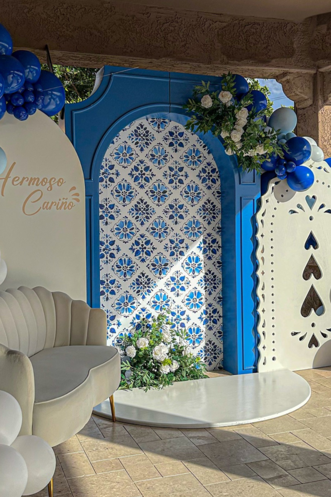
Royal Blue Tile
If bold is your style, don’t hold back.
This deep blue setup feels rich and dramatic, especially paired with classic talavera-inspired panels.
The layered arches add depth, but it’s that patterned center that anchors everything culturally.
When working with strong color, balance it with white or cream balloons so it doesn’t feel heavy.
And adding a seating area in front turns the backdrop into a true photo moment.
This works especially well outdoors where natural light enhances the blues. Strong color + structured panels = unforgettable impact.
Blue Garden Arch
If you want elegance without balloons taking over, let greenery lead.
This blue backdrop works because the florals soften the structure instead of competing with it.
The arched center framed with subtle tile details keeps it rooted in the Cielito Lindo vibe, while the rattan chair adds warmth.
Try this if you prefer refined over flashy.
Focus on layering plants at the top and base so the arch feels naturally framed.
A simple papel picado banner above ties everything together without cluttering the scene.
Sometimes restraint makes the cultural details stand out even more.
Mocha Blush Drama
When you mix blush with mocha and cream, you instantly create depth.
This setup feels rich because it doesn’t rely on one shade of pink -it layers tones from soft beige to chocolate brown.
That contrast makes the name panel pop.
If you attempt this palette, distribute darker balloons strategically near the top to balance the lighter base.
Florals in similar tones keep it cohesive. Notice the small cactus accents tucked in?
They ground the design without overpowering it. Bold color doesn’t mean loud -it means intentional placement.
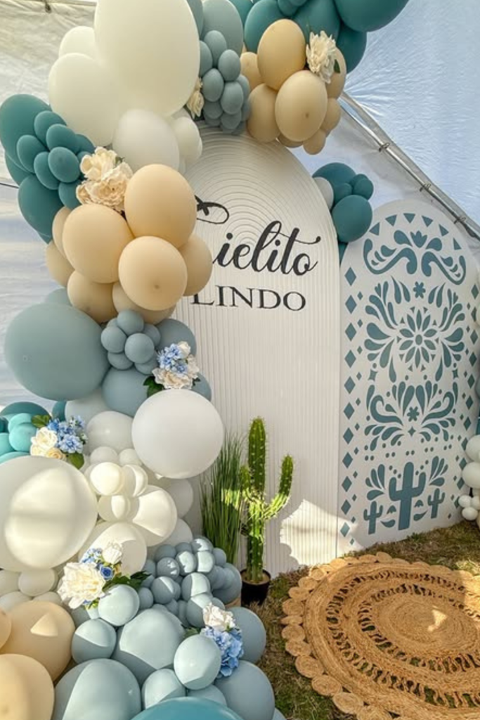
Teal Desert Blend
Here’s a refreshing take if you’re tired of pink and blue.
Teal mixed with sandy beige feels modern but still culturally inspired.
The carved panel detail quietly nods to tradition while the balloon clusters keep it playful.
If you’re working inside a tent or covered space, choose colors that won’t look dull in filtered light.
Teal holds its vibrancy beautifully.
A woven rug at the base anchors everything and makes the setup feel finished.
When you combine desert tones with cool accents, you get balance without chaos.
Blush Ladder Accent
Sometimes it’s the smallest prop that changes the entire mood.
That simple wooden ladder here adds height and dimension without needing extra panels.
Paired with soft blush and cream balloons, the setup feels airy and layered.
If you want your backdrop to feel styled rather than staged, include one vertical element like this.
It breaks up the balloon mass and gives you a place for florals or small details.
The tonal pink palette keeps it cohesive, while the carved panel adds cultural texture.
Little structure shifts make a big visual difference.
Teal Fiesta Pop
If you want your setup to feel playful but still on theme, add one bold cultural element front and center.
That teal folkloric silhouette instantly tells the story without overwhelming the space.
Paired with soft blue and cream balloons, it feels festive yet balanced.
When working with a statement cutout like this, keep the surrounding palette tight so it doesn’t compete.
Notice how the patterned white panel echoes tradition without going busy? That layering is intentional.
Strong accent pieces work best when everything around them supports the mood instead of fighting for attention.

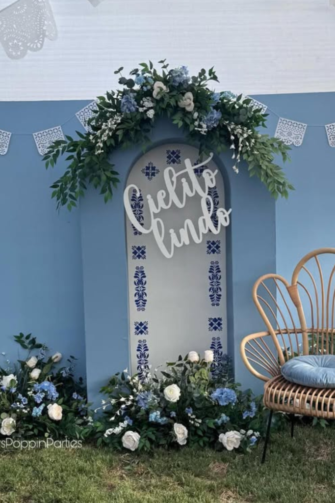
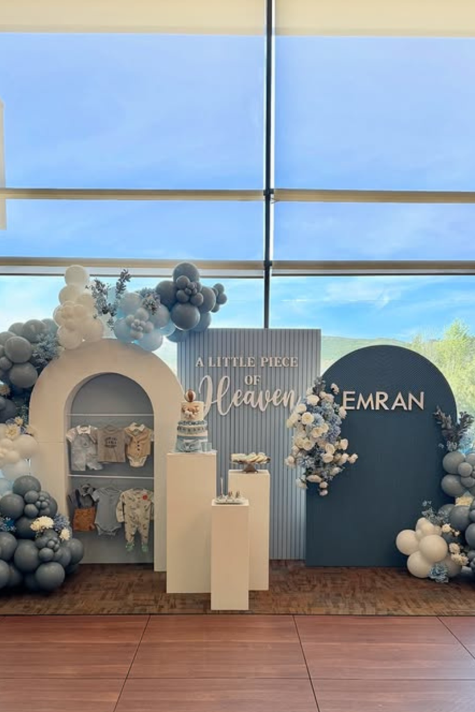
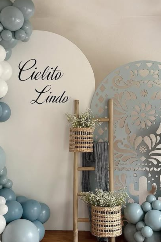
Little Heaven Panels
If you love a modern event feel, take notes here.
Instead of one backdrop, use multiple panels with different heights and finishes.
The phrase “A Little Piece of Heaven” subtly ties back to the meaning of Cielito Lindo without being literal.
Balloon clusters are placed strategically at the corners, not flooding the center.
That gives the signage room to breathe.
When you’re styling indoors with large windows, softer blues and greys photograph beautifully in natural light.
Structure first, balloons second -that’s the formula here.
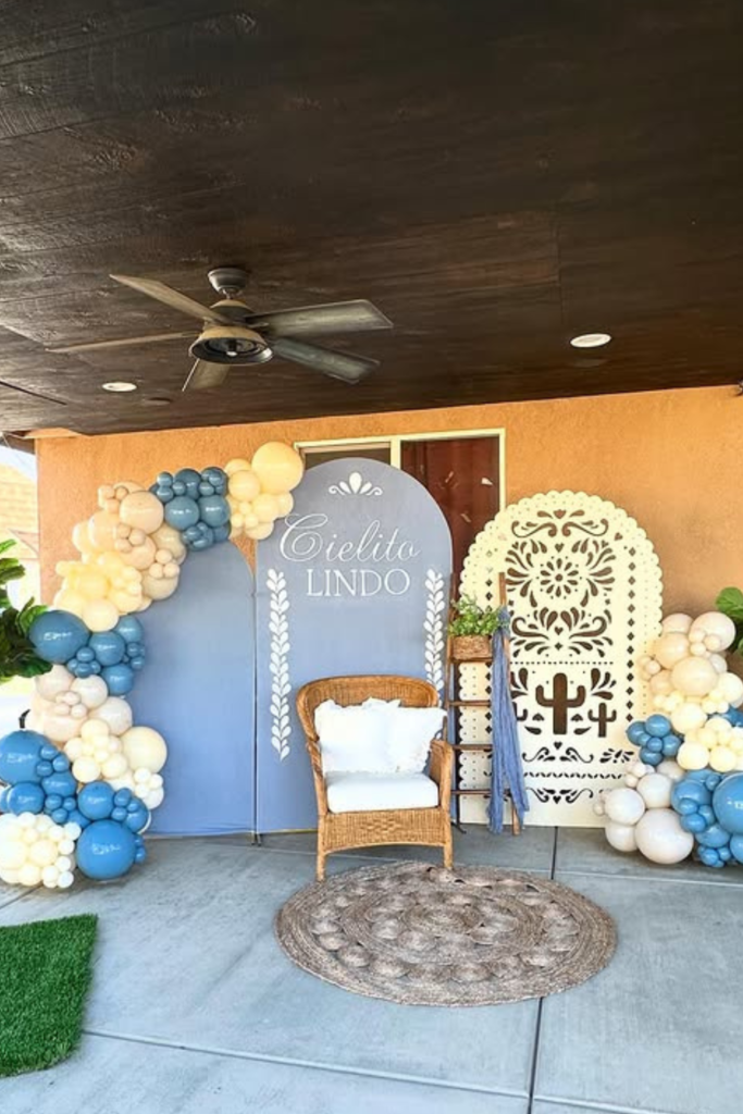
Rustic Blue Lounge
Want your backdrop to double as a lounge area? Add seating.
That simple wicker chair instantly turns this into an inviting photo moment rather than just decor.
The dusty blue panels feel calm, while the carved detail keeps it culturally rooted.
If you’re hosting under a patio or covered area, work with the existing tones.
Warm walls pair nicely with blue and cream balloons.
A woven rug underneath finishes the space and prevents it from looking incomplete.
Comfort + culture makes guests want to stay in the frame longer.
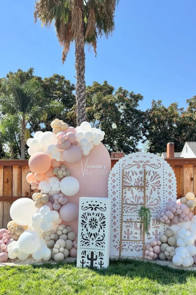
Blush Baptizo Blend
Here’s how you mix celebration styles without losing elegance.
Soft blush, cream, and nude balloons create a romantic base, while the carved panels and cactus accents keep the cultural vibe intact.
If you’re styling outdoors, use the fence and greenery as part of your design instead of hiding them.
Layer balloon clusters heavier on one side and lighter on the other for visual flow.
The tonal palette is what makes this look elevated.
When everything stays within the same family of shades, even multiple elements feel cohesive.
Soft Blue Corner
Not every backdrop needs an entire wall -sometimes a styled corner is more than enough.
This setup proves you can transform a simple space into a photo moment with the right layering.
The dusty blue and white balloons feel calm and baby-focused, while the carved panel keeps that subtle Cielito Lindo character alive.
If you’re working inside a home or smaller venue, use the corner to your advantage.
Let the balloons climb upward instead of spreading wide.
The wooden ladder with woven baskets adds warmth and breaks up the balloon mass beautifully.
When you mix texture with a tight color palette, even a compact setup feels complete and intentional.
FAQs
How do I make a Cielito Lindo baby shower look cohesive instead of chaotic?
The key is choosing structure before decor.
Start with one clear color palette (no more than 3–4 shades), then pick a strong focal point like an arched panel, carved backdrop, or statement balloon installation.
From there, repeat subtle elements -whether it’s talavera patterns, cactus accents, or woven textures -across your tables, signage, and favors.
If you try to add everything at once, it will feel overwhelming.
But when you anchor the design and build outward intentionally, the entire setup feels polished instead of busy.
Can I use this theme for a boy, girl, or gender-neutral baby shower?
Absolutely. That’s one of the strengths of the Cielito Lindo theme -it adapts beautifully.
For a girl, lean into blush, rose, and cream tones.
For a boy, dusty blue, beige, and soft white create a refined look.
If you want gender-neutral, terracotta, sage, and ivory feel warm and modern.
The theme isn’t about the color -it’s about the cultural details and joyful atmosphere.
Once you understand that, you can adjust the palette to fit any celebration.

Hi, I’m Abrar! I’m a writer who loves creating content around fun, celebrations, and creative ideas that bring people together.
I enjoy writing about topics that add a bit of excitement to everyday life. Whether it’s planning something special or finding new ways to entertain, I focus on ideas that are simple and enjoyable.
I keep things practical and easy to understand. If something seems fun and worth trying, I’ll write about it.
When I’m not writing, I’m usually looking for inspiration or thinking up new ideas to share with you!