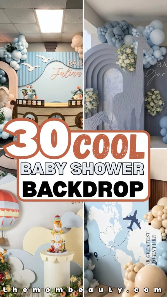
30 Baby Shower Backdrop Ideas for 2026
You start searching for baby shower backdrop ideas thinking it’ll be quick-then suddenly you’re overwhelmed.
Balloon arches, round panels, boho themes, safari setups… everything looks beautiful online, but how do you choose the right one?
The real struggle isn’t finding ideas-it’s knowing which ones work and how to execute them without it looking cheap or chaotic.
In this article, I will show you how to choose right baby shower backdrop and then 30 backdrop ideas to try.
Let’s jump in!
How to Choose the Right Baby Shower Backdrop for Your Space
Before you pick a theme or order balloons, you need to look at your space.
This is where most people go wrong. They fall in love with a Pinterest setup without asking, “Will this actually fit where I’m hosting?”
If you’re hosting at home, measure your wall first. Check the ceiling height.
A large balloon arch might look stunning online, but if your ceilings are low, it can feel cramped instead of elegant.
If you’re working with a small living room, consider a half-arch or a round backdrop panel instead of a full installation.
Hosting outdoors? Then you need to think about wind, sunlight, and uneven ground. Lightweight backdrops can tip over if they’re not secured properly.
Also think about guest flow. If you want it to be a photo area, place it where people naturally gather-not in a tight corner.
The rule is simple: design for your space first, then design for style. When the proportions make sense, everything automatically looks more polished and intentional.
Save this article for later! 👇👇
Around the World
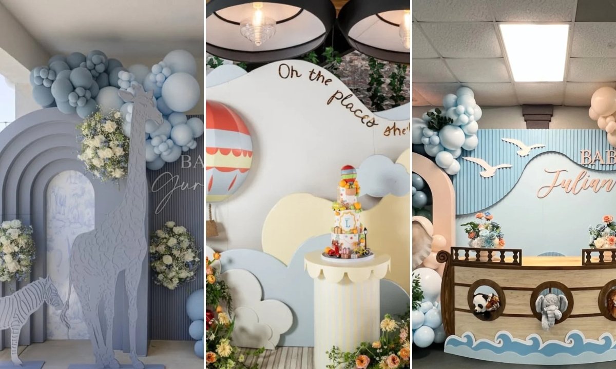
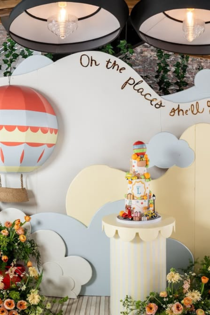
If you want something that feels imaginative without being overly babyish, lean into storytelling.
This travel-themed backdrop works because it builds a scene, not just a wall.
The hot air balloon, airplane, and city landmarks instantly create movement and curiosity.
Notice how the soft cloud shapes keep everything light and cohesive.
If you try this theme, focus on layering cutouts at different heights instead of keeping everything flat.
Add one strong prop (like a scooter or landmark) to anchor the design.
The trick here isn’t more decor -it’s depth and dimension that makes the backdrop feel immersive.
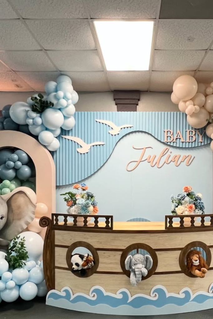
Safari Statement
If you’re going safari, commit to scale.
What makes this setup stand out isn’t just the animals -it’s the oversized giraffe and elephant that instantly command attention.
The ark-style table adds personality without overwhelming the space.
When you recreate this look, balance bold props with soft balloon tones.
Notice how muted blues and creams prevent it from feeling too loud.
Add greenery sparingly so it feels styled, not cluttered.
Big statement pieces work best when the rest of the palette stays calm and controlled.
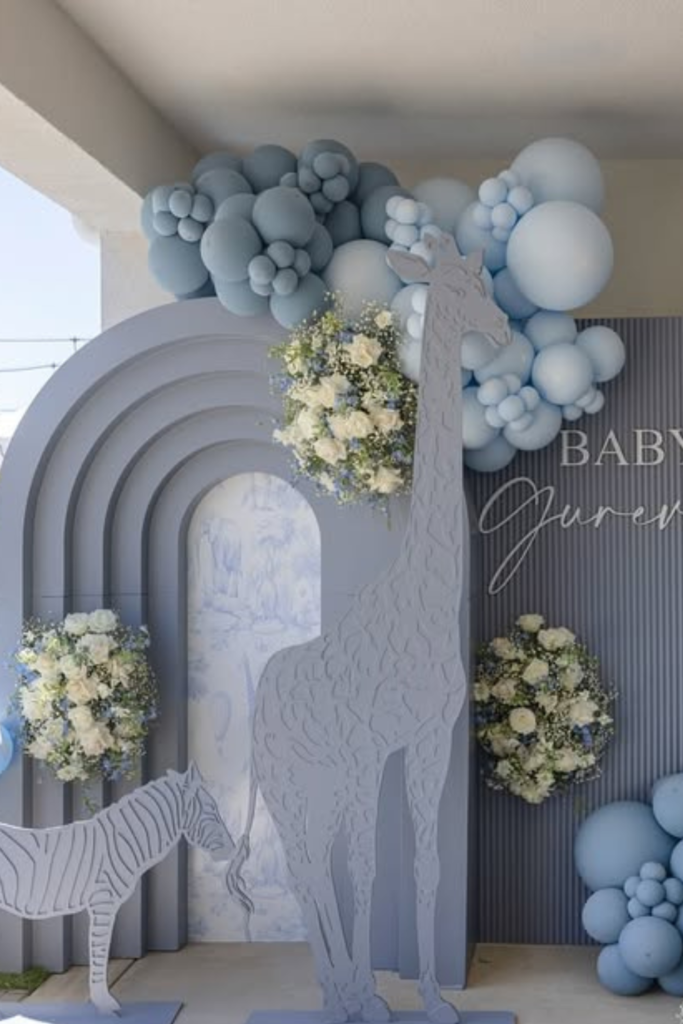
Soft Blue Safari
If you love safari but want something more elegant than playful, this monochrome blue version is your move.
By keeping everything within one color family, the backdrop feels refined instead of theme-park inspired.
The layered arch panels in the background add architectural interest without needing busy prints.
If you try this, mix balloon sizes generously -the fullness is what gives it that luxury finish.
Fresh white florals break up the blue and add softness.
When you limit color but increase texture, the result feels high-end and intentional.
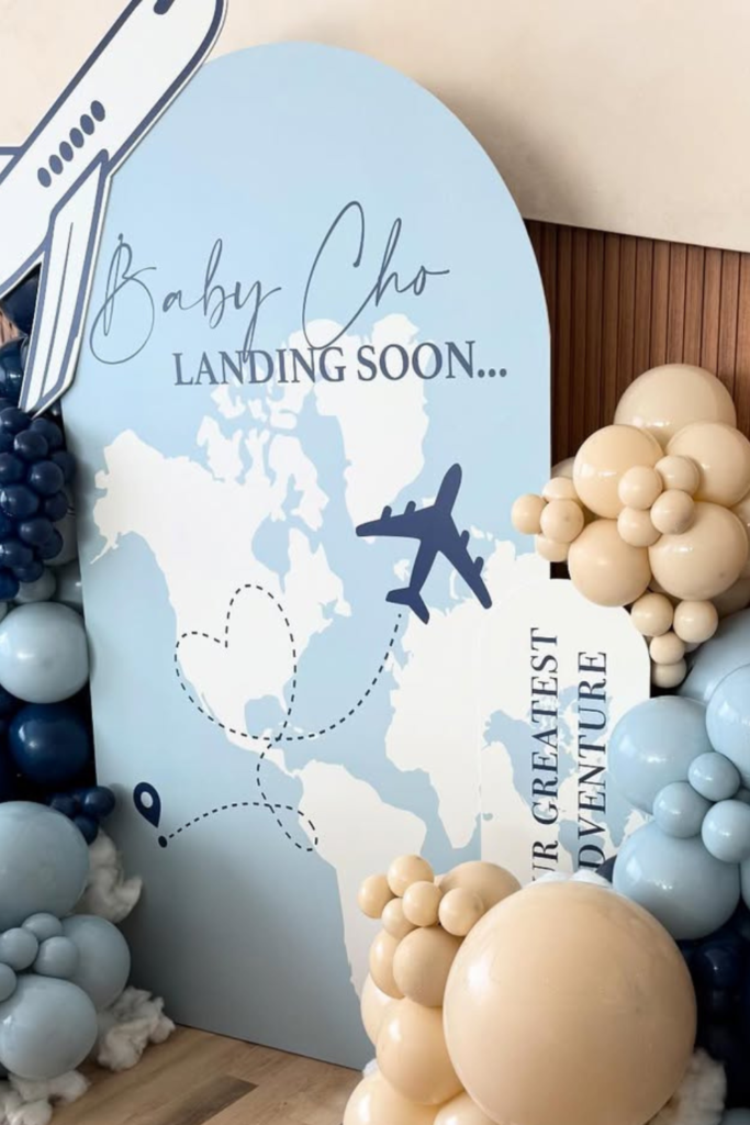
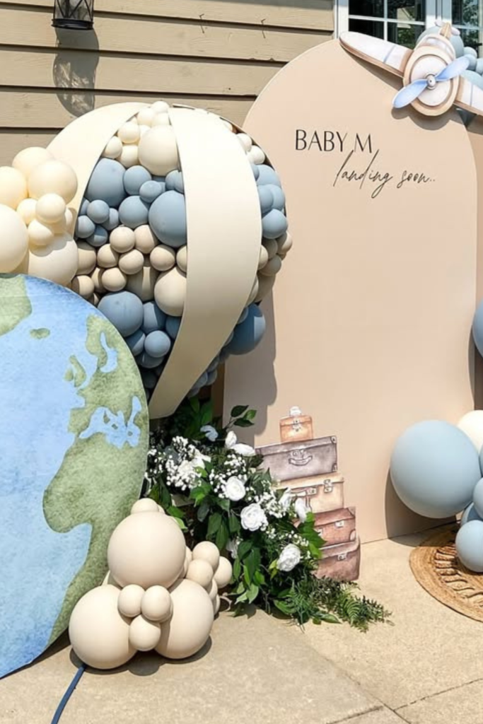
Baby Landing
Sometimes a theme works best when it revolves around one clever phrase.
“Landing Soon” instantly ties the airplane graphics, world map, and dotted flight path together.
It feels cohesive because every element supports the same idea.
If you want to recreate this look, keep your base backdrop clean and let the balloons frame it rather than cover it.
Notice how the navy, beige, and baby blue palette adds contrast without chaos.
Adding small cloud details at the bottom softens the base and makes the whole setup feel complete instead of floating awkwardly.
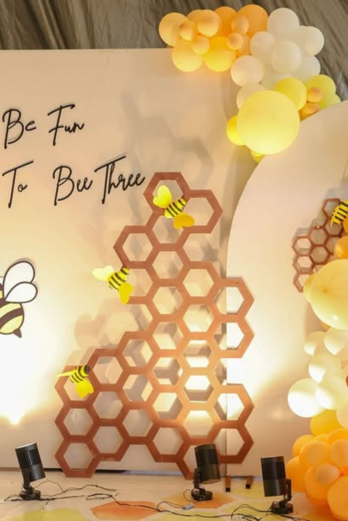
Sweet as Honey
If you want a theme that instantly feels joyful, go bold with color.
This bee-inspired setup works because it fully embraces yellow instead of just hinting at it.
The honeycomb panels create structure, while the balloon clusters soften the sharp lines.
If you try something similar, don’t scatter bee elements randomly.
Group them intentionally so they feel designed, not stuck on.
Warm lighting at the base makes the yellow glow instead of looking flat.
And notice how the orange tones in the outfit complement the backdrop -coordinating wardrobe with decor makes your photos look twice as intentional.
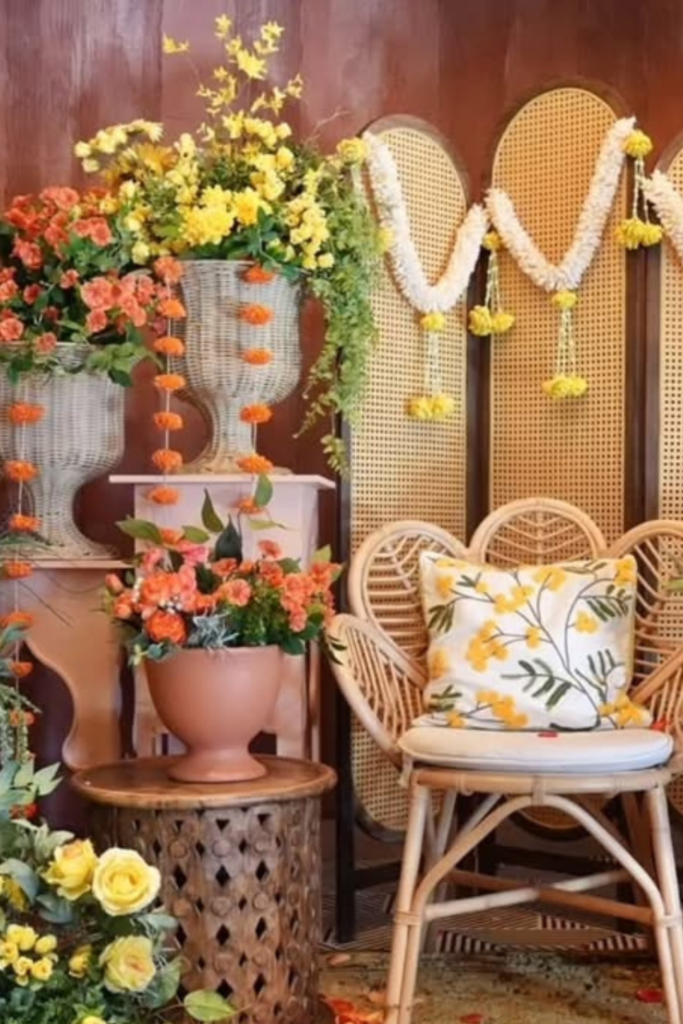
Blooming Boho
Sometimes you don’t need balloons at all.
This setup proves texture can carry the entire design.
The layered rattan panels, oversized floral arrangements, and earthy pots create depth without overwhelming the eye.
If you’re drawn to this style, focus on height variation.
Place florals at different levels so the backdrop feels layered instead of symmetrical.
Stick to two main flower colors and let greenery fill the gaps.
When everything feels natural and slightly imperfect, that’s when boho looks elevated rather than messy.
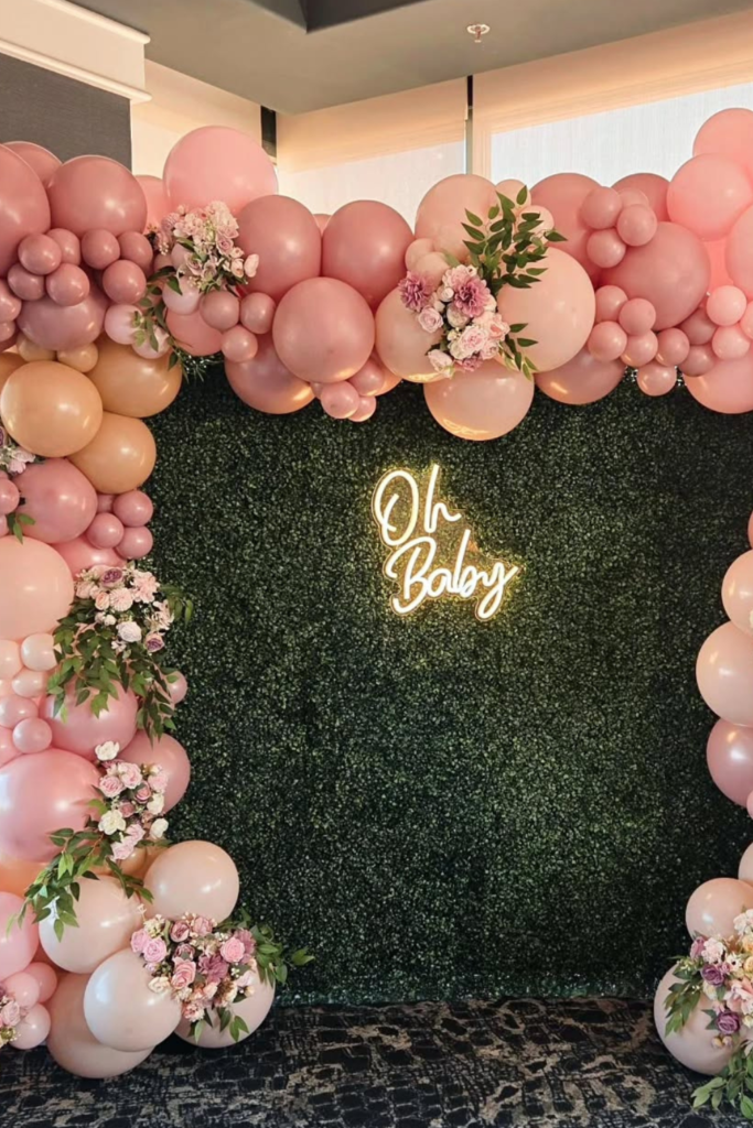
Oh Baby Frame
If you want a guaranteed photo moment, frame the space like this.
The balloon border creates a natural picture frame, and the green hedge wall anchors everything in the center.
When recreating this look, think in contrast.
Soft pink balloons pop because they sit against deep green.
Add florals inside the balloon clusters to break up the latex texture and make it feel styled.
And keep your center signage clean -once you start over-layering text, the impact disappears. Sometimes framing the moment is more powerful than filling it.
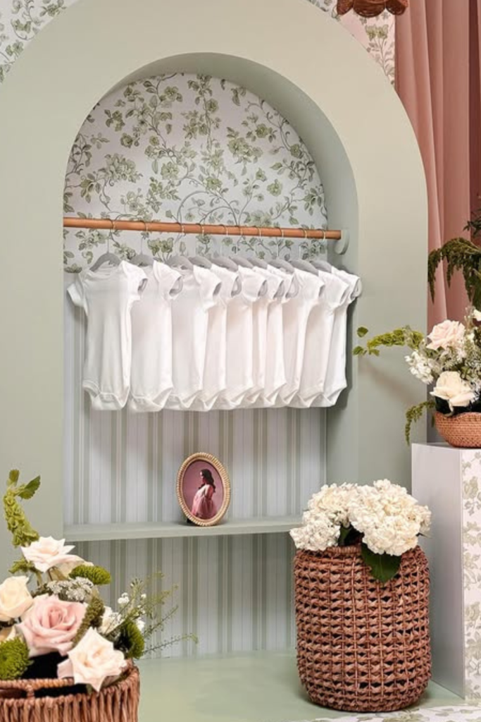
Boutique Display
If you want your backdrop to feel personal instead of purely decorative, add meaning.
This clothing-display setup turns baby essentials into part of the design.
It’s subtle, sentimental, and incredibly charming.
If you try this, keep the color palette soft so the focus stays on the tiny outfits.
Mix textures -wicker baskets, florals, wallpaper, fabric drapes -to make the space feel curated.
And don’t overcrowd the rack.
Leaving breathing room around each piece makes it feel intentional, almost like a little baby boutique moment.
Vintage Landing
If you’re doing a travel theme outdoors, soften it.
This setup works because the blue and beige palette feels airy instead of bold.
The globe cutout instantly grounds the theme without overcrowding the space.
If you try this look, build your balloon clusters low and wide instead of tall and narrow.
Outdoor backdrops need visual weight at the base so they don’t look top-heavy.
Add small travel props-like suitcases-to give personality without distracting from the main panels.
Keep the wording minimal. Clean typography always photographs better in natural sunlight.
Neutral Luxe
If your goal is elegance over playfulness, go neutral and commit to it fully.
This palette of cream, taupe, and soft brown feels elevated because there’s no competing color.
The oversized bow pulls everything together and adds softness without extra clutter.
When designing something similar, choose one strong focal element (like the bow or statement arch) and let everything else support it quietly.
Glossy balloons mixed with matte tones add depth.
You don’t need bright colors when texture is doing all the heavy lifting.
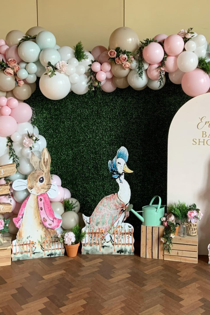
Storybook Garden
If you want something charming without looking cartoonish, lean into storybook details.
The soft animal cutouts and muted pastels create personality while still feeling refined.
Notice how the balloon garland doesn’t overpower the characters. That’s intentional.
When you recreate this style, keep your balloons slightly desaturated so the illustrations stand out.
Wooden crates and small garden props add dimension at floor level, which makes the setup feel layered instead of flat.
Think whimsical-but controlled.
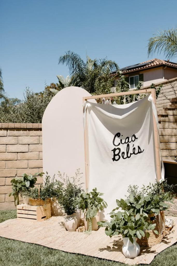
Ciao Baby
Sometimes less really is more.
This setup proves you don’t need balloons at all to create impact.
A simple fabric panel with bold script can feel modern and stylish when styled properly.
If you try this, focus on grounding the backdrop with greenery and natural textures.
Use rugs, baskets, and plants to build warmth around the frame.
Keep the color palette earthy and soft so the text becomes the statement.
Minimal designs only work when the styling around them feels intentional—not empty.
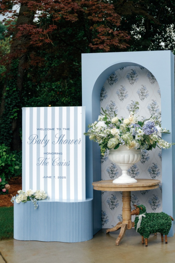
Classic Blue
If you want timeless instead of trendy, go structured.
This setup feels refined because it leans on symmetry, stripes, and soft blue florals instead of balloons.
The arched niche adds architectural interest without overwhelming the design.
If you’re recreating this look, think in layers: panel, pattern, pedestal, then florals.
Keep your typography elegant and spaced out -crowded text ruins a classic aesthetic instantly.
A single large floral arrangement often feels more elevated than multiple small ones.
When in doubt, edit down.
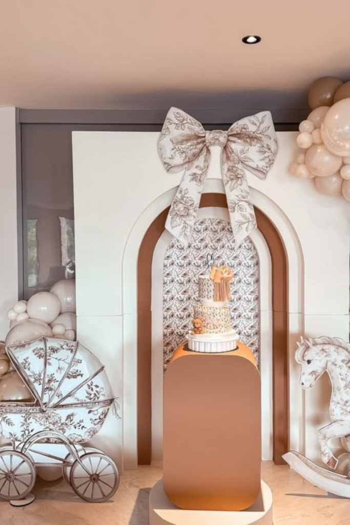
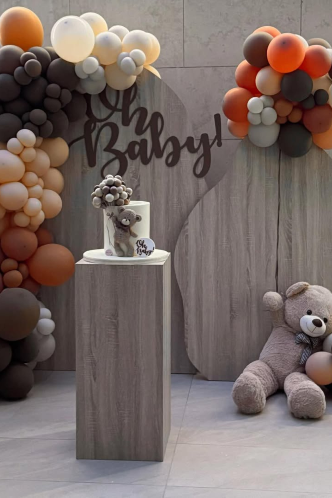
Modern Teddy
If you’re using a teddy bear theme, the key is keeping it stylish.
The neutral wood panels and muted balloon tones make this feel grown-up rather than childish.
When designing something similar, avoid bright primary colors.
Stick to browns, creams, and soft caramel tones so the teddy becomes part of the aesthetic, not a random prop.
Notice how the balloons hug the corners instead of swallowing the wall -that restraint keeps everything polished.
A plush bear on the floor adds warmth without cluttering the focal area.
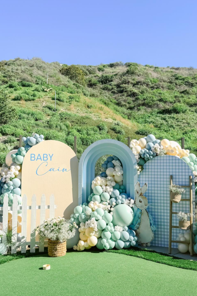
Pastel Garden
If you’re going outdoors, let the landscape work with you.
This pastel setup blends mint, butter yellow, and baby blue in a way that complements the greenery instead of competing with it.
When recreating this style, soften the balloon clusters by mixing in florals and small white filler balloons.
Hard edges feel harsh in open spaces.
Add one interactive element -like a small gate or ladder -to create depth for photos.
Outdoor backdrops shine when they feel airy and slightly whimsical.
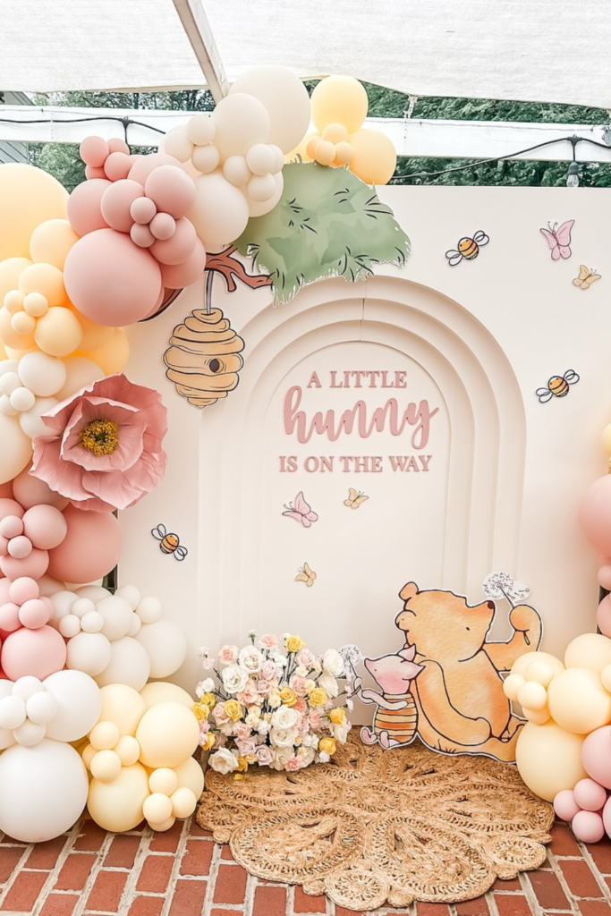
Little Hunny
If you want playful without losing elegance, soften your color palette.
This “Little Hunny” theme works because the pinks and creams feel gentle rather than neon.
When building something similar, balance illustrated panels with dimensional balloons so the backdrop doesn’t look flat.
Oversized paper flowers add drama without adding weight.
Keep your phrase centered and readable -clever wording loses impact if it gets buried.
Sometimes a sweet message and cohesive colors are all you need.
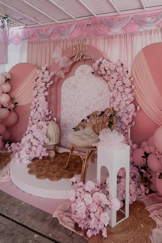
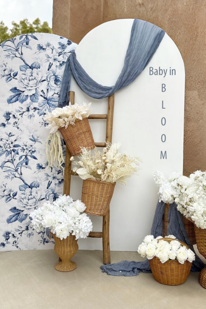
Blush Bloom
If you’re going all pink, don’t hold back.
This “Baby in Bloom” setup works because it commits to the color story completely -florals, draping, balloons, even the stage platform.
If you try this, mix fabric and flowers so it doesn’t feel like a balloon wall with extras.
Soft drapes instantly elevate the space and hide harsh venue lines.
Layer florals around the arch opening to create a focal frame for photos.
And keep seating minimal -one textured chair is enough.
When everything coordinates, pink feels romantic, not overwhelming.
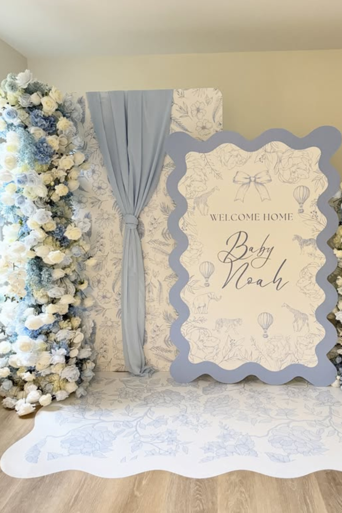
Blue Toile
If you want timeless with personality, pattern is your secret weapon.
The blue toile panel adds instant charm without needing balloons at all.
When recreating this look, pair busy prints with clean white space so the design can breathe.
Wicker baskets and dried florals warm up the crisp blue tones and prevent it from feeling cold.
Keep your signage subtle and vertical if space is tight.
Sometimes a strong backdrop print does more than any balloon garland ever could.
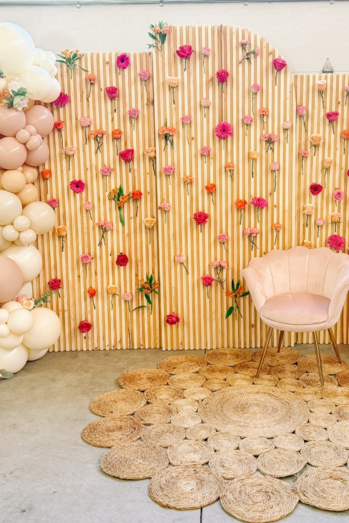
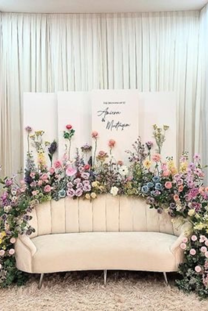
Floral Wall
If you love color but fear chaos, organize it.
This slatted wall filled with scattered blooms works because the flowers are evenly distributed, not clumped randomly.
If you’re building something similar, choose two or three floral shades and repeat them across the surface.
Balloon clusters on both sides create balance and frame the chair naturally.
The woven rug grounds the setup and adds texture at floor level.
Controlled repetition is what keeps vibrant backdrops looking styled instead of busy.
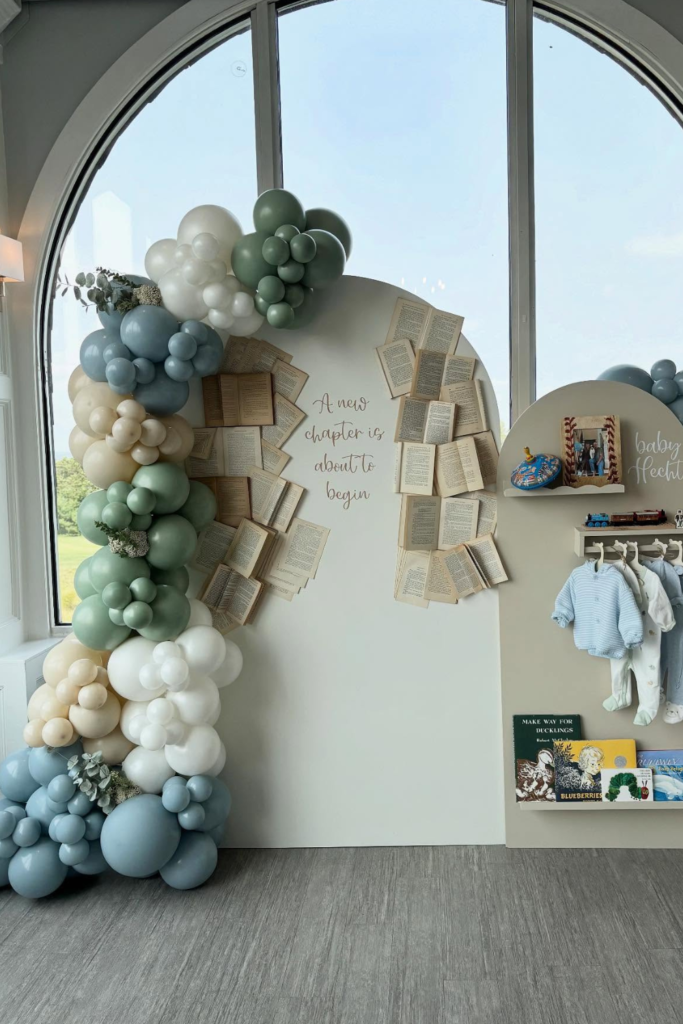
New Chapter
If you want something meaningful, tell a story.
This backdrop feels special because it connects books, baby clothes, and the phrase “A new chapter is about to begin.”
If you try this idea, use real pages or paper textures to create depth on your panel.
Keep your balloon colors muted so the storytelling elements stand out.
Adding a small clothing rack or shelf makes it interactive and personal.
When decor reflects a journey instead of just a theme, guests instantly connect with it.
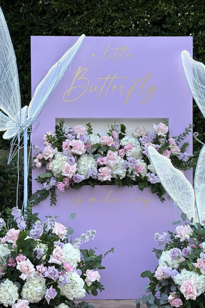
Little Butterfly
If you want something that feels delicate and magical, go soft in both color and structure.
This lavender butterfly theme works because the florals spill naturally from the center instead of sitting stiffly around it.
If you’re recreating this look, let one main floral installation carry the design and keep the rest balanced.
Oversized butterfly wings add drama, but the pastel palette keeps it graceful.
Use greenery to soften the edges so the setup blends beautifully with an outdoor backdrop.
When everything feels light, the theme truly comes alive.
Floral Arch
If you’re not into balloons at all, lean into abundance.
This floral arch proves that layering fresh blooms around seating instantly creates a romantic photo zone.
When designing something similar, build from the ground up.
Start with a lush base, then gradually taper florals upward so it frames the couch without hiding it.
Keep your backdrop neutral -white draping lets the flowers shine.
Sometimes a wall of florals is more powerful than any balloon installation.
Tierra Baby
If you love warm tones, embrace earthy color instead of pastel.
This terracotta and cream palette feels bold yet grounded because the shades complement each other instead of competing.
When trying this style, mix matte balloons in caramel and sand tones for depth.
Adding cutout panels with pattern detail keeps the backdrop interesting without extra props.
Outdoors, strong shapes photograph best under direct sunlight.
Keep the arrangement wide and low so it doesn’t fight the sky behind it.
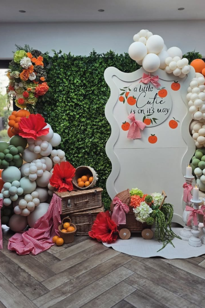
Little Cutie
If you want something playful but polished, balance theme with texture.
The “Little Cutie” setup works because the oranges are echoed subtly throughout the decor instead of overwhelming the space.
If you recreate this idea, scatter real or faux fruit near the base to tie everything together.
Mix soft balloon clusters with greenery so the palette doesn’t feel flat.
The gingham bows add charm without feeling childish.
When small details repeat intentionally, the whole backdrop feels cohesive rather than themed.
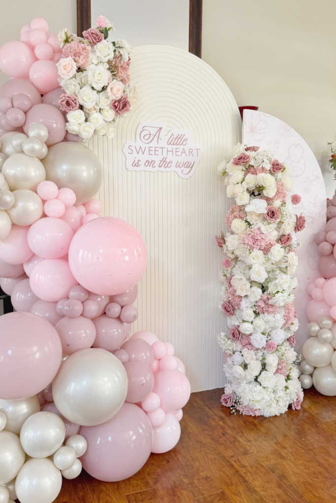
Sweetheart Blush
If you want soft and romantic without going over the top, balance balloons with florals.
This “Little Sweetheart” setup works because the flowers break up the pink and add texture instead of letting it feel like a bubble wall.
When designing something similar, vary balloon sizes dramatically so the clusters feel organic.
Add one vertical floral column to draw the eye upward and create height.
Keep your center panel simple and lightly textured -too much pattern competes with the softness.
The magic here is contrast between smooth balloons and lush blooms.
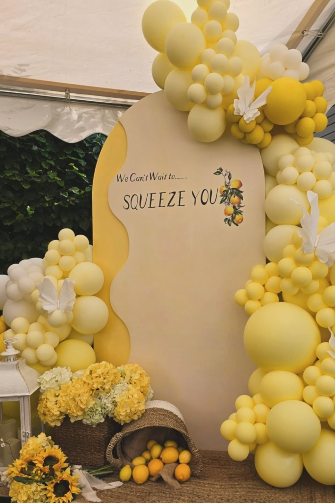
Squeeze You
If you’re doing a lemon or citrus theme, go all in on color.
This bright yellow backdrop succeeds because it doesn’t shy away from saturation.
To recreate it, mix multiple shades of yellow so it feels layered, not flat.
Add a few white accents to give the eye a break.
Real or faux lemons at the base instantly tie the theme together.
And keep your wording bold and playful -citrus themes are meant to feel joyful, not subtle.
Powder Blue
If you prefer polished over playful, lean into symmetry.
This powder-blue arch feels elevated because the decor is intentional and uncluttered.
When building a similar look, use one strong architectural shape as your anchor.
Keep florals mostly neutral so the blue stays dominant.
Wall sconces or soft lighting instantly elevate the backdrop and make it feel venue-ready.
A minimal color palette always looks more refined in photos.
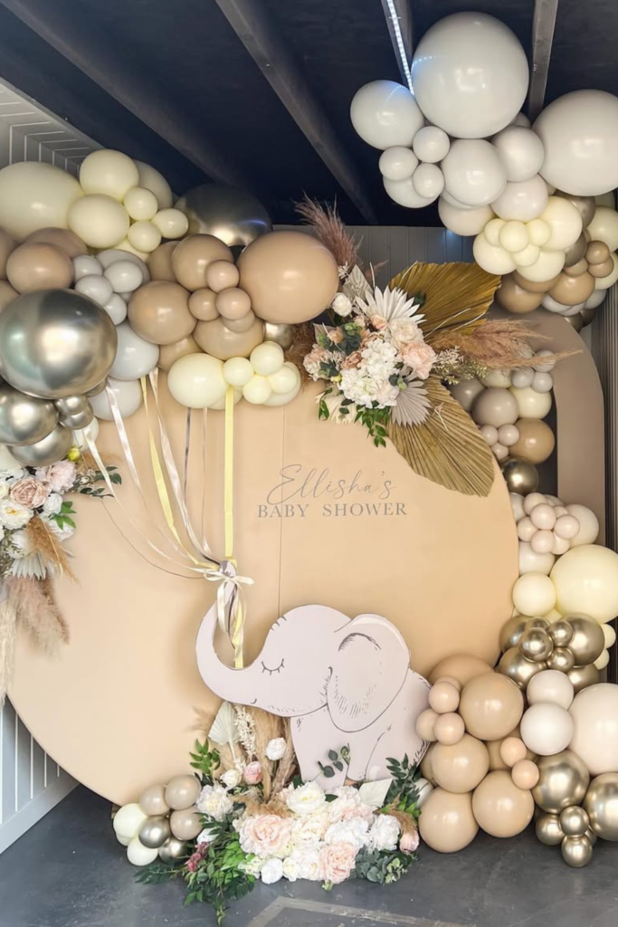
Neutral Safari
If you love safari but want it chic, strip back the color.
This neutral elephant theme feels luxurious because it relies on beige, cream, and metallic touches instead of bright jungle tones.
When recreating this style, combine matte and metallic balloons for depth.
Add dried palms or pampas to bring in texture without adding color.
Keep the animal cutout subtle and let the florals soften the edges.
Neutral themes feel high-end when you focus on layers, not loudness.
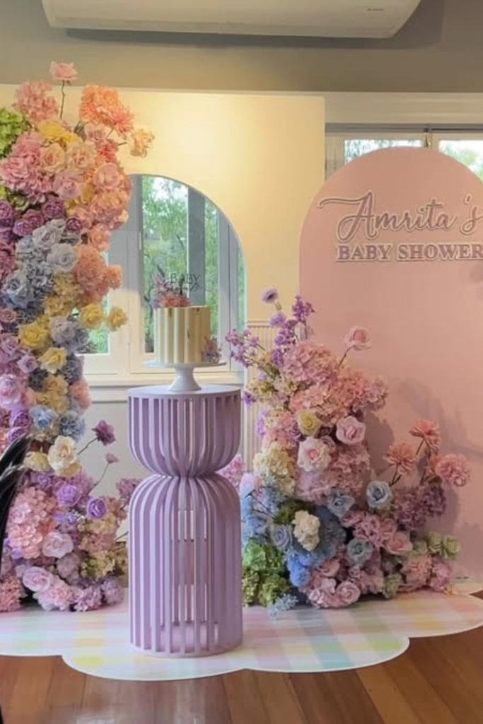
Pastel Garden
If you want something that feels straight out of a fairytale, let florals do the talking.
This setup works because the flowers aren’t just accents -they’re the backdrop itself.
If you’re recreating this look, blend soft pastels like lilac, blush, butter yellow, and baby blue so the arrangement feels painterly instead of matchy.
Keep one clean panel for the name so the eye has a place to rest.
A simple pedestal in the center prevents the florals from overwhelming the space.
When colors transition softly into each other, the entire setup feels dreamy rather than busy.
Blue Elegance
If you’re aiming for polished and refined, structure is everything.
This blue-and-white backdrop feels elevated because of its symmetry and thoughtful framing.
When designing something similar, use patterned panels subtly and anchor them with solid borders so it doesn’t feel chaotic.
Tall floral installations on both sides create balance and naturally guide guests toward the center.
Soft draping adds movement without clutter.
Stick to two main shades of blue and plenty of white to keep the whole look crisp and timeless.
FAQs
What size backdrop should I choose for a baby shower?
Start with your space, not the design.
Measure the wall width and ceiling height before you choose anything.
For most homes, a backdrop between 6-8 feet wide works well without overwhelming the room.
If you’re adding balloon garlands, remember they add visual width and height, so account for that extra space.
If it’s mainly for photos, make sure at least 2-3 people can comfortably stand in front of it.
Too small, and it looks cramped in pictures. Too large, and it dominates the room.
Proportion is what makes a backdrop look intentional rather than squeezed in.
How can I make a baby shower backdrop look professional on a budget?
Focus on depth instead of quantity. You don’t need dozens of props -you need layers.
Start with one clean backdrop panel, then add one structured balloon cluster and one texture element like florals or draping.
Stick to two or three colors max. Mixing too many shades is what makes DIY setups look messy.
Vary balloon sizes for fullness, and leave breathing room around your signage so it stands out.
When you simplify the palette and layer thoughtfully, even a small budget setup can look styled and polished.

Hi, I’m Abrar! I’m a writer who loves creating content around fun, celebrations, and creative ideas that bring people together.
I enjoy writing about topics that add a bit of excitement to everyday life. Whether it’s planning something special or finding new ways to entertain, I focus on ideas that are simple and enjoyable.
I keep things practical and easy to understand. If something seems fun and worth trying, I’ll write about it.
When I’m not writing, I’m usually looking for inspiration or thinking up new ideas to share with you!